This week we had critique on everyone’s work in the class.
To prepare for this critique we had to produce a slide deck containing our app’s logo and brand guidelines, along with some sketches, wireframes and early mock ups. This was to give us all a base on which we could get feedback on.
The feedback I received
- Fix colour choices as they are too similar in tone.
- I have used 2 sans serif fonts, 1 could be changed to give headings more impact
- My icons and buttons should be made smaller
My thoughts
I agree with all of my feedback. The colour choices, especially were not my favourite and I intended on changing them. I liked the idea of using orange as it is used alot in healthcare and medicine but in reality trying to get the right shade of orange was difficult. I needed the shade to be light enough that was still be high enough contrast for the body copy but still remain orange in tone and bright. I plan on keeping the greenish blue shade I used, I will use a darker tone but I like the idea of using green or blue shades as they are related to health and nature. I also agreed with the size decrease in my buttons as I realised how big they looked when shown in class. The typefaces I have currently, I like and I can’t see a serif font that I think works with my theme but it is something I will keeping researching.
Colour choice changes
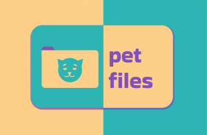
This is the branding and colour choices I showed for critique.
When I was trying to create another colour scheme I decided that I wanted to keep the 3 colour main primary colour scheme. I learned from other students critiques that you can have a secondary colour palette to allow you more freedom in your designs while also keeping everything in theme.
The first thing I did before changing the colour scheme of my brand was to change up my logo. The first drawing I did for my logo was more of a rough idea so I decided to finalise that first.
![]() This is the logo I came up with. I changed the pet to a dog but still kept the shapes pretty simple. I used a circle for the head and a half circle for the snout. A triangle was used for the nose and the rest I drew out with a pen and manipulated the bevel curves of after.
This is the logo I came up with. I changed the pet to a dog but still kept the shapes pretty simple. I used a circle for the head and a half circle for the snout. A triangle was used for the nose and the rest I drew out with a pen and manipulated the bevel curves of after.
I used the same green-blue colour from my original branding and just toned down that colour and moved it to a greener hue for the fill of the logo. When I took that lighter green-blue colour and put it into a colour harmony generator the complimentary colour was a pink-red colour. I took that colour and used it for the tab and I made it a bit darker to fit in with that darker green-blue colour. I actually like how this colour scheme worked out so I tried to change the branding to incorporate these colours.

After seeing these colours placed so close together and with text, I think they appear too dark. I like how the new logo looks but I think the colours need changed again.

I decided to completely change all the colours. I took the original blue-green colour and made it into a light blue colour. I then wanted to add some contrast to that colour while still being cool toned. Therefore I made that light blue colour a lot darker and shifted it to a more purple hue. I think this colour brings a lot of energy to the brand and I really like how it looks in text. I then wanted to make a colour that was more warm toned to contrast both previous colours and create an accent colour. For this I decided to come away from the reddish pink colour I had used before and make a more orange shade. Orange and blue are complementary colours so I thought it would be harmonious with the previous colours I chose. I do really like how these colours work together, I think the light blue shade fits in with healthcare and the other colours bring some energy to the brand and make it stand out. When it comes to looking at just the logo, I don’t think the orange sits well on the blue-purple background.

I decided to keep experimenting with my colours sort of mix together my previous two options. I went back to the first branding for the logo colours but I also wanted to add in that energetic purple-blue colour I made in the previous choice. I made the text white and a border around the logo in white to sort of break up the high saturation of colours in the branding. I do like the idea of breaking up the colours with white and also introducing that to the brand as I will use white space in the app design. However, I don’t think the purple and red look good together.

This lead me to this final change in colour scheme and branding.
I combined my favourite colours from the previous options, I added a white stroke to the text to match the stroke on the logo and I also think it helps the readability of the text. I like the new presentation of the brand, it looks a bit smoother and professional. I think the orange may still be too bright and it might have to be changed once I integrate it into my app design.
Font changes
As stated in my thoughts after feedback, I feel my display font choice of ‘Bakbak One’ works with the brand. I liked many serif font choices other students in my class had made but I was struggling to find any to fit my theme. I found one serif typeface that I liked and had bold retro look that I thought I would try out with some sample copy from my app.

I tried the serif copy in both my display copy and body copy as I read in this article that serif typefaces are easier read in lengthy pieces of text. I do like the contrast between the serif and sans serif types but I just don’t think this one works with my branding as well as my original choice. Therefore I am keeping this font as it is for now. I will however, keep researching and finding inspiration for other fonts in the meantime.
Icon changes
 From looking at other people’s work and also from my own critiques I realised that my current icons were too big. They were also inconsistent as the dog icon and the megaphone icon I downloaded as placeholders. In the image above you can see my process, I re-designed my megaphone and speech bubble first. I changed the ellipses inside the bubble to the shape of a chat message in the app itself. I messed around with the colouring of this second option and at this point I hadn’t settled on my new colour scheme. In the next row I had changed the placeholder dog icon to the icon from my logo to keep consistency. At this point I had my new colour scheme and implemented it here. In the last row I resized my icons to be smaller and also added a title to these icons to explain what they are. In the last row I also changed the orange into less saturated option as I felt the orange could be too bright and make the icons harder to see and understand. I’m happy with how these turned out although I feel the orange colouring will still be experimented with until I feel it is correct.