In this week’s lecture we discussed how the content of a digital product underpins everything.
In our future job roles being a good content writer is a ‘unicorn skill’. The user will have problems understanding and interacting with apps with bad copy and content.
There are four main types of content in web/digital design.
- Text
- Images
- Video
- Data
Text makes up most of web content and so is a very important feature of a digital design. In the mock up stage of a design using fill in copy like ‘Lorem Ipsum’ doesn’t serve a purpose in terms of what the finished product will look like. It is important that the written content is thought of throughout the design process.
We then were introduced to Digital Service Standards. In government sites it is important to think of the user needs and what they are looking at the website for. Designing with data allows you to see what it important in your design and can help your confidence in the products performance with real users.
This week we were also told about our upcoming critique on week 7. For this critique we must create a pdf presentation of our app so far including the following..
- Logo
- Brand guidelines
- Sketches
- Wireframes
- Initial Mock-ups
Therefore in preparation for this critique, I worked on my branding and brand guidelines.
The first thing I wanted to tackle for this was my logo so I could get a feel for the brand and set the tone for the rest of the branding and project.
However to think of a logo I needed to decide on a name for my product. I wanted to include the term pet so that it wasn’t animal specific and easy to understand. I also thought it would be good for search purposes if a user is looking for an app like this. I needed just another word for the title as was trying to keep it as short as possible. I thought maybe adding the word vet to the title would be smart as you are able to communicate with the vet in this app. This lead me to the following ideas.
- Pet2Vet / Vet2Pet
- Pet Help
- Vet + Pet
- Vet Chat
The problems with the options is that a lot of them were already in use and others I didn’t think were catchy enough or didn’t explain the apps purpose. I decided to leave out the ‘vet’ word and focussed on what the app does. It’s a record of your pet’s health and all in one pet care product.
- Pet Records
- Medi Pet
- Pet Files
I decided to go with ‘Pet Files’ even though I really liked the sound of ‘Medi Pet’. I thought that Medi Pet may have sounded a bit too much like giving actual medical care to your pet or maybe an app you’d use in emergency situations. Pet Files is accurate as the app will act as a file on each of your pet’s, holding all of their information and history.
After that had been decided, I started drawing some ideas out on paper first.
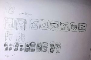
I began with labelling a section called ‘file icon’ as in this section I would draw out all my ideas of what a logo could look like drawing from the ‘files’ in the product name. The drawings started out quite complex with me drawing a medical file with a cats face on it and the app’s name. I simplified it to just the file with the cats face on it and started experimenting with some angles and positioning. The simplest of them all being the last one on the line.
I then tried experimenting with the initials of the app’s name, trying to draw them in a more visually intersting way. While doing that I tried to see if I could fit in the shapes of a dog and car into the letters. However those all ended up looking too visually complex and hard to make out, my favourite icon ended up being the simplest of them all, a classic folder/file icon with a cats face on it.
Then I took to Figma to draw this out digitally.
I think the simplicity of the logo works well as I used mostly basic shapes to create it. There’s some cleaning up to do but I should do for now.
Now was to start working with colour. I researched some colour significance with health care and I found this article form adobe. The article explains the meanings and emotions that come from different colours. The colours I would like to use are blue, green, pink and purple. Not all of them of course but I would like a couple of them included in the palette. This is what the article had to say about these colours.
‘Blue is calming, soothing and friendly. It’s often a fail-safe, neutral choice and can take on a professional or friendly tone’
‘Green ties to nature can lend your natural food brand or yoga studio an organic, healthy feel’
Pink is ‘nurturing and playful’
‘Purple is a very elegant colour. It signifies loyalty’
The colours that would make the most sense for this app is possibly a combination of blue and green as they can be professional and both can be associated with nature. However I need a bright accent colour and I think a shade of pink, purple or orange could all work. Therefore I started experimenting with all kinds of combinations

I enjoyed the idea of orange or purple bringing in a lot of energy to the brand but I like the nurturing association with pink. As a base colour I really liked the teal colour as it is a mix of the blue and green. I thought It could be a good primary colour and maybe the paler shade of orange could be a good secondary colour. So I decided to build off of the first icon on the second row.

I chose one of my favorite fonts ‘poppins’ as a stand in until I decide on my typefaces.
I decided add purple as an accent colour on the file and to add it to the colour palette to use for a call to action or buttons.
I wanted the presentation for the logo to stand out more so I thought of splitting the rectangle in half, the logo on one side and the title on the other with each half a different background colour.
This is what that looked like, I added a drop shadow to unify the two halves. To finish it off I placed it on a background rectangle that was also split but with the opposite colours.
This is what the finished logo presentation slide looks like.
For the next slide I needed to show the colour scheme of the app. To make this I just placed a couple of colour swatches on the slide and arranged the sizes of these swatches to how prominent it is in the colour scheme. I added the hex code and RGB of these colours.

To finish off the branding for now I needed to decide on my typefaces.
I wanted to use ‘poppins’ in the project as I feel it works really well as a body copy with a friendly feel. I experimented with some options for a heading typeface including some serif typefaces but I just didn’t think they fit the tone of voice.
While searching for bold sans serif fonts I found Bakbak One. I thought it worked well with poppins and decided to use it in my project.
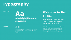
To make the typeface slide I added in both typefaces and an alphabet below them. To show how these fonts work together in terms of the actual product, I created a sample piece of text to the side.
I think the hierarchy of the sample text works well and the typefaces both have the same tone and feel to me.
I finished my logo and brand guidelines this week and the sketches and wireframes were completed last week. Next week I will develop some mock ups to finish up my presentation for critiques.