The first thing we discussed in this week’s lecture was immersive storytelling.
Immersive storytelling goes beyond books, prints can be largely static. Being able to design digitally allows us to create more immersive experiences. For this, we should consider movement and interactions.
Nowadays we expect some level of interactivity with our websites. The micro interactions a user gets when interacting with a site, like buttons taking them to different pages or scrolling to zoom in on something, offers a sense of immersiveness that a static site or book could not.
Macro VS Micro
Macro interactions in a websites means going from page to page, section to section.
Micro interactions means going from component to component or interactions within components. (hover states)
We were then shown some example websites to show how these interactions work in real-time. This helped me gather some inspiration for some fun hover states, and movement between page.
Viewing most immersive or interactive sites is better on desktops or laptops, however some level of immersive techniques should be responsive on all platforms.
We then looked at some specifics for designing micro interactions. Some important functions for this is communicating status and providing feedback, enhancing the sense of direct manipulation and helping people see the results of their actions.
To explain this further we broke micro-interactions down into these sections:
- Triggers– used to initiate a micro-interaction. These can be user or system initiated
- Rules– determine what happens once that interaction is triggered
- Feedback- This lets people know what is happening, what users see, hear or feel while a micro-interaction is happening
- Loops and Modes- determine the rules of the micro interaction. what happens if a condition may change.
A good example of these micro interactions would be creating a password on a site.
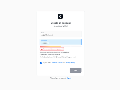
The trigger for this interaction would be the call to action in the box for the user to then type their password in to. The rules would be that a meter from red to green will appear to show users the strength of their password. When the user processes to type in their password the feedback to them would be the meter changing colour based on what they typed and giving them a written feedback response in some cases. The loops and modes would be defining the changes in this interaction based on what the user typed- would it stay red, turn green or amber.
We then looked at some other example such as the Space X and Apple.
SpaceX’s site was very useful to gather information for as it creating an interactive site about its’ story and rockets which is very similar to our brief. Some of my favourite things I noticed when moving through their website are;
- the fullscreen high definition images
- numerical data moving on scroll to correct value
- the wireframe diagrams of rockets before they are filled in
- videos of rocket launches
Some things I didn’t like about the SpaceX website was:
- The content available on the home screen- mostly just videos, I think important updates and some articles included would give the user more to look at.
- The hamburger menu and horizontal navigation at top of the screen could be confusing- 2 modes of navigation
After this we were shown a quick walkthrough of how to create a hover interaction between 2 screen on Figma and given the advice to explore and teach ourselves to recreate some interactions we’ve seen. This will both help our design skills but also give is some inspiration into what features and interactions would work for our own projects.
This week I started adding my content such as text and images I’ve sourced so far, into my project.
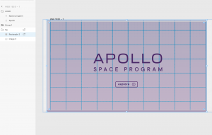
I started off with the launch screen, I wasn’t very happy with how the blueprint background looked as it was too light for any text to be very readable.
I decided I still wanted to use the same image but I experimented with different layer blending options
This is how my launch screen looked initially in the lo-fi prototype.
 I do like the subtle gradient in the grid lines but it also makes everything to visually noisy to read when large text sections are involved.
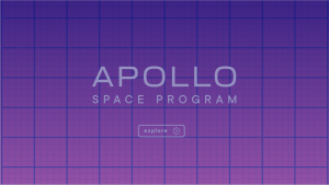
My first idea was to change the layer blend option to ‘screen’, and for this I kept the purple rectangle in front of the blue print image in the layers section. This was easier to read with darker text however I don’t like the blue coming through as that is not in my colour scheme.
 I again kept the layers the same for this next choice but this time the blend option was ‘luminosity’. This background became much darker so I changed the text to a lighter colour in my scheme. I like this better but I still think it needs to be fixed up a bit.
Finally I settled on changing the layers section to the image in front of the purple rectangle.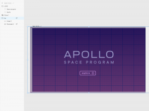
I changed the blend option to ‘multiply’ and I think this is my favourite option. The background is dark enough for text to contrast but you can still see the subtle gradient. I kept the logo text the lighter purple but I changed the ‘explore’ button to the pink colour in my scheme.
This is the background I kept for the rest of my project.
Next was to start adding in my text and image content.

This is what my home screen looks like once I’ve added my images that I sourced from the NASA website. the first section of text can be independently scrolled to see a hidden paragraph of text.

This is what the full text section looks like, when its not hidden. I like how this looks so far but I’m not sure if the text can be seen very well over the image.

If you scroll down you will see another section. This is quite text heavy at the moment, I want to add a stylised blockquote in between the top two paragraphs to break things up a bit.
The images shown near the bottom can be horizontally scrolled to see more.

This is what this horizontal scroll looks like unhidden. At the end of this screen the user is given the option to explore different section in more detail. My plan is to have the home screen show a short overview of the mission that the user has to scroll through and be immersed in the experience and after that is completed they can discover more in their own terms. I plan on adding a hamburger menu that can be accessed at any time and bring you to a specific section as well.
After this I started adding in the content to my other sections of the prototype, I started off with the data sectioned that I have names ‘The Numbers.’

This is what my lo-fi prototype looked like before.
The first thing I changed was the backgrounds of this section, to the design I chose for the home and launch screens.
 This is what my prototype looked like after adding this.
I think this makes a lot of difference to how the prototype feels. the darker colours with the subtle gradient contrasting with the light text, creates a more atmospheric effect than the first version.
The next step was to add in my text and images.

This what the prototype looks like after adding in my images and text.
I added the drawing I did of the Saturn V rocket for my style tile into the first screen. I wanted give some facts and figures about each section of the rocket as the user clicks through the slides. Ultimately I want to create an animated effect where the rocket rotates and expands so the parts are more equally spaced and there is no repeated parts on the other slides. I think how it looks now still has a really nice effect and works well with the background. The moon section is still underdeveloped as I would like to have a drawing of the moon in the same wireframed effect of that image. Currently this image is a placeholder until I work out how I want the drawing to interact with the content.
The last section I worked on this week was my ‘Crew’ section.

This is what this section looked like before adding in the content and images.

This is what this section looks like after adding the content
I loved adding the content and colours into these sections as I felt it really brought them to life. I like the drawings I’ve done so far however they were made quickly to see how they would work with the content. I plan on developing these drawings more and adding more life and shading to them.
The final section to add the content and images in for was my ‘Silver Screen’ section.

This is what this section looked like before.

This is what my silver screen section looks like now.
There is still some more work to do in this section. I want the numbers to interact by counting up to the correct amount. I also think the colour choices should be changed.
Next week I will focus on these prototyping interactions and animations.