This week we discussed the importance of art direction in our projects.
Art direction is concerned with the strategy behind that execution. Deciding on an art direction could take the form of a slide deck of similar websites, different buttons and typefaces that you like the style of.
Art direction is important as it gives the visual designer some direction to shape the user journey. Art direction allows you to tell a story but it should be appropriate to the product you intend on creating.
There are a couple of ways of creating a visual inventory for your project..
- Element collages
- Style Tile
I’ve decided that I will create a style tile to get some art direction for my project. Another task we should complete for next week is a low fi prototype of our project.
Airbnb Research
In this lecture we were shown the brand guidelines of Airbnb. I found the way they displayed these guidelines very interesting and informative. Therefore, I decided to read this article they made to describe the journey of redesigning their visual language.
The main goals airbnb wished to meet with their redesign were to make their new visual language…:
- Unified- part of a greater whole, no outliers
- Universal- global product, accessible to all
- Iconic- design should have obvious focus and bold in its iconography
- Conversational- Communicate with users in easily understood ways
Firstly the designers laid out the foundation of the brand. This includes things like the typography, colours, icons, spacing, information architecture. This way, when the designers would work on creative solutions and explore, while having a foundation to compare and fall back to. At the end of the day the designers would review what they had done and course correcting, allowing them to always work towards one ,unified, vision.
The designers would work with components. Usually a collection of simple components would be created which would then be combined and reshaped to create more complex components. Airbnb’s designers decided to work slightly differently by considering their components as elements of a living organism. They would define their components by a set of properties that can coexist with other components and evolve independently. This would create a united language, which is important as airbnb is a global company. They would build their component libraries up and categorise them based on navigation, content, marquees. They would create a set of all of these for ios, android and tablets. This allows for a more cohesive, responsive overall design.
Style Tile
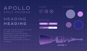
I created a style tile to help me during the prototyping process and create and art direction for this project.
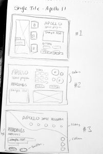
These are the sketches I made to decide on a layout.
I then created the style tile on Figma. I used a blueprint texture for the background, I then layered a gradient of my chosen colours to make the texture fit my theme.
I then added the title of my project in my chosen typefaces, which I then put under the title. The headings are in Gomme Sans and the sample paragraph text is in Kinetic. I placed the icons and button style I intend on using in the project and my chosen colour scheme. I then finally added an image of a drawing I made of the Saturn V rocket which is an image I will use in my project.
Lo-Fi Prototype
A lo-Fi prototype can be a really useful way to get an idea of what your project will look like and perform while also not focussing too much on the content just yet.
I created my prototype on Adobe Xd as I haven’t used that software before. I decided that it would be a useful exercise for me to become experienced in another prototyping software even though many current companies use Figma. I think that building my skills to get familiar with any software will come in handy,
Building from the sketches I had completed last week, I started to prototype. I would take the layouts I had used in my favourite sketches and the visual identity I had created in my style tile.
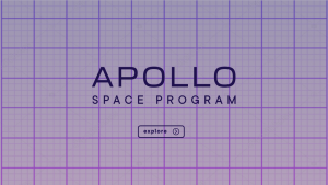
I started off with my start screen and I really like the position and size of my logo, I think I will move the call to action button up a little bit higher as looking at it here I think it looks a bit too low.
Next was to design my home page, which I want to be a story of the overall mission the user has to read through before choosing different sections to learn more information.

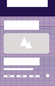
Something I will definitely work on as I start to add content in, is the background. I wanted to change the grid background from my style tile version as I thought it would look to dark when I would start adding my body text in and I wanted the grid lines to stand out a bit more. As much as I like the gradient colours in the grid to brighten it up, I think it is too light now and there won’t be enough contrast for the body copy to be very visible.
Next was my ‘Numbers’ section which would be about the number data about the spaceship – Saturn V, and the moon.

The first screen the user will click into will show a diagram drawing of the Saturn V rocket, with a short description of it. There will be a slider menu at the bottom of that section and if the scroll down past it they will see the next section which is of the moon. Again this will a short description written about it and some measurements. If the user clicks the second circle in the slider menu under the rocket, the diagram of the rocket will grow and turn on its side. The large image across the 2 screens represents that. On those screens there will be some data and descriptions of the different sections of the rocket. A similar thing will happen if the user clicks the second circle in the slider menu under the moon section. The moon will rotate and its opacity will be increased. The moon will the move across the screen in the last screen of the slider menu.

This is my prototype of the crew section. Each screen will host A large drawing of the astronauts on the first screens. In the second screens this drawing will move and rotate to the other side of the screen.

Above is the prototype for my ‘Silver Screen’ section which will bring the user through some images and descriptions of movies that feature the Apollo Space Programs’ missions.
I want to add another screen to this section but at the moment I just have the 2. I like how they look so far, they’ll feature some nice fullscreen images of the movies and in the boxes I’ve labelled Budget and Profit, the money will animate to count up to the total amount when the user scrolls it into view.