In this weeks lecture we went through the process of useability testing of a product.
First we were brought through some example on how to make certain elements of a website or app clear and obvious, eg. buttons.
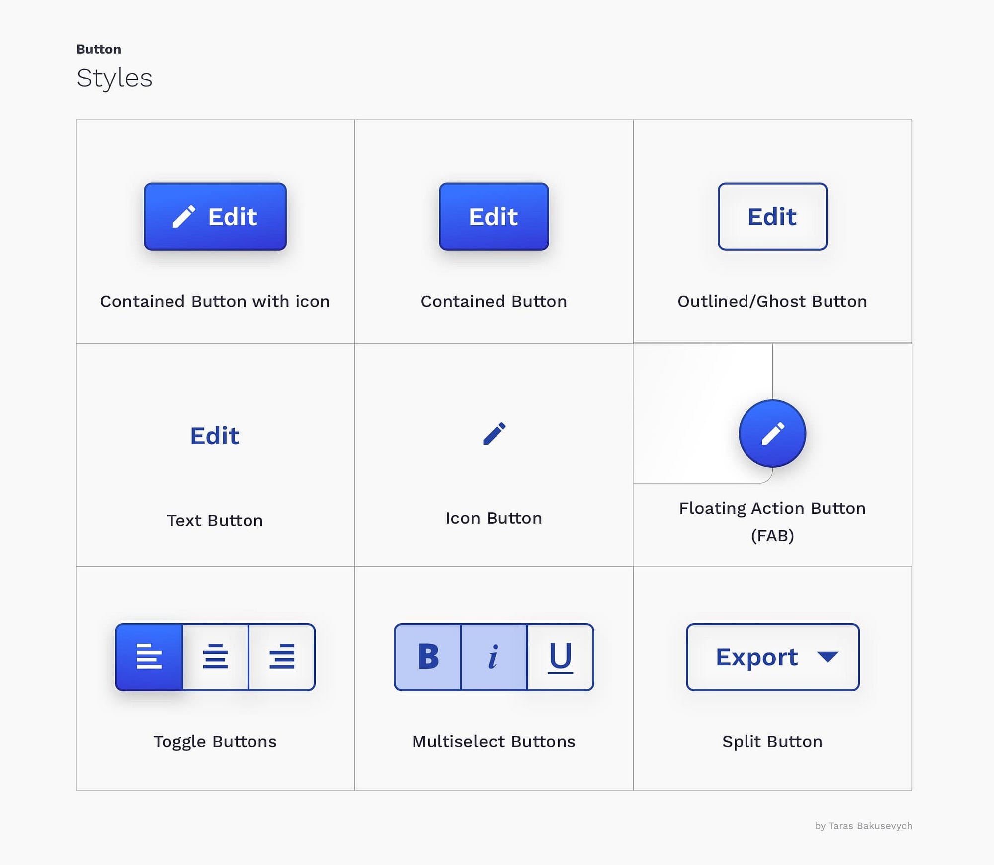
This images references the different types of buttons that appear on websites. The uncontained text and icon buttons are unclear to a user on whether they are interactive or not. Shaded or contained buttons allude to the shape of a physical button which is more intuitive for users.
We were also brought through some other tips on how to make websites more understandable for users:
- People only read a few characters of a word. When wanting to be clear, use short, simple words and phrases. People also process what they see incredibly quickly so making something harder of process will frustrate the user.
- Memory, people remember words to process them quicker. Use high frequency words (words used often) to avoid confusing the user.
- Best text width is not too short or wide. Making the paragraph too wide makes the text harder to scan and too narrow has the same effect.
Testing Group
We were then brought through the process of testing and how it is important that you test your target audience. I was told that a group of 5 users is enough to find 80% of issues in the product which was fantastic as being able to gather 5 people to test is a lot more reasonable than 50 or 100. The issues they find would really only be the big issues but with repeat testing and post support you should be able to fix most bugs.
Testing Equipment/Software
- Screen-recording to see footage of what user is doing
- Microphone to record audio of user’s process
People Required
- Testing participant – uses the product and answers questions
- Facilitator – ask test questions, identify at least 3 tasks for the participant to complete on the product
- Observer- write down observations and use voice recordings
For the test questions it was recommended we should use the ‘Standard Useability Test’ This is a set of questions that you should ask, this keeps every test standardised, efficient and satisfies the purpose of a test.
After Test Review
After the test reflect and go through these points:
- Time taken on each task
- Effectiveness- if task was completed
- SUS score- Way of administering score to test to validate results.
- Problem solve
Also explained to us was the concept of increasing or decreasing the users goodwill with your website. Meaning there are things about a website that frustrate a user and make them not willing to keep using your site. Similarly there are things that can help the user and increase their will to use your site.
Things That Decrease Goodwill
- Hiding info the user needs
- Punishing the user for not doing things the way you intended
- Asking for info from the user you don’t need
- Putting images or things in the way of content
Things That Increase Goodwill
- Knowing the main info users want to do
- Making things obvious and easy
- Tell the user what they want to know
- Know the questions users will have
- Use icons and images to explain when possible
- Make it easy to recover from errors
The process of increasing the users goodwill with your website comes from substantial user research and testing to get into your users head and understand them.
David Henderson Presentation
David Henderson from David Henderson Designs, did a presentation this week on the UX placement opportunities his company will provide this year. As usual I took a couple of notes during this to keep in mind when applying.
Davids presentation was focussed a lot on what his company itself offers and how it got started. The start up of his company was quite inspiring to me how it all started with just him doing freelance work after he graduated university and things slowly grew to the company it is today. DHD hosts global projects and opportunities in areas such as web development to branding and photography. David mentioned that as a placement student we would be afforded the opportunity to see how each area of his company works to gain a more rounded experience.
The most important notes I took down was what type of person David wanted from this placement student:
- Diligent
- Honest
- Hard-working
- Genuine
- Organised
- Motivated
- Sense of humour
This list motivated me when I first heard it as I believe I have all these qualities and from the way he presented his company and this job it would be a fantastic opportunity for me.
Elements Project update
So far I have completed my sketches and this week I began designing some wireframes to decide on positioning and colour choices before I start prototyping.


This is how I began the design of my periodic table website.
I wanted to include a light/dark mode because talking to other students and from some reviews I found that users like to have a choice in how they see the product. Light/dark modes are a popular thing now with other digital products such as youtube, instagram, facebook all have the option for a light and dark mode.
I knew I wanted the dark mode to be different shades of dark blue as the blue shades remind me of science and professionalism. Also dark blues work well for dark modes. Therefore when I was designing the light mode I was stuck thinking of colours that were complementary with blue, thinking I couldn’t use blue in both modes. As orange is the opposite of blue on the colour wheel I decided to try orangey shades. I thought a strong orange would be too hard on the eyes so I went the paler, peacher direction. I knew I wanted a pop up to appear as you enter the app and I think that turned out well in the wireframe version.
After I had completed this, I had a 1:1 feedback session with my lecturer to discuss where I should take this design. The feedback. I received was:
- Use dark mode as default mode
- Change buttons used to downloadable standards
- Change light mode colours
In the feedback session we both agreed that the dark mode colour theme was much stronger than the light mode. To fix this I decided I would go back and fix the colours I used.
Changes


As you can see from these changes there has been a huge improvement in the websites design.
Change #1
I swapped out the buttons I made quickly for demonstrative reasons for a standard ready-made button. This really helps the overall look of the design and makes it appear more professional.
Change #2
I changed the light mode colour theme to lighter, greener shade of the dark mode which makes the two modes much more cohesive and sleek.
What next?
Next week I will start the branding side of my project and start writing more content for the project.