In this lecture we were given some fundamental tips to improve how your presentation is received.
- Ask people to gather round you in presentation area- brings audience closer to your presentation and makes it easier for them to pay attention and you to have eye contact.
- Stick to your time limit- It is disrespectful to other people involved in event to go over your time, practicing can avoid this.
- Use plain English- this makes your pitch understandable to any audience so they can get on board with your idea. Using complex language could alienate your audience. It’s also important to be succinct, don;t waste people’s time.
- Use slides to give a visual cue to your pitch and give your audience something to look at and get their attention.
We were then given some tips on our presentation design and delivery.
Presentation Design
- Use minimal typefaces
- Use subtle transitions
- use bullet points when possible
- presentation made in 16:9 aspect ratio
Presentation Delivery
- Get to the point
- Lay out what you intend on covering
- Use supporting materials
- Use rhetorical devices in your speech
- Have a pdf backup in case of disaster
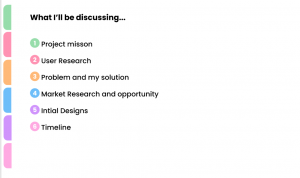
What is should included in investment pitches
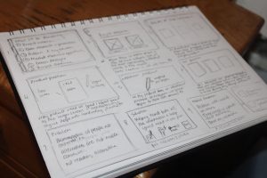
- Project mission
- User Research
- Market Research
- Design/sketches
- Timeline of project
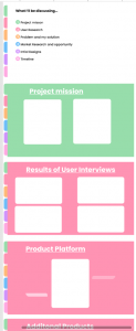
I wanted my slide design to be simple but colourful. I didn’t want illustrative or patterned backgrounds just a solid colour therefore the audience will pay more attention to my words and content on the slides.
I wanted the colours of the slide to be thoughtful not just using as many colours as possible so I thought of the idea of coding the background colours to the section of the presentation. eg. User Research slides = orange background. I was trying to make this colour coding idea easily understandable to the audience so I tried to think about how products or information in real life. This is when I thought of office files and the coloured tabs to separate content. I thought this would be a fun simple way to not only let the user know what section of the presentation I am at but also how much of the content I’ve covered at a given time.
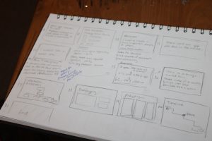
After this I started mocking up the rest of my slides;


Next Week..
I will begin writing and researching the content needed for my presentation.