I had a 1:1 tutorial session this week to see how my web building was going and to get some feedback.
During this session Kyle mentioned to me that my websites colour and concept reminded him of the work by Neville Brody. I had never heard of him until then but when I brought up images of his work there were definitely some similarities.
I thought I should look into a bit more detail about Neville Brody and see if I could gather more inspiration from him.
Neville Brody

Neville Brody is a 64 year old Graphic Designer, Typographer and Art Director. He spent 3 years studying at London College of Printing.
London College of Printing is a world leader in communications education so Brody was set up for success. However due to his more experimental work at the time, he was met with criticism because the school generally traditional methods.
Despite this he gained some of attention as an art director for ‘The Face’ magazine. He worked there from 1980 to 1993 and in the 80s the magazine was extremely popular, known to some as, “the fashion bible”. From this he gained great success.

In 1994 he formed his own studio called ‘Neville Brody Studio’, now ‘Research Studios’. His studio was very successful as well and has expanded to include offices in London, Paris, Berlin and Barcelona.
Brody is a founding member of the London based type foundry ‘Fontworks’ and has designed over 20 different typefaces during his career. During his time he was also a huge contributor to ‘FUSE’ – a publication about the practice of experimental typography. Brody states he was stood by using the computer as a design tool especially during its developmental stages.
His work
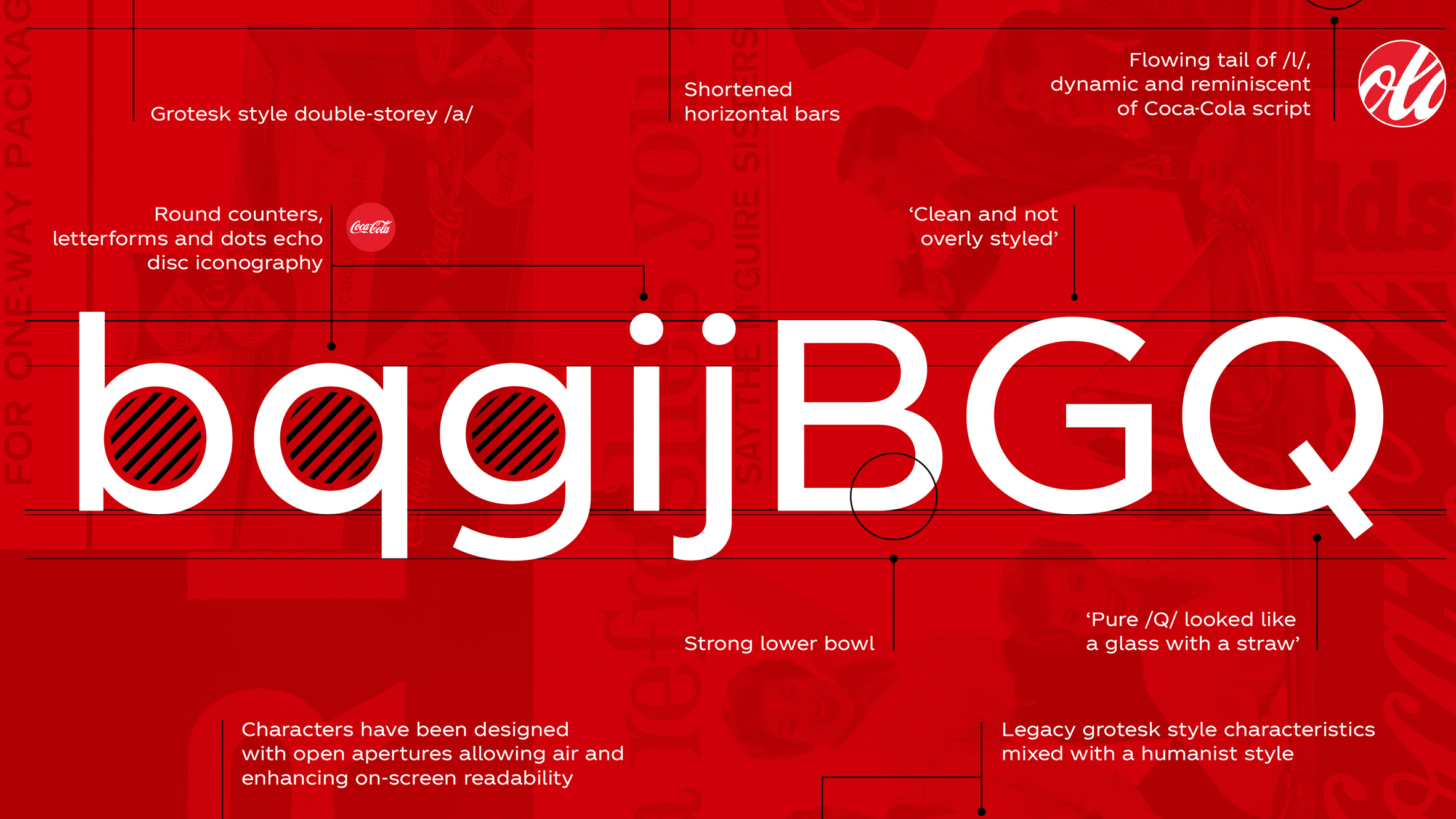
Neville Brody’s company created the first ever, Coca Cola proprietary typeface. This speaks volumes to how well respected and successful he is in the design industry.
I really like the typeface, I enjoy how the capital letters stretch longer than the lower case letters. I think producing letters this was offers more contrast when capitals and lower cases are used together, it creates a more interesting form.
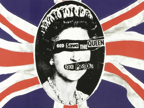
Obviously I have to mention the album cover he designed for the Sex Pistols. This is a truly iconic piece of art and was known for being incredibly revolutionary at the time he created this.
I love the editing on the photos to make it look like they were cut out and stuck on, it works really well with the identity of the Sex Pistols. It also suits the type of work Brody likes to create.
My Thoughts
I think what Neville Brody has been able to accomplish is truly inspirational to me. The fact that he was able to become so successful after not being understood in his college is really speaks to how much he must have believed in himself.
The confidence and belief Brody had in himself is the part of his journey that I want to apply to myself. That even if things aren’t going my way that I have the belief my work is good and I can improve.