In this week’s lecture we had a feedback session involving our portfolios so far and any initial issues anyone had with webflow. We also had a couple of presentations made by UX designers in Instil and Fintru.
Feedback
At this point I had built the homepage, about page and a case study page on my portfolio site. I had worked hard to have more content there available for feedback.
The main points of my feedback were:
- My Titles on each page were too high
- Case studies needed better alignment
- Switch every other section background colour to white to build more contrast
- Put a call to action button on the home page
During my feedback Kyle told me my site reminded him of some work by Neville Brody an English Graphic Designer who I hadn’t heard of before but will look into as his style is something I wish to emulate.
I took this feedback on board and started changing the problem areas of my website.
Problem #1- Titles too high
original
This an example of what the titles being too high looks like.

changed
In the changed image, I added a padding of 40px between the title the top of the webpage. This isn’t a huge change but I think it makes the website a little easier to read and look at. Along with this I also changed the ‘projects’ vertical text to be under the navigation bar. I like the look of the title and navigation staying exactly the same on every page and the design underneath changes.
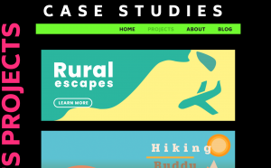
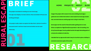
Problem #2- Case Study Alignment
original

original
This is what my case study layout looks like currently.
The big issue is how I laid out my case study. The text is not aligned with each other and the numbers and titles are too big.

changed
changed
Problem #3- Case Study Bg Contrast
original

changed
This was something that I changed just to see what it looked like but in the end I just preferred how it looked before, I wanted the case study to look cohesive and I didnt want too many changes in the design of each section. I thought the big numbers and text was enough noise on the page without adding more distractions with different backgrounds.
Problem #4- Adding Call to Action

original
This is what my homepage looked like before button.

changed
This is my home page with the added call to action button. The feedback I got to add this was incredibly beneficial because I think having this button on the homepage entices the user to explore my site, rather than leaving everything in the navigation.
Overall thoughts
This week’s feedback lead me to make some great improvements on my site and overall it was a very useful class for me. It was also fun to see how my peers’ websites were coming along and be inspired by them.
Instil Talk
After lunch we had a couple of presentations the first of which being, Instil.
I had heard of instil before from other students in the class and the lectures but I was not fully knowledgeable of the company and the work they produced. This made me pay a lot of attention to their presentation however, as I wanted to apply to them for placement and I needed understand who they are to do so. Therefore I wrote a couple of notes while they were presenting.
One of the first things Jason said as he began the presentation was that we should “treat placement as a game, take what you can from it and learn”. This was really useful advice as at the time I was worried about getting a placement, if the placement would be a good fit for me, what I would be doing etc.. All these little things to stress over but when it was put so simply that whatever it is learn from it and take what experience you can from it to improve.
He went on to discuss other parts of what it is like to be a designer in a workplace. One of the things he mentioned was that “most of the time design is about convincing the people in the room that your design is the best”. This was an intersting point I hadn’t thought of before. Sometimes your work could be the best in the room but sometimes it won’t be. What’s important is being able to speak intelligently about design and having the charisma to talk about these things in an appealing way.
During the presentation Jason gave out some more helpful tips like “Don’t be afraid of stealing” in reference to taking inspiration from other people’s work. Everything we’ve seen or will see has been based on something someone saw someone else do. Which sounds complicated to type but it actually makes sense, to me anyway. It’s hard to get inspired to create something amazing when staring at a blank canvas, a lot of creative people need to see each other’s work and projects to get ideas for our own.
He discussed how a placement would work in Instil, what type of projects we’d take on but overall Jason’s presentation discussed more about what to expect in a workplace rather than Instil as a company. This is not a complaint I found the talk helpful and interesting and it actually made me want to do more research on the company myself. He made it seem like a welcoming environment that understood our point of view as design students which was really nice to hear and put some stresses aside for me.
Fintru Talk
I had always seen the FinTru building when walking back from uni this year as walk down ormeau road and I know someone who got a job there but as a software engineer so I wasn’t entirely sure what they offered in terms of UX.
The Lead UX designer at Fintru, Andrew gave the presentation and they began by talking about how FinTru is a growing company with buildings in Derry, Dublin, London, New York and the Netherlands. They also have a building in Belfast making them a great placement provider for students here. The idea of working in a international company such as this is quite exciting, I never thought a company here would have such a widespread customer base.
Fintru’s presentation definitely focussed a little more on what they expected from a UX placement student. Andrew said that a placement student would plan user tests, get involved in projects going on in the company, attend workshops. The student would also have the opportunity to get rewards for hard work and a good salary. These are all increible bonuses to becoming a placement student at Fintru, the workshops comment was particularly interesting to me as it seemed like you would good opportunities to improve your skills there.
Andrew then spoke a little more on the interview process as he will be the one conducting these. He said some of the most important things we need for the interview is knowing your process for design and having a good design process:
- Research – doing suitable user research for each project so you understand what your project needs to deliver
- Analysis- Analyse your research and decide where this should take your project
- Design- Sketch and design ideas for your project and get feedback
- Prototype- build and prototype the project and gather feedback
- Deliver- Deliver project to client
- Reflect/Test- Think about what could be improved upon and user test project to fix bugs
Most of the steps in this process I complete during my projects however in previous projects there hasn’t been a huge focus on user research but this is something we are starting to learn more about in classes. I understand how it is integral to the process of a project and it is something I will try and improve upon in my own projects.