In this week’s lecture we continued learning about identity design but focussing more so on personal identity than brand identity.
The first task was to design our names using only geometric shapes such as circles and squares.
This is what I came up with, I originally designed very letter with a circle however it was difficult to represent the letter ‘L’ with a circle so I thought Id use some other shapes to complete the letters ‘L’ and ‘A’. I think by doing this the name is definitely more legible but consistency is lost and disadvantages the design.
I think if I were to do it again I would either spend more time making the letters out of the same shape or similar shapes, or choose a different shape to begin with.
Another task during this lecture was to create mood boards on pinterest, one using photos I took from thing inside/outside my home that looked like typography and one using digital art and photos of typography and monograms.
This week, we began the design of our own monograms, we were told to start on paper using only pencil to focus on the fundamentals of the design and the shapes we want to use before adding colour and extra detail.
Pocket Profiles
Wim Crouwell
Wim Crouwell was born in 1928 in the Netherlands and is internationally known Graphic Designer and Typographer. He used fixed grids to help with the design of many of his posters as he believed it created more dynamic proportions and it allowed him to be more impersonal with his designs which he highly valued. Wim Crouwell liked to focus on the function of his designs and its purpose, he was inspired to do this by the new form of architecture gaining popularity at the time. ‘The Swiss Style’ thought the function of a design was just as important as its aesthetics as without function the design would hold less weight and influence. He wa quoted saying ‘Functionalism is Sobriety’ which really expresses this point.
He founded ‘Total Design’ studio in the 1970s with the focus of problem solving with design. During his time there, he designed a new digital typeface called ‘New Alphabet’. This typeface was created using only horizontal and vertical strokes, which lead to some letters that were less legible but it lead to using typography as a form of design with shapes and lines rather than just a means to communicate.

Wim Crouwell had a strong focus on functional design in the way he created but also taught, he was firm on the concept that design should be ‘detached’ and ‘impersonal’ . When I look at the typeface he created I see a strong sense of proportion and a carefully thought-out design however, the typeface isn’t completely functional, some letters are hard to make out, especially some of the numbers on the bottom. To me this proves that as much as design should be functional and logical, I think it is important to also have fun with it and expanding limitations in mediums that you thought impossible.
Armin Hoffman
Armin Hoffman was born in 1920 in Switzerland. At the age of 27 he had completed an apprenticeship in lithography and started teaching Typography at Basel School of Design. Hoffman believed that design should be communication above all else and he taught this at the school along with his methods of creating designs, including photosetting- using a photographic process to generate columns of type on a scroll of photographic paper, photo-montage and experimental composition. Hoffman would later become head of Basel School of Design along with creating many posters in his lifetime- many for Basel Stadt Theatre.

As a teacher Armin Hoffman allowed students to work to their own limits including using no deadlines to allow students to have full creative freedom and really focus on the process of design rather than the end product. I think that is a really interesting take on educating design as a design is as important as its process. Research, inspirations, ideas and sketches are integral to design and this way of teaching allowed students to use these to their full advantage to the limit they wished. The process depended on them which I think would allow the students to reach the level of potential they decided on themselves forcing them to be independent and individual.
Later in his life Hoffman put his ideas and philosophies of design in a book called ‘Graphic Design Manual’ in 1965 which is considered a ‘bible’ of graphic design even today.
Independant Monogram Development
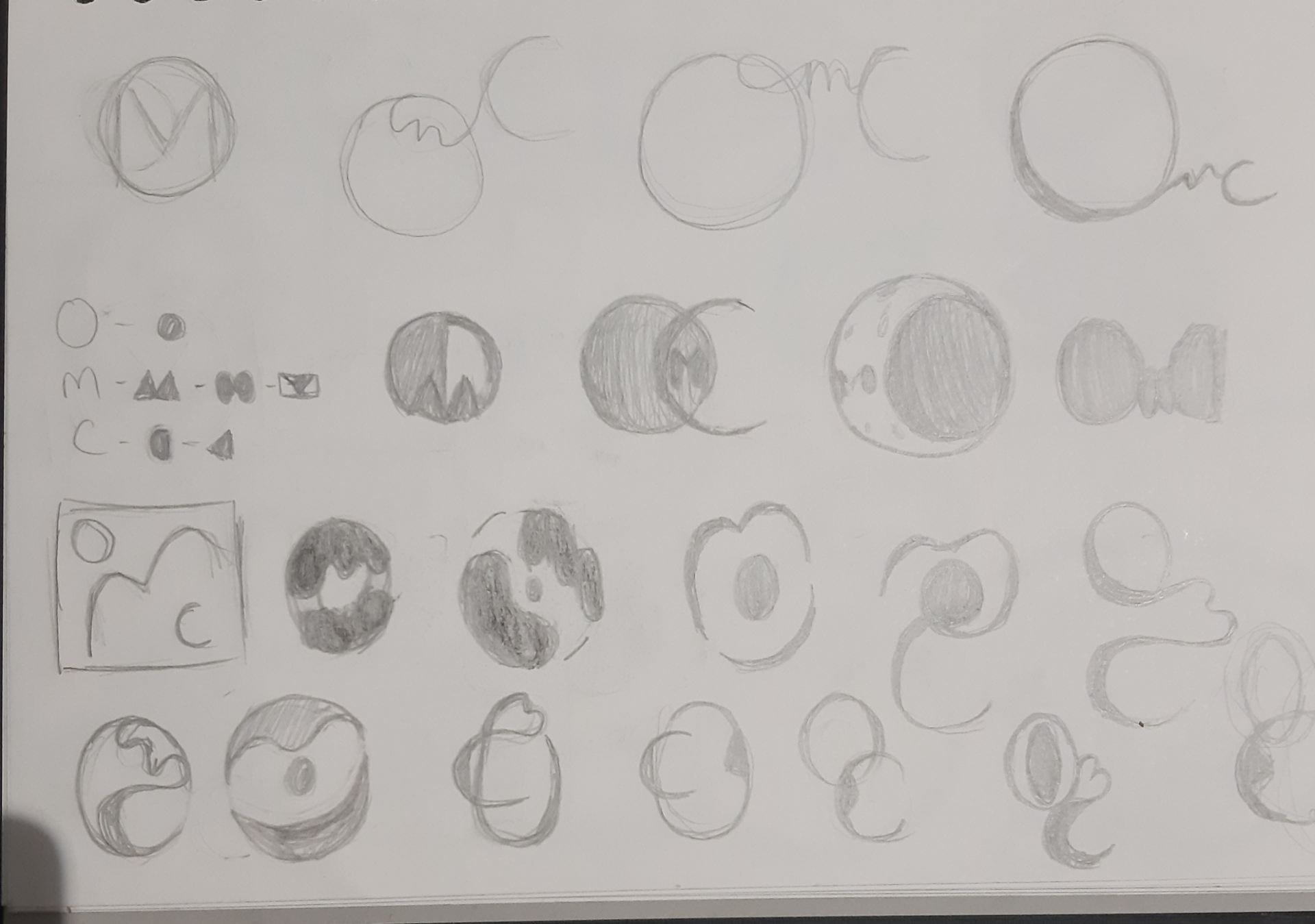

While developing my monogram I sketched pages of many designs, anything I could come up with in an exercise to test all variations I could think of with the letters of my initials. The photos on the left are example of designs I came up with.
None of these initial sketches are what I’m going to choose to make my final concept but I have found a couple of directions I will develop further with more sketches.
Something I was trying to do was to create consistency in my monogram, by drawing each letter in a round form or angular form, this is something I will continue to do in my sketches but instead putting to use the shapes I’m making with the letters to create a design in itself.