Introduction to the Core Principles of Design
This week was focused on the core design principles, these can be used as building blocks towards our own design style.

Leonardo Da Vinci’s ‘Vitruvian Man’ which looks into ‘The Golden Ratio’, which is defined as ‘the
perfectly symmetrical relationship between two proportions’.
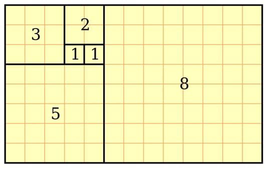
This rectangle describes the golden ratio as rectangles have been added
that are equal in length of the longest side of the previous rectangle creating
a sequence similar to the ‘Fibonacci sequence’ which is how these rations are connected.
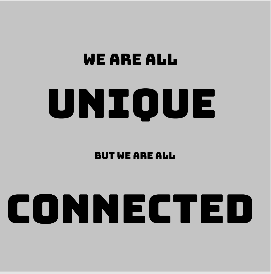
During this lecture we were told to create a type scale using the text from our Manifesto project. We scaled the text according to the Fibonacci Sequence;
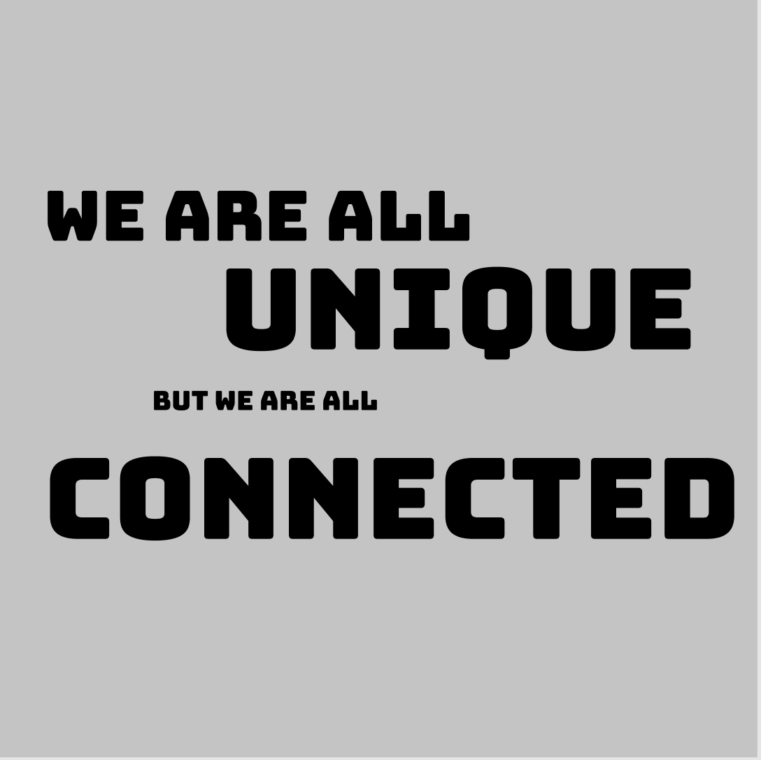

Out of these 3 experiments, I really enjoy the first one,
I think it has the most dynamism of the three and uses the principle of ‘Big, Medium, Small’ more effectively.
The middle one is more symmetrical so it draws the eye but I also feel it is more 1 dimensional than the others.
The last one I attempted to have more of a contrast between the text but I feel some of the text is too small to have an impact.
This then led to the Gestalt principles:
Gestalt- means form.shape in German- is a group of visual perception principles developed by German psychologists in the 1920s. It is the theory that “an organised whole, is perceived as greater than the sum of its parts”.
The Gestalt Principles are built on four key ideas;
Emergence
From research they discovered that people firstly identify elements in their general outline.
As people, our brain recognises a simple, well-defined object quicker than a detailed one.
Reification
Our brains can recognise objects even when they are parts of them missing. We match what we see to
familiar patterns stored in our memory to complete the image.
Multi-Stability
People can interpret ambiguous or vague objects in multiple ways. We can go back and forth with the alternatives and as a result
one view will become more dominant in our brains as we seek certainty.
Invariance
Our brains can recognise simple objects despite different rotations, scales and translations.
Humans can view different objects from different perspectives, despite the changing appearance.
These principles can help us in Interaction Design, we can use how the human brain reacts to certain objects and images
to our advantage. The brain sees objects that our close together as being closer related which can help us create narratives between
objects in very minimal ways. With the help of negative space it can create an engaging visual hierarchy, guiding the user’s eyes in the direction wanted
making the design more functional and efficient. People perceive similar elements as grouped together, making them appear they have the same purpose.
This can help significantly when organising elements on a screen as objects be emphasised by being different than the other objects grouped together by size and colour
creating the idea of a separate purpose and creating a focal point for the user.
When then completed another task, which was to remake, in Figma, the layouts of some of our favourite apps to see the Gestalt principles in action;
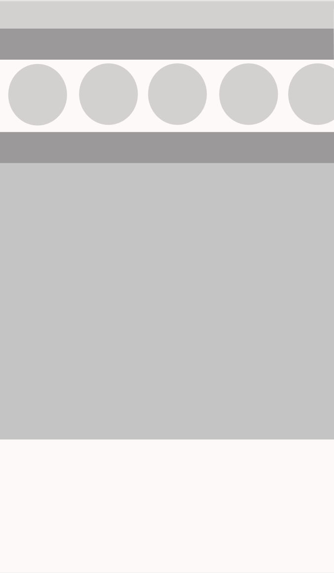
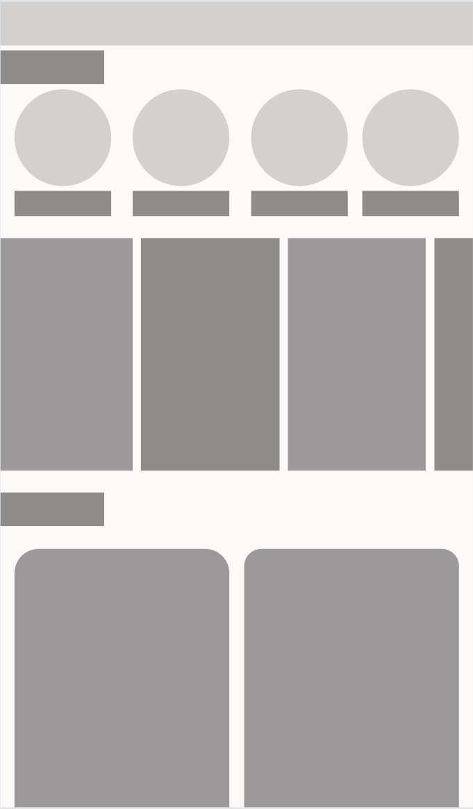
 The first app I decided to recreate was instagram. The row of circles of all equal size and proximity give the impression of a relationship and shared purpose. The users eye is drawn to the big square at the centre of the screen, which shows the main content of the app, therefore, instagram very successfully uses the visual hierarchy and Gestalt principles.
The middle screen was a recreation of snapchat. The circles agin are grouped together in close proximity to give the impression of a shared purpose but this is also repeated with other shapes of different sizes to organise the many types of stories available on snapchat’s ‘Discover’ page.
The final screen is my recreation of Spotify home screen. The buttons in the top section of the screen are grouped together with the same size and shape. These show what you have been recently listening to, to allow the user to quickly navigate through the app. The bottom section of the screen shows the biggest size of rectangle to draw in the user’s eye. These shapes contain episodes of podcasts that you are in the middle of listening to so you can quickly resume your episode when you open the app.