Introduction to Point, Line, Plane- The Visual Vocabulary
During this week’s lecture we learned how important it is to understand the basics of any design. To understand the ABCs of design, ‘Point, Line and Plane’
It’s important at the beginning of any design project to sketch all ideas down on paper, it clears your head and helps put the mental conceptions into real life designs and ideas.
We started out with the most fundamental of the building blocks of design, the point. The artist Sagmeister’s logo for ‘Seed’ shows us creative you can be with even one of the simplest elements
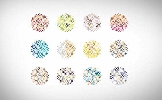
Each of these designs look very different but the only difference is colours of the some of the individual points.
Even this simple design choice allows for many interesting and colourful variations.
During this week’s lecture, we did an exercise in the versatility of designs possible using only point, line and plane
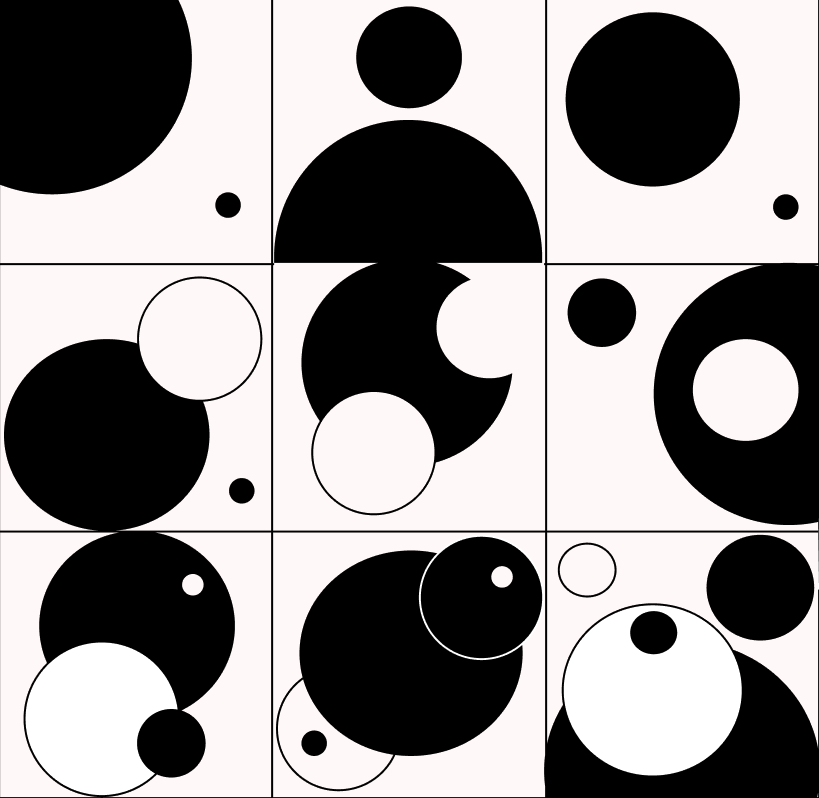
The first exercise we did was the point grid. The first row contains designs
made with 2 points, 2nd row contains 3 points and the 3rd row contains 5.
Due to the fact that this is a task about designing minimally, I reflected
that in the colours I chose, keeping them basic with a light cream colour to
make the white points stand out more. I’m pretty happy with how it turned out,
I found that the more points were involved, the harder it became to style them
which makes it clear to me that designing minimally can be very effective.
 The second exercise was the line grid.
Using the same principles as before, I started out with 2 lines in the first row,
This time I experimented with continuing one line throughout the whole row.
I like how it turned out but it could have created more of a narrative whereas
I feel this could look out of place. I enjoy the last square of the 2nd row because
I experimented with inverting the colours at certain sections which I think adds a
some dimension with only colour.I combined both the continuous line and inverted
colours again with the 3rd row, which I feel makes it look more interesting and playful on the eye
 The final exercise was the plane grid. It was difficult to design anything interesting with
only 2 planes in the first row, however i’m please with the outcome. I placed the same square
at different point in the row to create a sort of pattern out of very little and used different
background planes to make it stand out. The 2nd row allowed for a bit more intersting forms, I
kept them all in the same colour theme to create the look of shades instead of shapes.
In the final row I experimented with a different form of shade instead of just rectangles
which I think really adds to the design and makes it stand out. I could have continued that with
other squares in the row but I think that could overwhelm the row and make it look messy