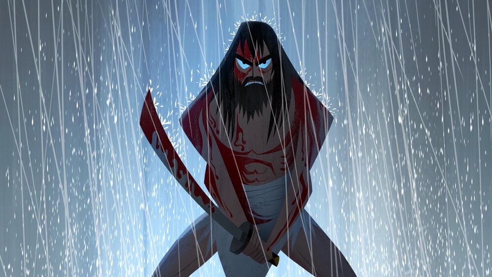
For our next assignment we are to work in the style of Genndy Tartakovsky, animator and storyboard artist of well known stylized character story’s such as Hotel Transylvania, Samurai Jack, Dexter’s Laboratory, Power Puff Girls and other well known titles. The approach to this project is working on a character design in the style of said artist that would be part of the Hotel Transylvania universe, mostly a non-human form that would be a customer of the hotel.
My first thought was to look deeper into the artists style. I’m a big fan of his past titles and grew up watching his iconic animation style, being able to pick him apart from most other cartoons. Despite this I wanted to understand his approach to character design in order to accurately fit my character into his style.
From my own personal reflection of his work before going into further research; I adore his ability to turn away from realism and rely on basic shapes to make up a character. As I recall from previous Animation Studio work shops, breaking down basic forms and placing them into characters gives more personality and a better reflection of character. There’s only so much characterisation that can go into realism and the need to think of ways to convey this onto screen, symbolically (colour, expression, wardrobe, make up, lighting). However there’s more freedom in animation. The same rules can still apply however shape, form, height, size, angles (soft-sharp), can all apply to characterisation. That’s what I adore about Genndy Tarkaovsky’s work, he’s not limited by realistic proportions e.g as seen below, Samurai Jack – angular, sharp edges, block/sturdy build.

I wanted to look across various forms of media to get an idea on his thought process on creating characters, tone and mood.
Genndy Tarkaovsky: Background in Animation.
Genndy Tarkaovsky’s career isn’t limited to animation, but directing, producing, screenwriting, voice acting, storyboarding and various other tasks involving motion picture/cinema however Tarkaovsky made his start as an art director at “Hanna-Barbera” for the show “2 Stupid Dogs”, the show often described as Hanna-Barbera’s version of “Ren and Stimpy”. The show’s animation method was “digital ink and paint” and this technique was used throughout the entire shows runtime. The process involved digital inking and painting, being similar to the traditional process until after the animation drawings are completed. This involved the animators drawings being scanned into a computer or drawn directly onto the monitor using a graphics tablet, which they coloured and processed using their chosen software at the time. Once finished the resulting drawings are composited on computers over backgrounds, which were either scanned into the computer or formed digitally. This is a very popular approach in todays industry when it comes to 2D work and proved in the shows favour at the time as it offered varying line density (“weighted” area’s to the characters) and creative freedom in colour vibrancy. Tarkaovsky’s first project, even way back then, favoured using overly-exaggerated shapes to define his characters and his work only evolved from there.
https://en.wikipedia.org/wiki/Genndy_Tartakovsky
https://faroutmagazine.co.uk/exploring-the-beauty-of-genndy-tartakovsky-work/
https://en.wikipedia.org/wiki/Traditional_animation#Digital_ink_and_paint
https://en.wikipedia.org/wiki/2_Stupid_Dogs
Video Essay’s Watched:
To conclude: Tartakovsky’s own influences stem from a series of old school western and Asian cartoons alongside live action filmmaking, this is shown from his early development in college and his talent of timing animation. He prefers the classic cartoon aesthetics with his main priority being visual storytelling. Whilst filmmaking has it’s limitations animation gives him the ability to “create imaginative stories unbound by the pretence of realism” which pays tribute to the history of animation.
When referring to Hotel Transylvania he mentions the animation and stylisation of people being the main appeal, he pays mention to Tex Avery’s animation style and that, alongside warner bros cartoons, was a big influence to Hotel Transylvania’s aesthetic. They essentially translated 2D drawings and concept sketches to a 3D space without loss of design or energy of the original concepts. They used 2D rules and applied them to the movie, squash and stretch of characters being a big visual factor. With exaggerating expression and character movement they can replicate the feeling of old school cartoons.
Past Works:
After reviewing Tarkakovsky’s influences and thought process behind animation I wanted to take a look on how he designs iconic characters over the years and how this could be applied to my own design going forward. I wish to break down shape and form (learned from previous animation studio workshops, benefits from seeing the visual characteristics) through character sheets and concept sketches.