
Sketching Quick Ideas
Now that I have a solid idea of which kind of digital product I am making, and who for, it’s time to start sketching up some possible screen ideas.
I wanted to get a few ideas for each of my main screens planned out, and I plan to refine the ones that I choose to go ahead with. With this in mind, I quickly sketched some lo-fi wireframe options.
Log-in Screen Ideas:

For the log-in screen, I wanted to include the brand logo, as well as possibly the wordmark. I have included a log-in and sign-up button on each screen, but I might make them independent of eachother.
Home Screen Ideas:
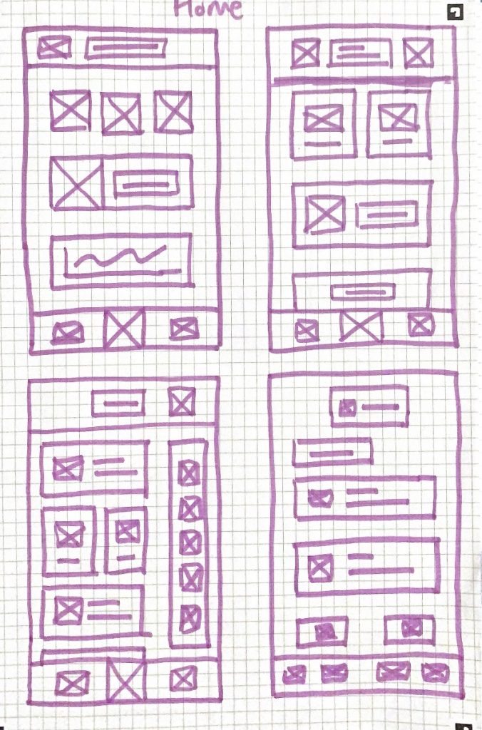
As for the home screen, I know I want to have clickable tiles that will take you to the corresponding screen. This way, everything is all in one place, and you don’t have to tap through a bunch of different things to get to where you want to be. The first idea includes variations of overviews of things like statistics, but I am unsure how this would look or feel in the prototype. I also tried it out with a couple different nav bar options, as well as a screen with some reminders/alerts down the side.
Statistics Screen Ideas:

I like the idea of each screen following the tile look, mainly for a nice level of consistency. Considering this, I made a couple of the ideas here be a variation of how the statistics tiles may be laid out.
Live Chat Screen Ideas:

As for the live chat screen, I knew this had to be kept simple – and have a likeness to other DM chats that people are used to using and seeing. The main things I tried out in these sketches were changing the chat bar, as well as sketching out what it may look like with the keyboard involved.
Food Diary Screen Ideas:
![]()
Just like the statistics screen, I wanted to experiment with different variations of a tile layout for the food diary. I am thinking though, that the one on the top left may appear too small – so I’ll be best to go with something similar to the third idea.
Symptoms Screen Ideas:

I am not too sure if I want to have little bars where you can drag across to choose the severity of symptoms – or just have some buttons. I might test out both and see how I feel. I do think, though, that I will put all of the symptoms in one long tile, rather than a bunch of smaller ones. This is because this tile would extend once you tap “Add a new update”.
Log Bowel Movement Screen Ideas:

Similar to the symptoms page, I am not too sure which approach to take between buttons or a drag option. I wanted to sketch a few versions including differently sized buttons as well, because I am going to put words inside the coloured buttons for stool colour (for those with colour blindness).
Tips and Advice Screen Ideas:

I want the tips and advice page to include different articles written by the app. I thought I’d sketch some that may include an overview of the article, and then one with images instead.
Thoughts:
I am looking forward to playing around with the ideas that I came up with, and then refining them into something better. I always find that my ideas turn out the best when I give myself a few options to begin with.