
Urban Outfitters Interface Inventory
Part of the tasks for this week was to create an interface inventory for a brand of your choice. I chose Urban Outfitters because the UI on their website is very interesting and has lots of interactive elements.
![]()
The first element was the Navigation bar. It has their five main categories/pages which are clickable links. They include Women’s, Men’s, Home & Lifestyle, Sale & Offers and UO Culture. There is also a search bar included on the nav so you can find specific items quickly.

They also have a sign in button for returning customers.

This is their basket icon, so you can check what you have added and then check out.
![]()
Above the main nav is another, smaller nav, which includes a drop-down to change language (the sign-in button is here also), along with another couple clickable elements such as the option to purchase a gift-card.


These two icons allow customers to see that UO offer student discount and Click & Collect services, which have more details if you click on the option.

The sale banner has a “Shop Sale” button so you can skip right to the offers page easily whilst scrolling.
![]()
This blue banner prompts the user to join the mailing list in order to get 15% off. This element also means that you’re more likely to become a returning customer as offers and sale notifications will be sent to your inbox.

The “New Arrivals” section is an interactive carousel that showcases some featured items. It automatically scrolls when you hover over the arrows, and the images are also clickable so you can view the item directly.
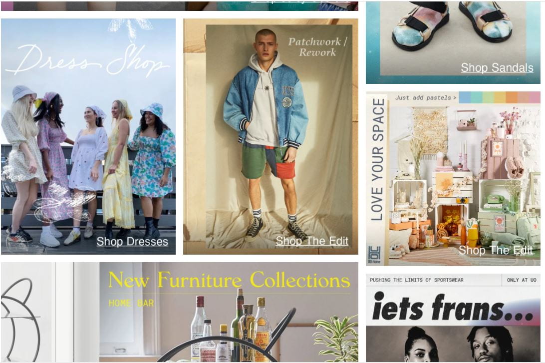
The main bulk of the site is laid out like a mood board. Each Section has a feature image, and some small links to go to the page that it is for.
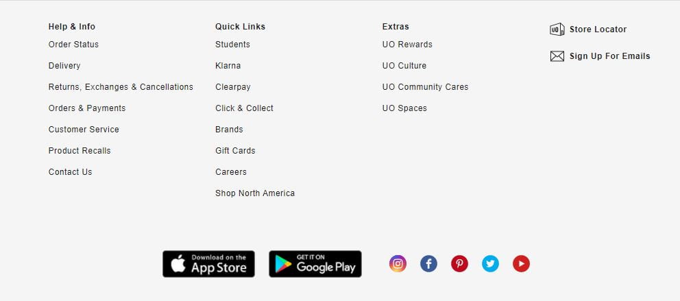
I also included the footer in this as it is full of clickable elements, as well as icons to download their app on ios or Android. The social media icons are also hyperlinked so that you can be taken directly to the accounts linked.