Bluebell & Bug
IDEATION
Knowing how important this final year is, I spent quite a bit of time before the semester started brainstorming some ideas and storylines for the upcoming final major project.
This group consists of me and Una McIver, so it’s a 2 person team for this one. During one of the first classes of the semester we were encouraged to talk to other people within the class and hear ideas and decide whose group we wanted to join, I approached my classmates with my idea and Una decided to come on board, and together we became a duo!
The idea for our film I’d come up with a few weeks before was following a little girl who gets shrunk down while exploring her garden and looking at all the creatures that live there, the magnifying glass she was looking through suddenly flashed bright and shrunk her. Upon opening her eyes in her garden, she finds herself in a strange (and a little bit scary) new world. Luckily, she finds company in a little firefly who also got caught up in the fray and as a consequence lost its light – so they set off together to find it’s light and search for answers for her to get big again in the magnifying glass that started it all.
INFLUENCES
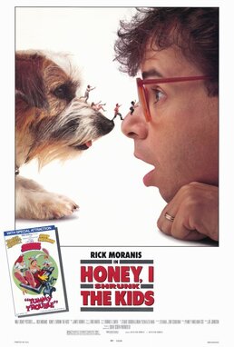
Honey I shrunk the kids
The inspiration here is obvious, but we wanted to put our own spin on a concept like this.
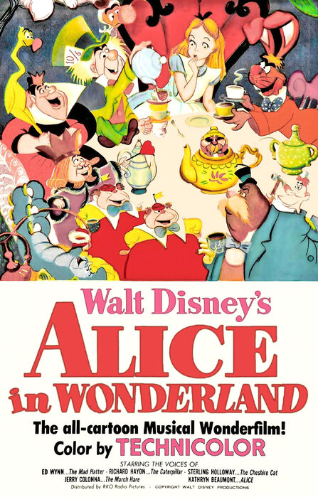
Alice in wonderland
Alice in Wonderland follows quite a few themes that we employed in our final film, mainly the fact that she’s transported away into a strange, sometimes scary world that makes no sense to be. We also wanted to explore the themes of growing up and leaving your childhood behind that this movie has.
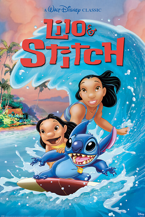
Lilo and stitch
The importance of family no matter what you look like, the friendship that two such different creatures could have for each other, it’s one of my favourite themes/tropes in movies and we wanted to employ it as well.
Ponyo
Ponyo’s quest to become human could be compared to our characters goals. The bugs to get their light back and Bluebells, return to their normal size.
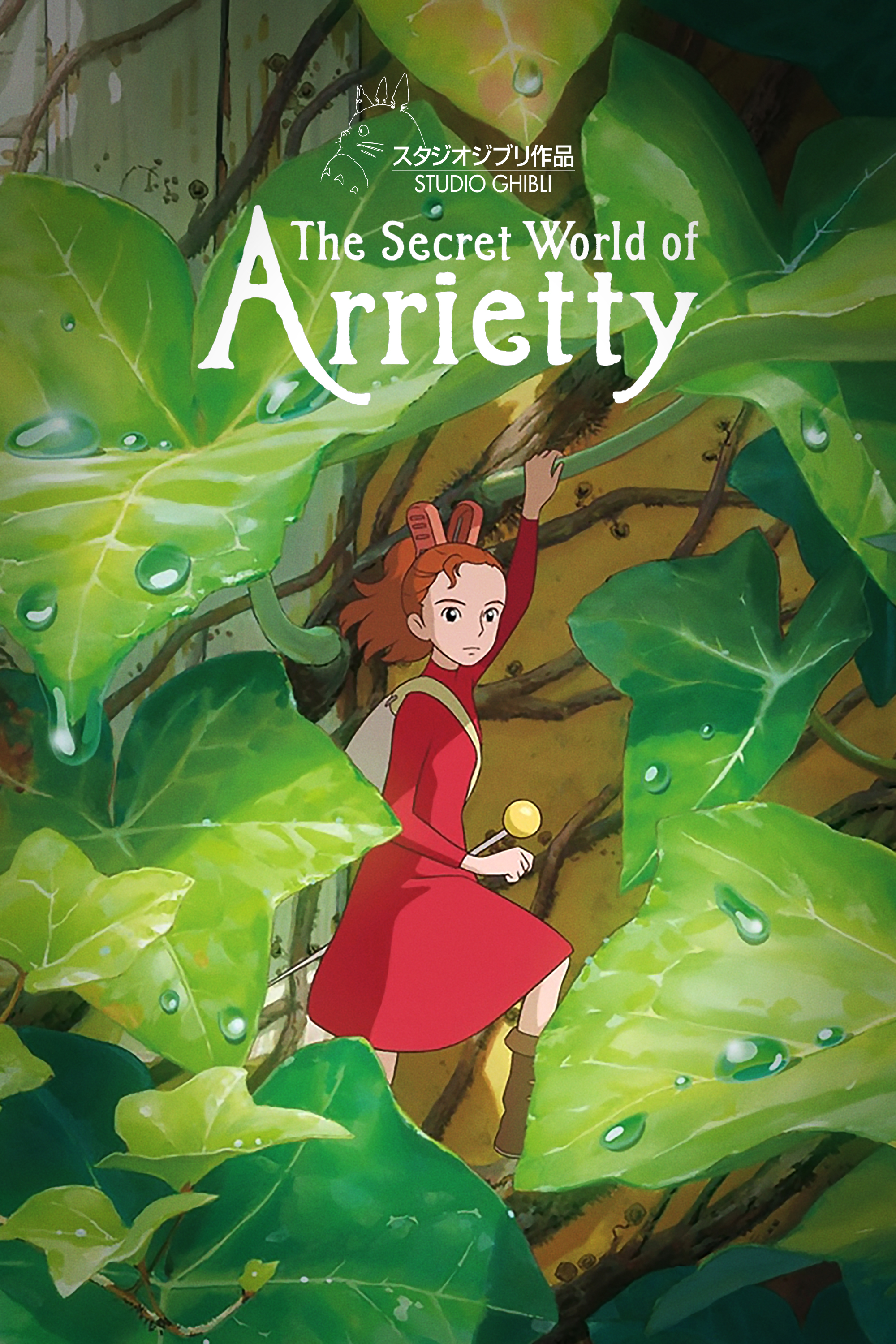
Arrietty
Hilda
Grounded
Having been inspired by these pieces of media, we decided to focus on the theme of companionship and adventure. They also helped us decide more certainly on what kind of personality we wanted our characters to have, and how we wanted to craft their world.
CHARACTERS
When crafting what we wanted our characters look and vibe to be, we gathered up a lot of different characters to compare to. A lot of the characters we purposely looked at were ones that for some reason or another had a little companion with them in their lives (Finn and Jake, Ash and Pikachu, Bee and Puppycat) Since our story followed a similar concept we wanted to focus on characters who had their own companions and think about the relationship they had with one another.


Compiling inspiration for the bug character was actually quite difficult, not a lot of bugs in media are portrayed as cute and friendly after all, so while we looked at a range of different things we mainly took our visual inspiration from sources such as Catbug from Bravest Warriors and Cri-Kee from Mulan.
ENVIROMENTS

In the early stages of our project, we put a lot of focus into gathering real life references of the outside world for our project. Una took a lot of pictures from the Botanic Gardens in Belfast and I was lucky enough to have a family event in Donegal which brought me to an area with lots of trees and mushrooms and grass – the perfect place to take environmental pictures as inspiration for our film. It was difficult to get pictures we could specifically use in our animation, because even lying flat on my stomach in the middle of a field I couldn’t get an angle low enough, but we got pretty close. With a library of environment references gathered by the two of us it would make creating our backgrounds in the future a lot easier.
With all of our photography gathered we also decided to go ahead and create some rough colour concepts for our film as well from colour picking from our photos. This was actually very helpful when we were coming up with our backgrounds and needed a lot of shades of green – it also helped us figure out what mood we wanted our film to have and the range of photos gave us the option to have several different palette ideas.


CONCEPTS
For our concepts, the rough personality and vibe of the character was an ordoorsy and spirted child and a sweet little bug, so we went to work concepting some designs. I initially sketched out a range of ideas but we quickly decided what we generally wanted our character to look like.
We did however run into some difficulties at this stage as we were unsure what age we wanted our character to be exactly, so we flip-flopped for a while trying to figure that out.
CHARACTER CONCEPT ART: https://www.artstation.com/artwork/04PeE8

During the pitch presentations however, we were given some great advice from Sarah that helped us refine our idea more. Sarah encouraged us to push the ‘childlike’ physical aspects of our characters as the initial designs were a bit ambiguous in age and could be seen as a child around 12-13 when we were aiming for a little bit younger, thanks to this advice it was a lot easier to create our character.
With the advice we were given we were able to narrow it down further and reached our final design having taken the age we wanted our character to look more into account, before it was possible our character could be more teenage, but we did things such as make the head bigger and make their outfit baggier and more indicative of a child whose still growing into it, we also gave them a more childish hairstyle with two little pigtails at the back which really helped them look their age.

The characters colours were more important than we first figured. With our story taking place in a garden mostly everything is going to be a shade of green, so we had to put a lot of thought into making our characters palettes not blend in with the green. While we were choosing what colour palettes, we liked we always had to be cross-referencing to our background tests to make sure they would stand out when put in a scene.

The bug was a completely different story, since it was quite a simple design it wasn’t too hard, but it was difficult for us at first to decide specifically how the legs would work. Fireflies obviously have 6 legs so for a while I was conflicted whether or not to take two away and make it four-legged. I experimented with connecting the two back legs together so that we didn’t lose them, but after me and Una had a few conversations about it during our meetings, we decided that giving the bug four legs would be simpler for animation, and also didn’t look too weird – it’s an animation, we can bend the rules all we want.
BUG CONCEPT ART: https://www.artstation.com/artwork/8bK51m

FINAL DESIGNS
ALL FINAL DESIGNS: https://www.artstation.com/artwork/VJP1Gn


After I created the character turnarounds I also thought it would be helpful to do a few expression tests for our main character, since me and Una’s own personal art styles differed quite a bit to the simplistic style we wanted to go for in our film, I wanted to create a guide for us so neither of us gave the character an unnatural expression at any point.
STORY
During the pitch presentation, Yuan and the others brought up some holes in our plot, urging us to think about how the bug and girl actually get bigger and get their light back.
We had laid out our plot and story and we also got some great advice from Mike. Our characters initially were going to run into more threatening obstacles, such as our beetle character not just being a red herring, but a whole chase scene occurring, but Mike said to us it seemed that we were making a moment of conflict just for the sake of it, and he was right. At the beginning of the project, I was so wrapped up in creating a good story with a proper ‘heroes journey’ that I completely forgotten that at the end of the day it was our story and we could make it how we wanted. He asked if we wanted our project to follow our original idea or if we thought a minute of joyful fun would be better since we talked about how some of our main themes were childhood and the beauty of nature. We realised we could do what we wanted, dial it back, and focus on the characters navigating through this adventure (mostly) happily.

Aodhan and Alec suggested that if we wanted to keep tension, we could add a scene with them being stuck in a spider web, but we chose having a more peaceful adventure than that in the end up.
We did also have an idea for a sequence where as they’re falling from the sky after being shrunk, they are carried away by a leaf on a gust of wind into a raging rapid (hose stream that was left on) but we decided it would be too complex for what we had planned.
How we refined our film after getting this feedback:
- Changed our narrative to take out a chase sequence
- Let go of a few scene ideas we had that were either too grandiose or too irrelevant to what we wanted
- Got a better idea of what our characters should look like
During the production presentation later on in the semester, we were given some really good advice for our film. The critique wasn’t about our characters as we had taken the advice given in the pre-production presentation, but it was more focused on our narrative at this point since we had visuals for it.
Me and Una struggled a lot trying to convey exactly what happens in the story that shrinks our character down, and how they get big again. We wanted to leave it sort of ambiguous so that the audience can decide if this is taking place all in a child’s imagination of if it was genuinely supernatural, but we strayed into leaving it a bit too ambiguous. Henry, Mike and Yuan urged us to think about how exactly this happened since it seemed a bit too vague in our narrative, so we thought about it a lot after the presentation.
Using the feedback, we chose to make it a bit more obvious narratively how they shrunk down, before it just seems like the magnifying glass just decided to shrink our character and take the bugs light, with no real obvious sign given, but we fixed this.
Our narrative changed so that a beam from the sun shoots down and catches the characters eye in the magnifying glass, the sunbeam, trapped in the magnifying glass takes our fireflies light upon becoming trapped, and our main character gets caught up in the supernatural light and shrinks down. An unintentional shrink ray.
At the end, to return to normal, our characters have to do the same and return to the magnifying glass to catch the last ray of the sun to reverse it and return to their normal lives, even though they need to say goodbye.
ENVIROMENT CONCEPTS
Inspirations
Hilda
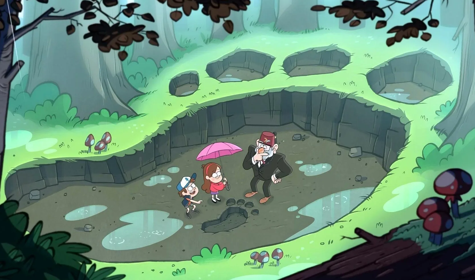
Gravity falls
When it came to the background designs and the environment concepts, me and Una spent quite a bit of time thinking about what we wanted the world around our characters to look like and what level of detail we wanted. Gravity Falla and Hilda therefore were great shows to look at inspiration in. Both of these shows generally have very natural backgrounds with lots of nature or hand-made structures, and it was very helpful to see how they fill out a scene without leaving much blank space even though the shots can be very ’empty’. It gave me a lot of good ideas on how to make my own backgrounds look less sterile.
During one of our meetings, we also created a Pinterest board for our project and added a lot of environmental art. It wasn’t so much the environmental art style we wanted to decide on through this, but how we wanted our world to feel to the audience who will see it, so we used the Pinterest board to create mood boards to help us in our visualisation.

Due to us being a group of just two people, we came to the conclusion we didn’t have the time or energy to spare on creating insanely detailed backgrounds for our film, so we decided very early that the environments were to be generally simplistic, with some wiggle room for important or less character heavy shots.
SIZE GUIDE/ASSET LIST
To make creating our animatic easier, it was very important for me to figure out the scale of our characters in the world around them and the other characters and objects they’d interact with – namely the simple things like the grass, but also the butterfly, gnome and ducks they’d see on their adventure. I also had to design said ducks, butterfly, magnifying glass and gnome.
Creating the size guide also had another use. As well as being a guide for the scale of things, I also intended to use them as assets we could sprinkle within our backgrounds to make creating the backgrounds for our animation easier. Una was grateful for this as they said they struggle to draw such natural backgrounds and my doing this is a huge help.

Obviously since it’s a garden and pretty much everything in the environment is organic, there’s a lot of variation in size and shape we’d be able to use for our backgrounds, but it’s a good point of reference for our animation.

These character sheets of ducks and butterflies are here because they aren’t exactly characters in our animation, more like background decoration to help add more life into the world we’re creating.
Though we did end up having to cut out the scene the butterflies were in for the sake of time.


BACKGROUND DESIGN
I really enjoy drawing naturalistic backgrounds, so I sort of took charge of the background design and concepts in our film, I experimented a lot with whether I wanted the backgrounds lines to be more textured or straight, and thought about what that would convey. We did end up favouring a textured brush for our background, it gave a more natural feel and also helped to separate itself from our characters within the shot.


I did a lot of rough backgrounds for our film, as I didn’t want to be the only one creating them, but wanted to give Una a guide and make it easier for them to create them as well, we didn’t end up getting a lot finished and into our film in time for submission though.


STORYBOARDS/ANIMATIC
I was in charge of the character design, and Una was in charge of the storyboards for our film. I did help out at times though with the storyboard concepts however, as they had no issue with me drafting my own scene if I had time and a vision in mind.
Although we did sort of skip the storyboard stage pretty much completely though, and our ‘storyboards’ ended up being our animatic. During this stage I was able to help create a few shots for the animatic.


ANIMATIC
(created by me and Una McIver)
It was at this stage of pre-production after creating our animatic that we realised the scale of our project was really quite large for just the two of us. With the animatic having some shots needing to be timed out correctly we realised that our film that we were intending to be only around a minute long was going to be nearing the two-minute mark. It was at this stage that we seriously needed to have conversations during our meetings about cutting some scenes out to bring down the time in order for us to get it done in time for submission.
During our weekly tutorials with Sarah as well, we were able to be given advice on what scenes were necessary and what scenes could be cut – most of them were quite simple and neither of us would miss, but there were a few I was sad to see go. We talked a lot about the scenes I’d roughed which had the butterfly flying overhead, and the shot with them jumping across the duck pond. Although I knew I’d give myself more trouble during the animation stage, I decided we would keep one of them. I kept the duck scene in and cut the butterfly, if we had taken both out, I feel like our film wouldn’t have enough examples of the scale of the world and it would take away some of the charm, so I’m very happy we decided to keep one.
ANIMATION TESTS
While Una was working on the animatic, I was able to do a few simple animation tests for our film. I created them in Krita but this was alongside conversations with Una about what animation software we would use to animate our final film in.


https://www.artstation.com/artwork/QXloGZ
We debated what to use for our final animation, with the two main choices we were considering being Adobe Animate and Toonboom Harmony, we weighted the pros and cons of both but eventually decided to go with Toonboom. We decided this on the knowledge that Toonboom is industry standard when it comes to 2D animation, and, while it looked hard to learn, it had the easiest interface for us to navigate when compared to Adobe. We had never really used both programs before, so we weighed our options carefully. In the end, we decided it was best for this project and our future employment opportunities to use the industry standard.
After our animatic was completed and Pre-Production pretty much wrapped up, we started to look at tutorials for Toonboom so we could do our rough animation for production as quickly as possible.
TOONBOOM TUTORIALS
Having never used Toonboom before, I went looking for a few tutorials of the basics, I found a few helpful beginner level tutorials and followed them in order to get acquainted with the software, both of us watched these and then did the basic ball bounce animation as a bit of a practical test. After we had a grasp of the program, it was time for our production to begin and for us to start our rough animations.
It was a really steep learning curve trying to learn Toonboom having never touched It before and I did run into a few silly issues while I was learning. During our roughing stage I was told way too late by Una about turning the animate mode off, and spent the majority of the roughing stage manually setting keyframes for every frame instead of just a frame because with animate mode on if you didn’t set it as a stop motion keyframe it would automatically tween. Luckily, I learnt this before we started lining our animation otherwise I would’ve wasted even more time when we were already so short of it.
PRODUCTION
Before we could start our rough animation, we had previously made a notion board where we kept track of all our project tasks. Una organised our final animatic by the different shots in them and input them into the board, then I created a status section for us where we could update each other on what stage we were at in the shot (Roughing, Animating, Colouring, Compositing and Finished) and also the section where we could assign each other our shots. This was super helpful in helping us organise who was doing what and where we were at.

ROUGH ANIMATION
With that organised we began our rough animation; we divided our shots pretty much equally and set goals with each other each week during our meetings that by that time next week we would have completed a set amount of shots. Thanks to this we kept up a steady pace in our work and were making good time.
However, we came to realise that we were definitely going to be cutting it close for the submission date. By the time our rough animations were done and we were about to line them, we realised that we physically couldn’t complete the entire films in time for submission date. (backgrounds, sound, colour) We talked in the last few teaching weeks with Sarah about our submission and our worries, and were told that as long as the lined animation was done and we had proof of concept we’d be able to submit our initial film and then have it completed in time for the EOY show. It seems that over the year the project got a bit away from us and kept getting longer and longer without us realising, we did previously cut scenes but at this stage in production taking out any more wouldn’t convey our story properly. Therefore, we had to do what we could in time for submission.
This is the fully finished rough animation with all our parts edited together, though I did make a seperate one with just the shots I worked on.


We didn’t run into too much problems when creating our rough animation, though there were a few cases of us losing a scene because we forgot to save for too long and it crashed, or files corrupting due to renaming a connected folder. We learned our lessons quickly though, and overall didn’t encounter too much bother apart from the time crunch.
Sarah was also immensely helpful at this time by giving us advice on how we should animate in order to save time, there were times I would make a shot too complicated, or would add too many frames to a snappy movement which would make it seem slower. Sarah always caught me on this and gave me advice to fix it for the next week.
LINED ANIMATION
We didn’t have much trouble with the lining part of our project, again it was just a mad dash to get all of our shots completed in time for submission. In the entire project we had just over 20 shots each to animate, so it was already quite an undertaking, but lining takes time so there were a lot of long days and nights spent in the 2 weeks before submission. There were also a few shots we had roughed a bit too roughly so when we got to the lining part, we made it a bit harder for ourselves at times. I personally left a few shots roughed without properly figuring out what the hands or arms and legs etc were meant to look like, so when it came to the lining, I had to spend some time figuring out how to draw things that I should have previously figured out.


Generally, my only problem at this stage was the time crunch. As I mentioned previously, we consulted with Sarah about the fact we’d be unable to have most post-production finished by submission, so we were focusing instead on getting the shots properly lined instead of focusing on the backgrounds. While we did have a lot of placeholder backgrounds at this time, I decided against completing any in favour of getting the animation done.
Me and Una had divided up our shots at the roughing stage and so we continued to work on the shots we had previously worked on because it was easier for us, I did take over one of Unas shots for them but it was very short and wasn’t an issue for me. Overall, in our project we had 46 shots to work on, and we had divided them about equally.
By the time we had finished lining all of our shots it was just before the submission date. We were aware this would happen but didn’t know just how close it would be. Our final shots when edited together come to about 2 minutes.
Honestly, I’m really happy with the outcome of our lined shots so far, it’s a shame the project grew a bit too big for us to complete in time but it will be completed for the end of year show. If I could go back and give myself advice during the beginning of the project again, I would probably have cut a few more scenes and changed some to make things more succinct, I also would’ve prioritized backgrounds around when we just finished the animatic so it would’ve looked a bit more polished now. I also feel that we might’ve worried a bit too much about the story at the beginning and wasted time changing menial details instead of getting started, but I can honestly say I tried my best this time around too.
PROJECT ORGANISATION
In order to streamline communication through the stages of the project, at the start of the year me and Una made and created a dedicated project server on Discord. By creating this we were able to create channels we could talk and put work in for all aspects of the project, with dedicated areas for pre-production and production, as well as organisational channels and a voice chat so that we can schedule meetings. We decided to call every week for a meeting to touch base and discuss what we’ve done and what we’re going to do next.

We divided up our server into organization, pre-production and animation production so we could have all of our resources organised and easy to find when we needed them, which came in very handy for keeping track of things from the beginning of the project that would’ve been lost by now.
Continuing on into the organizational side of things we also created a space where we can organise our shots and scenes for our animation, assign them to either one of us and set deadlines, as well as give us the option to see where the shot is in its development. I suggested we use Notion for this. I knew that Excel was also a good option but I had previous experience in Notion from my placement last year and neither of us had used Excel in a while, so there were no objections there.


We used notion as a hub of sorts for our project, but for our project progress rather than the project resources, we kept track of what stage of our production we were at, kept track of the shots in our animation, and also used it to keep track of what tasks we had to get completed that week.
At the beginning of the project when me and Una were still ironing out our narrative and character ideas, we also created a Miro board to keep track of all of our inspirations and ideas. We kept the original story script I created in there, as well as character references. We also used this to brainstorm our projected project timeline and the story beats of our film.

POST-PRODUCTION
Unfortunately, most of our post will be completed in the run up to the end of year show.
We have gathered sound effects and music for the project, but simply didn’t have enough time to physically do all that with just us two and a minute to finish between us. We did talk about this during the last teaching week with Sarah, and decided we were okay with our final submission being lined only, as the animation itself is finished and that’s what we’re being marked on – though we will still work hard to colour and get all post-production done so everyone can see the final (final) outcome of our year of work.
Our characters say nothing throughout our film so it wasn’t hard to gather the sounds effects for that, we used a royalty free sound effects website we were recommended: https://filmcow.itch.io/filmcow-sfx the music we will use too is royalty free.
We’re doing to be using DaVinci Resolve to edit our final film together when it’s all coloured to add out post prosessing effects and credits, we’re both semi-familiar with the program so using that rather than having to learn an entirely new program so close to the end of year show wouldn’t be a good idea. We did debate using Adobe Aftereffects because it has more range in what you can do, but decided against that as our film is quite simple and won’t need much in the way of effects.

FINAL OUTCOME

