VERTICAL SLICE
This week we were wrapping up the final character designs for the detective and our monster. I wanted to give the group a choice in the final look, obviously, so I created 6 variations of hairstyles we could choose from and created a poll to send to my group members so we could choose collaboratively.

Number 4 ended up getting the most votes so that’s going to be the final look our detective is going to have! Now I could start the final character reference sheet!

Since I created some character concepts for our monster last week and we decided in a meeting how we wanted it to look, I wanted to make a coloured drawing of the monster before I made the character sheet so I could decide on the colours. I wanted the monster to have a washed out, discoloured look to it’s skin and body – just to sell the implication that it’s not actually alive, it’s somehow still moving and thinking even though it should be dead.

With the colours for the monster decided, I moved onto the colours for the detective. I took this chance to create some sprite concepts as well that I might be able to work from in the future, A contact walking pose, a stationary standing pose and a pose where he was getting ready to shoot his gun.
![]()
I coloured in the poses and sent them into our group’s discord server. We quickly decided that the second colour scheme was our collective favourite – but it was actually quite difficult to decide whether to keep the coat colour or not. We experimented with 9 different coat colours ranging from burgundy, to yellow, to purple – but ultimately decided the original light brown suited the characters personality the best.
![]()
I finally got around to creating the character turnaround/reference sheet for our detective. I added a front view, ¾ view, side view and back view. With this done this means I’ll finally be able to start animating the character and be sure that it’ll remain on model and style consistent!

Research was needed before I started animating. I asked about what animations we would need for the specific characters in a group meeting and know what animations I need to create, which is great – but how would I animate for a game?
I spent some time researching game animations and all the different types they use. I used pixel art sprite animations to get a general feel, even though our game isn’t really a pixel game, it’s more close to something like Spritifarer. It gives me a good base to start from though, and it’s good to know where the animations would start/end through this.
https://opengameart.org/content/ph64-sprite-base-male-average-average

I also looked at a few different artists interpretations of running animations to take reference of when I do my own. I didn’t particularly want the main character’s face to move much when moving, so I was inspired by the way Jess Smart Smiley animated this pixel run.
https://jesssmartsmiley.wordpress.com/

I also found this detective run cycle by Tigerhawk01 on deviantart and found it very helpful! I’m not intending to put as much energy into our own run cycle but it’s a reference for a long coat in motion that I could look back on if need be.
https://www.deviantart.com/tigerhawk01/art/Detective-Run-Cycle-518009172
Starting with the walk cycle, it’s very simple all in all. Our character is stoic and gruff, so there’s not much personality he actively shows in his basic motions. There’s a slight turn of his head in parts when his upper body moves with his arms but overall, not much to say.
I do like it though.


It’s nice to see my groups character finally in motion, and it’s cool to be the one doing it!
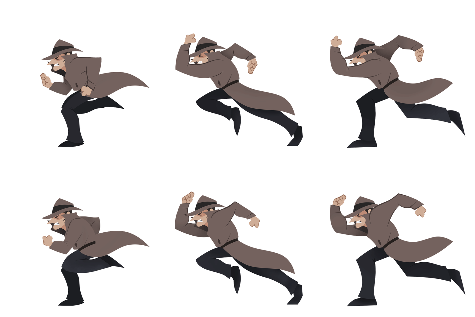
The second animation I started was now the run cycle – again, simple in concept! I started with the sketch, in this run I wanted to add a slight bit of strain into his face as he was running because he’s exerting himself.

The sketch was finished but something didn’t look quite right to me – I’d been staring at this man run for so long though that I couldn’t figure it out. I sent it over to some of my classmates who had fresh eyes to look at. It was quite obvious looking back on it, but for some reason my brain just couldn’t comprehend it then. The arm at the back stays at pretty much a 90 degree angle throughout the whole run, while I made the arm closest to us straighten and curl up. I don’t know why I didn’t notice I was doing that before. Still, I was very grateful for the peer advice as now I could fix it and continue with the animation.

It looks much better in the second pass.


With the walk and run completed. I felt good about the start I’d gotten in the animation section of the project. It’s all starting to come together.
Next week I’m intending to create the character turnaround/reference for the monster for EJ to use as they’re helping me with animation, so they can get started as soon as possible. I would also like to get started on the idle animations, and perhaps the front/back walk cycles!

