Week 1: Form and Shape
On the first week of semester one, one of the tasks was to study form and how to simplify, modify, and develop them. Using some of the videos provided by Alec I followed the tutorials on complex forms and twisting forms (one that helped with creating a dynamic form of a human figure).


The ‘twisting form’ sheet was particularly helpful, I later used this technique in both class and personal work. While these studies were helpful and presented nicely, I feel I should have developed them more; the ‘twisting forms’ sheet has many of my own experiments, but the complex forms seems less developed in comparison.
Character Form
Alongside the general shape and form studies I was also given the task of inspecting and breaking down the forms of animated characters. This was more of a challenge, although more fun to complete, than the basic form study. I choose my character hoping to explore the forms of characters from the 70s, the 90s and finally 2014, from different animation types (T.V or film) and of varying complexity.

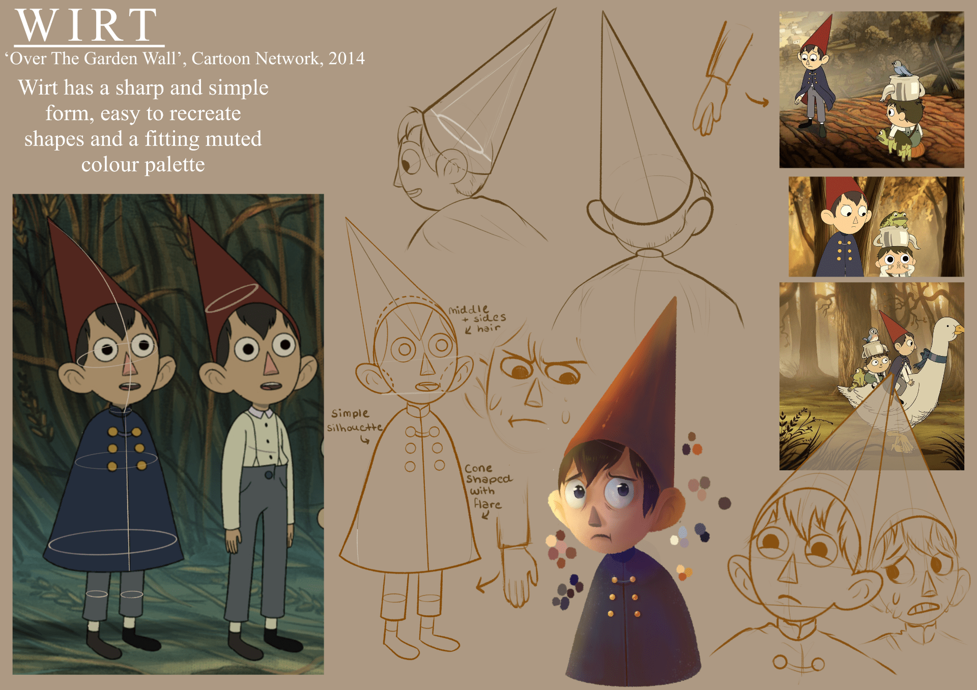

Unsurprisingly, the 1990’s TV show ‘The Moomins’ featured the most simple character form; rounded and consisting of ovular shapes, as this was a running show the designs had to be simple and easy to replicate on a long term basis for consistency in animation. Yet, the form and shapes of the Cartoon Network miniseries ‘Over The Garden Wall’ has a more complex character, easier to replicate with digital programs, but still has an overall simple silhouette.
The film ‘Watership Down’ has arguably the most complex of these designs; a realistically proportioned rabbit form. Although easier for a film than a longer series to hold a consistent form, the hand drawn shapes of the rabbits would have still been difficult to maintain.
My studies of these animated forms I feel are detailed and give an easy to understand breakdown of the base and underlying forms, and the addition of my rendered study, in my opinion, help give dimension to the shapes and make them even easier to understand. However I feel as though I should have explored the full form in my redraws, rather than the head and upper body that I focused on primarily. Overall, this week was very enjoyable and gave me a greater perspective on the detail that goes into form!
Week 2: Composition and Perspective
Now placed in a group (the hybrid world group) I was to make a set of thumbnails with varying and interesting compositions and perspectives. High angles, low angles, close ups, and 1 point perspectives is what I focussed on, and attempted to create unique compositions with thought of the mise-en-scène and focal points (the cave opening far bottom right, the statue and tree top middle, the snail bottom middle, or the dragon far bottom left).

This week was also great, and I had a good time creating this desolate civilisation with a wilder outside. Although I feel I could have come up with more interesting ideas, I am still happy with the final product and my attempts at perspective. I used some videos Alec provided for help, as well.
Perspective Research


3 1 point perspectives and 3 2 point perspective studies, these were very interesting to create in Krita and although some are slightly off (particularly the ‘Ratatouille’ one) it as informative as it was hard to place, 2 point perspectives are something I struggle with and hope to improve on.
Week 3: Tone and Value
Thumbnails


Developed Thumbnail

Using the techniques given in video tutorials by Alec I completed a set of thumbnails that differed in style and tone use; like ‘cross hatching’ or ‘dark tone’. Although the hatching technique is a favourite look of mine, my attempted at creating a hatched background was not as detailed or pleasing to look at as my other studies, and I would like to keep practising this technique before I use it again. My favourite of all my studies is the ‘all tone’ log in water, I used a reference for this that helped greatly;

While this week was harder in my opinion, as the thumbnails themselves took a long time for me to complete, I am very glad of the opportunity to explore different styles of background rendering and I used the all tone greyscale technique in my final backgrounds for my animation.
Week 4: Colour
Exploring Mood


Thumbnails Coloured


Colour Scripts


Week 5: Character


Main References (Form and Character)


Week 7: Animation Introduction
References


Final

Week 8: Storyboarding and Animating with Forms
Quick Storyboard:

Incredibly messy and quick storyboard, jotted down to get my ideas in order! This later changed almost completely in the final.
Flour Sack Exercise 

I was limited in the number of frames I could use, animated in Procreate, but I am happy with the final. It was a good suggestion from Alec to have included some props, to make the animation make more sense (i.e. the fall, slight look upwards).
Week 9: Animatics and Secondary Actions
Animatic
Character Style Sketches

This sketch of ‘Draconis’ was an exercise in practising the style I would animate the characters in, inspired particularly by ‘SUNDOWN’ an animated short from Gobelins’ YouTube channel. This style appealed to me as it is simple, pleasing to look at, but has all the features simply detailed; making animation easier.
Prop Design

While I liked the shapes of these props, inspired by the shapes of constellations, they would have looked nicer in a more 3D style, to show the edges and form better.
World Building

This tonal sketch of a Centaur giant was later adapted into a character in the final animation, acting as a villain of sorts.


Backgrounds


Initial Sketch

References


Week 11: Animating 2D Effects


Week 12: Final Animation
Using frame by frame and puppet tools in after effects, I finished my final animated part for the chain. The grass is almost all puppeted, and the figures in scene 2 and 3 are as well, hopefully giving more movement.