Prologue
What we learnt in this lecture;
- Visual Grammar
- Language and Typography
- Narrative Design
What is Visual Grammer?
Visual grammar provides a way to describe and communicate features of an image. It is practically a set of rules and practices, a definition from Christian Leborg;
The reason for writing a grammar of visual language is the same as for any language: to define its basic elements, describe its patterns and processes, and to understand the relationship between the individual elements in the system. Visual language has no formal syntax or semantics, but the visual objects themselves can be classified.
The last point in the quote above is important. It basically implies that using different visual images and have it mean the same thing to all people won’t work. We can classify much of this visual grammar into some group;
- Objects – The basic elements we have to work with.
- Structures – The patterns formed from our basic elements.
- Activities – The processes we can represent with our basic elements and patterns.
- Relations – The relationships between objects, patterns, and processes. They’re the way everything in your design relates to each other and the viewer.
Objects and structures will both further be subdivided into abstract and concrete sections.
Visual Hierarchy
Visual Hierarchy is used to rank design elements and influence in the order you want your users to view them. By using principles like contrast, scale, balance and, more, you can help establish each element in its rightful place and help the most important elements stand out.
Some signals that aid in the establishment of a strong visual hierarchy are:
- scale
- value
- colour
- spacing
- placement
Visual Hierarchy plays a massive role delivering a good experience to your users. Anything such a typeface, scaling, bright or muted colours can indicate what content is most important.
Scale
Scale is a principle within Visual Hierarchy. Sizing is a very basic but crucial principle that can give elements more importance than others and help draw the viewer’s eye towards a certain area. By increasing the scale of an element, you can immediately attract the viewer’s attention. If we take this principle and use it when looking at a website or image we can clearly see what they want to be important.

Contrast
This helps to identify that two elements are distinct from one another this is often applied through colour. Dramatically contrasted colors are more eye-catching,
Contrast – Dramatically contrasted colors are more eye-catching. … Whitespace – More space around elements draws the eye towards them. Texture and Style – Richer textures stand out over flat ones.

Language
We use language as a tool for communication with other people. Writers use words to communicate with their readers, while designers use visual language to communicate with their users. Fonts, colors, shapes, visual elements such as icons those are elements of design language.
The use of a correct design language therefore supports and gives consistency to the value of the brand. If a company has built a strong identity and an equally unique design language we would be able to distinguish its products even if they were not branded.
When considering language you must first develop a clear tone of voice, tone of voice is the style used to communicate with the audience, considering the choice of words, brand personality, and emotional tone. Every brand has a personality linked to its market segment, its target audience, and its values. Therefore, the tone of voice is part of the essential details defined in a creative brief.
Macro and Microcopy
Macrocopy communicates a tone of voice and helps to establish a brand personality. Microcopy deals with design interactions by meeting functional requirements e.g. content on buttons. Macrocopy can be defined by simply listing keywords that demonstrate the elements/ personality of a product or brand. A great example was provided in this weeks lecture and has been included below.


This alone shows the vast difference in the tone of voice when talking about a Mini or a BMW even though the cars are made by the same company. These clearly show the different target audiences, one is presented as fun and dynamic while the other is presented as luxurious and well-engineered.
Typography
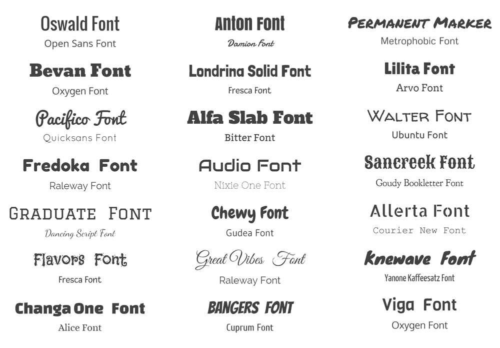
Typography is the art and technique of arranging type to make written language legible, readable and appealing when displayed. It is one of the fundamental principles we follow. Typography on its own is a power asset, which is extremely versatile. Typography doesn’t ask the designer to draw their own letterforms, but to instead work with typefaces that already exist. This process requires the designer to go through a series of decisions like selecting the proper typeface, choosing the point size, adjusting kerning and line spacing and coming up with a layout that makes sense.
Typefaces are broken into two categories Serif and San Serif. A serif is a decorative stroke that finishes off the end of a letters stem. In turn, a serif font is a font that has serifs, while a sans serif is a font that does not. Fonts are also classified into different types of San Serif and Serif fonts;
- Old Style
- Transitional
- Modern
- Slab Serif
- Sans Serif
- Decorative
- Script-Cursive
Anchor or Role Typeface
When making a project involves large amounts of text, choosing an anchor typeface for the body text will guide the rest of your design choices as you make continuous tests and refinements for different combinations of typefaces against your anchor.
Contrasting Typefaces
For text-light projects, having clear hierarchical roles for a font is not as great a concern as visual impact. Pairing contrasting typefaces such as serif plus sans-serif. Designers often share their favorite typeface pairs, which are just a simple search away.
Typeface Families
Many type foundries create typefaces with extensive extra features like multiple weights and cases, decorative glyphs, serif and sans-serif versions, etc. You can use a single type family like this to ensure consistent design while creatively using those extra features to provide extra emphasis or decoration that might otherwise require another typeface. Typeface families are often a great compromise of visual consistency and typographic flexibility.

Conclusion
Overall it is extremely important to consider the aspects of Visual Grammar, just like normal text grammar it is important to follow it.