Target Audience
Who is my target audience? This is the first step I need to look at before I even begin designing the app. Kyle presented us with two choices, we could make an app designed for kids or undergraduate students. Both paths had their own respective challenges and possible ideas. Initially I thought of using Minecraft as a base for a kid friendly periodic table game. This would be a fun idea but another great idea was through Kyle and that was to use Tinder as a base for the undergradute audience as we all know Tinder is extremely prevalent within the age group the undergradutes where under. It’s easy to use interface could mean a quick and simple way to layout the elements.
Periodic Table

When you open the app, you can choose your experience level from introductory to advanced. This means this app is accessible by anyone. The one thing I do not like about this app is it is too cluttered. There is too much going on in front of you it could actually confused people.

Pressing on an element, in this case Carbon. It brings up a window with all the information about the element, again just like the periodic table, it is very cluttered and the text is quite small even on an Ipad.

So this app can only be displayed as a horizontal view. Which is required to fit the periodic table in, but a lot of people don’t like holding their phones horizontally but rather prefer to hold then vertically as it more comfortable in a lot of case. This app was only really designed for an Ipad in mind which presents a major problem as not as student have an Ipad laying about.
Periodic Table 2021

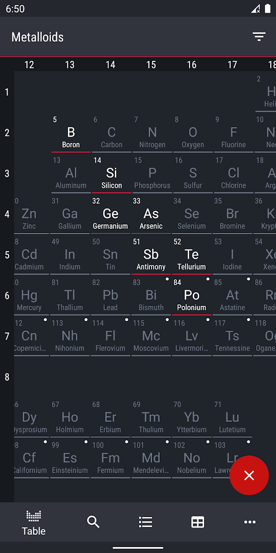
Upon opening the app, it displays the periodic table. Due to the app being on a vertical display you are unable to see the whole periodic table, mean you have to scroll down to see the rest. This means it may take more time to find a certain element, however it does come with its advantages such as the elements being displayed a bigger size, making them easier to see. One really neat feature with this app is the ability to select categories, which will only highlight the elements within that category.
The example belows shows only Metalloids being highlighted. The overall design of this app is very nice, the simple designs make the app very nice to view in my opinion.
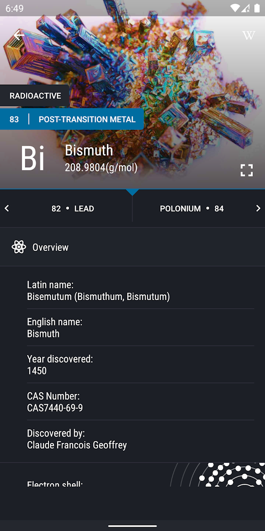
Again just like the other app, selecting elements from the periodic table will bring up their information, it is much better looking in this app, and also is really readable. The app mentions on the app store that;
You will learn a lot of new and useful for yourself, no matter you are a schoolboy, student, engineer, housewife or a person of any other provisions that does not have a refresher to Chemistry.
This ofcourse refers to how easy it is to use, the information in it goes into detail but is also easy to understand for those with less knowledge. The layout makes it easy to follow and navigate. When you click on an element you simply scroll down to find out more.
Another really neat little extra that this app is that when you are finished reading about an element, you can easily click to view the next one. This mean you don’t have to keep going back and forth to the landing page just to view another element.
Reflection
Ofcourse looking at these gives a great oversight into the do’s and don’t’s when making an app. Things such as bad layouts, overcluttering and restrictive issues such as only being made for an Ipad. I overall loved Periodic Table 2021, the simple and muted colours mixed with brighter colours gave it an overall great aesthetic.