

For this exercise in typography we where tasked with experimenting with a few things such as combining two letters, taking a single letter and editing the look of it and also playing around with an Ant Middleton poster.
For the single letter exercise, I chose the first letter of my name since it was the first letter to come to mind, all I really did was add a semi transparent version of itself beneath it and also cut of the top corners. The most noticeable change I did was adding a big white streak through part of the time.
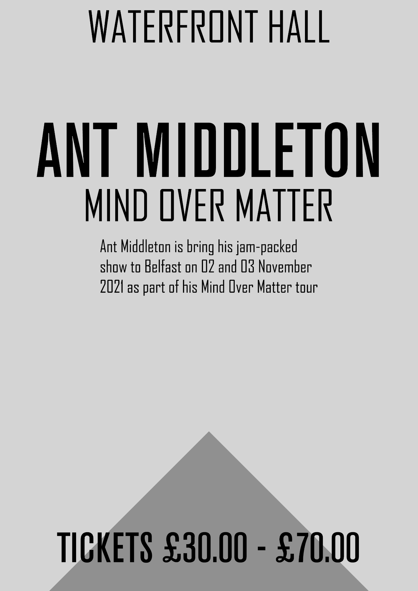
The Ant Middleton text piece, I decided to go simple while keeping everything centred. The text I used was a mixture of Agency FB for most of the text and then I used Akzidenz-Grotesk Condensed Ant Middleton’s name and the tickets price.