
Getting Iconic
Icon Design
You need to understand how these work, where they should appear, and how to create these.
“capturing the essence of the object in as few lines as possible, while retaining its essence. Icons are tiny poems.” – Kyle Tezak
Push those basic elements as much as possible.
Icons have history.
Images reduced to icon forms in cave painting. The 1964 Tokyo Olympics have a clear, clean graphic form – you can see elements keeping consistency in design. These pair down things to a global object, so people of different languages can look at them and understand them.
Icons are Language Agnostic.
They must be understandable globally. For example, toilet door signifiers, universal instruction manuals.
Icons Here and Now
Icons can help you understand arrivals, departures, toilets, information. Icons have a role in user interfaces. The cog has become the universal icon for Settings. Icons should marry in with what is around in other products.
Send/Receive/Context
Where’s it coming from? Who’s the sender and who’s the recipient? Your typical user, what do they use? What’s the design process to go through for that?
Style
Be mindful of different approaches and keep lines consistent. Easiest place to begin is outline, and then adding colour.
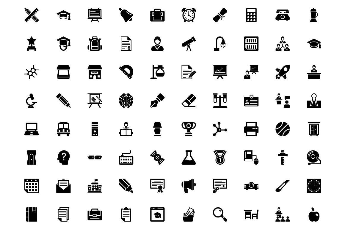
- Glyph icons
- Flat icons
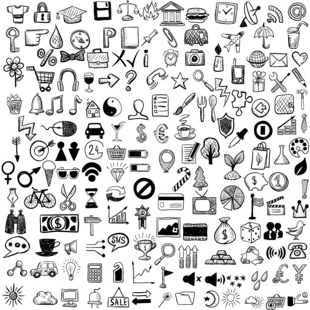
- Hand drawn icons
- Skeuomorphic icons
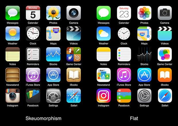
Depends on where the icon is. A menu bar at the bottom?
Too much detail can be distracting.
Be mindful of scaling and as it gets smaller you can risk losing detail.
Differentiate
Avoid drastic similarities, but each should incorporate a similar overall aesthetic.
Tim Van Damme
Brand/ Graphic Design, UI/Visual Design, Product Design
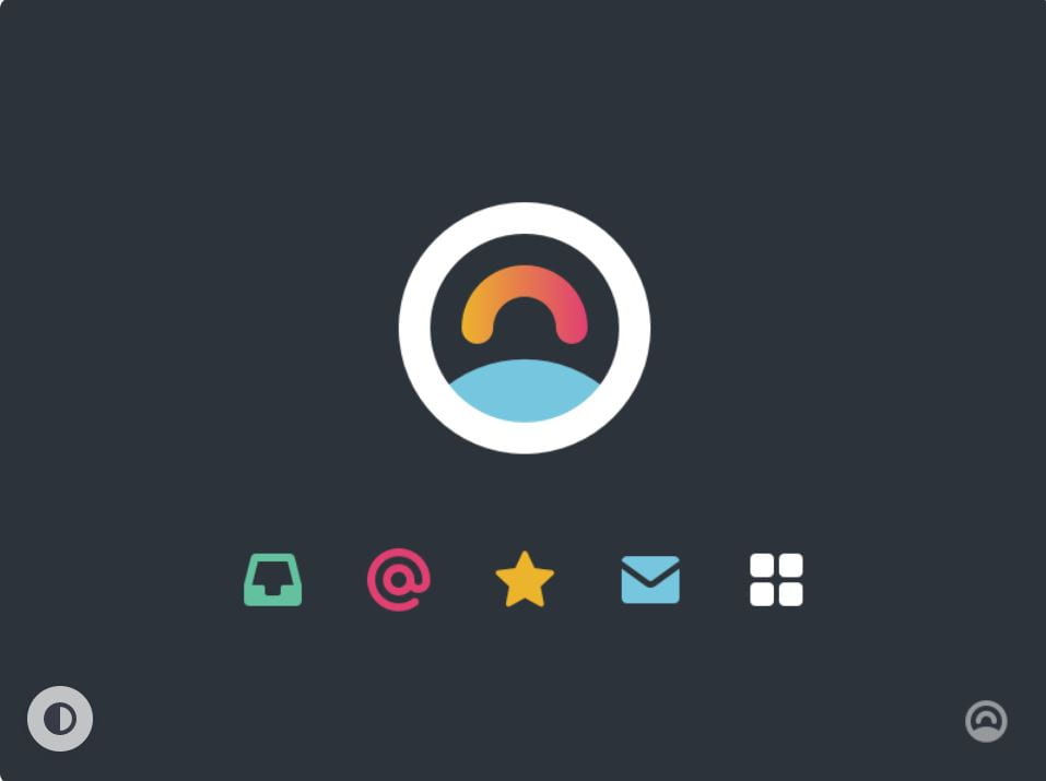
Whilst researching Damme’s work, I found his use of shape and colour to catch my eye the most. His use of shape if simply formed but very effective to the overall design as they are known objects. A lot of his more detailed icons has gradient colours in them which adds more depth to the icons rather than having only flat colours. I like the vibrancy and boldness of his work overall. This might be a small detail, but I noticed with some icons they are rounded off at the ends, I feel like this brings a real modern and soft feel to overall presentation of the icons. Everything mentioned I think is worth considering when creating my own icons. I think Damme’s work is a great reference when designing my icon set, especially if my target audience for my travel app is going to be for primary school age. The reference to his use of colour and simple shapes should in theory be a key factor in keeping engaging content for a younger audience.
Self-Reflection
This week I learned that there is more to the design of an icon, how it is important to consider the usability of the icons and how they are going to viewed in its intended purpose. From this I have learnt to look at designing icons differently, to consider basic shapes a little more and how they can be useful in a design more than trying to create it for what it is, and to just break it down into shapes first. Moving forward when creating icon set, I want to go for a simple look that showcases vibrancy and boldness like shown in Tim Van Damme’s work.