
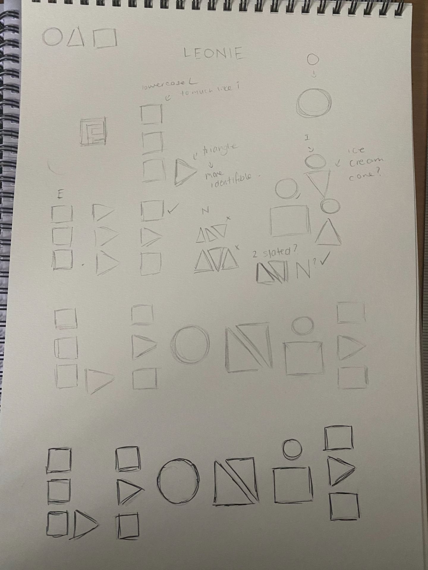
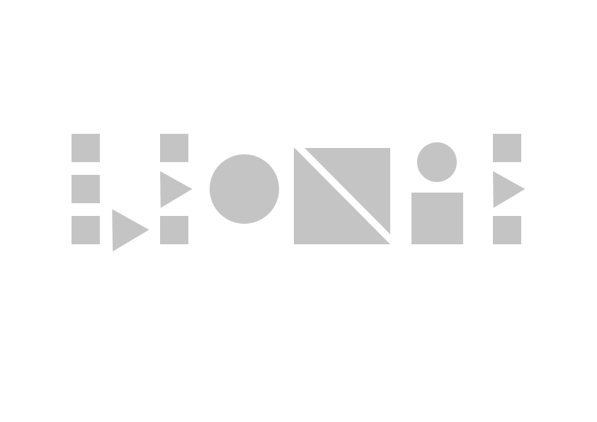
1 Hour Task
Write your first name using letterforms made only out of these geometric shapes.
- Circle, square, and triangle.
Consider…
- What is necessary to make the letters recognisable?
- What can be left out?
- How do you differentiate the letters enough but maintain a consistency?

Pentagram
Pentagram is a multi-disciplinary, independently-owned design studio.
Their work encompasses graphics and identity, products and packaging, exhibitions and installations, websites and digital experiences, advertising and communications, sound and motion.
Chambers Hotel
I really like the monogram design, it looks like a bed enclosed in a room, but the ‘C’ and ‘H’ still very legible in the design. I like that the lines are the one width and is very consistent and clean.
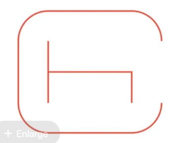

Website reference – https://www.pentagram.com/work
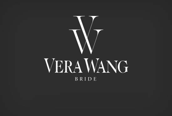
Monograms and Lettermarks
A monogram is a motif made by overlapping or combining two or more letters to form one symbol. Monograms are often made by combining the initials of an individual or a company, used as recognisable symbols or logos.
Example – Vera Wang
Vera Wang is a very high fashion, elegant brand, their monogram showcases this. I like the connecting ‘V’ and ‘W’, I think this utilises the two letters very well. The typeface used is very elegant and clean which stays true to the brand.
Looking at Letters
Axis- Letters can be reflected in the horizontal and vertical axis, some letters are asymmetrical. They can also be abstracted.
Task
Create 2 mood boards gathering inspiration and identifying different types of typography. One focusing on what you can find online and the other focusing on what you can find in life around you and outside.
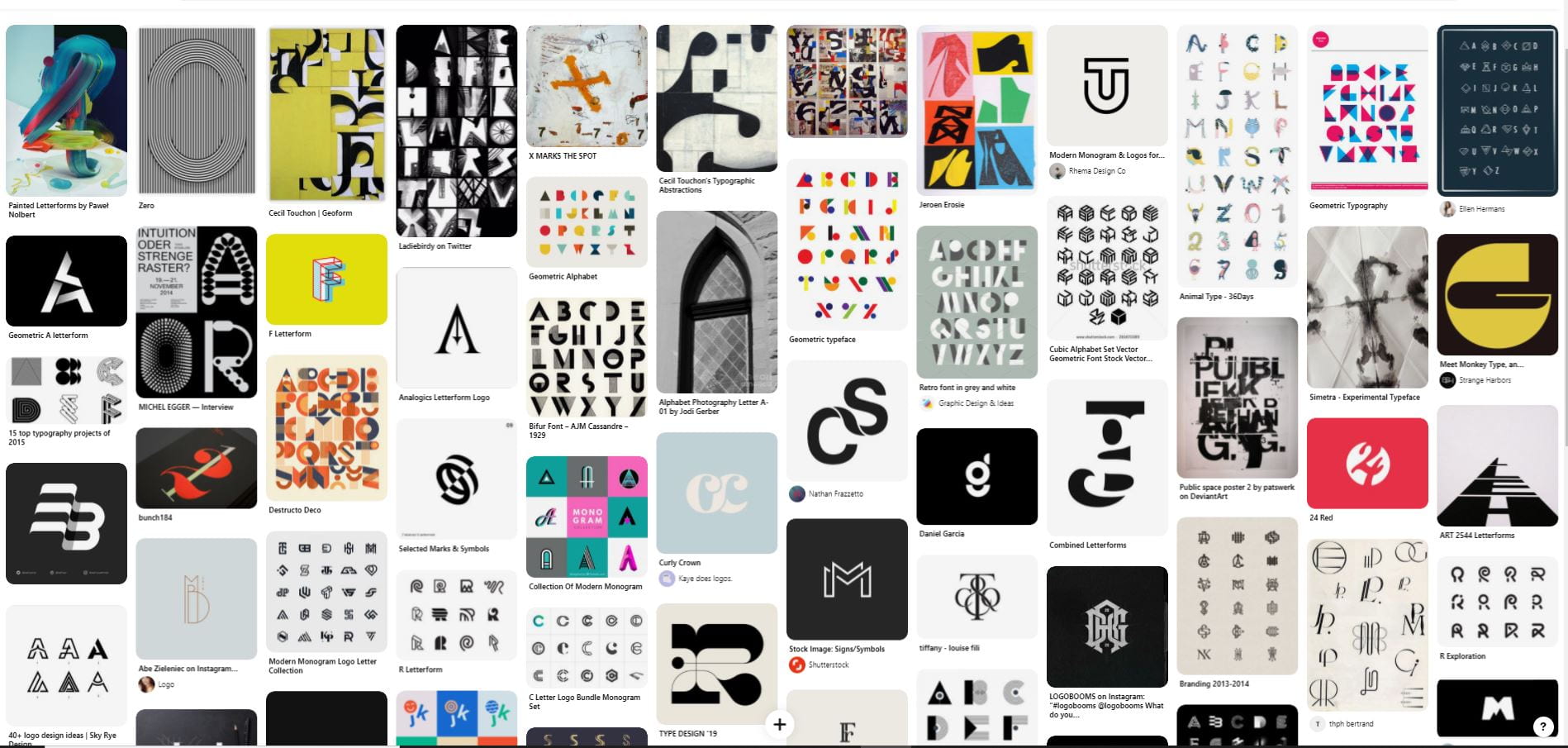
Mood board 01
Below is the my Pinterest Monogram Mood board. From looking on Pinterest. I found a lot of different styles. I really like the graphic work I found but I also found some work that was more artistic and abstracted, this is a style I quite like and wanted to explore as an option even if it’s not the final style I go with. The link to the mood board is here.
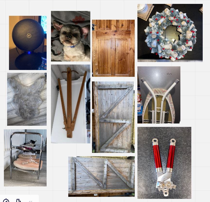
Mood board 02
Below is a my mood board consisting of my own photos of letterforms I was able to find around me or outside. Some are more obvious than others. I found this mood board to be beneficial as it helps to open up my eyes to a different way of looking at/for letterforms that isn’t the usual search. This like to the miro mood board is here.
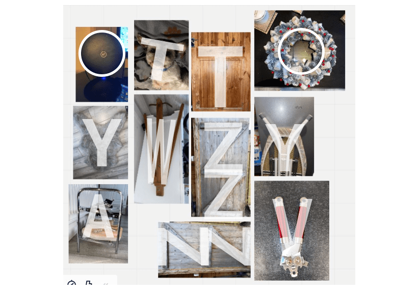
What letters are in the photos above?
Below is a showing the letters that I tried to capture in my photos.
Monogram Design Brief
Simplicity – is it simple in concept and understandable?
Attention Value/ Holding Power – does your monogram draw you in and hold your attention?
Application (Including Scale) – does the design work in all desired applications? On a business card, side of a building etc.
Competition – is the trademark distinguishable as you?
Tone of Voice – does the feel of the mark in keeping with you/the product?
Fashionability/ Timelessness – avoid a trend, contemporary, time sustainable.
Focus on Form (No Colour)
Work in black and white for now.
Consider whether some parts of the letter need removed or does the negative space hint at any other form?
Sketch first before you take it digital.
Use a grid.
Designer Research
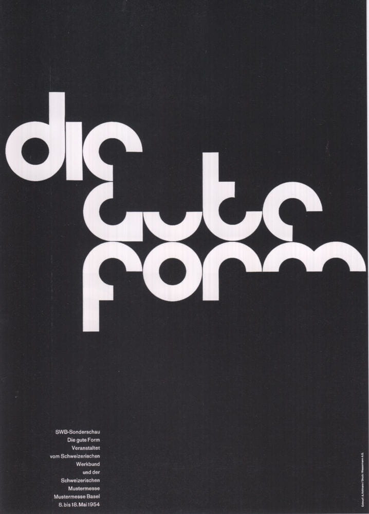
Wim Crouwel
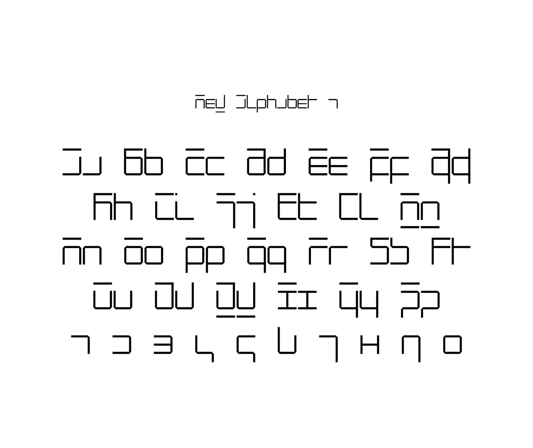
Wim Crouwel was the Dutch design icon who gave us the ultra-geometric Gridnik typeface. With the agency he co-founded, Total Design, Crouwel pioneered a rigorously functional approach to posters, logos and corporate identities, changing the face of design in the Netherlands. Alongside his famed creation of Gridnik and the New Alphabet – an extraordinary cipher script of vertical and horizontal lines – the designer was also defined by his remarkable ability as a ‘spatial organiser’ for exhibitions, spaces and fair stands.

Website reference – http://www.iconofgraphics.com/wim-crouwel/
https://www.wallpaper.com/design/wim-crouwel-obituary-2019
Armin Hofmann
Armin Hofmann is an eminent twentieth century Swiss graphic designer. The immeasurable influence on generations of designers is one of the many distinguishing qualities of his work. Hofmann played an instrumental role in developing the graphic design style known as the Swiss Style. His dedication to visual resolution represented a larger vision of civilized society and behind the artistic beauty of his designs hid a conviction about social issues and cultural values.
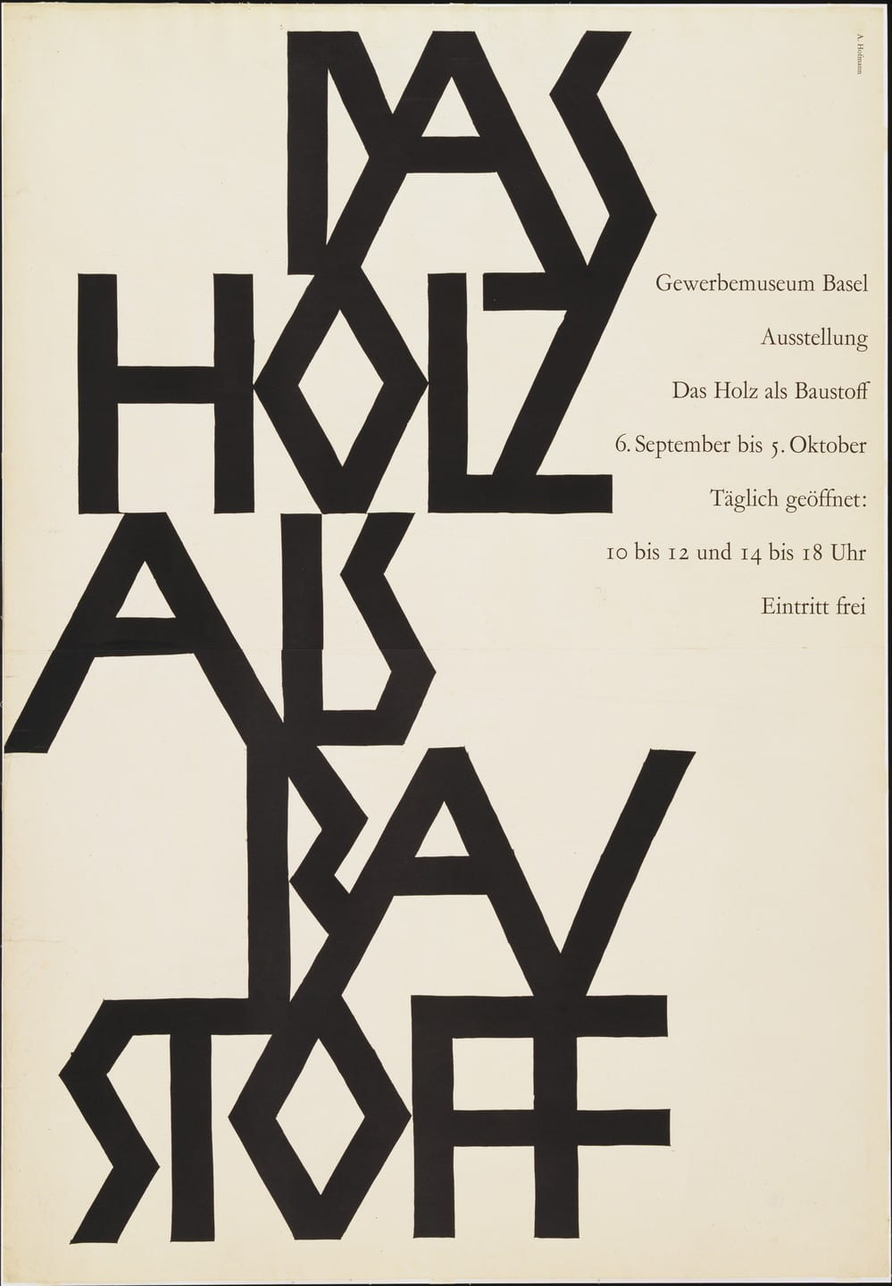
Website reference – https://www.famousgraphicdesigners.org/armin-hofmann
Summary/Self Reflection
I found it interesting to see all the possible design paths I can do when creating my monogram. I think it is going to important to sketch and keep generating ideas so I have multiple possibilities to chose from. I think looking at the likes of Vera Wang and some of Pentagram’s work has helped me see what is already out there and what I can achieve. Looking at both Wim Crouwel’s work and Armin Hofmann’s work has opened my thinking to more abstracted design. I quite like abstract work in general and think it’s good to try some abstract or unconventional ideas as you never know what I might get out of it. Moving forward I plan to sketch and develop my monogram ideas and try to work within boundaries within grids and not using colour as suggested in today’s lecture.
Week 02 Tasks
- Research
- Design a Monogram