
Monogram Sketches Feedback

- Monograms made out of shapes is a good concept and should consider developing these more (11,12)
- Bubble text is very lava lamp like, can be very animated
- The ‘X’ monogram is normally overdone, so maybe steer away from this idea
I found this brief feedback to be very useful as it has helped give me a better sense of possible directions I can take my monograms in. It was good to see everyone else’s work as it helps me see if I’m on the right line with what others are doing. As well as to see if I’m on track with the amount of work that I have produced or need to produce.
Importance of Type and Elements
The best way to communicate is writing it out. It permeates to every aspect of our design process: a web-page, an app, there will be type there somewhere. It’s the easiest way to put across that tone or style. Type is important because letterforms developed as alternative to chosen word: pictograms, icons, cave paintings; ancient Egypt inscriptions on walls leaving an important message.
This develops into hand-drawn printed work, a religious message or something of significance, different cultures develop in different ways and their type emerged differently. It communicates a message where the messenger cannot be present, its a way of speaking to people without having to be there.
Tone of Voice
Applying this visually is why you would choose a different typeface, each has a character and personality. Some may look fun and playful, high end, stencil-like or machine-based. You want to make your identity unique, so use the variety at your disposal.
The Elements of Typography
Typeface vs Font
Typefaces – a single set of characters with stylistic unity.
Font – a complete character set in one size, but is pretty much the same thing.
Anatomy
Baseline – where everything sits.
Caps height – top of capital letter.
Counter – space cut out within letter.
X-Height – Height of a lower case x, used to determine height of others in families.
Ascender and Descender – above and below the x height.
Widths – the end of the ‘s’ is a terminal.
Point size: how you would size your text
Sizing dictates a lot of things within type such as; headline, body copy, appropriate readability etc.
Classification
Sans serif: clean, industrial, modern, designed to take away some character and personality. Can be functional and easy to understand.
Serif: classic, iconic, easily read . The serifs are based on the carvings of the Romans, and are older, which is why we think of them as classical.
Slab serifs: bold and blocky -ended serifs. Bring across confidence and boldness.
Blackletter: calligraphic, drop cap, medieval, old fashioned.
Display faces: harder to read, for a headline, not same demands for legibility, easier to read at a larger size, decorative.
Non-Western: differently glyphs for different languages.
Scripts: handwritten or cursive; more personal as it seems like it’s crafted by hand.
Symbol fonts: examples; Dingbats and Unicode.
Tasks
- Read FontShop ‘Meet your Type’ pgs 9,10,13 & 14
- Select a typeface and write your name. Use this to identify the different elements of type and label them. Do this up on an A4 page either on paper or digitally.


Trying out the anatomy on my name. You can also view this on my Figma linked here.
This is a work in progress as the more I begin to understand different terminology, the more of them I can add to the piece. So far I think I have grasped a good understanding of the anatomy and terminology of typography and found this a good task to do so.

Choosing Type
Quick Menti Class Exercise
Quick exercise to see how we would describe particular typefaces. I found this useful as it helps me in recognising different traits a certain typeface might convey without even looking into the type its used in.


Kerning
This the space between letters. This is an important aspect to learn as it can make a difference in the presentation and comfort of your type.
Resource to try out to practise kerning.
20 Minute Practise


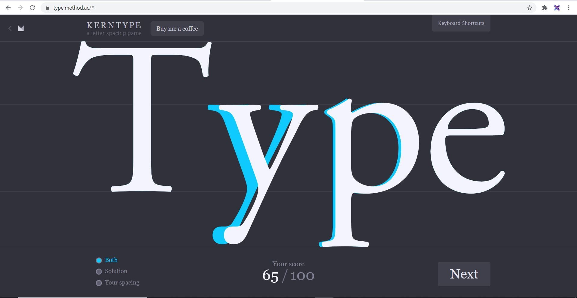


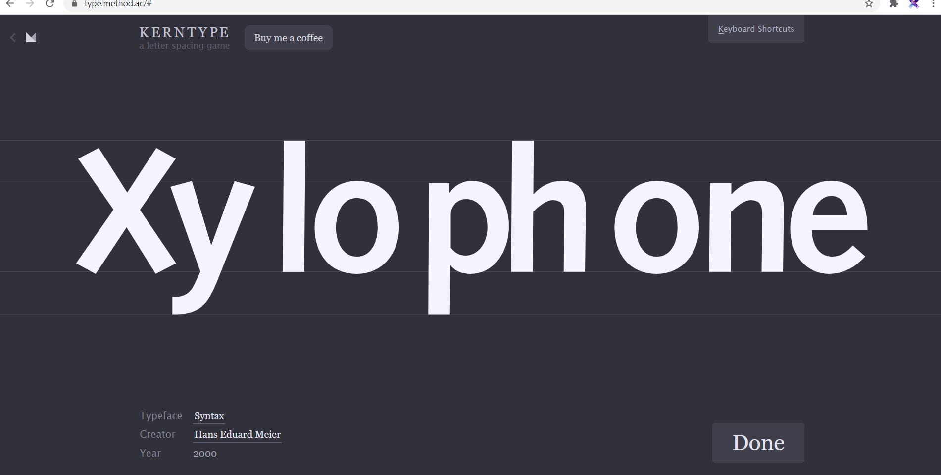

From doing this I’ve realised how difficult it is to do kerning and how precise it has to be. From the screengrabs above I definitely need to improve, I think I need to spend more time looking at the negative space between the letters to see where it matches up.
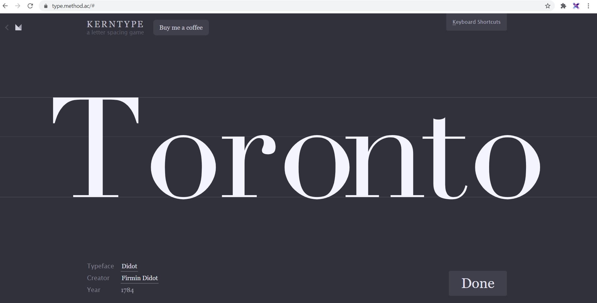
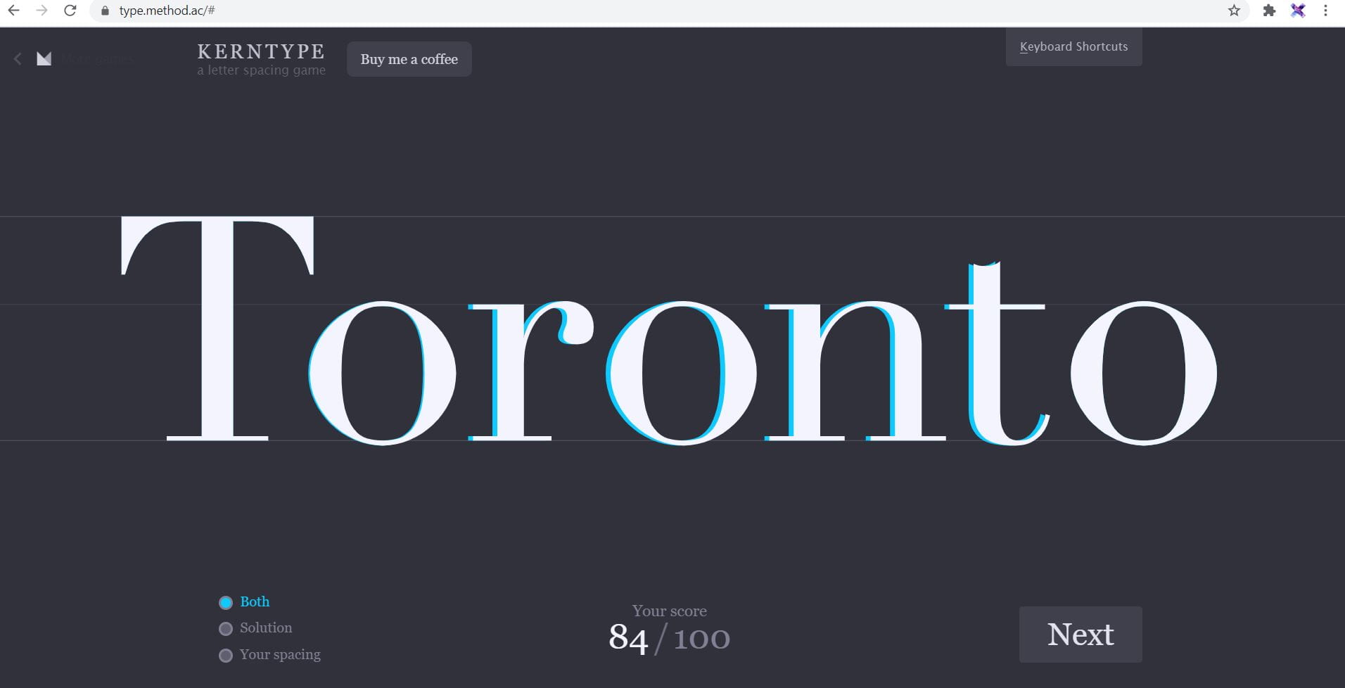
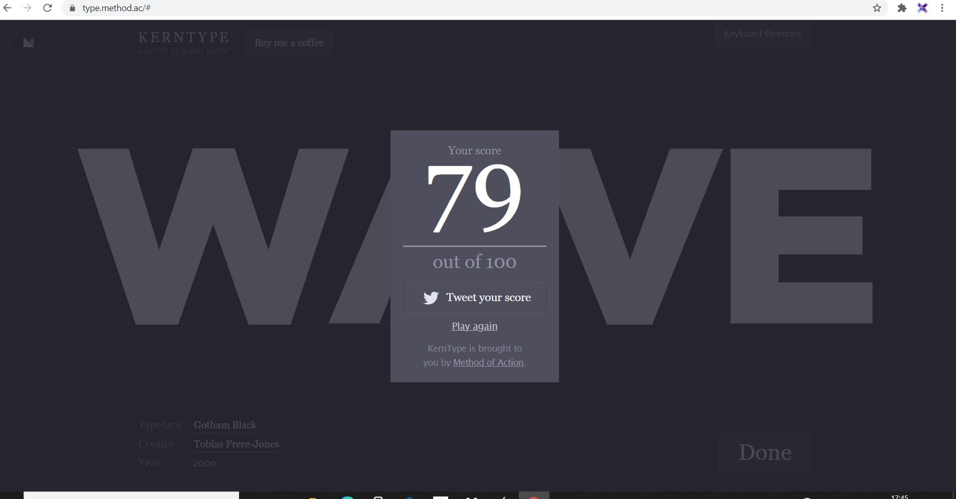
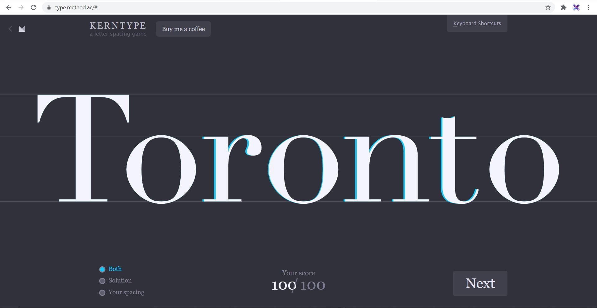
Kerning Practise 2.0


Ligatures
This is the connected letters in combination; a glyph found in typefaces where letters are more appropriately spaced when combined.
Leading
This is the space between lines.
Distortion
This is something you really shouldn’t do. Each fonts are carefully designed, choose the right type in accordance to the effect or presentation you want to convey. You shouldn’t stretch, make it shorter or vertical.
Wordmarks
What is a wordmark?
“It’s a type of logo design that includes only the company name — no symbols, mascots, or badges. Wordmark logos are also called “logotypes,” and can include monogram variations for smaller spaces like social media profiles and favicons. ” Definition – https://looka.com/blog/wordmark-logo-design/
Different Classifications
Script/Calligraphic


Typographic
![]()

Personal Brands
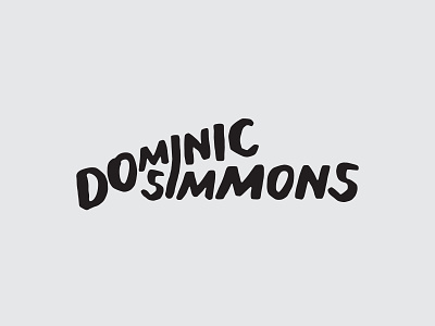
Custom Type
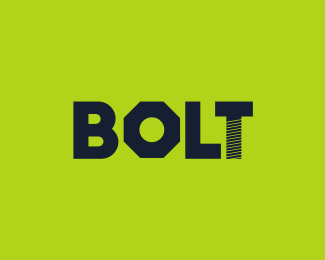
It’s important to create distinction in the wordmark logo with the appropriate design decisions. For example; sans serif or serif, lower or uppercase or a mixture of the two, colour, character weight, height and size.

![]()
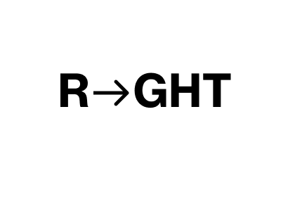
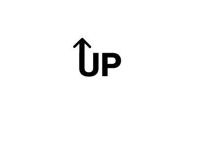
A Twist
A different way of customizing your wordmark is to add little changes that make the wordmark not just about the wording. It could be a ligature, a notch, contrast colour, negative space, positive space, letterspacing, kerning etc.

![]()
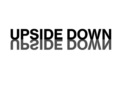
Task – Word Play
Pick a word and convey its meaning in the typographic design. Use Helvetica Bold and work on a minimum of six. Sketching ideas first will lead to a better outcome.
Quick sketches from my notes

Taking these into my sketchbook to further refine them before designing them digitally.

Making my designs digitally on Figma


Summary/Self Reflection
This week I learnt a lot about anatomy of type, I found learning the definitions and then applying them to the anatomy of type task to be very useful as it helped me visually to see each element. I also enjoyed doing the word play task as I now can look at words and type in a different way and make them more visually approachable. I feel like this could come in handy when finalizing my monogram and designing my wordmark.
“Words have meaning. Type has spirit. The combination is spectacular.” – Paula Scher