
Brief – Take your favourite song and present the lyrics in a manner which is appropriate to the music and singer/group in question. Considering the pacing and rhythm of the song. If lines or words are more meaningful than others they should be presented more prominently. Your research should look at styles of typography you feel will be most suitable for the music genre in question. Using what you have learnt so far your final submission will focus primarily on a typographic approach, you can also incorporate elements of point, line, plane, if they are appropriate to your chosen song. There is no limit to the size of your piece but it should follow a vertical format.
Song Choice- Love it if we made it – The 1975
Below are three visual boards I created on Miro. I found making these to help me visualise the song and the band altogether as when I go to creating my concepts and final design
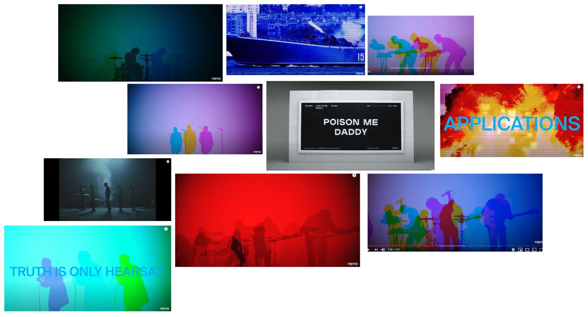
1st Visual Board – These are screenshots from the ‘love it if we made it’ music video. A good starting reference to the colours, styles and overall aesthetic of the time era of when my chosen song was released.
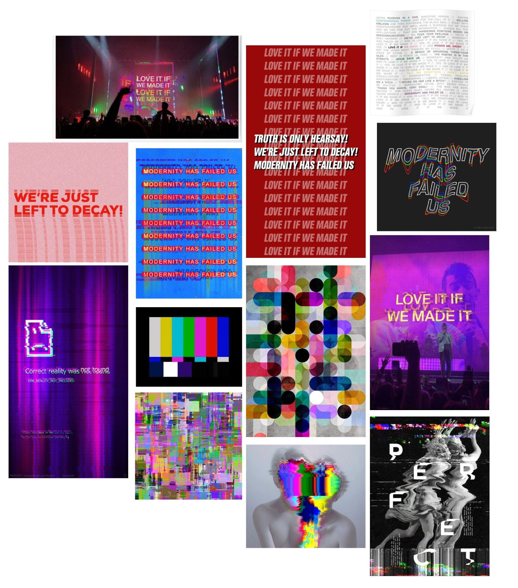
2nd Visual Board – These are images I found from either Pinterest or the 1975’s Instagram account that I thought visually matched the aesthetic and vibe of the song and its music video.
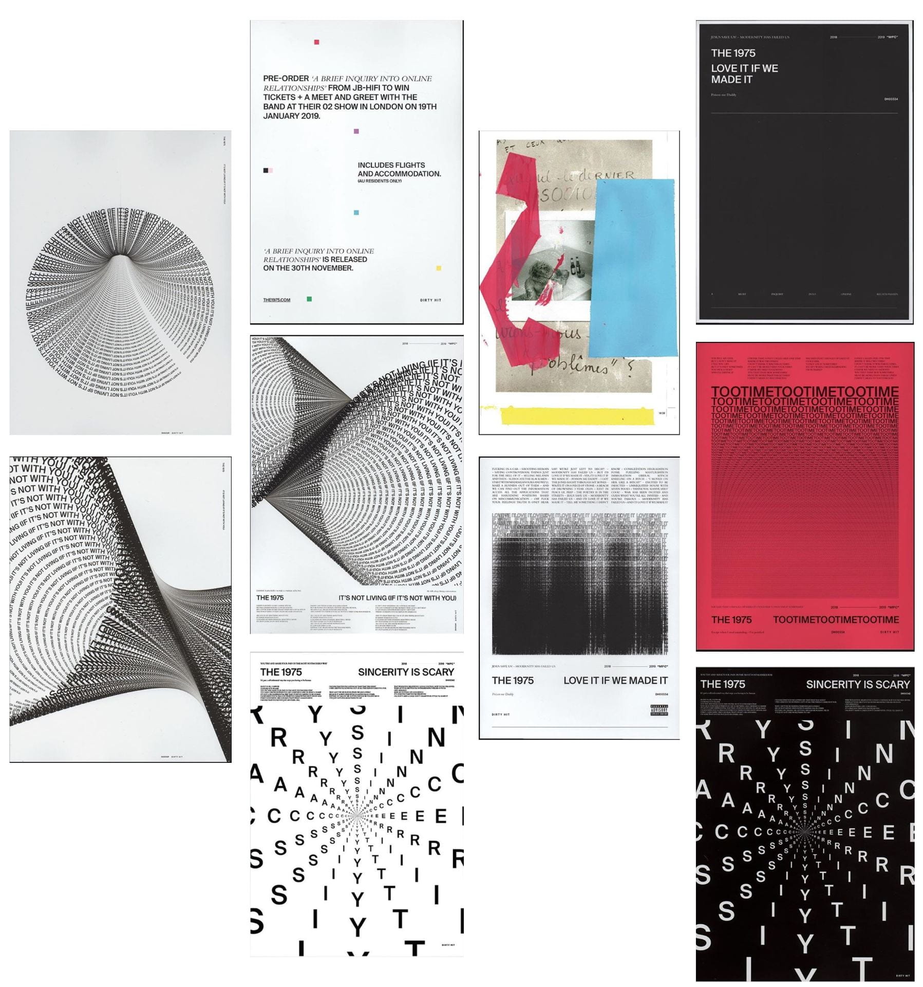
3rd Visual Board – These are screenshots from their Instagram of their songs and album posters that I found t0 be very graphic and bold, I found these posters really explored a typographic approach. I put these into a board as I thought these would be useful to refer to as they take a different approach to the way they do they’re visuals.
Figma Designs
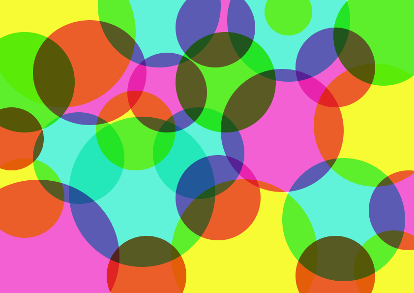
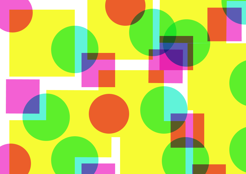
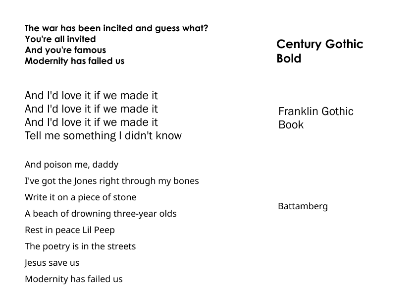
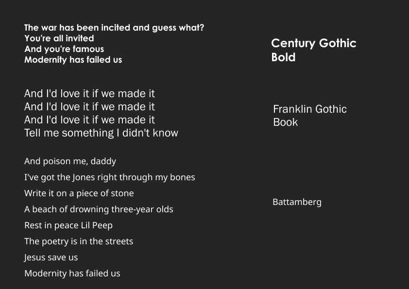
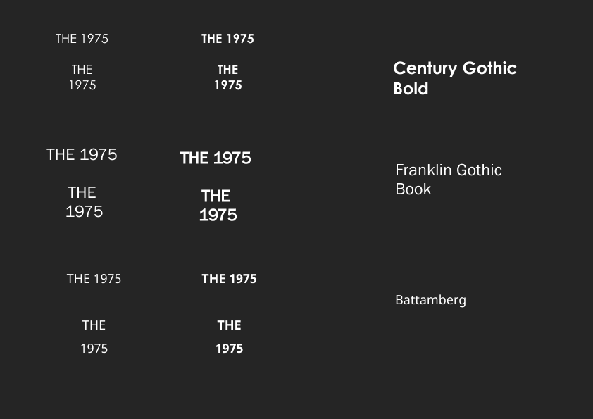
Below are the set of experimentations I have done so far. I started looking at producing circles and squares in a colour scheme similar to that of the ‘Love it if we made it’ music video, in the hopes to keep my piece in a similar aesthetic to the songs visuals. I then went on to looking at the my chosen text from the song and considered the look on simple backgrounds so looking at black text on white and then white text on black. To note I also did research on what type the band uses for their most well known album cover and used the same text to stick to the look of the band to see if it fits this design or not is a good consideration to keep in mind. I also tried two other similar types for comparison and variety.
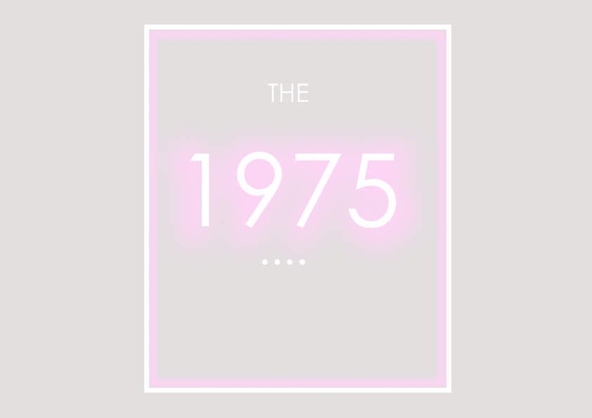
Knowing this I went on to recreate their self titled album covers to again get an idea of the design behind their previous look and aesthetic. I then took the same set of text and the alphabet in the ‘Century Gothic Bold’ and applied them to my previous experimental backgrounds. As well as looking at the difference in all lowercase and all uppercase in the designs. From doing this I noticed some of the backgrounds are far too bold and would need the fill transparency brought down to look more of a wash of colours so the text will be more apparent in the final design.


Final Piece
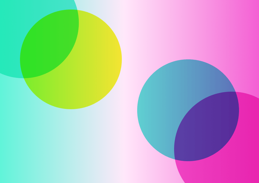
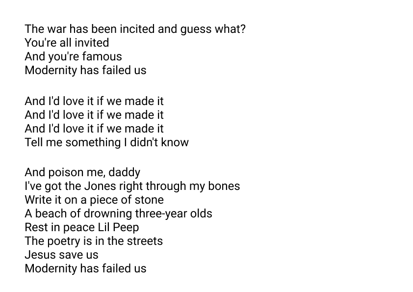
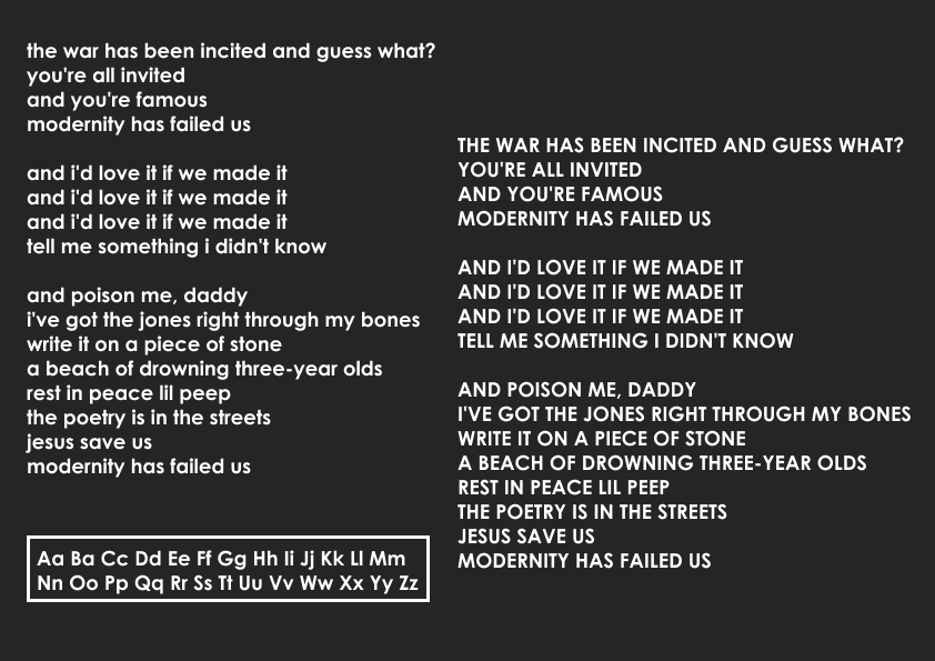
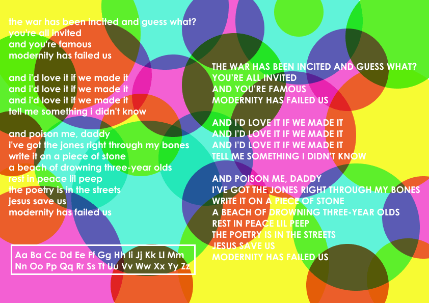
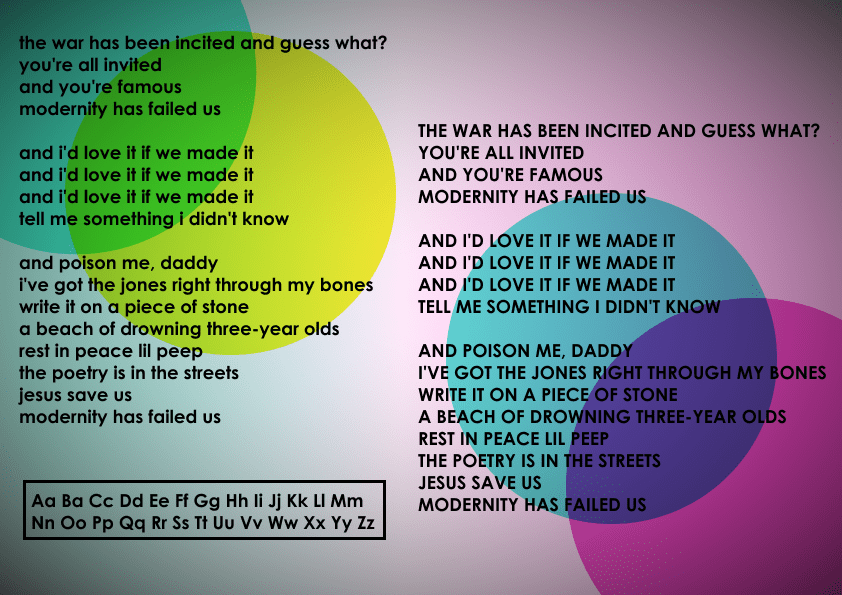
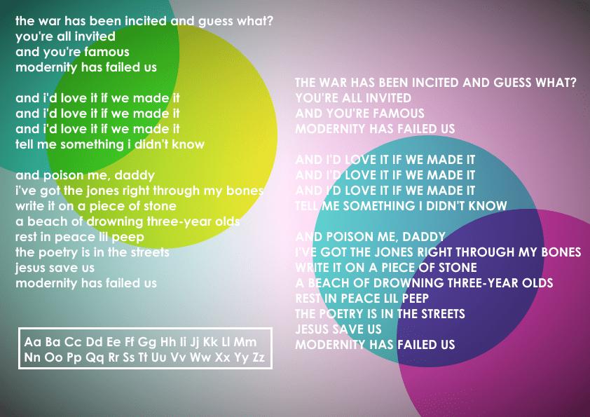
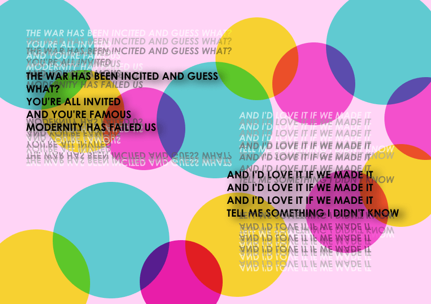
Below I picked the two verses of the song I wanted to showcase in my final design. I wanted all words to be bold and have no real hosen key words as equally both verses are the most valuable in the song. I tried a layering text effect, laying all the text on top of different descending colours of each other but as seen in the first design it was too much and not very legible. The second design I went for a less layered approach and had one of the layers at a bigger text size and added a drop shadow to make it stand out more. By doing this I find the text looks a lot more legible and I like the positioning of the text being adjacent with each other adds contrast between them both. I added in the overlapping circles which is my way of incorporating ‘point’ into my final design. I made the overlapping circles into a constant flowing pattern that flows on and off the design as well as keeping the viewer’s eyes floating onto the text as well. I think I will add a vignette effect to the background to dull it down to help the text stand out more.

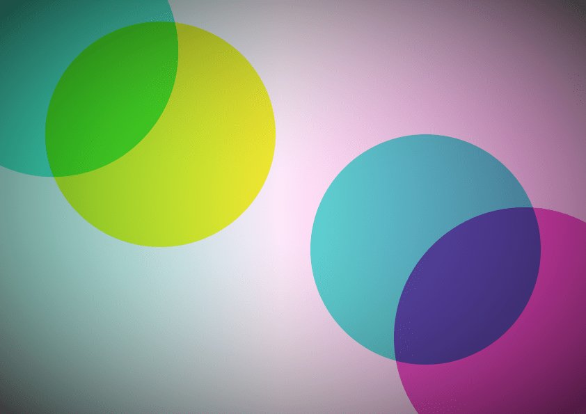
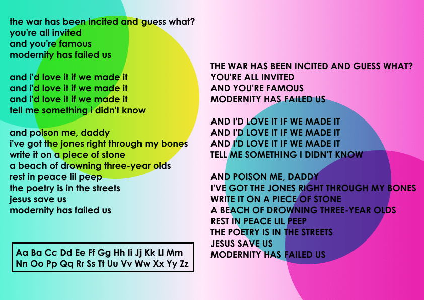
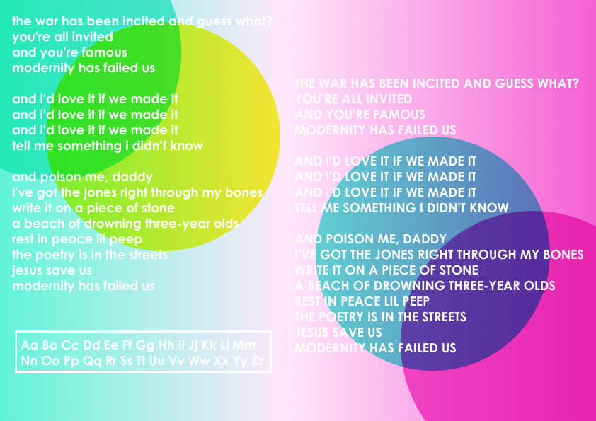
As seen below I added the vignette effect and I’m far more happier with the final design. I think the vignette effect definitely made the text stand out far more. I like the placement of the text and the layering text , I think having them adjacent to each other compliments them well. Overall I’m pleased with the final design and with the elements of it as discussed above.
