IWeek 10 Tasks:
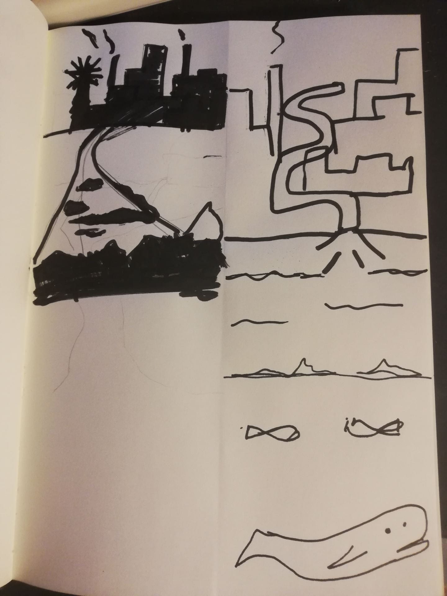
This week’s task was to just continue working on my infographic. When I began to work on my infographics and looked at some research I didn’t have any ideas for the infographic so I decided to change to ships on the sea/ plastic in the sea so I did a load of sketches before continuing.


Following this, I started to look at some facts in this general area and found lots of websites.
Websites and Info:
https://www.nrdc.org/stories/water-pollution-everything-you-need-know
Eighty percent of ocean pollution (also called marine pollution) originates on land—whether along the coast or far inland. Contaminants such as chemicals, nutrients, and heavy metals are carried from farms, factories, and cities by streams and rivers into our bays and estuaries; from there they travel out to sea. Meanwhile, marine debris—particularly plastic—is blown in by the wind or washed in via storm drains and sewers. Our seas are also sometimes spoiled by oil spills and leaks—big and small—and are consistently soaking up carbon pollution from the air. The ocean absorbs as much as a quarter of man-made carbon emissions.

Nonpoint source pollution is contamination derived from diffuse sources. These may include agricultural or stormwater runoff or debris blown into waterways from land. Nonpoint source pollution is the leading cause of water pollution in U.S. waters, but it’s difficult to regulate since there’s no single, identifiable culprit.
https://www.shipmap.org/
this is a website that shows the world’s shipping containers This is amazing and is a great visual representation of the number of ships on the sea.

https://www.weforum.org/agenda/2017/11/this-map-shows-every-ship-at-sea-in-real-time
EVERY SHIP AT SEA
We previously posted an interactive map of shipping routes that used 250 million data points to show how boats moved across the ocean.
Today, in a similar vein, we highlight a website that tracks the world’s ships in real-time, providing a unique picture of what is happening at sea. Below is a screenshot from MarineTraffic and going there will allow you to see all major ships in real-time as they voyage around the Deep Blue Sea.
Here’s a screenshot of the Strait of Hormuz, showing only oil tankers. (Dots are tankers that are not moving, while arrows represent tankers that are currently on course.)

https://www.un.org/esa/sustdev/natlinfo/indicators/methodology_sheets/oceans_seas_coasts/pop_coastal_areas.pdf

I found this paper when trying to find out how many people lived near the sea however it included a lot more than just that from how many work at sea to a rough estimate of how many of each type of ship is at sea at any given time.
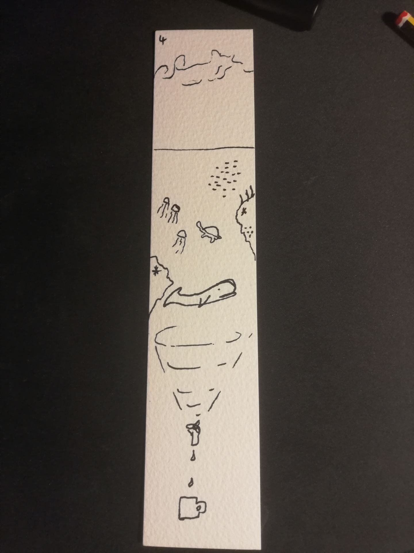
Icons/Illustrations:
I started some work on topic related icons to help with the making next week:

Video:
I had a quick look at a video on youtube for the basics of infographic creation.
I found this series on youtube and found it really helpful in working through my infographic.