The Website:
This was the first week where I started to only do website, I created a Github repo and multiple versions of my website:
This was the first version that I had created the previous semester: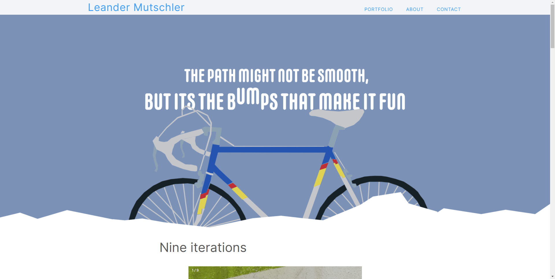
I quickly changed this to start to ling up with the new design I had picked changing the background color, removing the content, and styling some font text.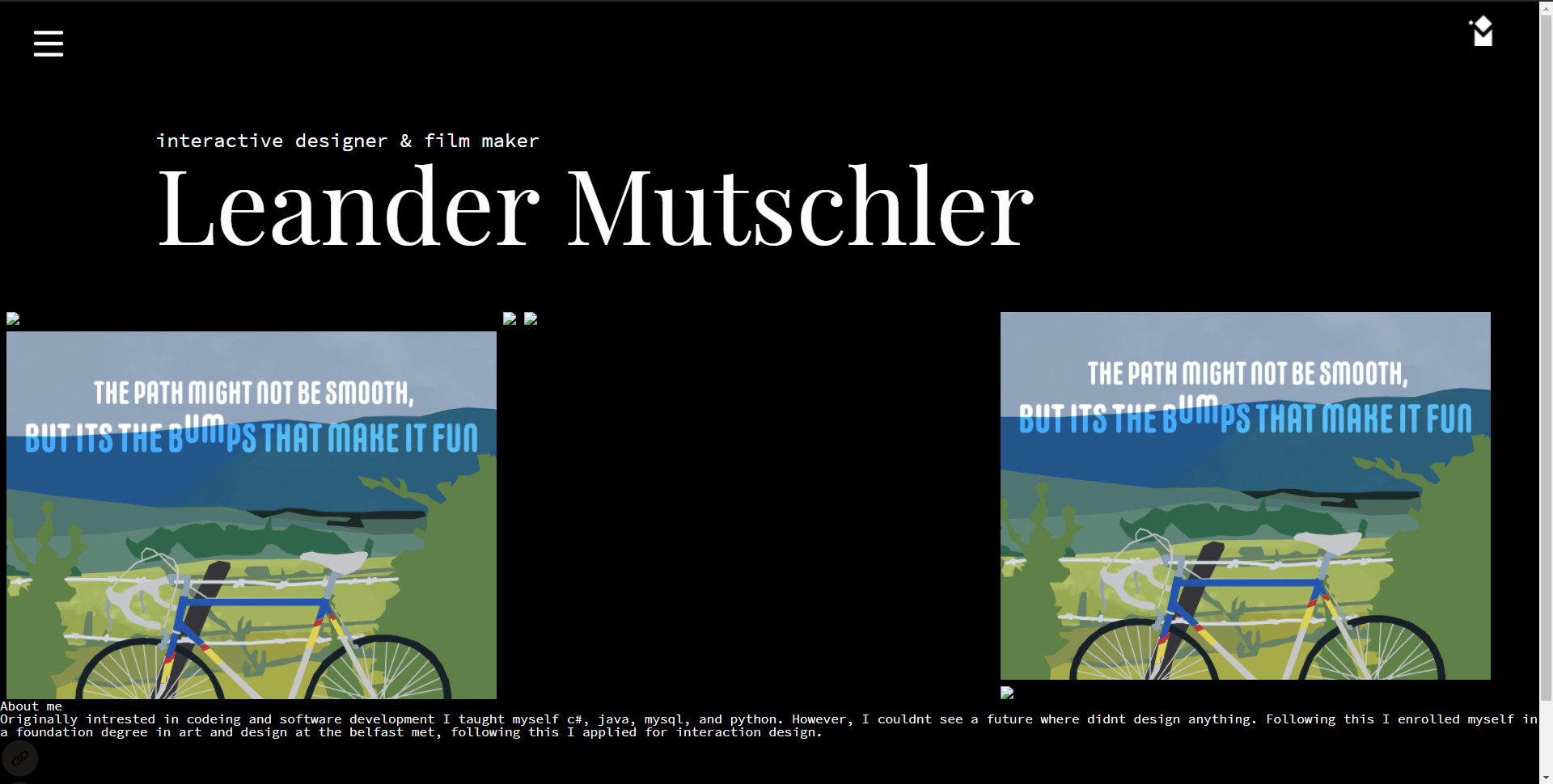
At this point, I began to implement a grid system to display my work and allow the user to filter specific projects such as films UX, and others.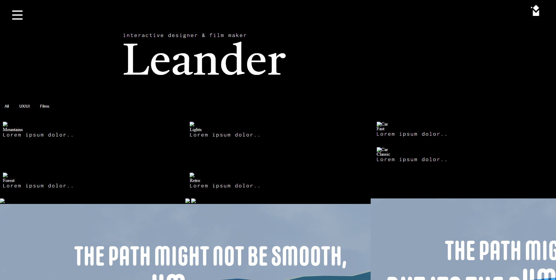
This took a lot of fiddling but after a day this is where it was left off, on top of some changes to a grid system beginning implementation I began coding on a drop-down nav that I saw on w3schools. The font still needed to be styled however I was liking it a lot.
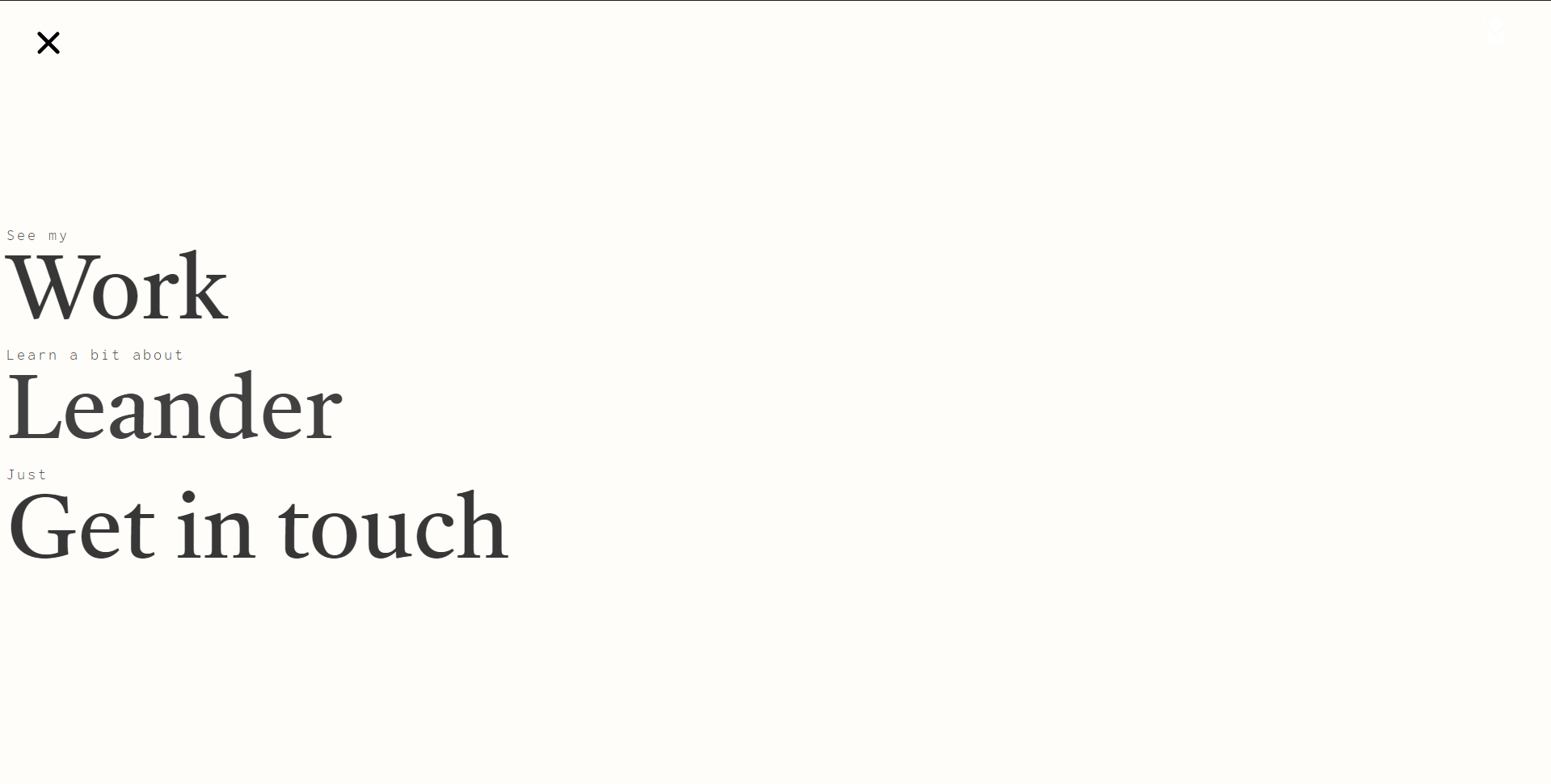
Following this I added links to my social media as a text before swapping them to the get in touch page and at the bottom of projects.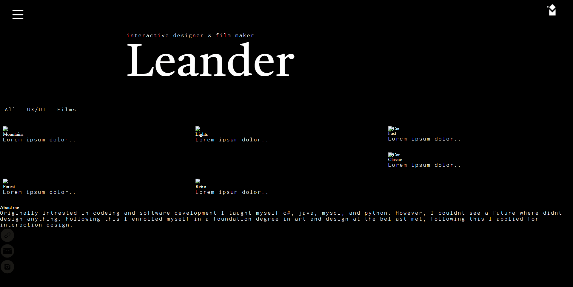
We then had our group critique where daniel suggested swapping my name out for just my logo and I really liked this idea so I began implementing it.
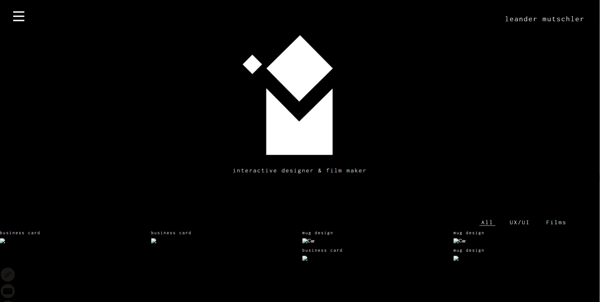
Following this, I began to populate the grid and add images.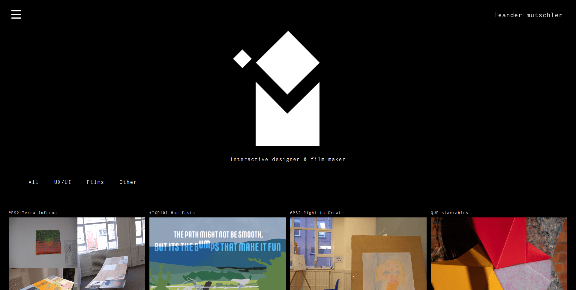
Alongside this, I added a small grain over the whole page that broke up some of the colors and helps soften the blacks and whites. I then had to begin work on the other pages such as the about page. I wanted to keep these simple and limited to just their purpose.

Initially, I had my logo in place of the image but thought it would be more appropriate. after adding it I styled it and added a circular radius to it. and made it black and white. I then went back and added black and white to the rest as a suggestion from my father and allowed the user to hover over the images and videos to not only make them color but also play.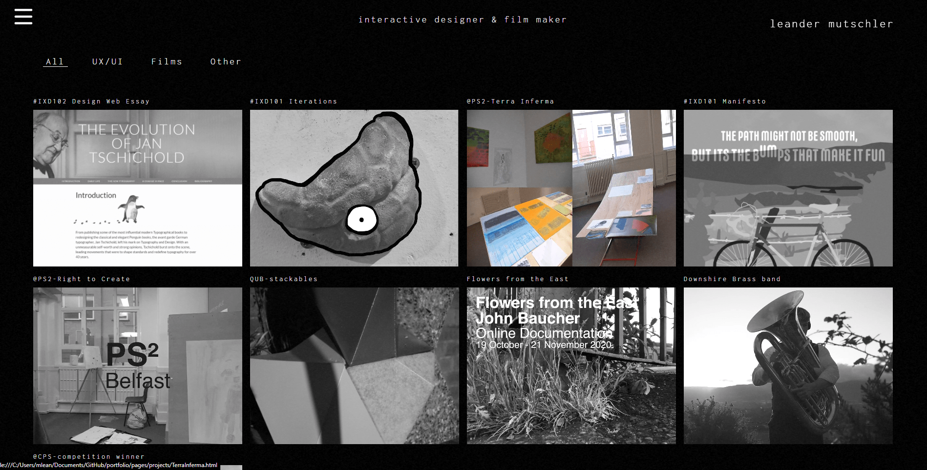
I then added the get in touch page which I left super simple with no changes.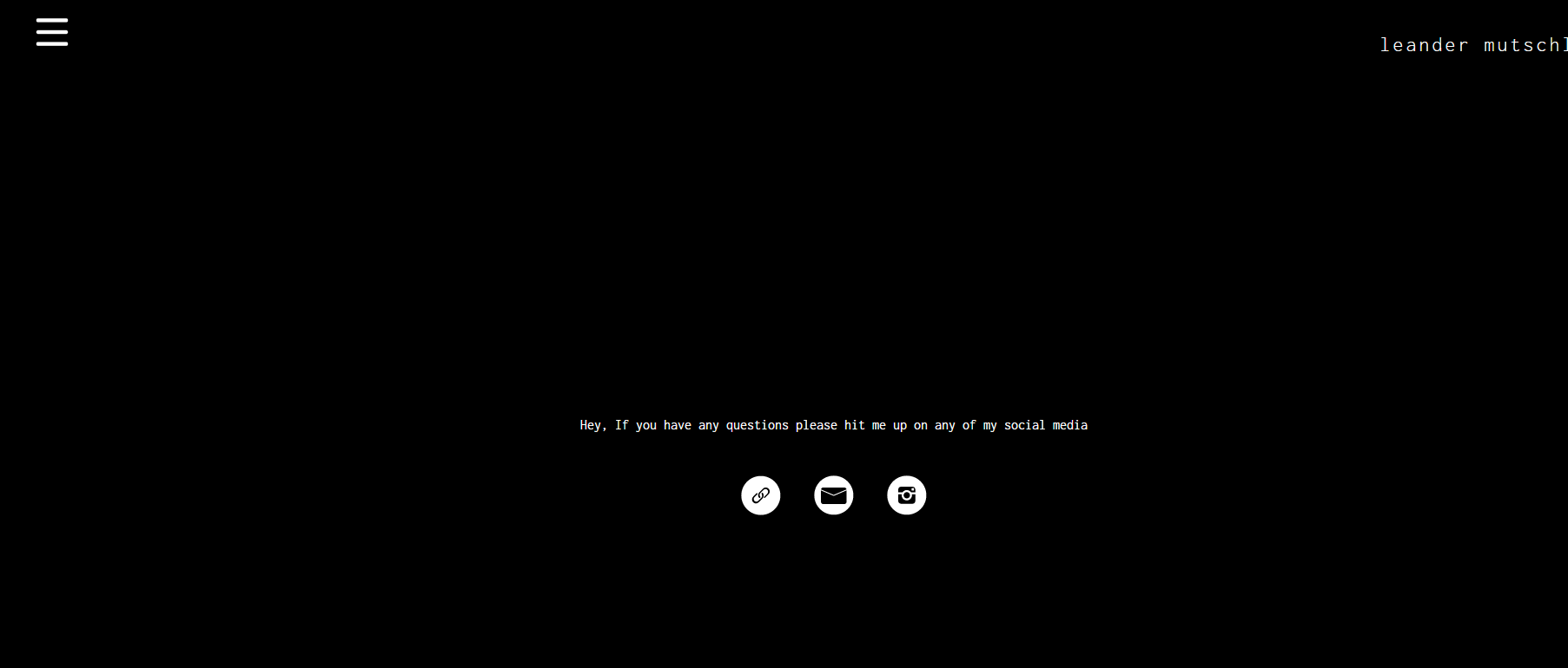
These two other pages used the main pages CSS styling along with some of their own which were added through other files. At this point, I had too many versions in one repo and I hadn’t been pushing them after each version so it wouldn’t let me push them meaning I had to create a new one which I only did for the final version.
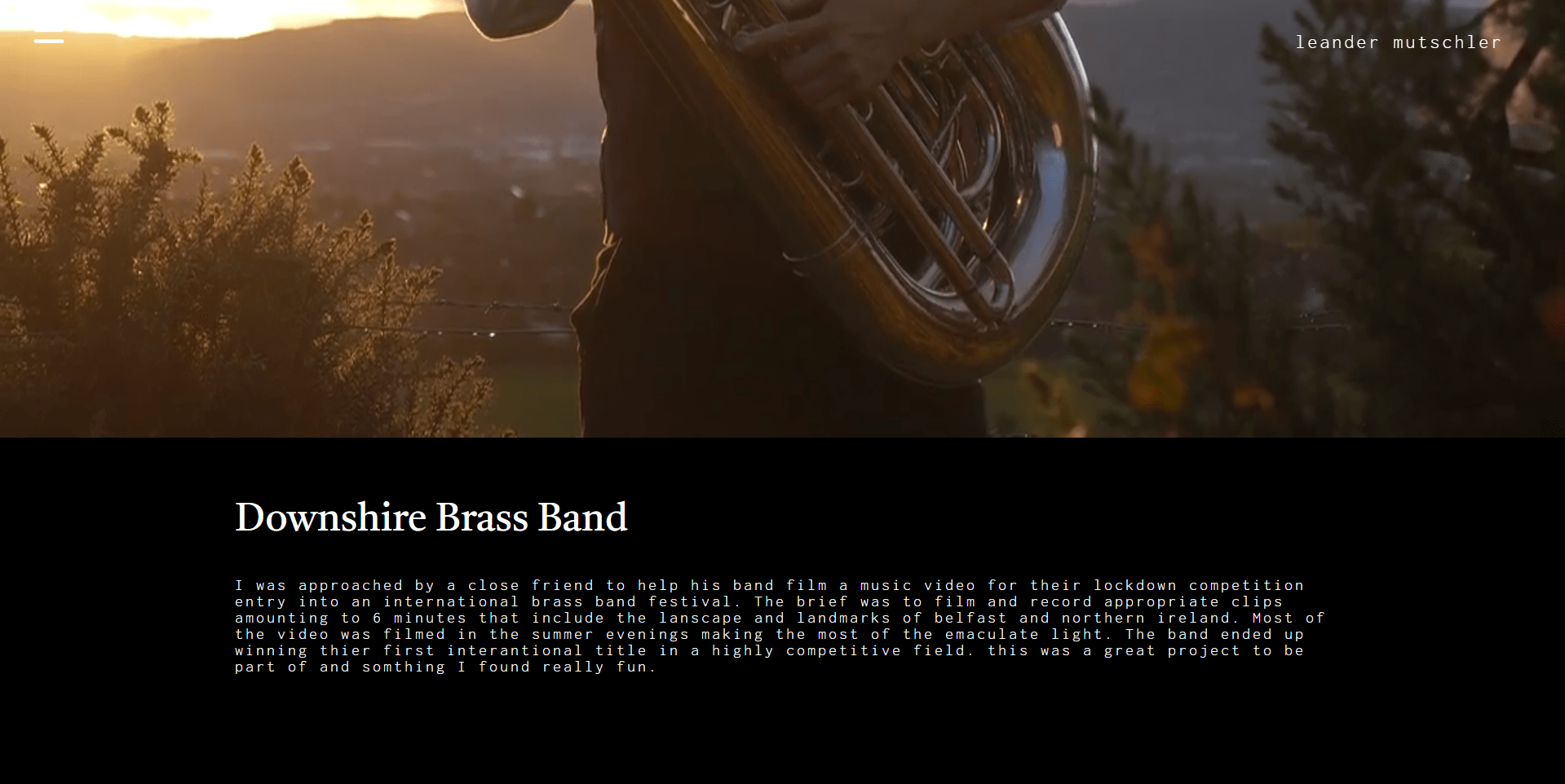
These project pages were linked to the images in the grid and when clicked would bring you to another page I just wanted a large header image with some text about what the project was. At a later date, I could add more information links or images if needed. 
I really enjoyed creating the website although I could always find things I wanted to change or add I limited myself to sticking to what I had already planned alongside setting myself a limit to how much CSS and javascript I would implement. I allowed myself to experiment with animations such as those that I used for the menubar and underline on the filter however I attempted to put in a page load animation for when swapping to the project pages however I found this too difficult to manage. Although I used very little Javascript I found it extremely fun and effective and it’s something I defiantly want t to learn more of. However, I realized I should focus more on the design and therefore didn’t delve too deep.
I am very happy with my website and learned a lot about how important planning is and how important other people’s feedback is in helping develop something such as a website.
website link: https://leanderixd.github.io/portfolio/index-7.html