This week I worked on my personal brand as I hated what I created previously. This meant a full rehaul and I thought I would start by picking the font.
Font:
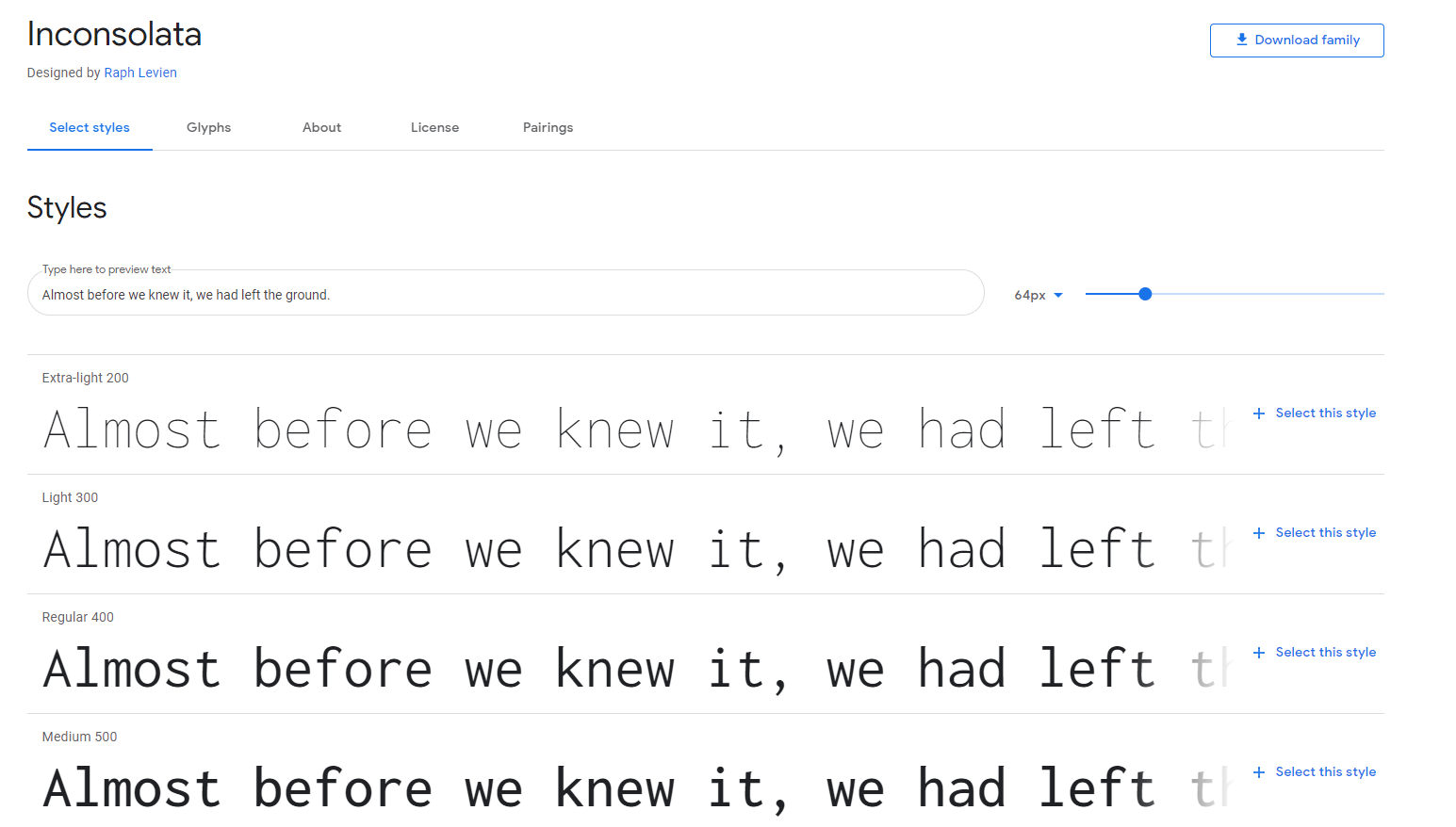
I wanted to use a font similar to that of a font used when coding as this is something I continue to do and really enjoy. I found out after some research that these are called Monospace fonts. So I went out and looked for nice monospace fonts on google fonts. I ended up finding a font called Incostolata. I chose it for its monospace style along with the fact it was one of the few variable fonts which are super helpful for web design.
I then had to look for a serif font to match with this and I ended up stumbling across Castro when browsing through google fonts. I really enjoyed the regular font along with the italics as they are similar but almost different fonts.

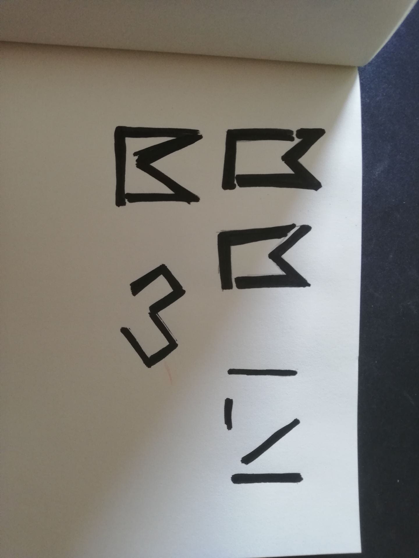
Following this, I started working on my monogram. I wanted it to be somewhat abstract and to use only black and white as I find myself enjoying simple design so I started by doing some simple sketches on paper: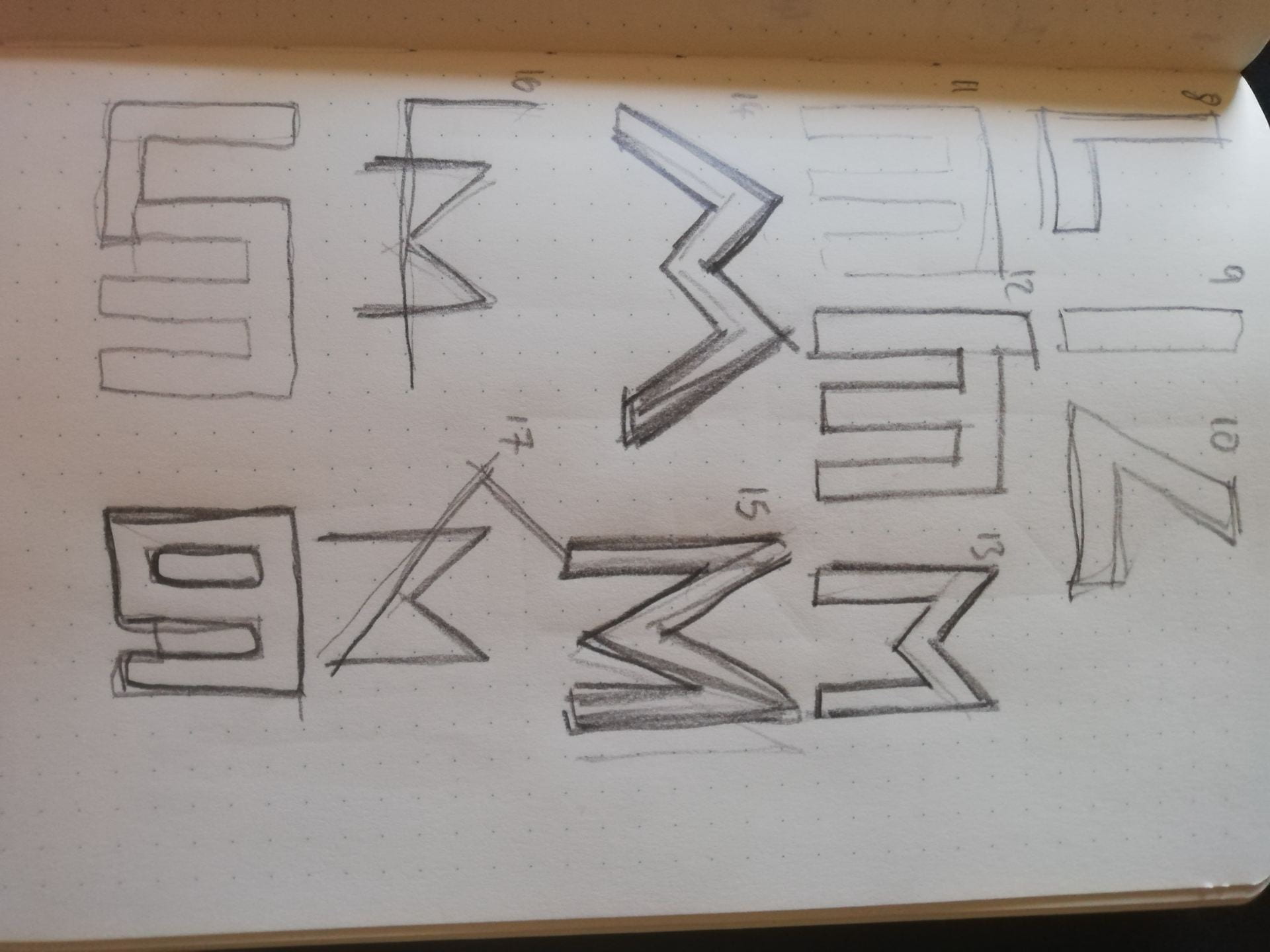
I think took these into Figma and started to digitalize some of them:
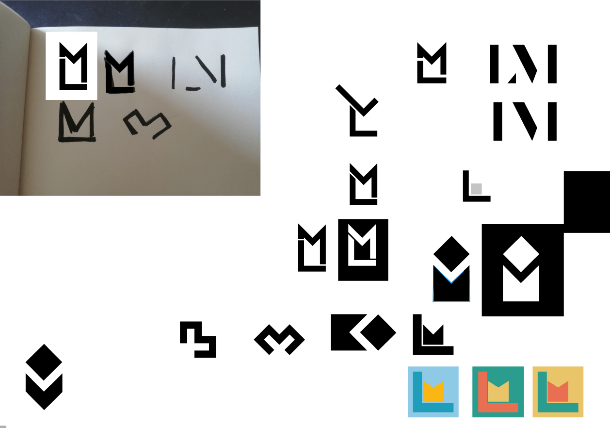
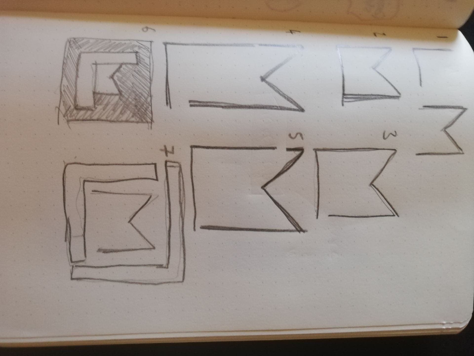
Following this, I stumbled upon a design using the shape leftover from cutting out the letters and using them as a negative. I then took all the logos I liked and displayed them on a black and white background along with tweaking some of the side lengths and diagonals.

The top left was created after all of these when I realized the L wasn’t visible enough and a dot had to be added to lengthen one of the sides to create the L. Some of the others were very nice however I felt like they were almost too boring so I stuck with the top left logo.
Visual Marque:
The visual mark was an easy one for me to pick. My name comes from a Greek legend of a swimmer who died trying to see his lover and in the place, he was rumored to have died there is now a Lighthouse called Leanders Lighthouse, So for this, I decided I would create a lighthouse as my visual marque:
These were all displayed in black and I decided it would be helpful to show the colors I intended to use for my brand cohesively:
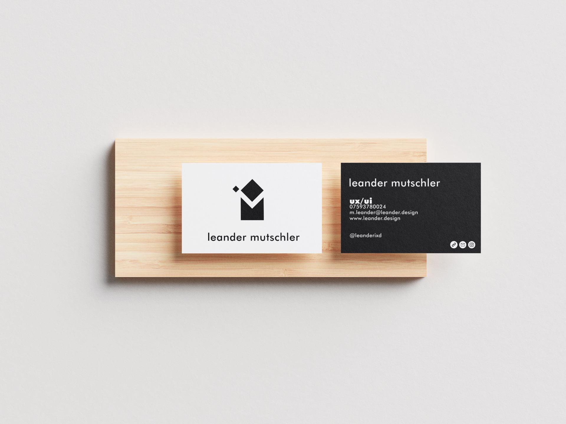
Following this, the last thing I had to do was update my Business card. I took the feedback I got last time to include more details such as phone number and address and the order in which these should be and I applied it to my business card:
I got some feedback on week 12 from daniel that I should line up the top of my name with the top of the monogram on the front so I did this as well and changed it ever so slightly: