Task 1: Business Card
Use your wordmark, typeface choice, and monogram or symbol to design a business card. These are 85x55mm. Consider both sides of the card.

Research
I had never really thought of business cards, let alone what to put on them so I did a bit of digging.
What to include:
1. Logo
Your logo is a visual representation of what your company does and what you stand for. It should epitomize your business and is a keepsake for your customers to remember you by. When you have a logo, it makes your company feel like it’s credible, professional, and trustworthy.
Three common types of the logo include:
Written name: Often referred to as a wordmark, this is a written representation of your brand. Many iconic brands use wordmarks, like Google and Visa.
Monogram or letter mark: These logos are composed of the initial letters of your business organized creatively. Abbreviating is a good idea if you have a long name, like International Business Machines (IBM).
Symbol: This is a pictorial representation of your business. It may be a shape related to your area of expertise or an abstract form that represents your brand. It can stand alone and support your written business name. The swoosh and the apple are two of the most widely recognized.
2.Company Name
Give this plenty of space and make it prominent. It’s arguably the most important piece of information on your card, as it’s what people are most likely to remember. Generally speaking, the name of your business should be the largest piece of text on your card.
3.Tagline
Try to summarize what you offer in six words or less. “Brand Strategy for All” communicates that Smith Consulting provides branding services to a diverse mix of clients and doesn’t specialize in one sector. It’s professional, honest, and focuses on the core service.
4.Your Name
Give this text field prominence to help people remember your name and create a personal connection to your business.
5.Job title
This serves as a good memory jogger. Not everyone’s good with names and some people are more likely to remember you for your area of expertise.
6.Logo
This example shows the logo repeated on the backside to reinforce your brand. The above example shows why it’s important to make sure a logo works in black and white as this application uses only one color, whereas the logo on the front includes a color gradient.
7.Website
You can drop the HTTP://, it’s not necessary and takes up space. It’s important that there’s consistency between the design of your business card and your website, so bear that in mind if you’re designing a card when you already have a website or vice versa.
8.Contact details (email, phone number, address)
Contact information is usually aligned left, right, or centered. If you have a preferred method of contact—such as phone number or email address—emphasize it with a larger size or prominent placement.
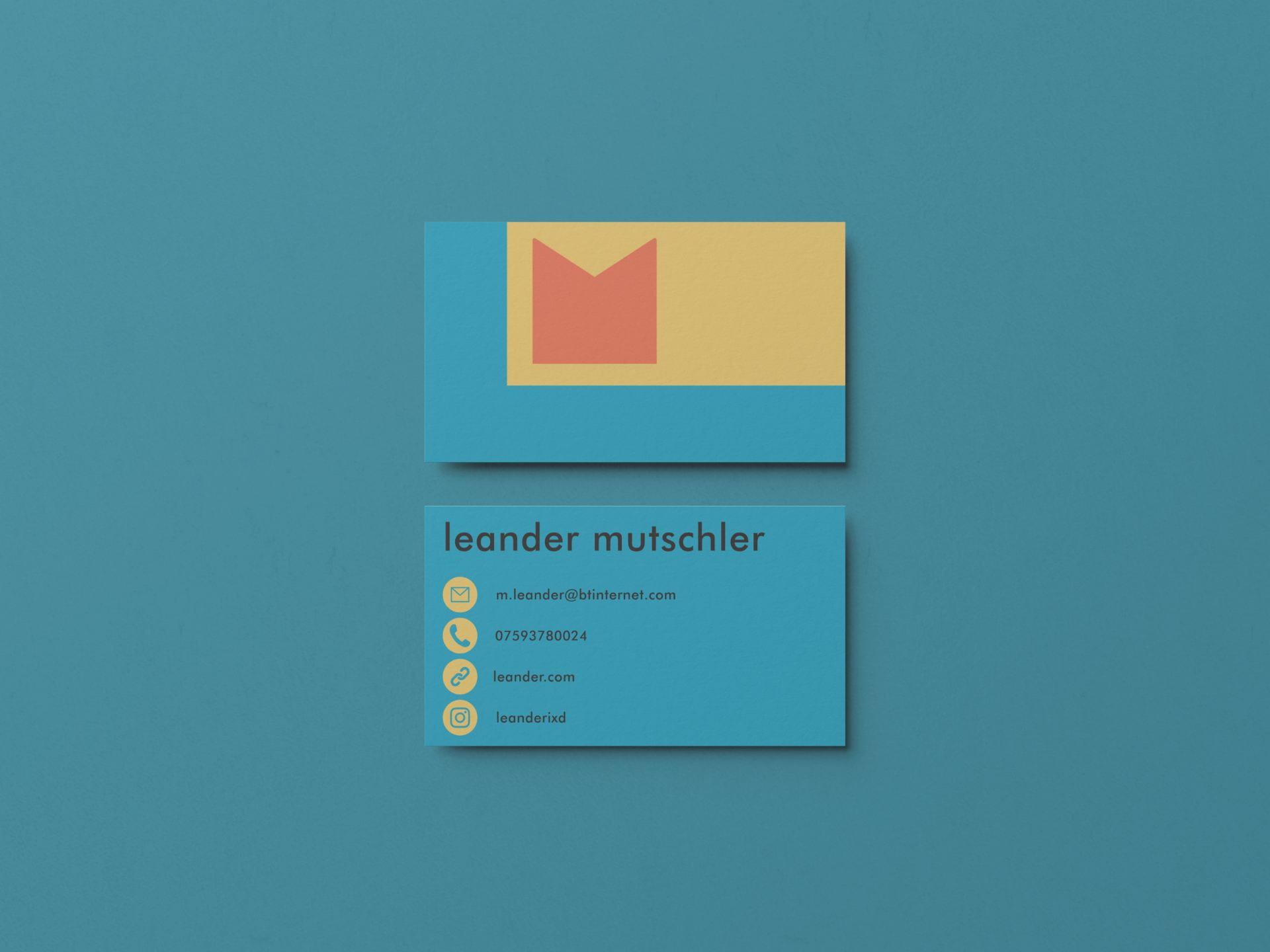
My attempt:
First, I created one quickly during the time we had in our lecture and combine my logo and the colors I used for it into a card with minimal typography and information.
I was quite proud of how well this came together in a limited amount of time. Following this, I got some feedback at the end of the time.
- Nice colors
- Good use of logos
- Missing Phone number/Address
- Positioning is too far left
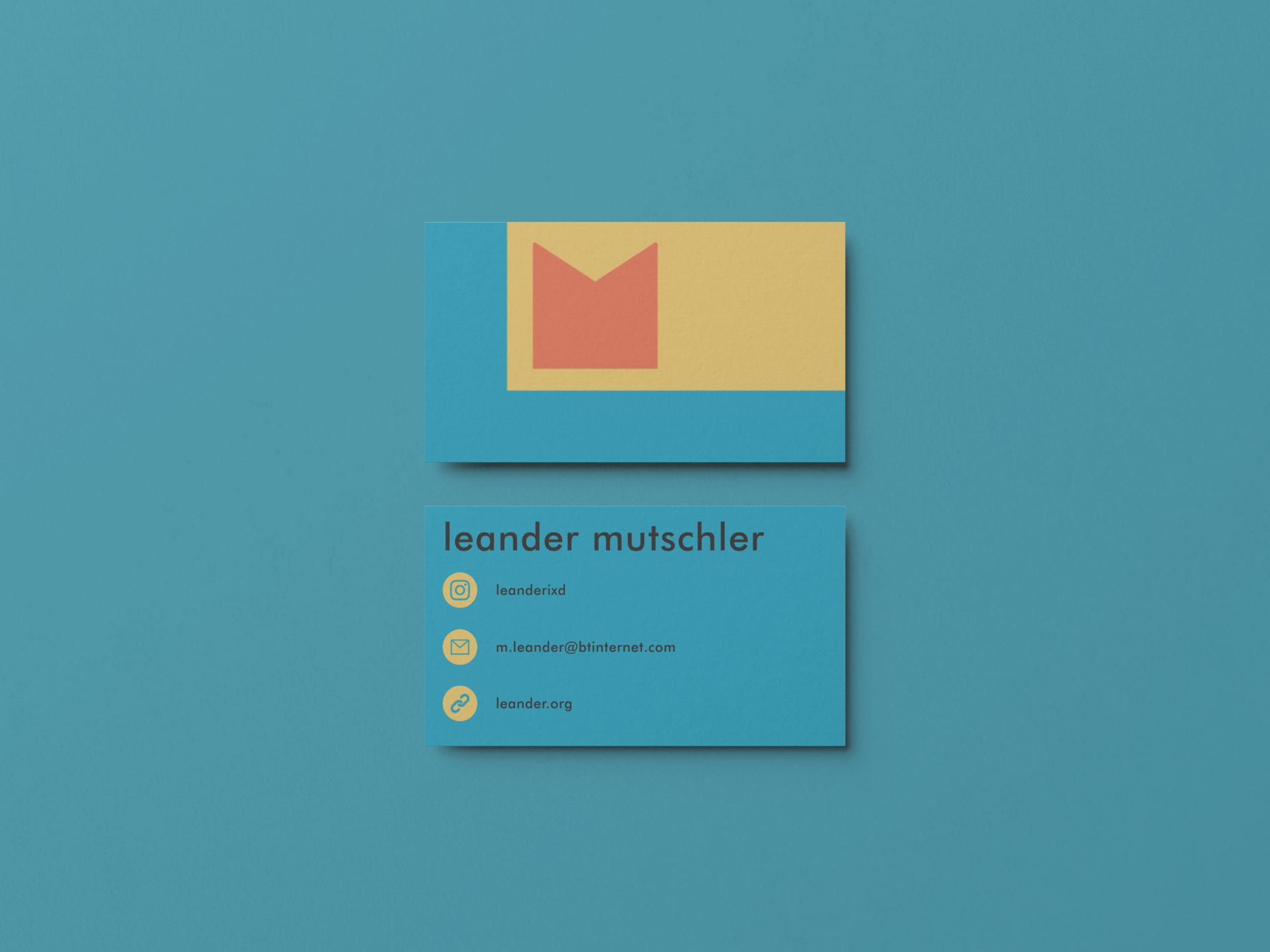
Following this, I took the feedback onboard, rectified my design and I am pretty pleased with the outcome.