I have never really been a fan of motivational manifestos or mantras as I feel they give false hope when sometimes you just have to do something
that you hate. However, when this happens I really enjoy going running or cycling. This just gives me time to think and be by myself so I decided
this would be the main part of my design.
I thought of a few mantras and found it surprisingly difficult to come up with one as they were either too cheesy or didn’t sound right. I ended
up asking my friends and coach for ideas and came up with a few:
- “pain isn’t a sacrifice, it’s an investment in success”
- “Don’t tell people your plans, show them your results”
- “Think it, Want it, Do it”
- “Work never ends, so keep ongoing”
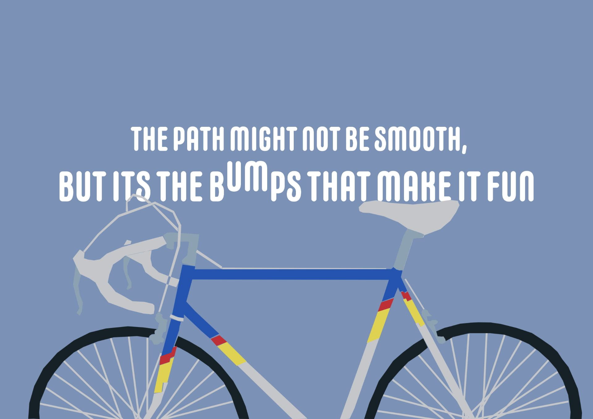
- “The path might not always be smooth, but it’s the bumps that make it fun”
- “You might fall, crash or slip but you’ll get there eventually”
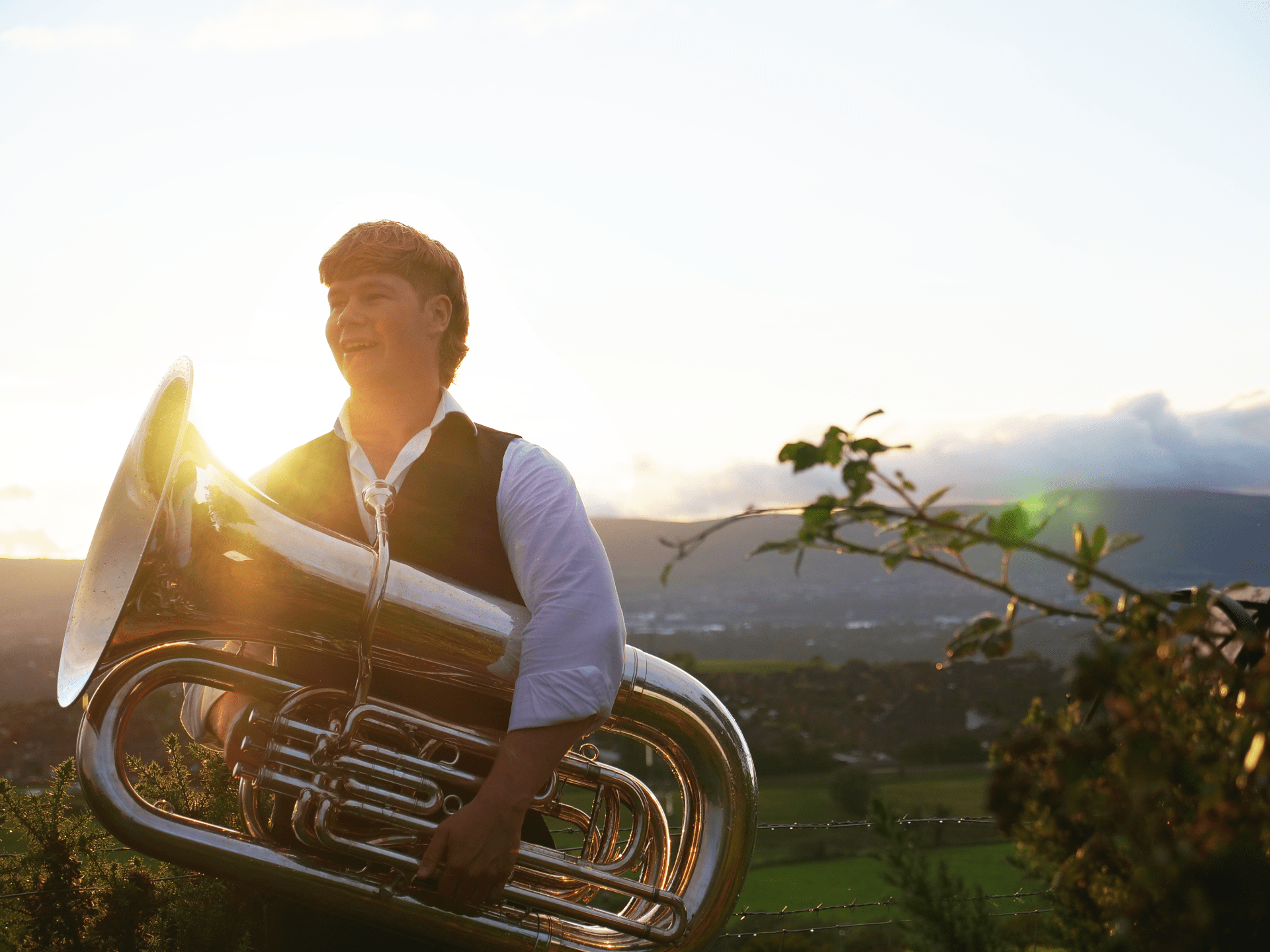
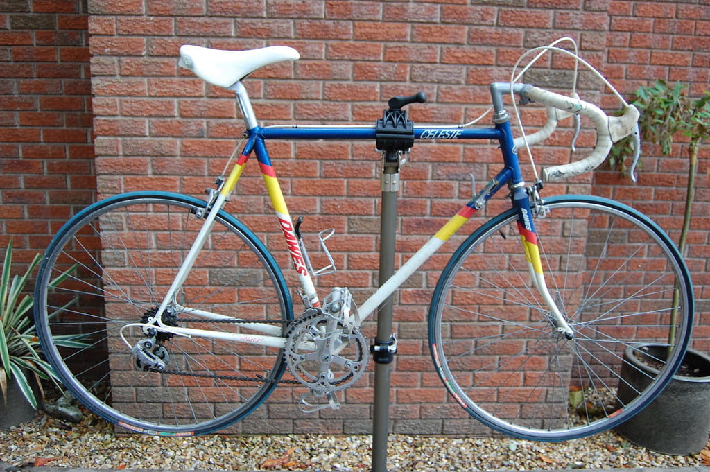
I ended going for “The path might not always be smooth, but it’s the bumps that make it fun” as I felt it applied to me more along with my enjoyment of escaping from stress with cycling I then initially thought of the views I look at when I go cycling around Belfast and Carryduff. I recently did a photo shoot and video recording for a brass band in Belfast and had a nice photo of the view over Belfast. I also had recently taken a photo of my bike while doing repairs and thought combining these could look quite good.
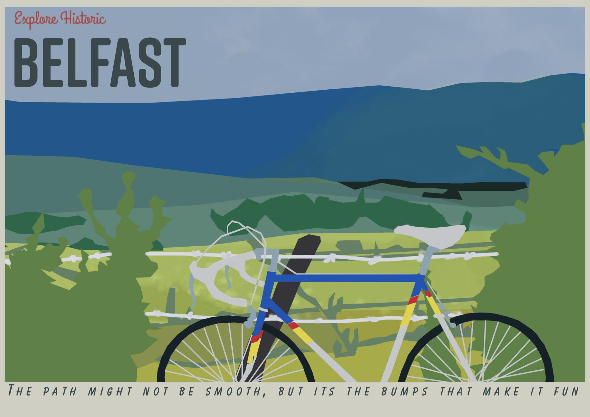
From this point, I needed to think of how I wanted to display this and in what style. I was a big fan of one of my friend’s projects last year where they drew inspiration from vintage travel posters and I thought the colours of the bike could work well with the colour pallet of the posters. I then created a quick sketch of the layout I wanted and took them into photoshop, drew it all up, and then messed around with the layout and text.

This is the first one I designed and after some constructive criticism from my younger sister I reluctantly messed around with creating a bump in the work “BUMPS”.I was actually quite happy with how this turned out and decided I’d create another without the background to see how well the bike stood alone with the text.
The Final one I created was this. I decided to see how it looked when formatted and designed exactly like one of the vintage travel posters and I was quite happy with how it looked however as a poster depicting a mantra it doesn’t do too great of a job. This would have been a cool layout if it were for a letter or card.
Overall I had fun creating these. I think my favorite out of the three is The First version. However, I also really enjoy the simplicity of the second rendition.