After a feedback session, I made quite a few changes to some of my current screens and added some new ones to further develop my app.
Home screen
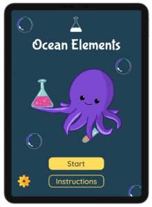
I didn’t change very much on this screen as I like the way it looks. I think the colours contrast well with each other, it greets the users with a nice illustration and the buttons are clear.
One thing I did add was the brand. Previously, it was just the name that used the same font as the rest of the app. Now, I have created a wordmark and a logo. The logo is a test tube and the liquid inside it resembles ocean waves to tie in with the tone of the app. I will go into more detail about the branding and how I got here in another blog post.
Loading screen
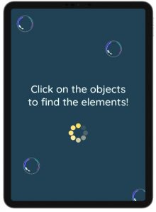
Again, I didn’t change much with this screen. I just decreased the size of the text. This created more whitespace and allowed the text to breathe more.
Main screen
This was the screen that needed the most changes and a lot of development done to it. previously, it was very bland, it wasn’t clear to the user what they should do and the overall UX could have been better.
The first thing I did was add the illustration of the boat at the top. This has a flag saying, “Click to find elements”. This gives users simple instructions on what to do. This will be beneficial if they didn’t read the instructions or the loading screen.
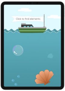
Something that was important for this screen was making the clickable objects clear that they are clickable. I did this by adding a hover effect to them. When hovered over the object increases in size, making it stand out from background illustrations. I did this through the prototyping tool. I set it to open an overlay (the bigger illustration) when hovered over. I added a dissolve animation to it so it wasn’t instant.

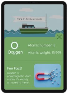
Next, I changed what happens when you click on an object. A small pop-up used to appear with limited information. Therefore, it was essential for me to improve this and include more information. This one is a lot better as it includes the name of the element, atomic number, atomic weight, and a fun fact. This information is more useful and relevant to the target audience. There is also an image on this to make it more visual.
Lastly, I added more illustrations to the background of the ocean such as plants and fish. I think this hugely improved the look of this screen as it’s more visual, interesting to look at and it creates a scene. I also made the background colour fade from light to dark blue as the user scrolls down. This gives the effect that they are going deeper into the ocean.

Full Screen

Test your knowledge
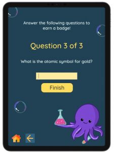
These next screens are ones I added since my last post. When the user clicks on the “Test Knowledge” button, it brings them to a question screen. It has simple language telling them what to do, what question they’re on, and what the question is. I also added a home and back button to this screen to make it easier to navigate. This is beneficial if the user wants to go back and read the information again before answering the questions.


Congratulations/finish screen
This is the screen that appears if the user gets 3 out of 3 questions correct. It rewards them with a badge. I think this is a good way to encourage learning as it encourages users to concentrate on the information, they are given so they can answer the questions and earn a badge.
This is the early stages of this part of the app as there are things I want to change. I would like to have 3 badges that users could earn, perhaps bronze, silver, and gold, depending on how many questions they get right. This way, users have something to work towards and improve their knowledge.

Here is a short video run-through of the prototype and interactions throughout: