Designing my final prototype
After receiving some helpful feedback at a group critique, I went back and made some changes.
I completely redesigned the top of the website. I took out the illustration and replaced it with an animation of my visual marque. I feel that this ties in with my brand better as it is bold and comes across as more confident than my illustration. The animation involves a line going through the maze which then draws the user’s eye down to the work.
I also made the buttons cornered and purple as this matches my brands tone of voice much better. You will see that I replaced a lot of orange with purple throughout the site. It looks a lot cleaner and more on brand. Instead, I will use the orange as an accent colour.
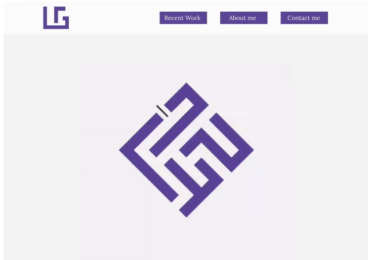
Here is my logo animation:
![]()
I also took the bio out from the top as it was unnecessary. This meant that my work would be the focus and if users wanted to find out more about me, they could read the “About Me” section.
I decided to move the illustration gallery to the top, just under the visual marque. I feel that this is attention grabbing as it has a lot of colours. It also provides a nice break from the colour pallet and brand and it will intrigue users to continue scrolling.
I changed the orange circle plus icons to square purple ones. These are much bolder and on brand. They will draw people’s eye in and encourage users to click them to find out more about a project.
![]()
Final prototype:
final portfolio website prototype
![]()
Overall, I am happy with how this prototype turned out as I think it reflects my brand much better now. I will continue working on the coding for my website to get it up and running.