Feedback
During the group critique I received lots of helpful feedback which I will use to improve my infographic. It will also help me moving forward when creating the next section of it. Here is the feedback and suggestions I received:
- Make the title stand out more by increasing the size
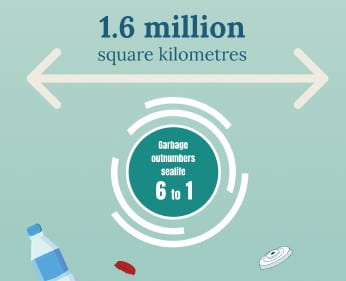
- The statistics related to the “Great Pacific Garbage Patch” are shocking and therefore should be bigger.
- Consider adding flags of the countries on the bar charts. I think this could be effective as it means people could tell which country it is at a glance and from far away.
- Display the statistics on the inside of the pie chart to make it clearer and cleaner.
- Make the percentage symbols smaller and use separate text boxes when making certain text bigger.
- Ensure all text is the same size in the pie chart and highlight both percentages in bold.
Making this list allows me to see what I need to work on, and I will be referring to it as I continue working.
Corrections
Here are some of the changes I made:


I made the title much bigger, so it stands out and users know what the graphic is about quickly. I made the facts about the Great Pacific Garbage patch much bigger as these are shocking statistics and should grab people’s attention. The bars on the chart now have the countries flags in monochrome. This means readers know what the country is at a glance as the text is quite small. I put statistics within the pie chart as it makes it clearer and cleaner. I also tidied up a lot of the text ensuring it was consistent in size and colour.
Final
![]()
Here is the PDF:
This final version includes effects on marine life. I decided to end it with this section as it’s a powerful note to end on. I visually showed how many species of sea turtle are threatened or endangered using colour. The ones that are endangered are in black and the only one that isn’t is in white, these are displayed alongside their names. I also wanted to include the pie chart showing how many sea turtles die each year from plastic vs from fishing vessels. This reinforces the fact that fishing is far more deadly. Lastly, I included different fish species and the percentage decrease. These are shocking statistics, and it will leave the reader thinking. I put in some illustrations of sea plants at the bottom to close off the infographic.
Conclusion
Overall, I am very happy with how my infographic turned out. I think the narrow layout works well as its easy to follow and the reader feels like they are going deeper into the ocean. The topic is very important, and I think it successfully educates people about the effect we are having on marine life in an easy-to-understand way. I am happy with the illustrations and how they help tell the story. This project has taught me a lot in terms of how to visualise information and illustration skills.