Famous monograms
I thought it would be beneficial to investigate some well-known monograms to get an idea of what works and styles I can try. Also, how I can stand out against others.
 I like this as it has parts of the letters missing but it is still legible.
 I want to try something like this where the letters overlap.
 This one uses the same letters as my initials so it gives me an idea of how they can be used together.
These are some other examples I liked:
My monogram mood board on Pinterest:
https://www.pinterest.co.uk/lgilmore401/monograms/
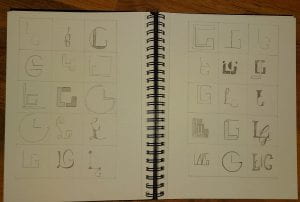
The next step was to begin sketching out my ideas, these are the results:
I found sketching out my ideas beneficial as it allows me to see what works and what doesn’t. I will continue drawing any ideas I have so I have many options to choose from. I also want to redraw some of my favourite ones and develop them before making them on-screen.
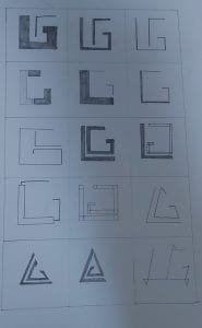
Once I received feedback, I then went back to develop my favourite ones. I also came up with some new ideas, these can be seen below:
I then received further feedback on these developments. The ones that stood out were the top right and bottom left monograms.
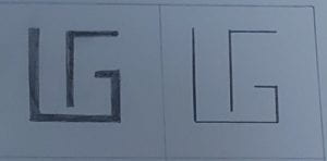
This one almost resembles a maze which ties in with my brands tone of voice as I’v used words such as, adventurous and determined. Therefore, a maze-like monogram can represent moving forward, which can show that I am confident. The one on the right uses thinner lines, this could fit well with a word-mark which uses thicker lines. It is also very minimal and legible.
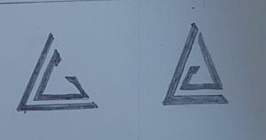
This monogram resembles an arrow pointing forward which, once again, matches my tone of voice. I think this shows confidence and determination. One of the words I used to describe myself when creating my brand was musical. This monogram can even represent that in a way if you think of it as the triangle musical instrument. I thought this was an interesting interpretation of it.
I will continue exploring these ideas and begin creating them digitally before choosing my final monogram.

