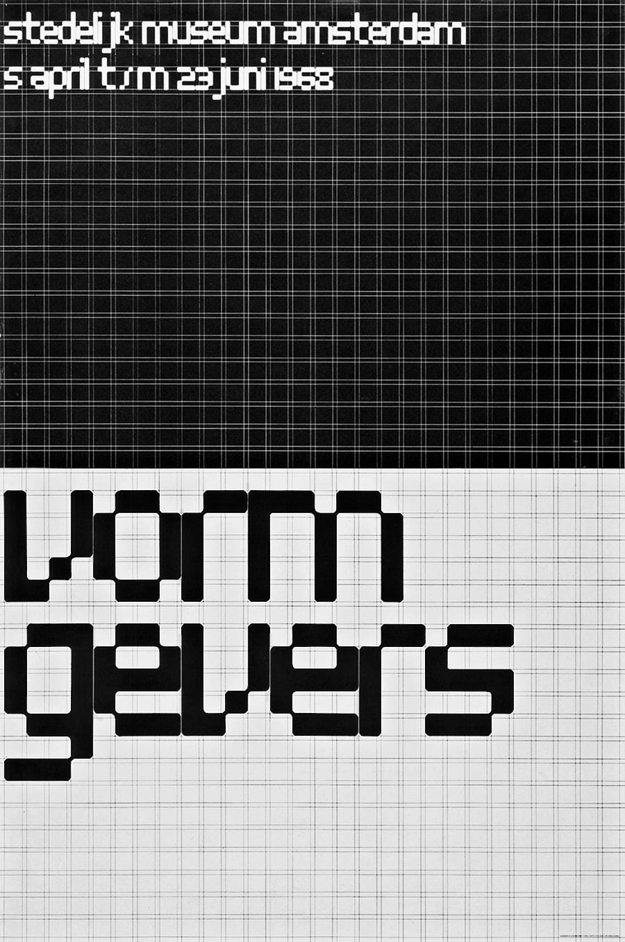
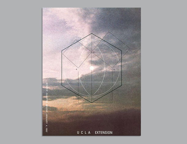
Wim Crouwel
Wim Crouwel is a graphic designer who has been highly influential in the design world and one of the founders of total design. He is well-known for his systematic approach to design using grids in his layout. He has been influenced by functionalism. This is the idea that the function of a design should be prioritised over the visual aesthetics. “It’s an absolute necessity to have good graphic design at one’s disposal”.

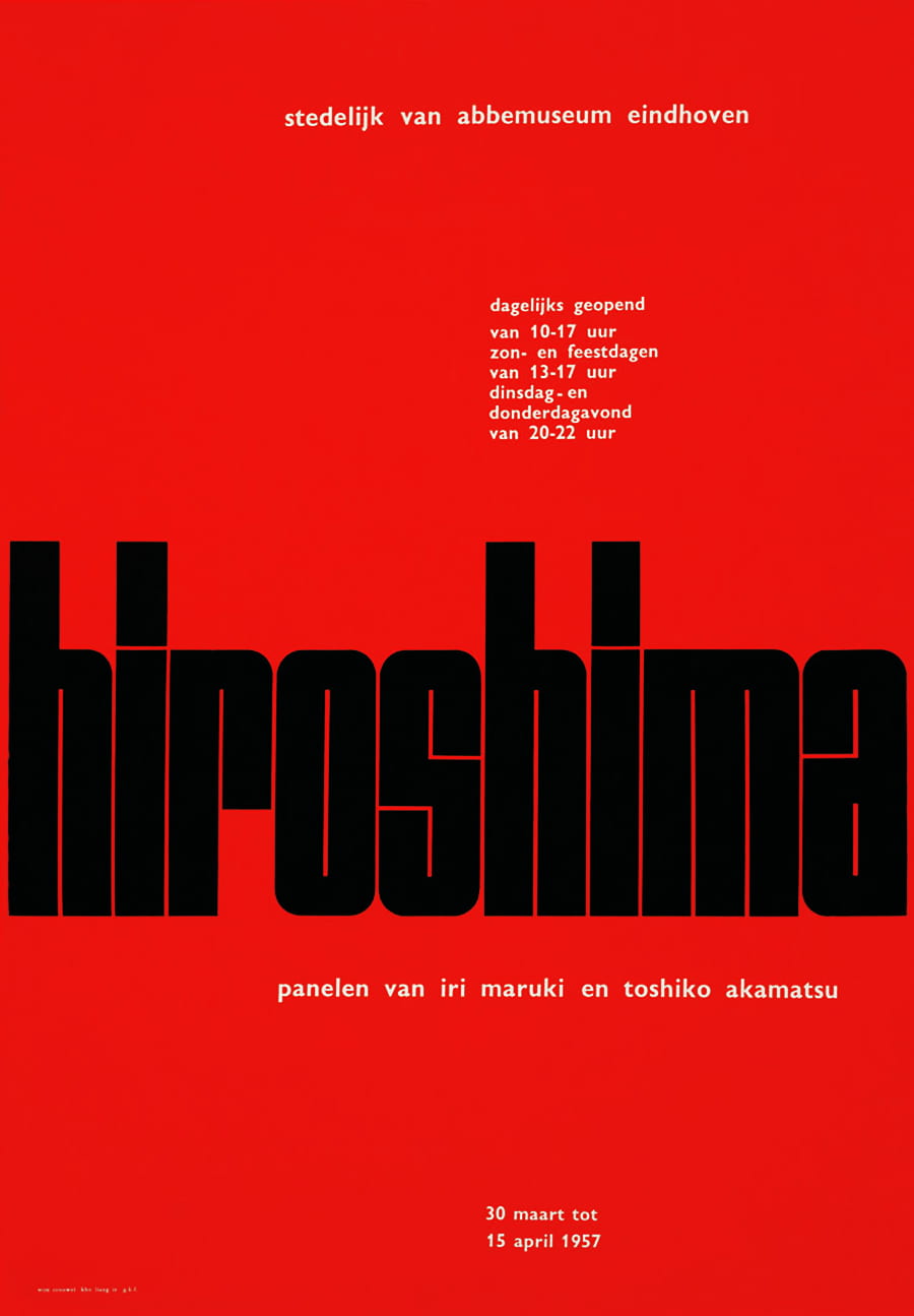
I particularly like this piece as the grid he used is visible. This makes it easier to understand his thinking behind it and why he placed things the way he did. I like how simple his posters are and the use of negative space. I also like how the letters in this one blend into one another. When designing my monogram, I will take this grid system into consideration, so it is laid out appropriately.
Armin Hofmann
Hofmann is a graphic designer who was a huge influence in developing the Swiss style. He wrote the book ‘Graphic design manual’ outlining the principles of design he used. He designed a variety of things including, graphics, logos, typography, posters, and symbols. In fact, his poster work has been displayed in many galleries across the world including, the New York Museum of modern art. I like his work as it is minimalistic and based on point, line, and plane.
I also looked at some of the logos he made. I think they are simple but very effective. Their simplicity makes them more versatile, meaning they could be recognised when reduced in size. I like that they are in black and white, the focus is on their form rather than being distracted by colours.
![]()
Mood boards
This is a mood board I created showing letterforms found in everyday life. Creating this made me look at the world in a different way and encouraged me to become inspired by different things.
This board was created on Pinterest and includes a mix of my own photographs and images I found online. I will be adding to this board as I progress:
https://www.pinterest.co.uk/lgilmore401/finding-letterforms/

This is a mood board for monograms that have inspired me. I particularly like the simple ones with a thin delicate font and others that make use of negative space.
https://www.pinterest.co.uk/lgilmore401/monograms/
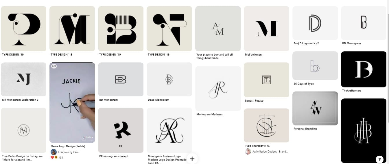
The more abstract ones do inspire me to try something that is out of my comfort zone. When I begin my sketches for my own monogram, I will try out many different styles.
“How Geometry Influences Logo Design” – Article
This article talks about how “basic shapes compose the fundamental geometry of the universe”. I thought it would be beneficial to read this and write my thoughts. These are the “5 universal shapes” that have been used through time which are found in nature.
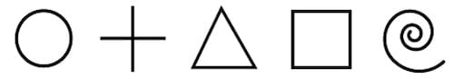
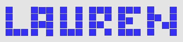
These are the building blocks of everything so we can use these shapes to create effective logos/monograms. In class, we did a task writing our name using a basic shape. I chose a square which created this pixel-like effect. This task reinforces what this article says and shows that you can create something using something so simple like a square. We can use these shapes to develop something more complex.
These shapes can mean different things when it comes to making a logo. For example, a circle can represent a global organisation, or 2 circles could represent a connection or relationship. Another example is that triangles can represent aspiration as it is like an arrow pointing somewhere. This showed me how important it is to think about these things as a logo/monogram conveys a message of what the brand is. I think this is also significant when it comes to the tone of voice of a brand as a logo should match this.
What I need to think about when creating my monogram:
- Simplicity
- Attention value
- Application/scale- does it work when reduced in size?
- Competition- does it stand out against others?
- Tone of voice- does it match my brands tone of voice? This is important for consistency.
- Timelessness- don’t just follow a trend because these change all the time.
- Form- does it work without colour? Should parts of the letter be removed? Use of negative space, uppercase/lowercase, use of a grid.
- How might it animate?
I will refer to this list when creating and choosing my final monogram.