What is a Manifesto?
I’m going to be honest, before starting this project I didn’t really know exactly what a manifesto was. After reading the project brief and researching online though, I’ve come to understand that it’s a bold declaration to the world of your core beliefs and the way you intend to live your life. It also should be a something that motivates and inspires you whenever you see it. Most importantly, it has to be something meaningful to you first and foremost.
Coming up with my Manifesto.
Starting out I had to do a bit of research online so that I had an idea of what a Manifesto should look like. I first went and had a look at the manifestos of the Surrealists, Dadaists and De Stijl as they were the examples given on the brief so I thought they’d be a good point to start at. As I looked through them I noticed that they were all quite long . This lead me to the discovery that Manifestos can be as long as you want them to be. They can vary from just a single line, to a paragraph, to a page, to a whole book like ‘The Communist Manifesto’. This was a great discovery for me because keeping things short and sweet isn’t exactly my forte. Although I wasn’t planning on writing a two page essay or anything, at least I knew that having a couple sentences wouldn’t be overdoing it.
I knew from the start that I wanted my Manifesto to be based around stepping out of my comfort zone and trying new things, something I always aspire to do in life but sometimes need a little extra motivation. I for some reason started thinking about that one “You have to start romanticising your life. You have to start thinking of yourself as the main character.” audio on Tiktok.
Here is a link to what I’m talking about: https://www.tiktok.com/@ashlaward/video/6831269918864870661?lang=en.
That inspired me to come up with my initial manifesto idea:
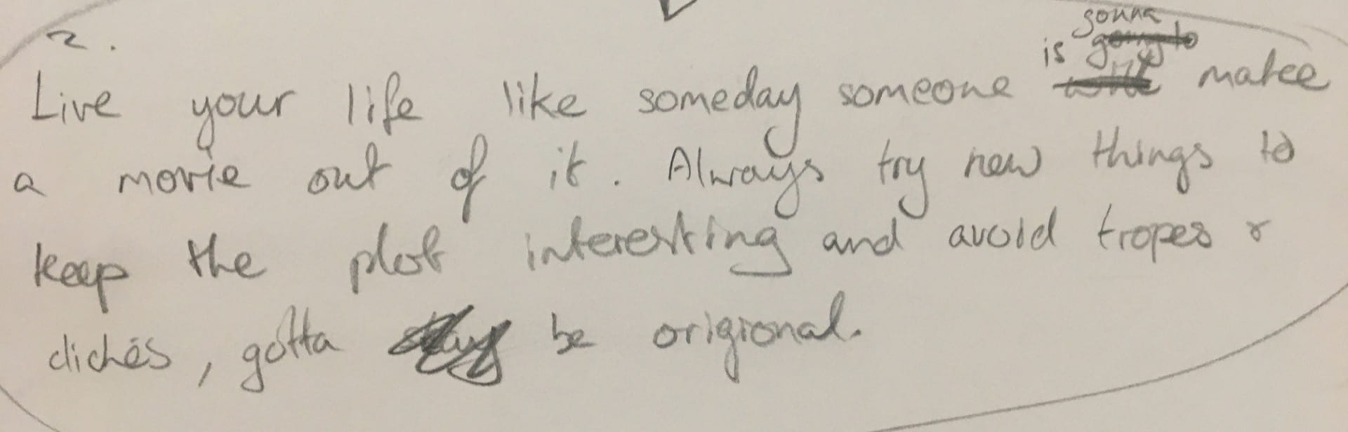
This felt a bit too long winded to me so I cut it down to be ‘Live your life like someone is going to make a movie out of it. Always try new things to keep the plot interesting.’
This is the perfect manifesto for me I think and it’s something I feel like I’ve subconsciously lived by since I was a little kid. As a child I watched a lot of rented movies from xtra vision and I think that’s what got me to start fantasising about being the main character of my own movie. To this day any time anything embarrassing happens to me or if there are any hardships I’ve had to face I always think to myself; “This would make great content for my coming of age movie” and oddly enough it helps me through. As well as that, I’m someone who always tries to push themselves to try new things. The way I see it, the more experiences you have in your life the more interesting it is and a great way to get those experiences is by trying something new. Your life has to be quite interesting if you want someone to romanticise it on the big screen after all.
Designing my Manifesto
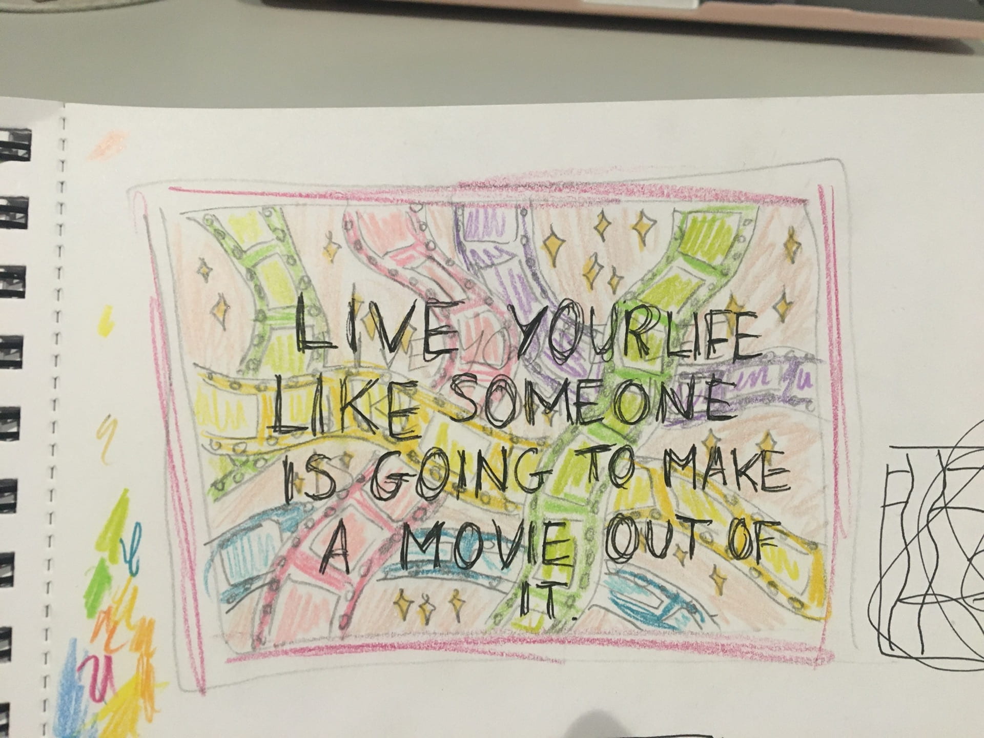
When it came figuring out the design, film tapes immediately sprung to mind. Each little frame is like a moment in your life. I knew that I definitely wanted it to be bright and colourful because I personally find bright colours really energetic and inspiring/motivating. It’s also the way I like to make my art normally so it wouldn’t be a good expression of me if I didn’t add at least a pop of colour. I thought it would be best to stick with pastels so that the text would stand out easier. My original idea was to have loads of colourful film tapes dangling around in the background and the text would sit on top in a dark grey (almost black but not quite) colour with a white border so it would stand out more. I also wanted to add sparkles in the background mostly because I love sparkly things but also because I feel like when you’re romanticising your life you are essentially chasing to put a pretty filter on every experience you have even the bad ones. Some might view this as a bad thing but I think it’s more that you’re choosing to see the positive in every situation like “this would make great content for the coming of age movie based on my life story”. Below you will see an extremely rough and messy sketch that I did of my in initial idea. You will notice that not all of the text is there and it is incredibly off centre, that is because I started writing the letters too big and couldn’t go back because I did it in pen. At least it’ll get my idea across I suppose.
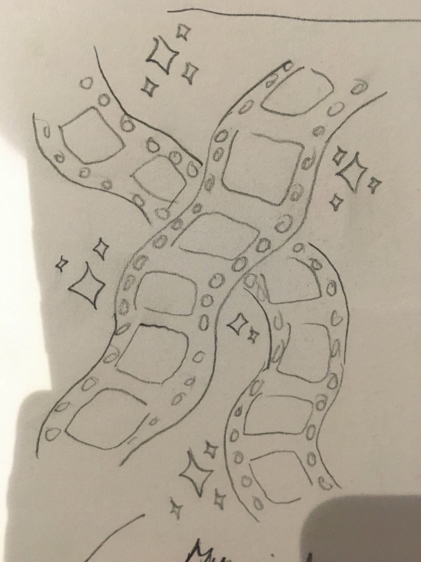
I’m so much more used to working on paper with traditional mediums and since my manifesto is about trying new things I decided to do it in photoshop, a software I wasn’t all that familiar with. Was it a risk? Definitely, but a risk I was willing to take none the less. I didn’t take my drawing tablet with me to Belfast so I had to meet up with my sister at a Costa where she let me use her iPad to get started on it. It was there that she told me that my design was too busy and I should keep it simpler. She suggested I just had one film tape and I took her advise on board. I then tried to decide what way I would position my film tape by doing some quick, simple sketches. In the image below, the wiggly things indicate the film tape and the scribbles indicate potential text placement. I ended up going with the idea of a film tape wiggling up from near the bottom left to near the top right, with the text curved around it having one sentence of text above and one below. I also intended to put sparkles in the background.

I went back home to Letterkenny half way through the week because I needed my drawing tablet to keep working on my design. When I was at Costa I decided to go with a peachy colour in the background and I drew some different coloured sparkles on a layer above it. When I got home I began working on the main event, the film tape. For whatever reason I decided to make it orange at first because not of the sparkles were orange. You can see an image of this orange film tape below.
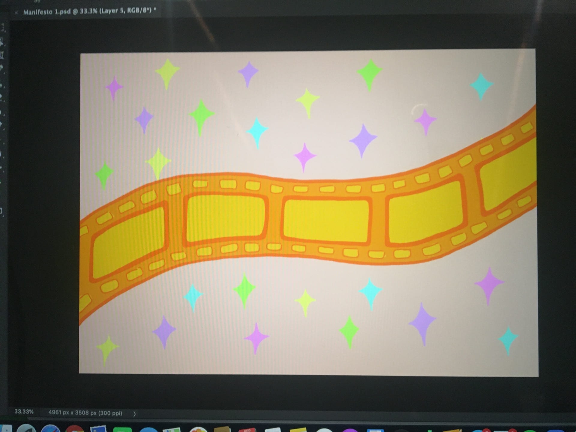
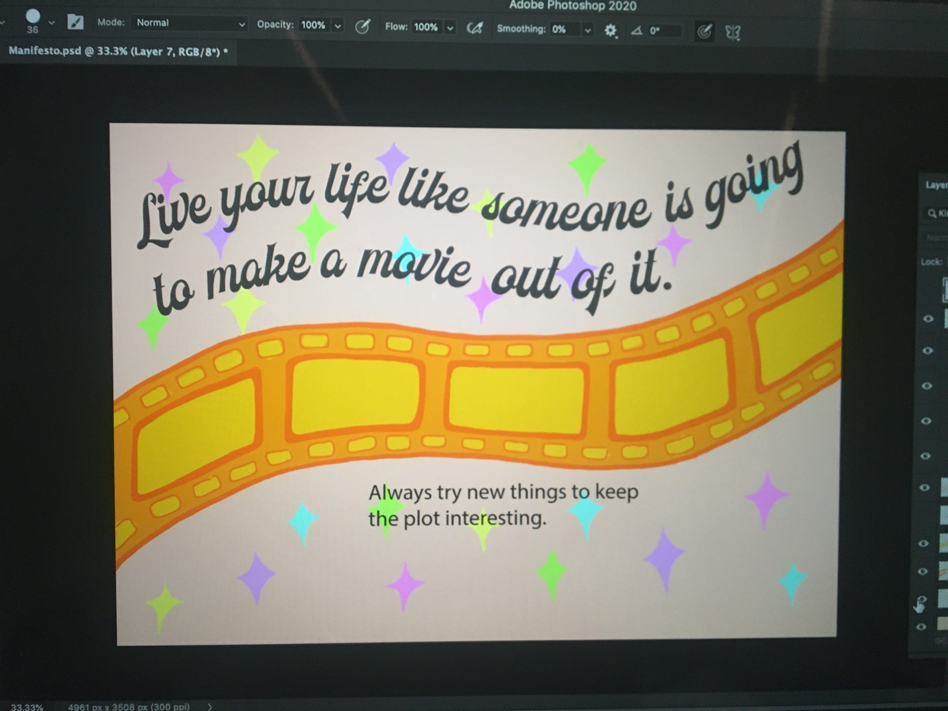
I also started arranging the text the way I wanted which took quite a while. Getting all the words to curve the right way was honestly the most tedious part of the whole project but I think it was worth the effort. I used a font called voltury. It was around this point that I realised I really didn’t like the orange film tape and couldn’t comprehend how I thought that was a good idea. I decided to to change the tape to grey tones to match the text and I thought look more cohesive in that way, but also so that it would look a lot more like a film tape. At this point I also realised that the sparkles didn’t work in the background positioned the way they were. I decided to bring that layer forward, shrink the sparkles and place them in the frames of the tape. This actually made a lot more sense and looked a lot better than having them in the background interfering with the visibility of the text. I added little white sparkles as well just to make the frames less dull looking.
Final Product

I’m quite happy with the final result. I think putting the sparkles where I did in the end was a good decision. For a first time using photoshop I don’t think I did too bad and I actually feel a lot more familiar and comfortable using the software. It’s good to try new things.
#101