A monogram is a logo that is created combing two letters. Monograms represent a person or a company’s brand. Using the brand’s tone of voice and values can determine how the monogram is made. This aspect of the brand creates a recognizable and memorable symbol for the brand’s customers. A monogram alongside a wordmark is an important way that a customer can recognize a brand. Important things in a monogram can include shapes and form, uppercase and lowercase, middle names etc. Many businesses use monograms to show the simplified version of the names. Some company names can be very long to have as a logo r wordmark. Monograms help them to have their first and last name combined into a simple and recognisable symbol.
A monogram must be….
Simple
A simple monogram will lead to a better understanding from the customers.
Recognisable
Monograms that use imagery creates a simple picture in the heads of their customers. It will help them to recognise every time they see the monogram.
Scalable
Monograms that are correct in size could be applied to many applications e.g., apps, websites.
Unique
A unique monogram will help with the customer’s memory and immediately recognise the brand. If all monograms are the same, then it will be harder for the customers to get a picture about the brand.
Connected to the brand tone of voice (brand)
If the monogram does not link to brand itself, then the customers see the brand as unreliable. The monogram must be linked to the tone of voice.
Interconnect
A monogram Is two letters that are Combined or interconnected. Interconnection is an effective design technique used mostly in monograms. The reason why it works well with a monogram is because of the pattern and imagery that can be made from it. The whole point of a monogram is to have two letters that make up one effective symbol. The interconnection process helps to make that happen. Interconnection can be applied to any part of the letter.
Grid structures and geometric shapes
Once a monogram has been designed from paper, the monogram can be positioned and cleaned up using grid structures. Using grids help understand how the monogram can be adjusted in size and layout. Grids can be seen as a base or a template for the monogram. It helps to refine or shape the monogram symbol.
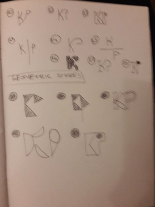
Geometric shapes are heavily used in monograms. The reason for it is because the shapes can be carved or sliced into the initials. We can use the three geometric shapes (Triangle, Ellipse/circle, and Rectangle) to create our own initials. Generally, designers have been using shapes to design monograms and have succeeded in doing so. Using geometric shapes have been influenced heavily upon the design industry due to its popularity and effectiveness.
As a task I have created my first name using geometric shapes:


For example:
Uppercase and Lowercase
Monograms can be made in many ways. They can be made from many characters such as uppercase, lowercase, numbers, or symbols. I will be experimenting with uppercase and lowercase characters. Although, uppercase and lowercase can be used, only a few are seen in Pinterest boards, google images etc. However, I will be using uppercase and lowercase letters to experiment when creating my monogram.
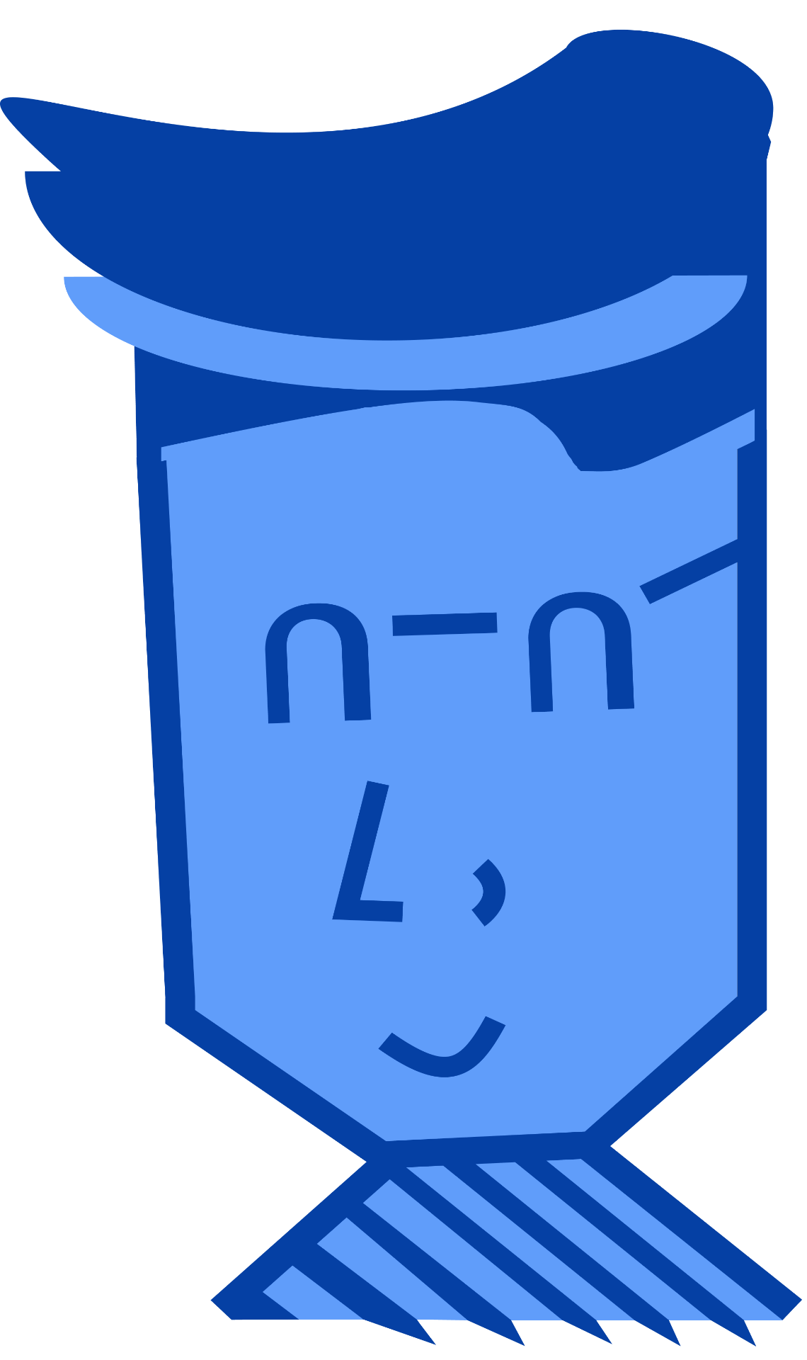
Famous monogram designs
Some famous monograms:
Emotions and imagery
Emotions are essentially the tone of voice. When we are mentioning the emotions in which the monogram produces to the customers, we are talking about the brand tone of voice and how they approach their customers. Do they have a friendly tone or a serious tone? Emotions can be read through visual aspects such as color, imagery etc. Having imagery in monograms refers to small image presented or simplified version of an image. For example, using a Ellipse and slicing half of it can be recognized as an image of a sunset. Imagery (as talked before) could be that one factor which will stick an image in the customer’s mindset.
My approach
I have decided to research some images relating to my monogram. I had used Pinterest to create my pins and provided links to view each of my images.
KP designs
I have looked at some monogram designs with my initials KP:
https://www.pinterest.co.uk/kewinphilip/monograms-with-letters-kp/
Colours
Since this is only the beginning stage of my monogram, Daniel recommended for use to use black and white colours to present our first draft of the monogram.
Directions
My First draft of the brand bio consists of the word “Directions”. I have decided to dip deep into the word directions. There could be a possibility that it will be useful when making my monogram.
I have looked at some images which represent directions:
https://www.pinterest.co.uk/kewinphilip/monograms-directions/
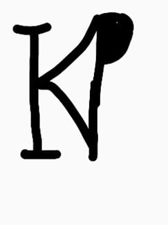
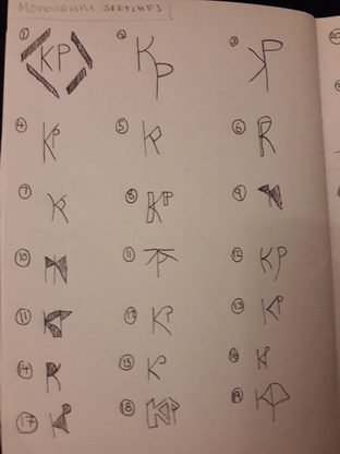
Sketches:
Alongside using letters, I had also experimented with geometric shapes
Final monogram piece:

Short review about monograms:
The research part of monograms was interesting because I have never come across this aspect of branding before. I have learnt how to sketch better and numbering each design. It was a helpful and fun experience for me, and I hope to learn more.
Leave a Reply