
When it comes to any form of media colour is important. From branding and identity to emotions and striking visuals, colour is something that is used to hold the audience’s attention and make a lasting impact.
There are many types of colour theory used to guide all forms of artists on how colours interact and grab the viewer’s attention. In class, we explored the main four principles.
Monochromatic, Analogous, Triadic, and Complementary.
- Monochromatic is the use of singular shades in one hue, commonly associated with black and white.
- Analogous is where colours sit next to each other on the colour wheel.
- Triadic is where colours sit equally spaced on the colour wheel around 120 degrees apart.
- Complementary is when colours sit opposite each other on the colour wheel.
This, however, only scratches the surface of what colour theory means and can be accomplished in an artwork. Those explanations don’t pay homage to what truly can be realised when using colour theory as a whole.
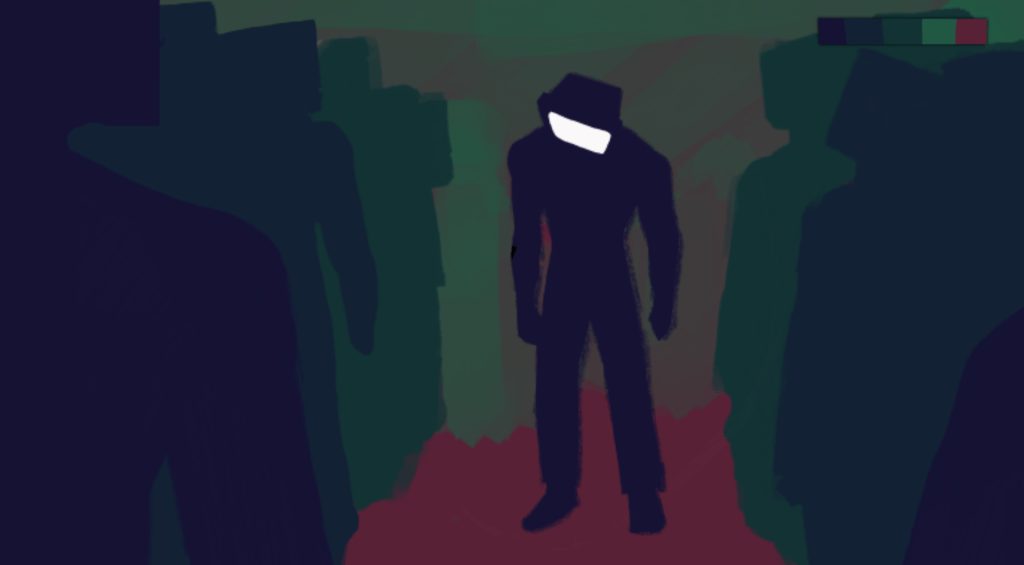
For the first task, we were tasked with adding colour to a thumbnail we had made previously. I chose to use one set of Triadic colours (Hex: #151234 Dark Tone, #122134 Mid Tone, #133234 Light Tone) and one pair of complementary ones (Hex: #215742 Green, #582136 Red) to create a colour palette.
For the next task we were asked to create colour scripts for a still image in a piece of media.
Colour scripting is where an artist creates a visual plan of how colour is going to interact and their relationship to each other.
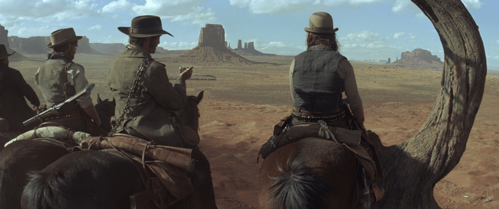
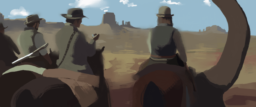
I chose to do a scene from ‘The Lone Ranger’. The colours in the image I referenced are very desaturated which plays into the vintage feel of a western themed movie. The clothing almost blending into the background could be taken as the rangers wanting to blend into the background, or on a deeper note, be at one with their world. The contrast in the scene also comes into play, as the low contrast between the light and shade as it also plays into the idea of unity and being one with the open plains.