EOYS:
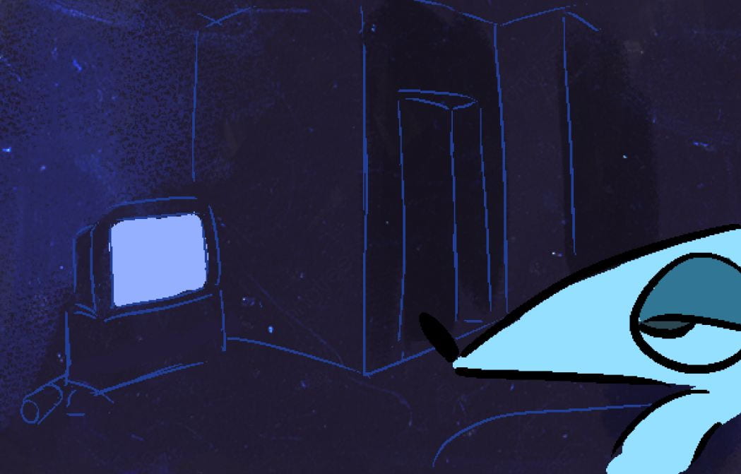
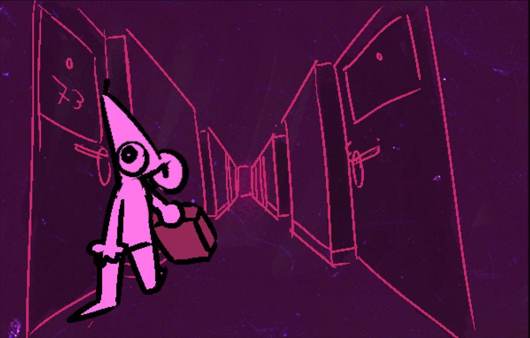
For this Digital display I wanted to do it in 2D because I feel like that’s my strong suit compared to 3D modeling.
I also made two other angles that are less detailed to further show the layout of the EOYS because you can’t look around at your own leisure.


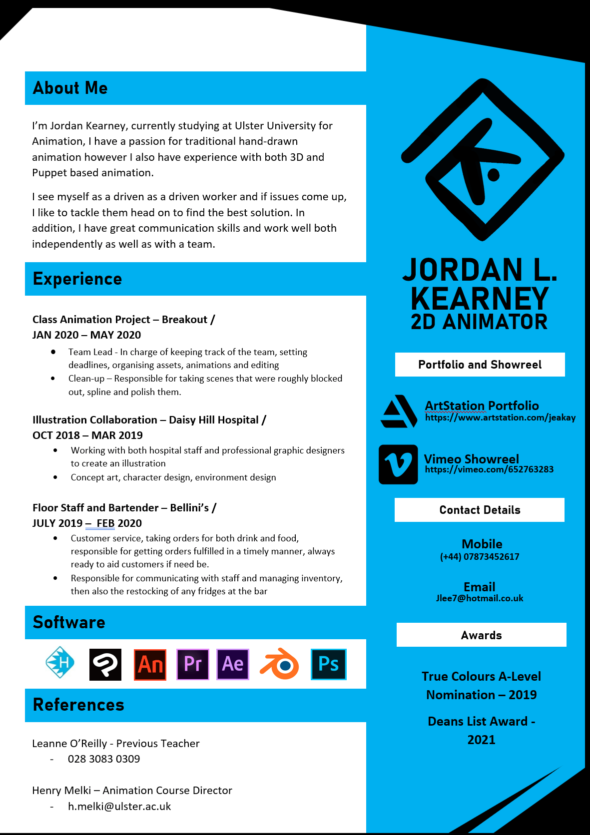
CV:
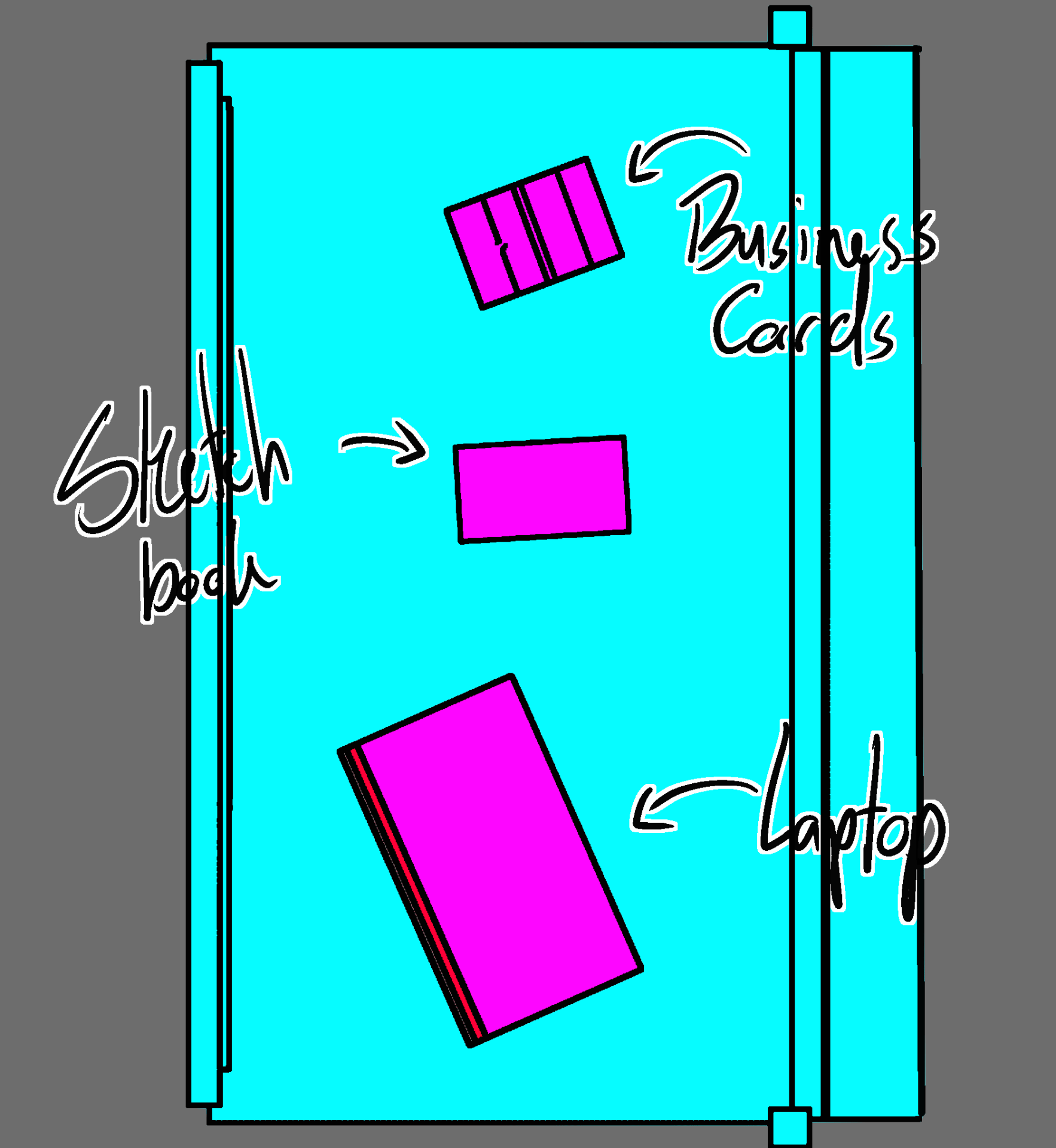
For my CV I wanted it to be bright and pop, in addition I wanted the main colour appearing to be blue as I’ve branded myself with blue under my logo and I wanted to keep it consistent.
Design Deck:
Showreel:
Business cards:
Here are the back and front of my business card. As for the design I wanted to make something that was somewhat clean and professional but also bright. I did this because people tend to just have a business card in their wallet and purse and just forget about it, but to try and negate that I wanted to make something that would standout and catch the persons attention anytime they see it.


Wall contents:
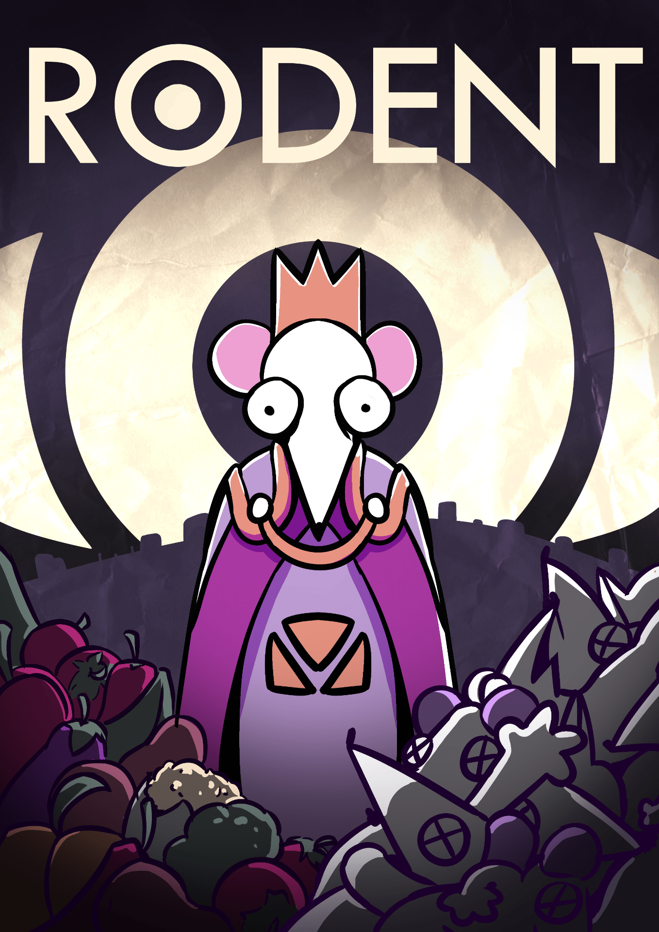
For the wall contents I wanted to display the poster along with some of the concept art of the animation to help draw peoples eyes and give them an gist of the kinda thing they’re going to see.
