Poster:
When designing my poster for my animation project the first thing I did was go out and research what other movie posters look like in order to help give me inspiration and ideas on what I might include in my poster and how I’d go about with the poster layout. I did research on a few movies I liked before eventually stumbling upon the posters for the recent Jordan Peele horror films. Movies like “Us.”, “Nope.” and “Get out.” all use stunning portraits in order to help convey the feel and vibe of a movie and so I wanted to try and capture that same sort of feeling for my own Poster.


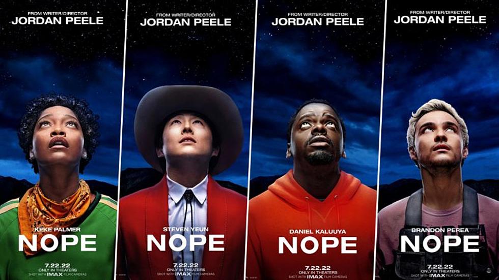
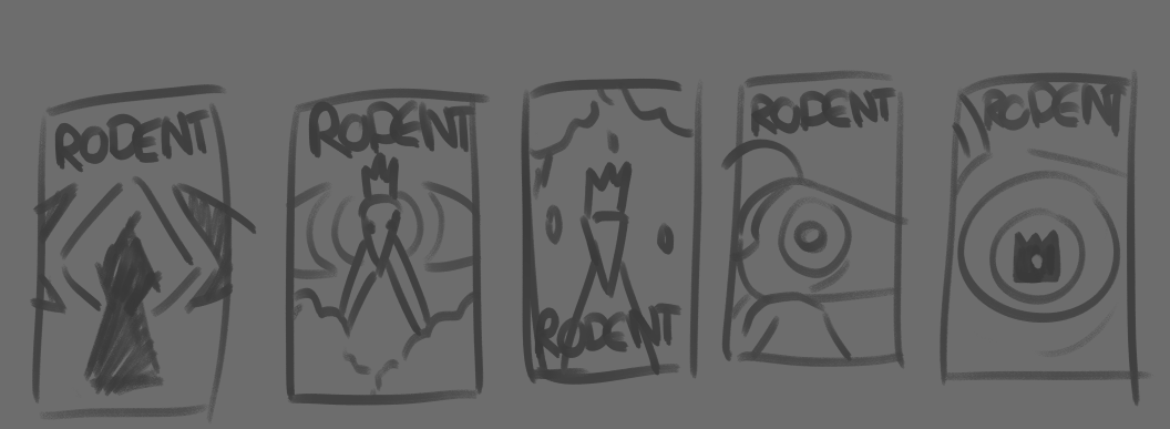
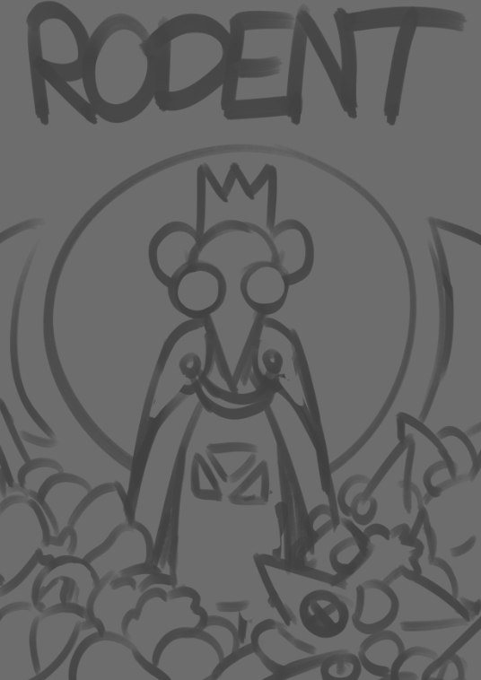
When starting off a did a few thumbnail sketches in order to help give me throw down a few ideas to pick and choose from and also to give me an idea of what composition might work best for me. I really wanted the head of one of the rats to be the focus in the poster with some sort of eye element in it to foreshadow the eye god that promises the Rat King food in exchange for a sacrifice. And so a couple of the first thumbnails were close-ups of a Rat’s eye, but that didn’t really seem to explain the movie very well to the audience so I went back to Jordan Peele’s posters to get inspiration, there’s where I saw the posters for Nope, many of them had characters in the movie just looking up with some sort of confused / curious look on their face, from there you could immediately feel the vibe nope gives off and so I used that element for myself too. In my next thumbnails I had a sketch of the Rat king looking the camera and to incorporate the eye element I added the Eye God in the background, taking up a huge space in the background with it’s pupil being right where the Rat King’s head is. Next up I added in some piles into the next thumbnails, these were supposed to depict piles of vegetables and a pile of dead rat bodies, which again harkened back to the plot of the rat population starving yet the king still hordes his own stockpile of food symbolising that his greed ment the constant death and upset of the people he’s supposed to rule.

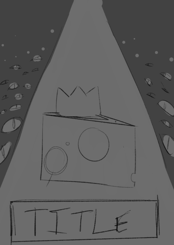
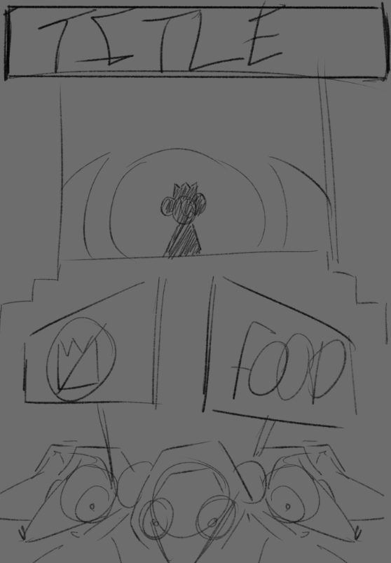

In the end I decided to pick the thumbnail with the piles at the bottom, I copied the thumbnail, enlarged it and used it as a guide to make a grid / silhouette to help make sure the piece guides the viewer’s eye’s to the main point of interest, that being the Rat King’s face.

Once that was done and I was happy I went and did a quick sketch of the poster added in the details of the King, pile of rat bodies and the pile of vegetable all blocked in along with setting the position of the Eye God into a decent position that I was happy with. Once that was done, next was lining, blocking in the colours and adding the background elements. The background was just a flat purple with a white ring around the head of the king, this had the unintentional but nonetheless positive added effect of having referencing old paintings of holy Christian figures, with many saints and profits being depicted with a halo surrounding the back of their head. With him being a messenger of a god it has another symbol that people would unconsciously latch onto when seeing the poster. Finally once all that was done I just the final details of adding shade with a multiply layer and a dark colour around the bottom and top edges of the poster, used to further draw the viewers eyes to the centre of the Poster and to the King’s face.

Business Card:
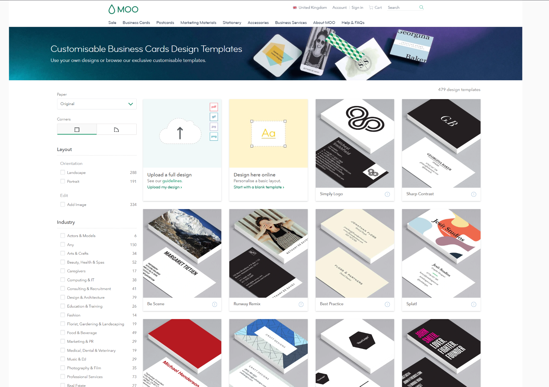
For my business card design process, I followed a similar procedure as my poster. I went online, looked at references of professional and appealing looking business cards and took inspiration from them. Moo.com was very useful, providing a huge variety of business cards to go inspiration from. I really liked many of the colourful cards with bold logo’s in center they had displayed, not only did I find them appealing but I also feel like they stand-out a lot more compared to many other average looking business cards. When thinking of my business card I briefly considered getting inspiration from my animation and putting something related to that in with my card, however after further consideration I felt that associating my brand with a grim tale like that constantly wasn’t the best idea.
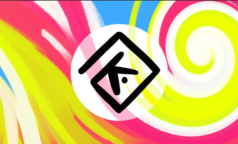
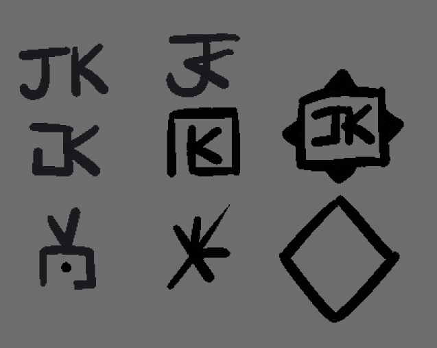
I made a few quick thumbnails in order to see what kind of theme I felt like going for, in the end settling for a swirl design that I sketched up, if anything where to catch someone’s eye it would that, not only that but I wanted to help portray me and my personality with this so having something bright and colourful seemed like the best way to go in this suituation. To start off I just put down some CMY colours, making sure they all contrast effectively while using the Gouache brush from clip studio paint and slapped a few twirl effects on top of it, along with other settings changes in order to the get effect I wanted. Next I quickly made a new logo for my brand in order to place into the centre of my business card however once I did, I noticed that the logo didn’t stand out too well, and so I put a white ellipse behind it with the opacity turned down a little so it popped more. Still even when that was done it felt empty to me, getting more inspiration from Moo I ended up putting some black bars on the sides of the card and around the my logo in order to break the vertical symmetry a bit.
Business Card Draft Design:

Final Business Card Draft:

LOGO:
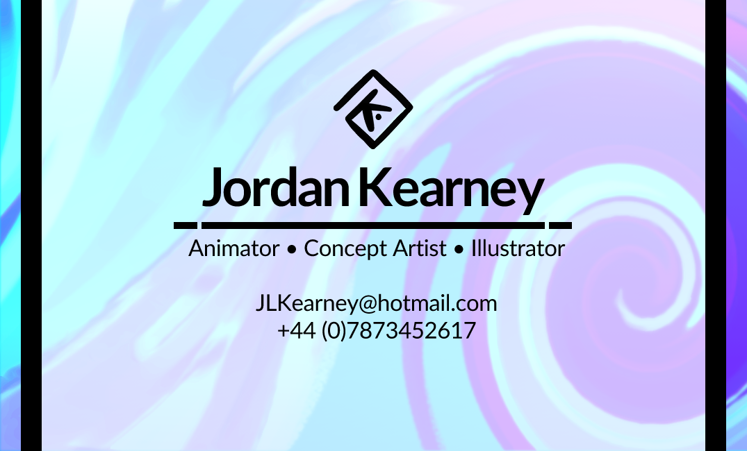
I worked next on the back side of the card where I’d put all my personal details next. For my font I wanted something that wasn’t too formal, but still looked presentable and would be able to be read on a small card like a business card, and so in the end I decided to go with Lato. It’s crisp lines made it easy to read at almost any size, the text looked good when emboldened and gave off the kind of personality I was looking for too while still working well with the swirl theme. For contrast I put my name above the rest of my details, made the text size bigger and emboldened it so it stood out further, with that done I made an underscore with the line tool and put my remaining details there at a smaller size so it didn’t take up too much space.
EYOS Promo:
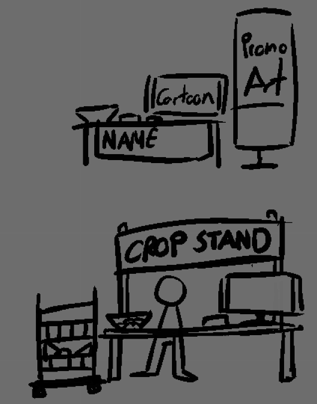
For my table I briefly considered not doing too much at all because I couldn’t think of a way to theme my table and just decided instead to sketch out a normal layout, a white table, a bowl with sweets for anyone who comes by to visit, an artbook, pitch deck, a monitor playing my animation with some promotion art on the side so it didn’t look bland.
However after some thought I did come up with another design that’s a bit more fun, I would turn my table into a broken down farm stall that the rats in my animation would use to sell their food if they were able to, on the side there would be a vegetable stand that may have some rat pushies in it for people to take along with the same things used in my previous idea, maybe with an extra monitor to show my design deck. In addition to this I plan on printing out business cards in order to hand out to protentional employers, hoping to sell myself further and have them contact me after the EYOS.
EYOS Promo changes:
After getting some feedback and due to an extension I moved my end of year showcase from a physical showcase to a digital one. This would mean that I would have to change my design a bit to accommodate for that. And so to do that I decided to make the design a bit grander looking, have the stand be in the actual world of Rodent.
While a lot of of EYOS displays are done in 3D I decided to make mine in 2D because that is my strong suit and I felt I would have been able to do a better job with that compared to anything else.

To do this I decided to try and place the showcase in front of some of the key areas of the animation. Those being the castle/temple, the farm in the beginning and finally the burning bodies found the centre of the village.
CV:
For my CV I mainly just took my pervious CV from last year’s professional practice classes and updated it to suit me today with my updated logo and accolades, such as being put on the Deans list.
Job Research:
When it comes to researching jobs in the animation field my interests haven’t changed much at all from last year or the year before, my main interests lies in 2D animation and Concept art so I’m aware having a technical art ability is very important, however some jobs do ask as one of their requirements to have experience in TV-Paint, and while I haven’t used TV paint before, I feel I can still apply and or just show interest in the position. In my CV I show I have experience using various different art applications and am proficient at using them showing off my adaptability and ability to learn a brand new art program.
Job Research changes:
On reflection I did not do nearly enough research into the methods some professionals use in order to promote themselves and their work. In this case I did research into a few different 2D animators, however when it came to having the best portfolio I wanted to look into Sean Cunningham, an animator and Illustrator from Ireland who co-founded Studio Meala.
Sean makes use of Tumblr as his main way to promote his sole work from my research. With the way Tumblr works you are able to customise it much like a website to suit your needs. In this case he used it to give the viewer his contact info on the side along with various hyperlinks in order to direct them to certain parts of his portfolio in addition to linking both his shop and socials.

When clicking on the art tab we’re showing with a list of options to pick from, I really like this approach as it allows for the viewer to look at what they want to look at, and I feel like incorporating that into how I display my work would be useful.
Design Deck:
When doing my Design Deck I wanted to split it up into three major parts, after adding my name, info and table of contents I broke the next few pages up into pre-production, production and post-production. Each one of these will allow for me to show off further work that either I won’t be able to show in the actual animation itself (such as storyboards and concept art) or things I believe were pretty strong pieces that should have some extra attention brought to them. Doing this project by myself I want to be able to show that I am able to work in mutable areas and still create a quality product at the very end, allowing for people to see my understanding of the animation pipeline and my technical ability.
Future Considerations:
In the future I want to develop my ideas on my EYOS promotion, I feel that I could do a lot more in order to help sell me and my work to a wider audience, perhaps setting up an account on social where I post updates on my work in order to get more eyes on my work.