Week 5 – Character design homework
For week five’s homework we were tasked with creating some new characters or develop further on some pre-established characters used within our worlds.
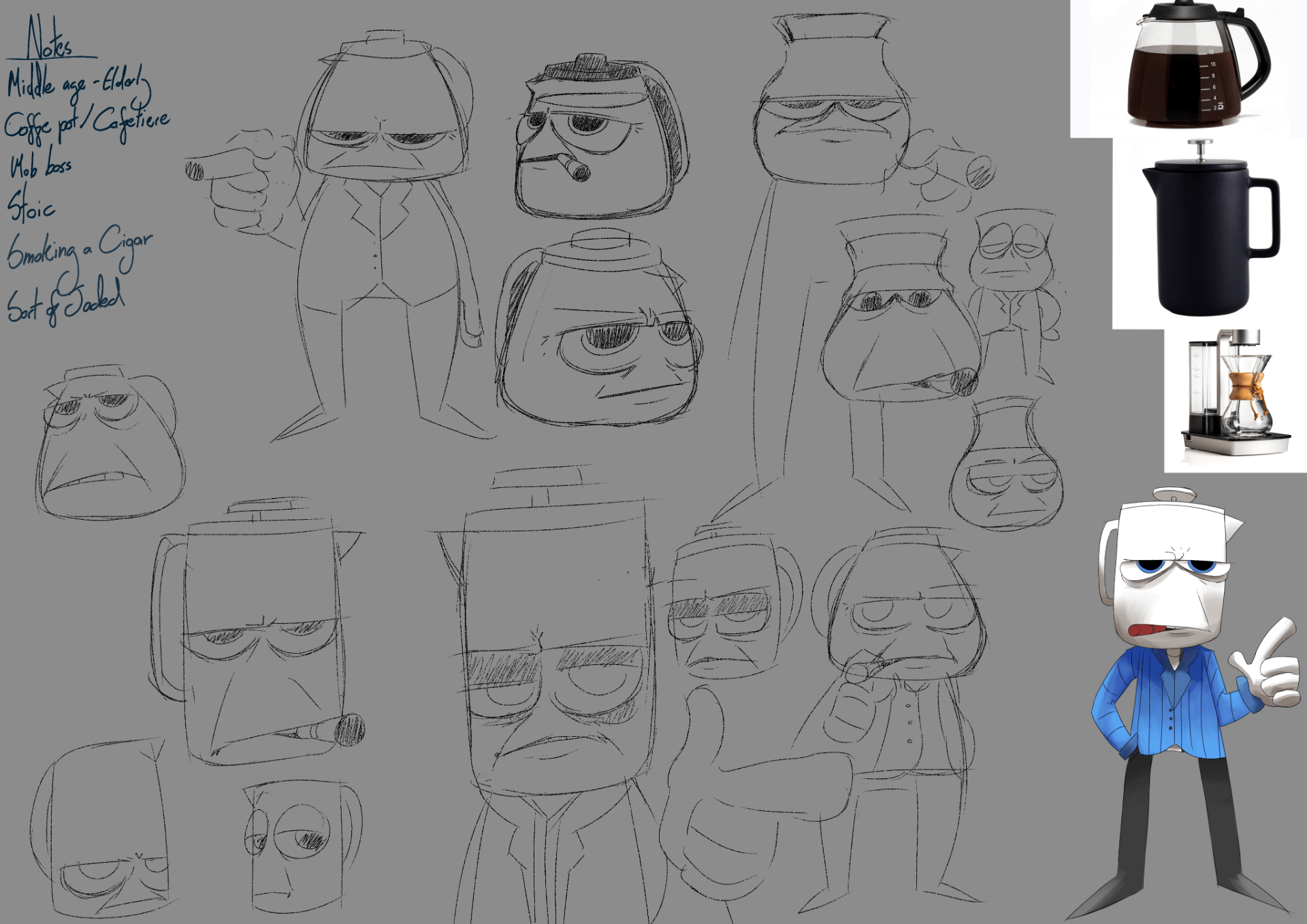
I was kept in group 1 for the fifth week meaning that I was working with the Nespresso Noir word, working on the mobster cups, pastries and brewing equipment that inhabit the world. For this assignment I wanted to work on both the main “protagonists” (The Chamomile) and “antagonists”(Joe / Big Joe) design’s. Although I did like some of my initial designs for them both I felt that they could be pushed a bit further to try and contrast their looks and have their designs fit more with their personalities.
Initial designs of the characters:
To start off I knew I was mostly happy with how their body types looked, having The Chamomile being short and Joe being a bit taller and so most of my focus went on exploring different types of cups and or cafetieres / coffee makers in addition to updating and their faces with a more consistent style in mind.
Joe:
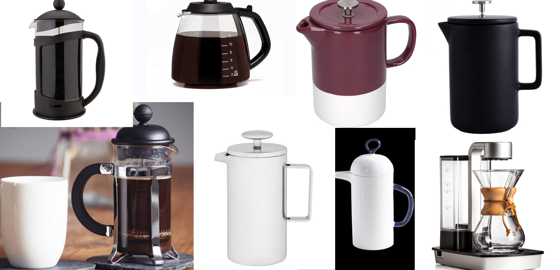
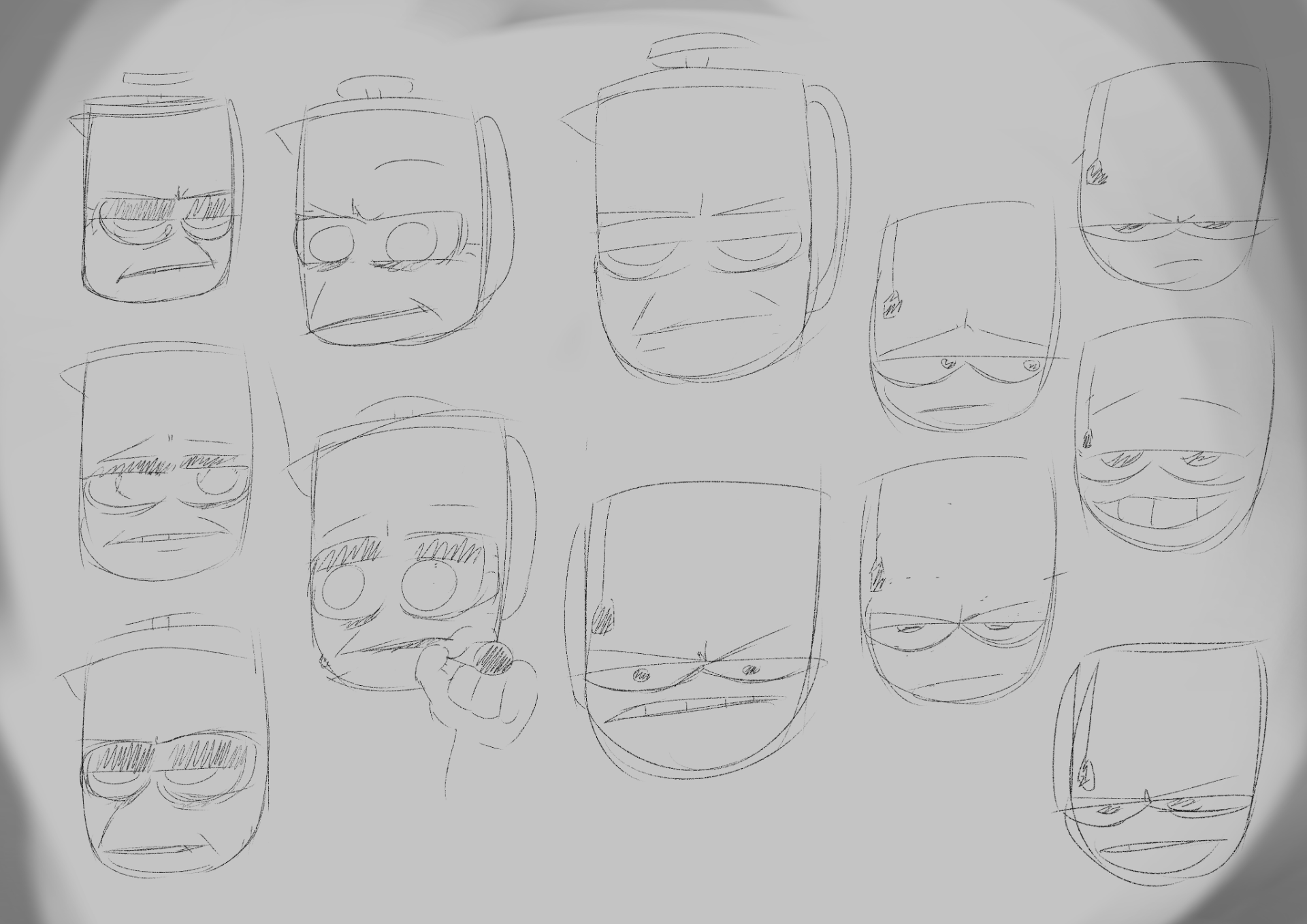
For Joe I knew I wanted him to be more middle-aged coming into his elderly years, having been in the industry he’s in for so long he developed a more stoic demeanour and acquired a more jaded view on the world. For his head design I looked at different types of coffee brewers and cafetieres. When starting off I considered to make Joe a larger character, adding some more weight with the coffee jug head, trying to experiment a bit the face placement on the head shape. However after sketching out the design based on a cafetiere I felt confident that I wanted him to be more slender and square, trying to avoid him looking more friendly with the rounder shapes in his body in addition to just finding the more square body and head being more appealing to look at.
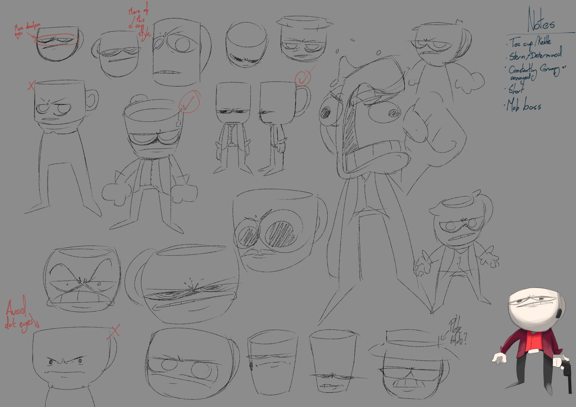
The Chamomile:
The Chamomile is a younger character holding a major grudge against the Bitter boys for some of the things they done to him, in addition to that he has a much more explosive personality compared to that of Joe, being prone to bursts of anger and being a fairly aggressive person despite being such a small character. For his head I wanted to make sure his a more simple looking cup for both animation purposes and to try and to keep him in line with with some of the initial design that we came up with for him. Although I wanted his head to be a simple cup there were a variety of different styles I took reference from when looking online, however I wanted in the end to settle with a rounder cup to compliment his short and cute stature.
Developing on the designs further:
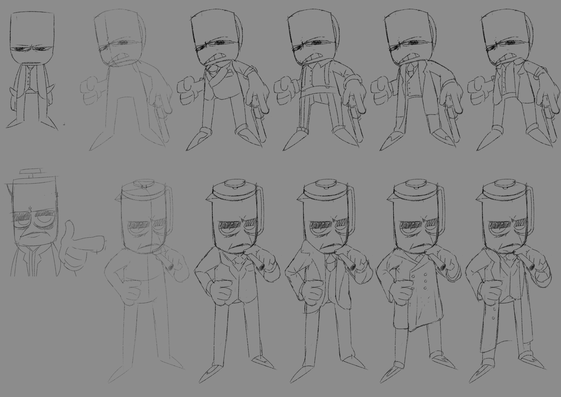
For this stage I wanted to explore their wardrobes, thinking of what these characters might wear based on their personalities. I looked a lot at 1950’s gangsters and mob bosses, seeing what their fashion may have looked like at the time and so I created a few different designs for both characters attempting to match their style with their personalities. In addition to this I also wanted to try making various different expressions after settling on the appearance of their heads.
Final outcome:
For The Chamomile I wanted his outfit to be much more rough in appearance so I gave him an open waistcoat along with a shirt that has it’s top button popped and his sleeves rolled up. I feel for him this outfit would be fitting due to his more unhinged and aggressive nature.
For Joe I focused a lot on looking at mob bosses, more specifically Al Capone and seeing what he would typically wear when out in public. And so for him I went with a classic suit and tie along with a trench coat to match, I also added an alternate look for Joe without the Trench coat on top.
As for the colour scheme I was inspired by movies such a Sin city where the film would be shot black and white with the exception of certain colours. And so to help distinguish between the characters I gave the coffee side blue shades of colour in their outfits and the Tea side the colour red. This also correlates with the characters personalities, with Joe being more a calm and level headed wearing blue, a more calming colour, and The Chamomile being more aggressive and unpredictable wearing red which is typically used to express danger or perhaps a threat.
I would also like to add that with in the theme of trying to contrast these characters I also took their clothing in consideration. You can see this with the style of their clothing, Joe wearing more proper clothing that all happen to be long in length, with the suit covering most of his body and the trench-coat draping down almost to his feet. Opposed to The Chamomile who’s clothing is more rugged and having his sleeves rolled up to his arms.

Mood Boards: