Exercise 1:
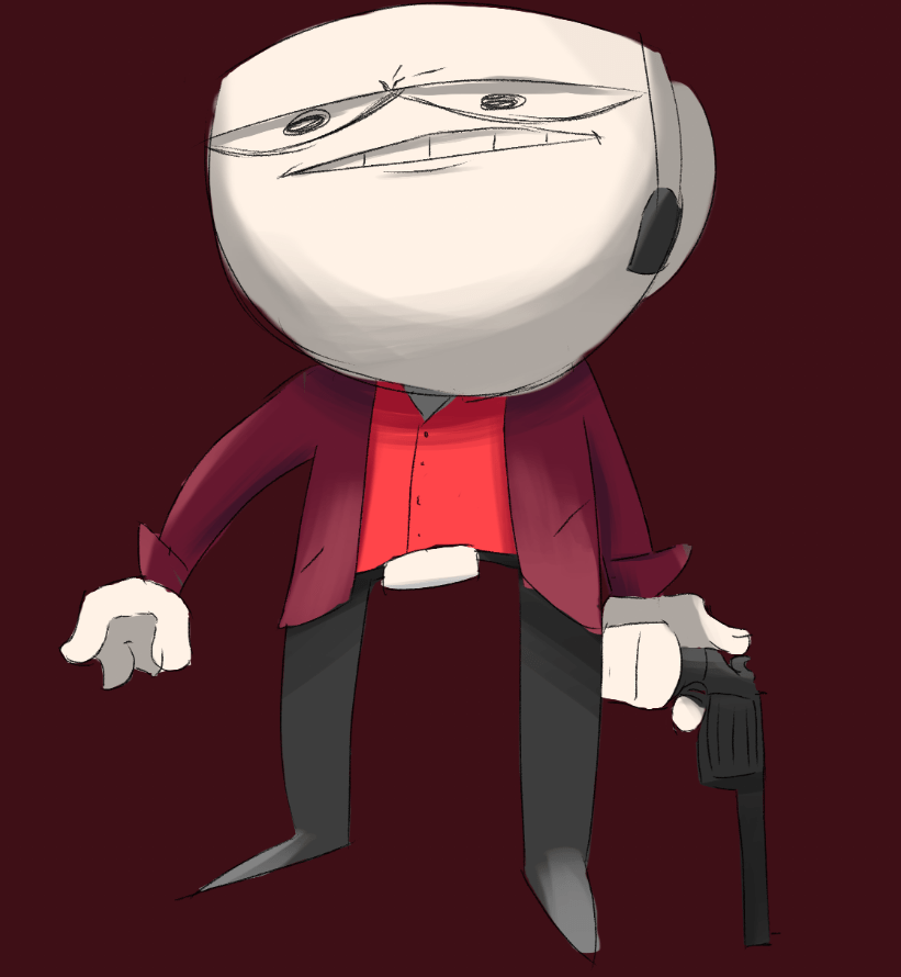
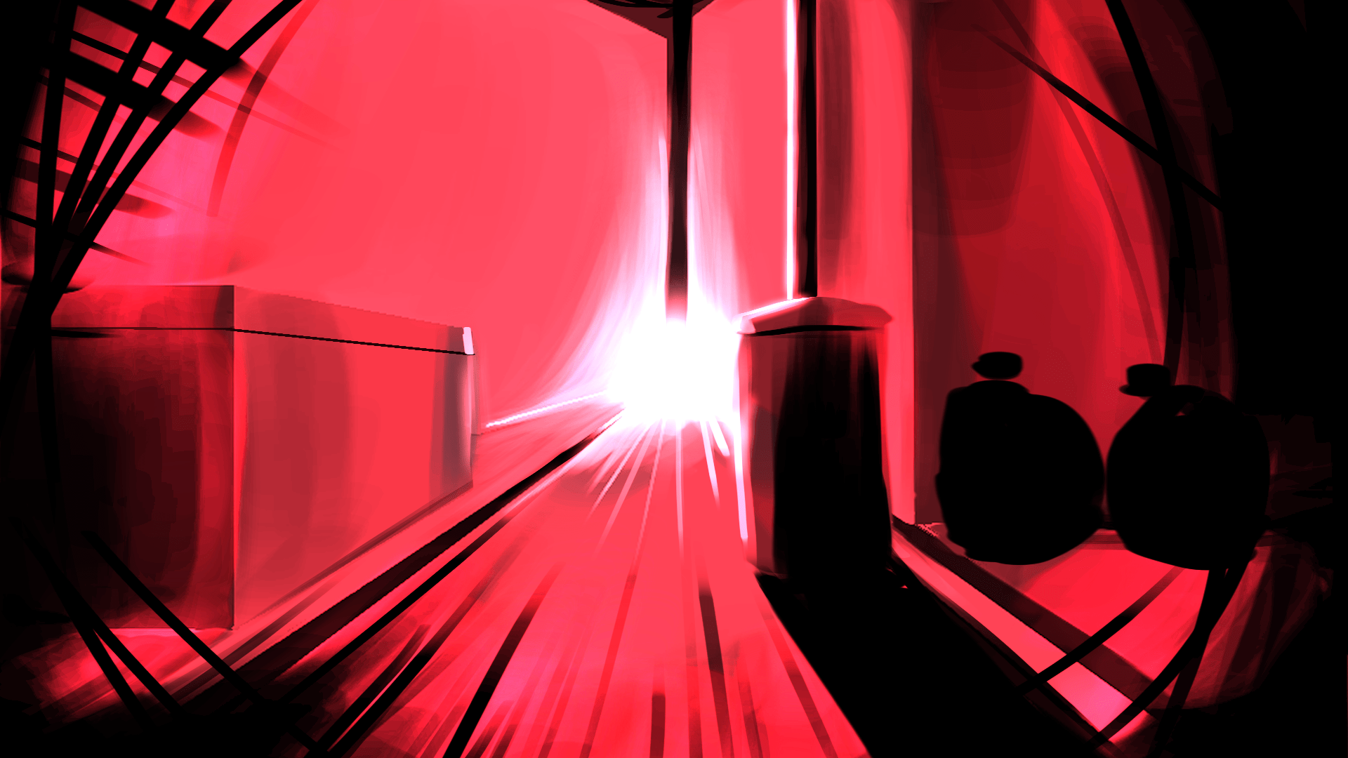
For the first exercise I was inspired by Ruiner’s colour pallet with their their use of mostly saturated red’s contrasted with the use of black. Although the game itself is based in the distant future I felt that the pallet could convey a sense of danger and I wanted to try to try and re-create that feeling with my piece.
For this piece I decided to use grey-scale painting by first using a black and white monochromatic painting, after that I applied a mostly-red colour layer on top, on the colour layer I also added in shades of magenta in darker areas to try and make a larger contrast between the light and dark area’s of the piece.

Experimentation:
These are simply just extra pieces I made experimenting with different blending modes with the colour layer in addition to adding darker areas around the edge of the pieces with some large black lines in a layer above the colour layer
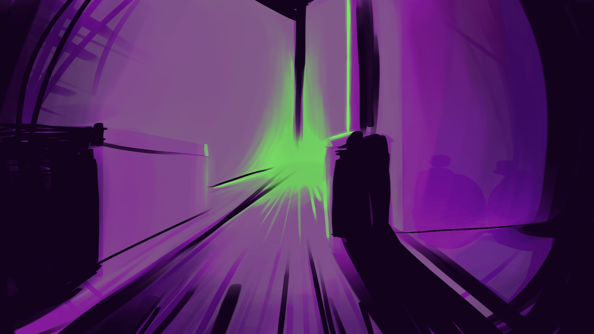
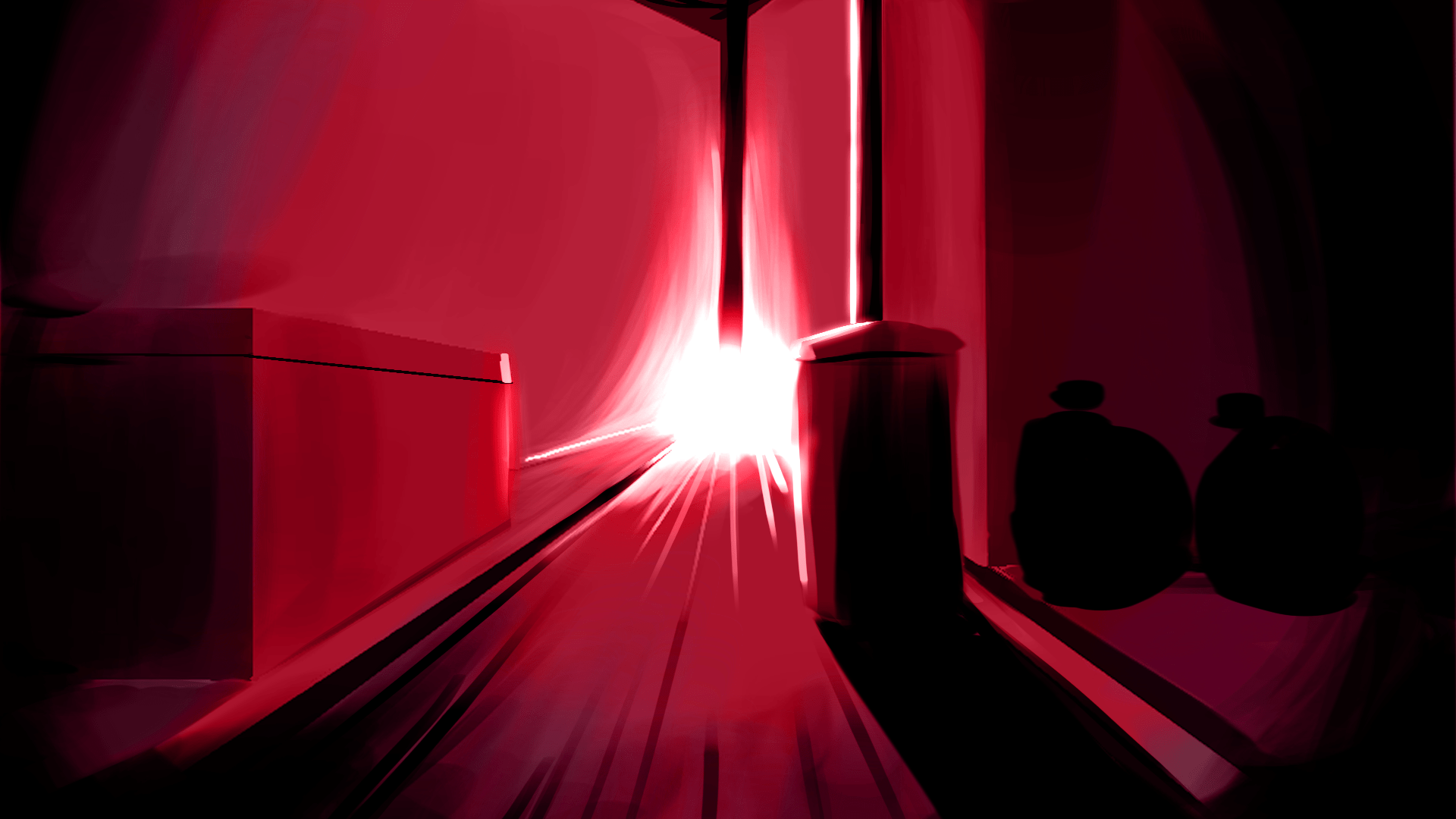
Exercise 2:
Light/
For my first piece on the colour and emotion exercise I wanted to try and create a warm and happy scene, to do this I used an analogous pallet consisting of mostly orange, yellows and slightly going into the greens, I used these colours specifically in order to try and promote a feeling of joy and warmth. What inspired me the most were images of sunrises where the sun fills the sky with a piercing orange glow and the surrounding area is nothing but a few a few shades of greens, yellows and oranges.

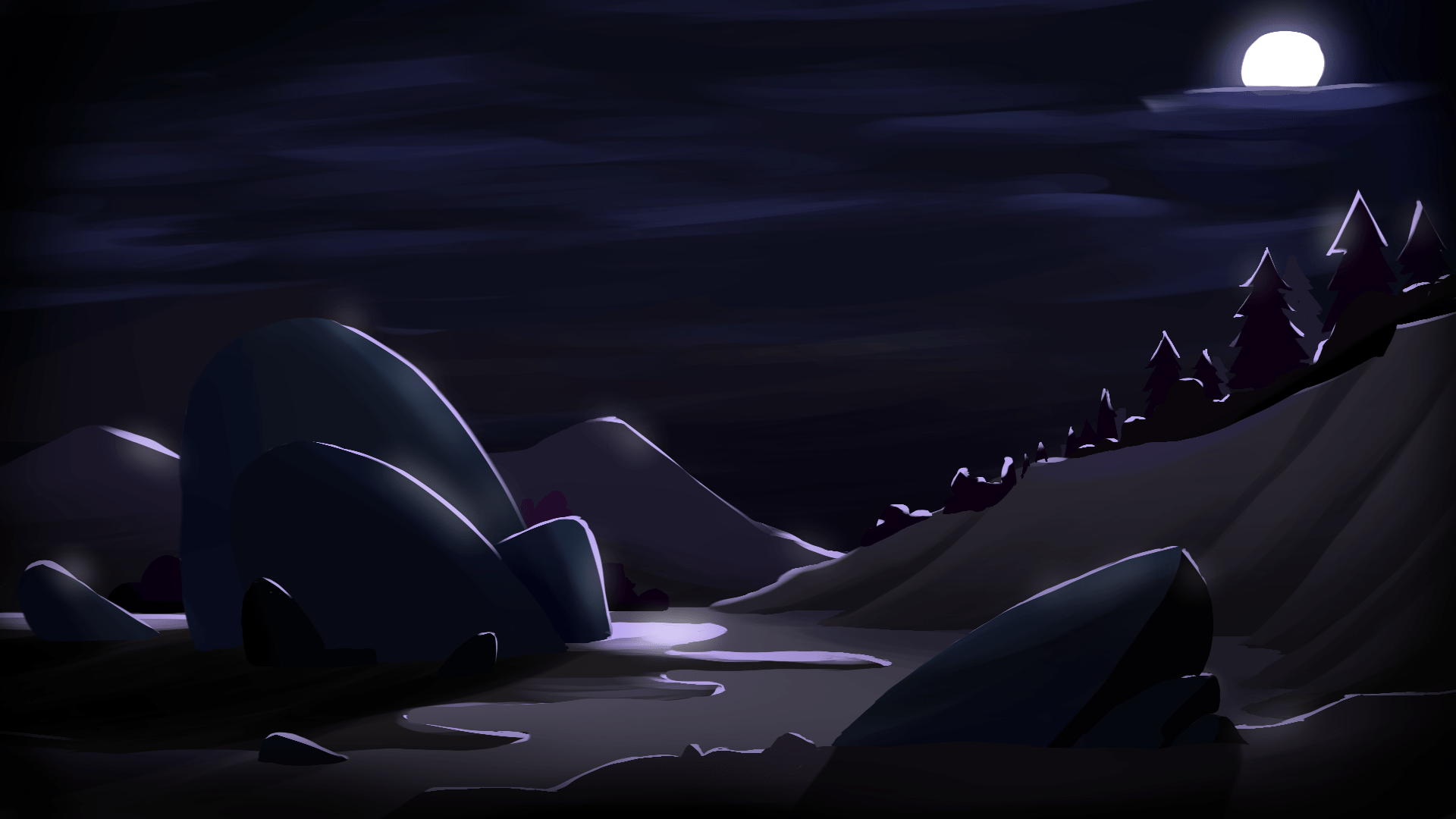
Dark/
For my second piece I wanted to do something completely different from the first piece I made, to do this I made sure to make it consist of mostly cold and dark colours with very little saturation. The scene was compromised mostly of purple and blue, trying to achieve a more eerie and ominous feeling. To give the scene a bit more contrast and to help the objects pop out and become more visible from one another I added a near white rim light to the scenery.


Colour Scripts:
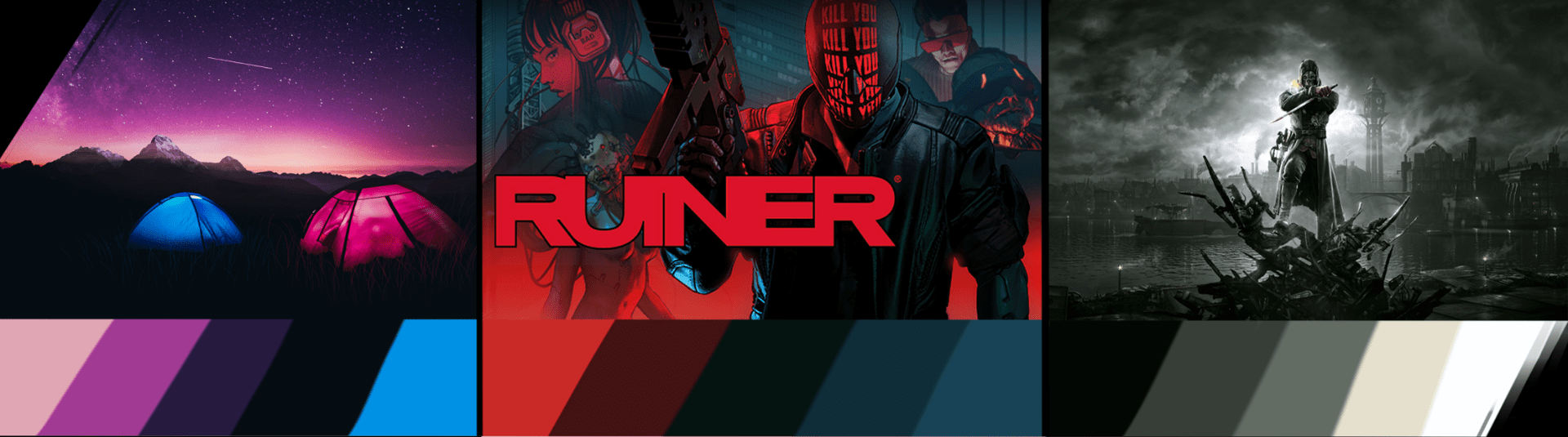
1st:
The first image of the two lit up tents against a a near jet black environment with a purple and pink sunset, this gives off a more mystical feeling with the pink and purple sky
2nd:
The second image of some official art from the game ruiner has a heavy use of a deep saturated red contrasted against more cooler shades of cyan and grey, this can convey a sense of a threat, danger or violence
3rd:
The third image is taken from the game dishonoured. The image uses a lot of very de-saturated colours which can suggest the place is very bleak environment
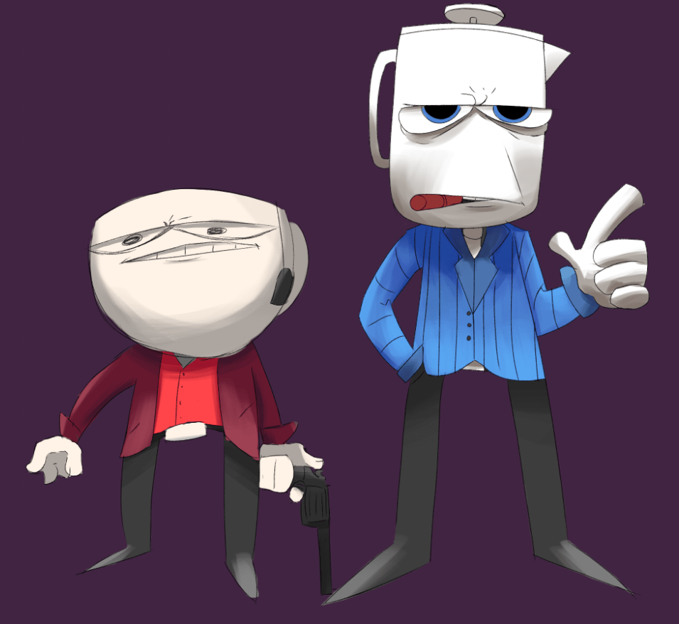
Coloured Character: