For week 4, we focused on the subject of colour. I worked on two colour exercises. These helped in understanding the use of colour and how the careful selection of certain colours can convey the mood and tone of a scene. For the first exercise, I chose one of my previous thumbnail studies of the noir prohibition world. Instead of it being in black and white, this time I would be able to add colour and set the tone, without the use of black and white. I chose to go with monochromatic tones consisting of mainly blues and navies. I chose these tones because they also work in setting a dark, mysterious and gritty tone for my noir thumbnail.
 I found this a little challenging because of the limitation of colours, and because I didn’t want one or two of the colours to clash and blend too much. I tried adding brighter shades beside darker to break up some of the props and make them more visible.
For the second exercise, I downloaded a template image and was tasked with doing two colour studies of it. I had the choice to use a group of colours to create a tone conveying of either; happy, fear, sad, hope wonder, whimsical etc. I chose to do my studies in a sad tone and a happy/ hope tone. For my sad colour study, chose dark blues, navy, purple, dark brown and made sure there was a dark and somber tone to the environment. The only light colour used in the study was from the mist which slowly crawls over the stretch of water.
 This is the sad colour study I finished. I tried to use dark, mysterious colours to set the mood. The rolling mist also adds to the mystery and I think it worked perfectly.
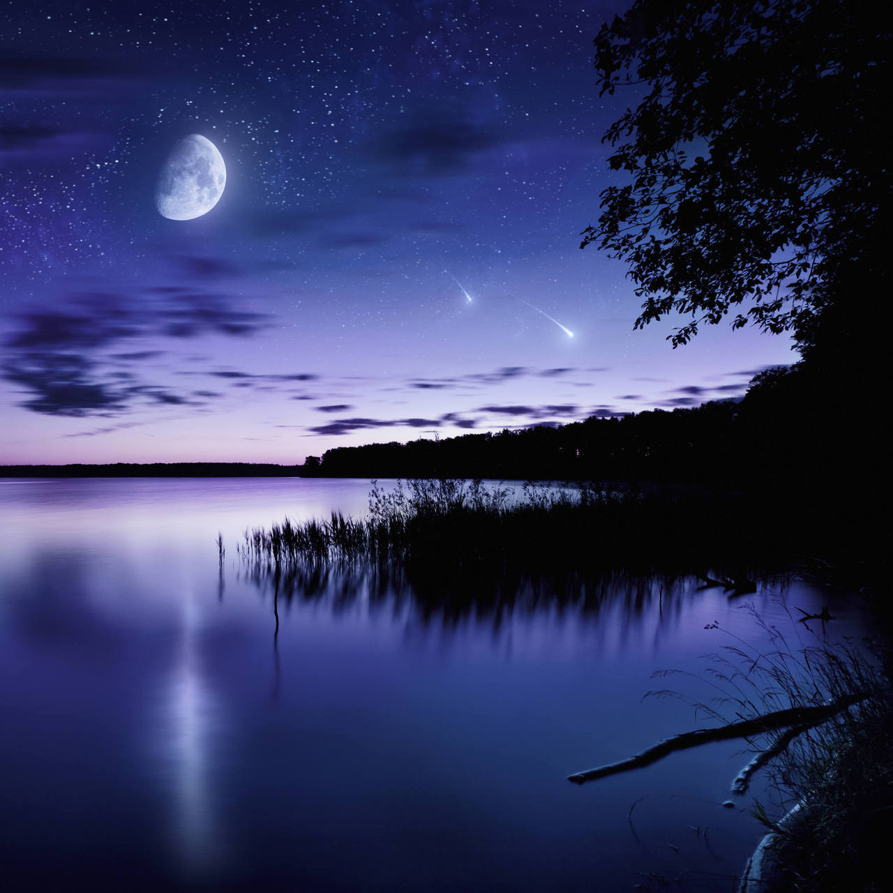
These are the reference pictures that helped me with my colour palette. I wanted to convey sadness so I chose images showing a night sky with dark navy’s and purples. I feel that these helped my images show and portray the sadness and depth in my scene.


Image References:
http://walls360.com/tranquil-lake-against-starry-sky-moon-and-falling-meteorites-russia/
https://hitachinakaten.com/photoshop-tutorial-how-to-make-beautiful-sunset-scenery-drawing-step-by-step-in-adobe-photoshop/
My second colour study was a more happy, hopeful tone. This time I used bright greens and yellows for the grass. I added more grass in the forefront to add to the hopeful tone, showing that nature was reclaiming the muddy area and making it greener. The water is bright blue and white and looks a lot cleaner, adding to the tranquility of the scene. The rocks are a light grey as they are illuminated by the sun, and the sky is full of shades of bright blues. The bright sky makes the mood of the scene feel really happy and cheerful.

Below is a reference image I used. It helped me especially when trying to find the right colours for the sky and the patch of water. I wanted a bright, happy sky, with calm, tranquil water below.
 Image Reference: https://uk.hotels.com/de1643123-ty3/cerca-de-campos-de-golf-hoteles-bar-harbor-y-alrededores-maine/?pos=HCOM_UK&locale=en_GB
As well as working on my own colour studies, I researched various stills from animated movies. These included brother bear, The Prince of Egypt and The Jungle Book. I chose a still image from each and dissected their colour palettes. From looking at the colours used in these scenes, I was able to explain why the colours were used and what their purpose was for. The shades of light, or dark colours were useful in portraying the tone or mood of each scene, which I was able to understand.


In the link below, you can see a more in depth analysis of each colour palette, and why I feel those particular colours were used and how they set the mood/tone of their intended scene.
