✨ Idea Generation & Game Ideas ✨
For our Vertical Slice project, my group began brainstorming what concepts as a game we all liked and what we wouldn’t like to make. As a whole, we all agreed upon something akin to an adventure game with story elements, and that we’d like to make it very stylised and low poly. I suggested something very colourful and perhaps fantasy inspired, which my group was in favour of. We settled on a low poly Celtic inspired game set in medieval Ireland.
During class, we all came to an agreement that we’d make the gameplay something similar to Wind Waker and other Legend of Zelda games. We began gathering references onto a Miro board to get a feel for how we wanted it to look, the gameplay students split off and began discussing what they wanted the gameplay and story to be, whilst the animation students all began gathering visual references onto a Miro board and deciding what direction we wanted to take for the design of the game.


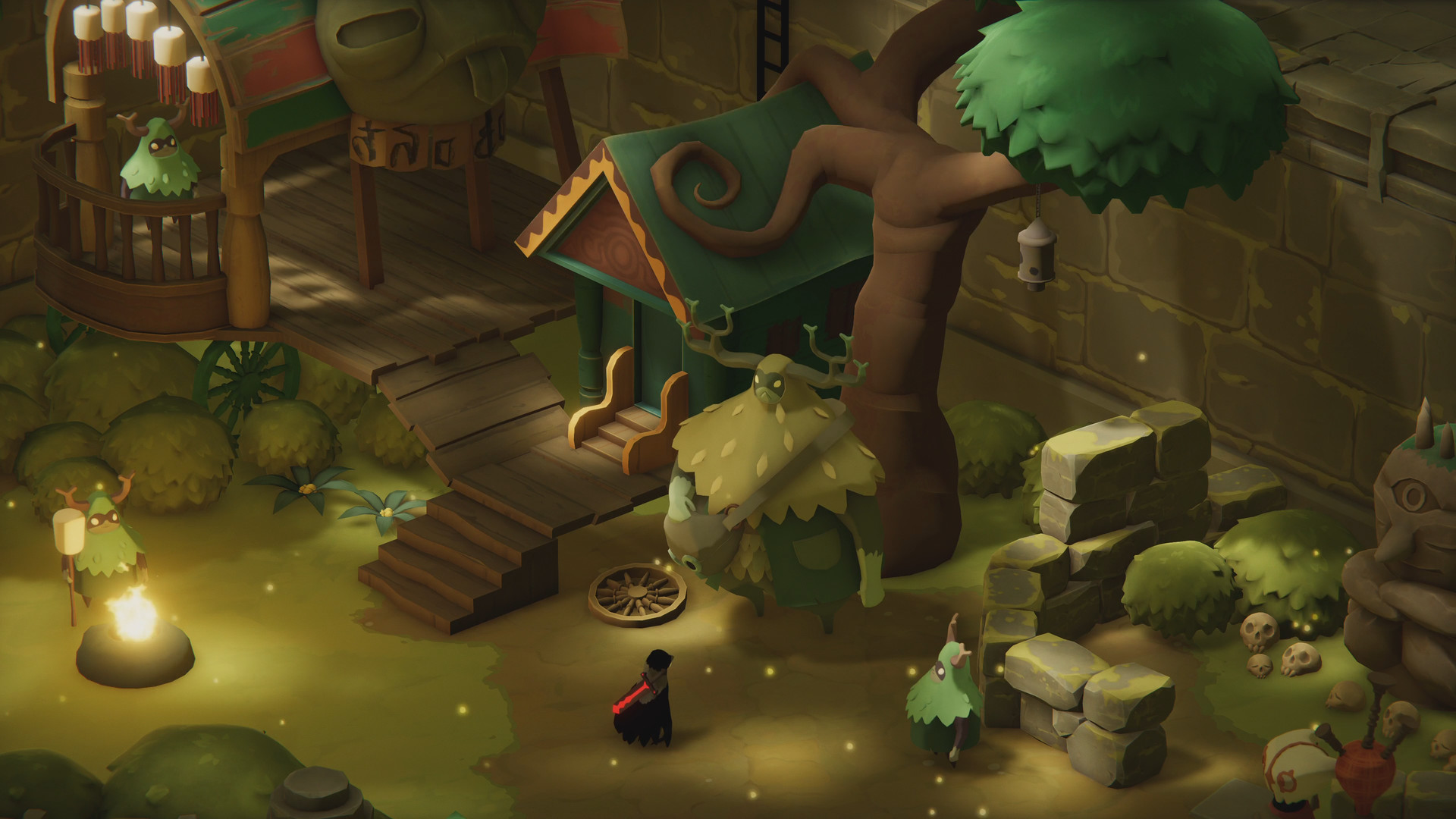
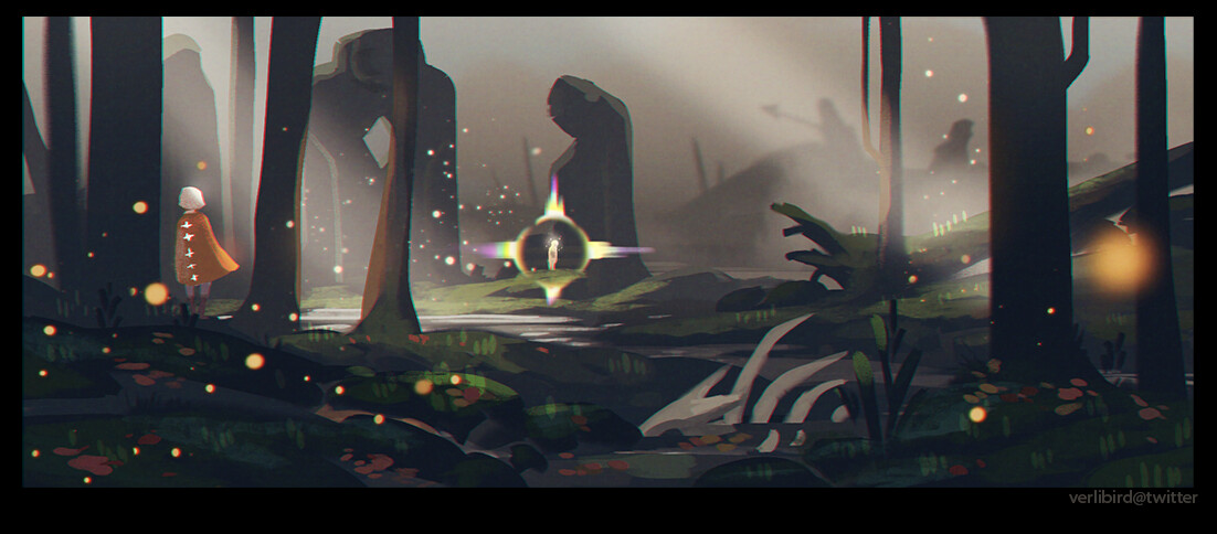
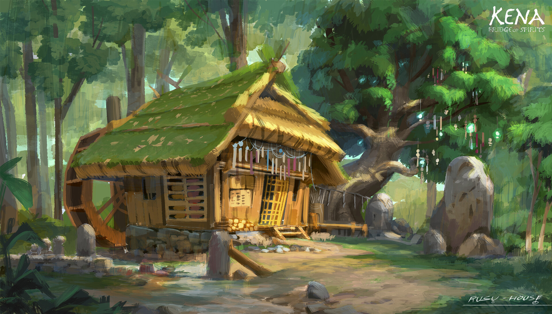
I suggested that we take inspiration from Death’s Door, The Banner Saga, Sky: Children of The Light and Kena: Bridge of Spirits, as I think all of these games have really gorgeous and earthy design elements and could adapt Celtic design elements really well.

⚝──⭒─⭑─⭒─⭑─ 💫 ─⭑─⭒─⭑─⭒──⚝
✨ Communication ✨
For communicating, our group set up a discord server where we could organise everything into channels, have meetings over voice calls and have a quick and easy place to catch up with everyone’s progress.


We also kept everyone’s work in one place with a shared Google Drive, Github and logged progress on an Excel sheet.


On week 8 we had our game playtested and we had participants fill out a feedback form so we could see what areas of the game needed attention, fixed or improved upon.

⚝──⭒─⭑─⭒─⭑─ 💫 ─⭑─⭒─⭑─⭒──⚝
✨ Week 1 Pipeline Run-through ✨
For week 1 we were tasked with making a small game demo so we could get used to working in our new groups. My team all decided that it’d be cool to make our demo themed to match our playable game idea, so we decided to make the bedroom of our main character. The gameplay involved interacting with objects in the room, E.G. the player picking up a hunting bow, looking in a chest, etc.
All of us took an aspect of the room to create, someone modelled a bed and someone modelled a door, I modelled the bow that the character would interact with.

I consulted my group for feedback on which shape they enjoyed the most, and bow 5 was their favourite. I took it into Maya to start modelling it, we were going for a low poly look so giving the bow an appealing shape while still keeping it really low poly and clunky looking was a real challenge, I’m very happy with the results, though.

This bow was kept and used within the main game as one of Ciarán’s weapons!
⚝──⭒─⭑─⭒─⭑─ 💫 ─⭑─⭒─⭑─⭒──⚝
✨ Style Guide ✨
We assigned everyone in the group a rough role for the project, these weren’t rigid and we could all help out in any area we wanted, but it was just to ensure all bases were covered moving forward. I was assigned Art Director and was tasked with putting together a style guide for designing the world of the game as well as the characters.
For the world style guide, I referred back to concept art of Kena Bridge of Spirits it was the perfect reference as the game features a magical forest and a village of masked inhabitants, very similar to what we were planning for our game. Other than that though, I had no idea how to actually put a style guide together I couldn’t figure out what was necessary and what wasn’t. I had no idea I had to do this by myself, and I’d never created one before as in previous groups we’d all just work together and create our concepts as a group to keep our models cohesive, so it was a real challenge for me.
I tried to use google for examples of style guides for video games, but a lot of them were really in-depth, and I wasn’t sure if I needed to create things at a similar level, in my mind doing so would take a few people to create, especially as I only had a few days notice to get it done so my group could get modelling. I found this site which helped me get an idea of what was essential on a style guide, such as the colours, how things should be designed, what shapes are essential (for me, I interpreted this as making sure Celtic imagery was included in assets subtly), and making sure everything read well in the game.
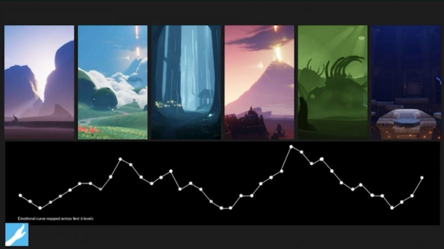
I compiled everything onto one huge reference sheet so that everyone designing assets didn’t need to flip through multiple things and could just keep one image open up while they worked. I included references of the colours and moods for different areas of the game I felt would look best, a lot of these references are from Sky Children of the Light concept art, as I feel that game uses colour extremely effectively when you travel from area to area.
It also includes roughly how the foliage in the forest should affect the assets we were creating, a rough guide on how things should be textured, how to incorporate Celtic influences subtly into the assets and plants, and how to ensure everything kept an angular faux-low poly aesthetic. I also included some visual inspiration for how certain areas of the game could look, and a rough guide on how to create that low poly look when modelling. I put a lot of time into the style guide and I’m really proud of how it came out.

⚝──⭒─⭑─⭒─⭑─ 💫 ─⭑─⭒─⭑─⭒──⚝
✨ Character Design ✨
The first thing I did when starting my character designs was compile all of my references and inspirations. After discussions with Eamonn and the rest of my group, we thought it’d be really cool for our characters to have animal-themed masks, which was inspired by Kena. It was also a good way for Eamonn to tie the story into the character designs as the plot of the game revolves around the relationship between man and nature.
I think that visually, bird masks can look super great on character designs, and a game I’d been playing recently has added bird masks as cosmetic items, so I suggested giving everyone in the village only bird masks, and the type of bird dictated what rank the person in the village was.
I also made sure to do research into traditional Irish clothing to dress our characters in, I found two really great references for this here and here.

This image especially was really surprising to me, I had no idea that Irish clothes were that colourful, as I know that usually dying clothes in other countries back then was particularly difficult or expensive. I was really excited to be able to use a lot of colours and patterns in the character designs of our game.
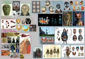
Below is the finished character design sheet, I compiled as many traditional Celtic clothing irems as I could, as well as character designs from games that I personally think would suit the game very well, I included some references from my teammates as well!
⚝──⭒─⭑─⭒─⭑─ 💫 ─⭑─⭒─⭑─⭒──⚝
For the main character, I came up with two designs, drawing inspiration from the sheet I’d made. I tried to make a visually interesting outfit and design while also keeping it simple enough to model and texture, as well as keeping as accurate as I could to Irish medieval attire. I drew up some sketches of our character with their cape off, on and with the hood up. I also followed Eamonn’s character description for designing Ciarán, but I wound up straying a little from it in the end.
For the character’s mask, it’s supposed to replicate a sparrow.


After checking in with my group about with design they preferred, I got to work on designing Ciarán’s dad and doing the turnaround for the Ciarán model. I followed Nuada’s character description more closely, as he’s supposed to be a very mysterious character, I kept him mostly enveloped in his cloak. For his character design, I included a traditional Irish broach that fastened his cape, and a shillelagh for a walking stick I think they’re a really nice touch.
His mask is inspired by a hawk, I wanted to show that it had a lot more details and intricate patterning than Ciarán’s as Nuada is the village leader.

This is the turnaround for Ciarán’s 3D model, I included a version with and without the cape, as well as including the book on his belt, which is what the player opens to look at the pause menu.

From Ciarán’s model, I was able to do a turnaround for the NPCs, all of them are the same base with slight hair or outfit variations to make it easier to model. The mask for the village members is a crow, they rank in between the sparrow and the hawk.

⚝──⭒─⭑─⭒─⭑─ 💫 ─⭑─⭒─⭑─⭒──⚝
✨ Character Sprites ✨
Eamonn suggested that for dialogue, it’d be nice to have character sprites flash up on screen, similar to a visual novel. I thought it was a great idea as having a close up of the character while they spoke would allow them to emote more, even through the bird masks.
I’d recently been playing games that had visual novel character sprites, so I had a lot of things to draw inspiration from off the bat, such as Smile For Me and the Ace Attorney series.


I wanted to keep it simple but also include some recognisable poses and a few different emotions to fit the different dialogue, due to the characters wearing masks I couldn’t show much of their face, but after a discussion with Nicole who was also doing the character sprites we decided it’d be okay to show eyebrows through the mask to make them slightly more expressive.
After Nicole completed her first lined character sprite, I felt that her colour palettes were a bit too harsh on the eyes, so I recoloured her lineart to try and make them fit the aesthetic a little closer. Unfortunately my group didn’t take my feedback onboard and we didn’t go with any of the revised colour palettes, I’m still quite proud of them though

After this I got to work on Nuada’s character sprites, I sketched them all out first to get a feel for his character. In his character description he’s listed as follows.

So I tried to carry that over in his sprites by making his appear very reserved and stoic.

I kept the style as close to Nicole’s as I could with a solid dark outline and cel shading, it isn’t how I prefer to draw but I think I made it line up with Nicole’s as close as I could. I also included some of the plaid patternings that was excluded from Ciarán’s design into Nuada’s.
![]()
✨ 3D Models & Textures✨
Towards the end of the project, the cave area of the game needed some crystals to help fill it out, as just the rocks themselves didn’t look very visually interesting, I modelled a handful of crystals using this tutorial. I had no idea how to create a convincing crystal shape, so this tutorial helped significantly, especially with the UVs! I stuck to Maya and Substance painter as I felt the sharper edges fell more in-line with the style of our game.
Here are my crystal models, I used different rock bases but essentially copied the same crystal shape over and over and changed the thickness and height to add variation.

Here are the UVs for my crystals, I segmented them into 4 sections on purpose, as I was planning to colour each face of the crystal differently and I wanted to make it as easy as possible for myself to do that when I moved into substance.

For the texturing itself, it was relatively straightforward, I lay down base colours and proceeded to make each face slightly variated, I used a cool-toned colour palette and leaned heavily into the purples and blues, as I feel it emphasised a magical feeling within the cave.
I used a gradient sort of technique like in the video, but used a lot more textured brushes than in the tutorial as I felt it looked the best. I also used a white jagged texture around the faces and edges of the crystal to make the faces stand out more! I think they turned out really well.

I also used a smart material on the crystals to make them reflective and metallic, so light would bounce off them in the caves.

Here is another variation of crystal I made! It’s smaller than the first but has that huge chunky piece in the middle to fill out space.

I also made a much smaller crystal, and I created three colour variations due to there only being two crystal chunks. This way, the smallest one could be used to fill up gaps in the cave and would still have a fair bit of variation to set them all apart. The first one is blue and purple.

The other two variations are a green and blue version and a pink and purple version.

I was asked by Jessica if I’d be able to help colour some of the NPCs to fill the village, I agreed and took over colouring of one. I wanted to incorporate Kena’s artstyle into the texturing as I felt the models looked a bit flat and shiny. I really love the textured grainy look of the concept art so I made sure to use brushes that had the same effect when texturing the NPC.
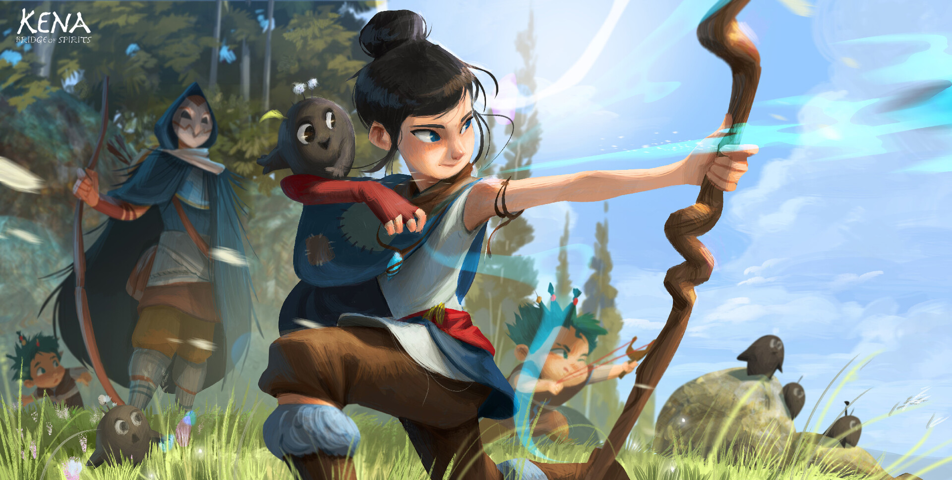
I used it everywhere, but its most noticeable on the bottom of the cape, I used a dirt texture and made it really light, and then overlayed this watery ripple sort of brush on top to make it look wrinkled and stained from lots of wear. I used a lot of these textures on the trousers and boots as well as they’d be getting dirty the most.

I also used texture on the face of the mask, to emulate the look of feathers as crows have really scraggly feathers where they meet their beaks. I copied Jessica’s style for the face under the mask, and I went with a warmer orange palette as Jessica didn’t have too many warmer tones in her textures. I wish I could’ve textured more

✨ Evaluation ✨
Our style for the game as well was supposed to be low poly PS1 era as we thought that style would be really charming, although consistently our feedback from lecturers was that we needed to make it less low poly, which I think landed us in this weird low poly-yet-not area that made our final outcome look sort of like a mobile game, it was disappointing as I think if the lecturers gave our original idea a chance it would’ve come across a lot better. I also felt that having a different set of lecturers seeing our work each week wasn’t the best move as we’d receive feedback one week, implement it, and then have it picked on by a different lecturer the next week. It happened a few times and was really confusing.
Otherwise, I’m especially proud of the concept work I made and the crystal models, and I’d love to take another shot at creating character sprites again!
