✨ Idea Generation ✨
For this assignment, we were tasked with creating three animations, a walk cycle, a run cycle and an animation showcasing body mechanics. (e.g. lifting a heavy box, jumping a gap, etc.) I was really excited to get started as I’d never done a proper walk or run cycle before, and I wanted to challenge myself with my body mechanics animation. I was also very excited by the opporunity to get to work in 2D again, as I’ve only had the opportunity to animate in 2D a few times last year. Even though I was excited for 2D, I wanted to practice my 3D animation skills as well, and I decided early on that I wanted to do a mix of both styles for my studies.
I wanted to focus primarily on 2D, so my walk and run cycles would be done on Krita, and my body mechanic animation would be done on Maya. For my body mechanics animation, I knew I wanted to do something sport related, and turned to some of my classmates to bounce ideas off of them. From these ideas, I thought someone playing guitar, skateboarding and playing baseball would be fun challenges, and from these I decided to settle on baseball! I also knew right from the get go that I wanted to use this Link rig made by Christoph Schoch. There’s a Zelda version of this model that’s used for animations online, but the Link model was made a lot more recently and I thought it’d be really fun to play with all of his props!
For my 2D animations, I wanted to do something that I’d personally have a lot of fun animating. I’ve recently started playing Ace Attorney, which is a static sprite based game where the characters don’t actually move. (at least, their legs don’t anyway, as we see exclusively see them from the chest up…) As such, I thought animating some of the characters with their full body would be interesting, as well as extremely fun for me! At this point in the project, I knew I’d need my animations to be almost self-indulgent, as I could feel myself getting burned out on working on 3D modelling assignments.
The characters I decided to go with were Apollo Justice and Klavier Gavin, two of the main characters in Ace Attorney 4. They both are extremely personable and have vastly different demeanours and personalities, so I was really excited to try and show that in my walk cycles! Below are some of the references I used from the Ace Attorney artbooks, as well as some explorative art I quickly did of the two.


⚝──⭒─⭑─⭒─⭑─ 💫 ─⭑─⭒─⭑─⭒──⚝
✨ Body Mechanic Animation ✨
I quickly set off to find references, I started by googling some visual references for baseball, I looked on google images and youtube to gather my references, I found a mix of video and image references for my animation! I was struggling for a while to find references of someone swinging a bat and not pitching, as most animation references were all to do with pitching a ball. However I had better luck when I instead searched out tutorials for people actually playing baseball, seen below.
The image below was extremely useful for me when I was bosing out my animations in maya, the blue curves helped me figure out how to exaggerate my rig to keep him feeling cartoony and dynamic!

I also found this diagram, showing someone who’s swinging incorrectly. Despite it showcasing someone who’s swinging their bat wrong, I felt it could actually help me in making my poses look more dynamic, specifically for the swing, and I added it to my collection of references.

First, I got myself used to the rig, I’d never worked with something quite this complicated before, but it was super intuitive and I really liked how many options were available to me with this rig! You could switch from FK to IK handles on practically all of his bodyparts, and there were hidden controllers to fully animate his face if the expressions controller wasn’t cutting it. His tunic, ears and hair were also all moveable.

Once I got up to grips with the rig, I started blocking out my keyposes, using my references above as I worked. The “Tension” picture was especially helpful here. I also found out how to attach his sword to his hands which would be my stand in for a baseball bat.


From here, I basically just filled in all the inbetweens I needed to get the arc of the baseball bat right and to keep his body posture correct. I admittedly forgot to take many photos or videos from this point forward, but once I had my key poses there wasn’t much else left to do but tweak some of the inbetweens anyway!
Once the animation itself was finished, I went back to give him some facial expressions. This is what I was looking forward to the entire way through this animation and it was a bunch of fun using the expressions controller. Though, I did find myself using some of the extra facial controllers to make his eyelids squint and to get a better furrow on his eyebrows, seen on his face below.

⚝──⭒─⭑─⭒─⭑─ 💫 ─⭑─⭒─⭑─⭒──⚝
✨ Walk Cycle✨
For my walk and run cycles, I went back to the animators survival kit as I remember reading about all the different types of runs, walks and skips that I referenced last year for my skipping animation. It’s also just the first place I’m sure most animators think to look for reference. The character I was animating for the walk cycle is a confident rockstar, so I took to youtube to find some walking references to get a “cool guy” feeling for my walk.
The video below was a great reference for me, the comments say that the walk was really exaggerated and has a lot of swagger, which was perfect for the personality of my walking character.
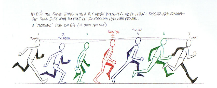
I also used some of the diagrams from Animators Survival Kit, naturally.

I started by blocking out my poses in Krita, I wanted to work fast on the beginning stages so I used a stick figure rather than a humanoid sort of guy in my references.

One of the things our lecturer told us to help really sell a walk cycle, was to think about the shoulders and hips as you walk, as they sway from side to side as you walk. I felt this tip would especially be useful to me when portraying a character with a lot of confidence. I used coloured balls on the joints to help me differentiate each shoulder, elbow, knee, etc. to try and achieve that cool swagger in his posture. I tihnk I did a really good job!
Next, I sketched out my animation, drawing in his body, clothes and hair.

I took a lot of care to make sure to get the shoulder sway just right during these stages, as I didn’t want to mess it up as I was lining. I felt it’d be really integral to portraying his character in the final walk cycle. I also added a flip to his hair to remind me when to add a bounce to his hair when I was lining my animation.

This was easily the longest stage of the animation for me, as I had a bunch of minor tweaks that held me up as I was lining. I’m a bit of a perfectionist and I wanted him to look as amazing as possible! I’m especially proud of his legs, the hand in his pocket and the shoulder twist, I think I sold it really well!
I also added some secondary animations to his hair, his shirt collar and his necklace. He was supposed to also have his drill curl bouncing as another secondary animation, but I realised that I definitely wouldn’t have time to finish this animation and had to move on.

⚝──⭒─⭑─⭒─⭑─ 💫 ─⭑─⭒─⭑─⭒──⚝
✨ Run Cycle ✨
For my run cycle, I wanted it to also reflect the personality of the character I chose, he’s a lot more serious than Klavier, and I knew that I’d need something a bit more stiff or awkward looking for him. I went looking for running references on youtube and google once again. I intentionally set out looking for something to show that he wasn’t exactly athletic, I thought it’d be good to have him look like he was running late or rushing to deliver something rather than just an average run as he isn’t the type to do that sort of thing in his free time.
The video below showcases someone’s form being corrected at a physio that specialises in a specialist running style, I purposefully referenced the first example of the run where the form was bad, as it fit my character better.
I also used this video quite a bit, even though it’s in 3D, the timing for the frames really helped me when timing my own animation and the notes on for the hips and chest twist were also really helpful for me!
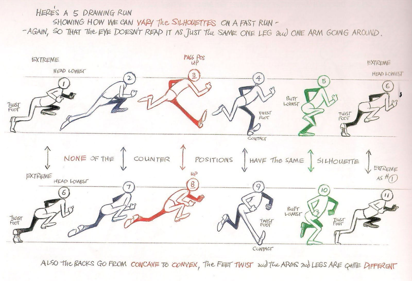
And of course, I dug out pictures from the Animators Survival kit, this time I referenced heavily one of the more exaggerated cartoony runs. Although I didn’t push it to these extremes, the posing when the character is coming up and their back is really arched was something I carried into my animation.


I also referenced a few clips from Nichijou, this anime is a huge inspiration for me and I really loved this gif in particular with how Mio’s legs moved, I liked how snappy it was and this gif helped me when needing a reference of someone running while carrying something, as I decided that I wanted him to be carrying a big stack of papers or files.

When animating him, I felt it was really important to keep the same twist motion I used with my walk cycle to help sell the run, his arms being bent at these angles also made it a bit harder to visualise but I really didn’t want to sacrifice the concept of him running with his arms full, I wanted the challenge! I think my stick figure sketch helps to show what movement I was looking for.

Once the arms moved how I wanted them, I noticed that his feet were snapping a lot at the back and it looked a little goofy, like he was purposefully kicking his heels up. I went back and corrected this as well as some slight timing issues and adding some inbetweens. (The arms also messed up a bit here but I corrected this shortly after.)

Once I was happy with the blocking out, I began to sketch my characters form and details. After having worked on my walk cycle, everything flowed a lot easier and I was less hesitant and sketchy with my line work, my leg posing also looked a lot better as I’d already spent time tweaking and figuring out what looked nice on my first animation. I planned on focusing on his legs first, adding the twist to his hips which you can kind of see below, before worrying about how his arms and upper body would twist.

Despite how much easier things were going for my run cycle, I realised that I really didn’t have enough time to line or colour this one either, as the walk cycle took so much time to line and my run cycle involved a lot more of the twisty body movements that I’d have to figure out, taking even more time that I just didn’t have.
I was thankful that his sketch was turning out so clean, as it’d look presentable enough for my final outcomes, I focused on finishing his legs, showing how his hips were supposed to twist as he moved. I think they turned out really awesome, I especially like how nice his feet look as I got to grips with drawing those awkward men’s dress shoe shapes. Even though I couldn’t finish his upper body at all, I gave him a blink to match my walk cycle, just because it was easy and looks cute.

⚝──⭒─⭑─⭒─⭑─ 💫 ─⭑─⭒─⭑─⭒──⚝
✨ Evaluation and Final Outcomes ✨
I initially was really excited to work on this project, I really needed something other than the 3D Environment project to work on and I really love animating! I really enjoyed working in 2D again and I can see just how much I’ve improved since last year alone, especially with my 3D animation skills. My Link animation was what I was most worried about yet he probably turned out the best out of the three!
I’m really proud of how I challenged myself to do something fun and a little different for each animation, and for trying to get creative with my walk and run cycles. That being said, however, I can’t help but be slightly disappointed in the fact that I couldn’t get either of my 2D animations finished, especially my run cycle as I only got to the sketching stage. I was even granted an extension and this was as far as I could get them which is annoying to me.
I believe that the problem was how much I’d burnt myself out on my previous project, our group had a few hiccups that required us to take on extra work throughout, I feel that if things went smoothly I would’ve had a bit more time to put into my animations. I also want to specialise in 2D animation so I’m a bit sad that I was practically dragging myself through this project due to how stressed and burned out I was.
Despite this, I know that the quality of my work is good, I am proud of everything I’ve made and seeing my improvement helped to cheer me up. My walk cycle especially, even though it isn’t totally finished looks super awesome and I know I’d be able to make something even better if given just a little bit more time! I eagerly look forward to my next animation assignment.


