In order to prepare for building my own portfolio site, I want to research various existing portfolio sites to gain inspiration and ideas. During Monday’s class, Daniel introduced us to a number of portfolio sites to research.
Bonfire
Link to website: https://www.bonfire.com/x/
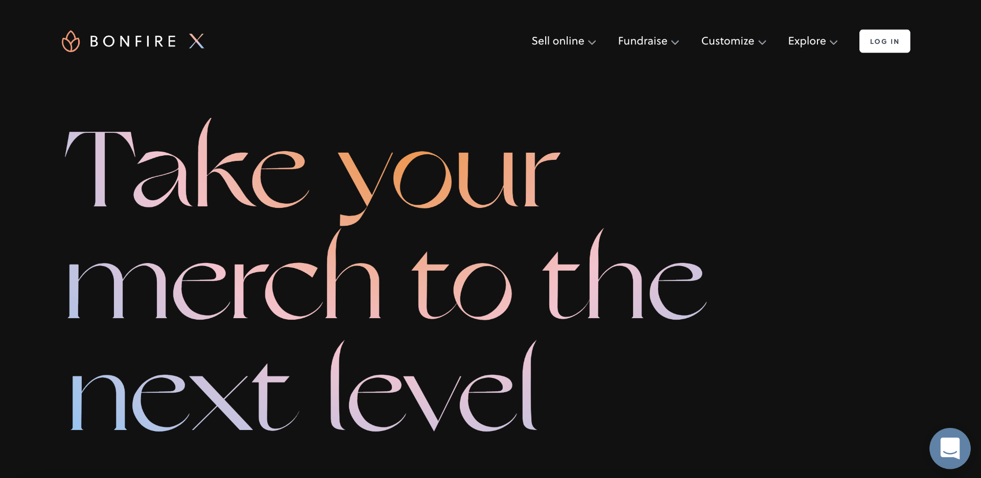


I really liked this site and chose to place it within my research as I feel all the elements within it worked so well together. Everything is nicely placed and spaced out, allowing empty space so as not to feel too cluttered. I like how the text is displayed over images in some instances, and how the gradient colour scheme is consistent throughout the site but displayed in different ways – for example, in text, icons and background.
What I can take away from this site is that it is entirely possible to have a different layout style for each page, as long as there is some element of consistency – in this instance, the consistency is colour and typefaces.
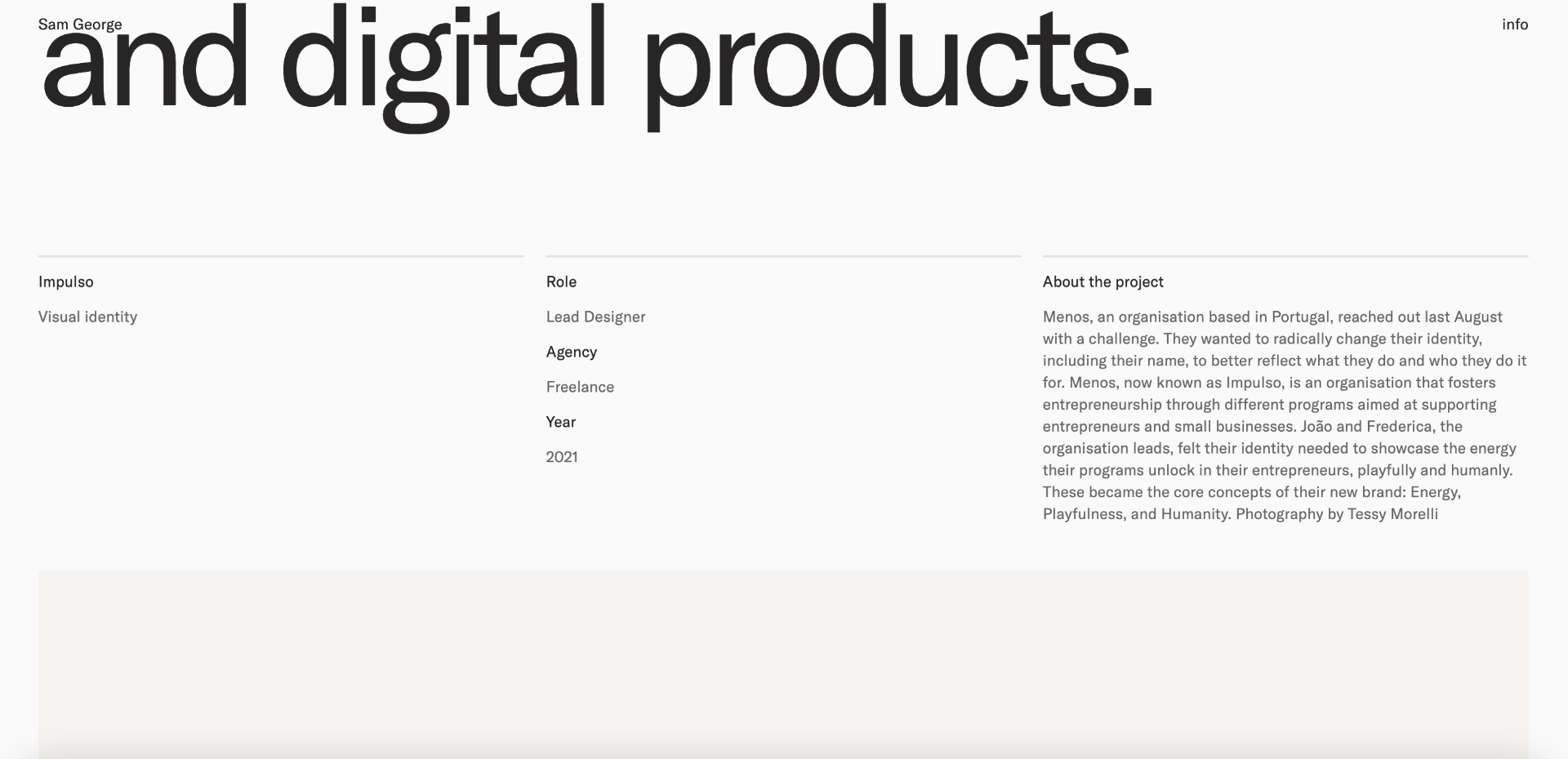
Samgeorge
Link to website: https://www.samgeorge.co/
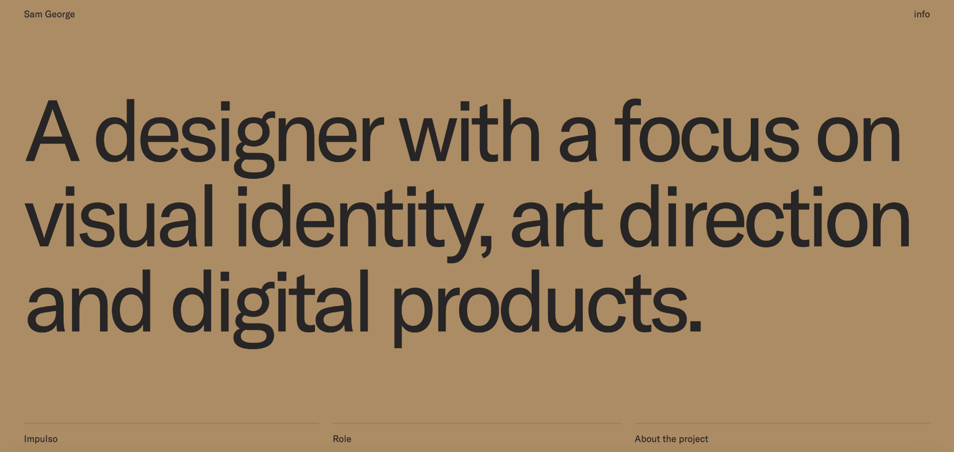
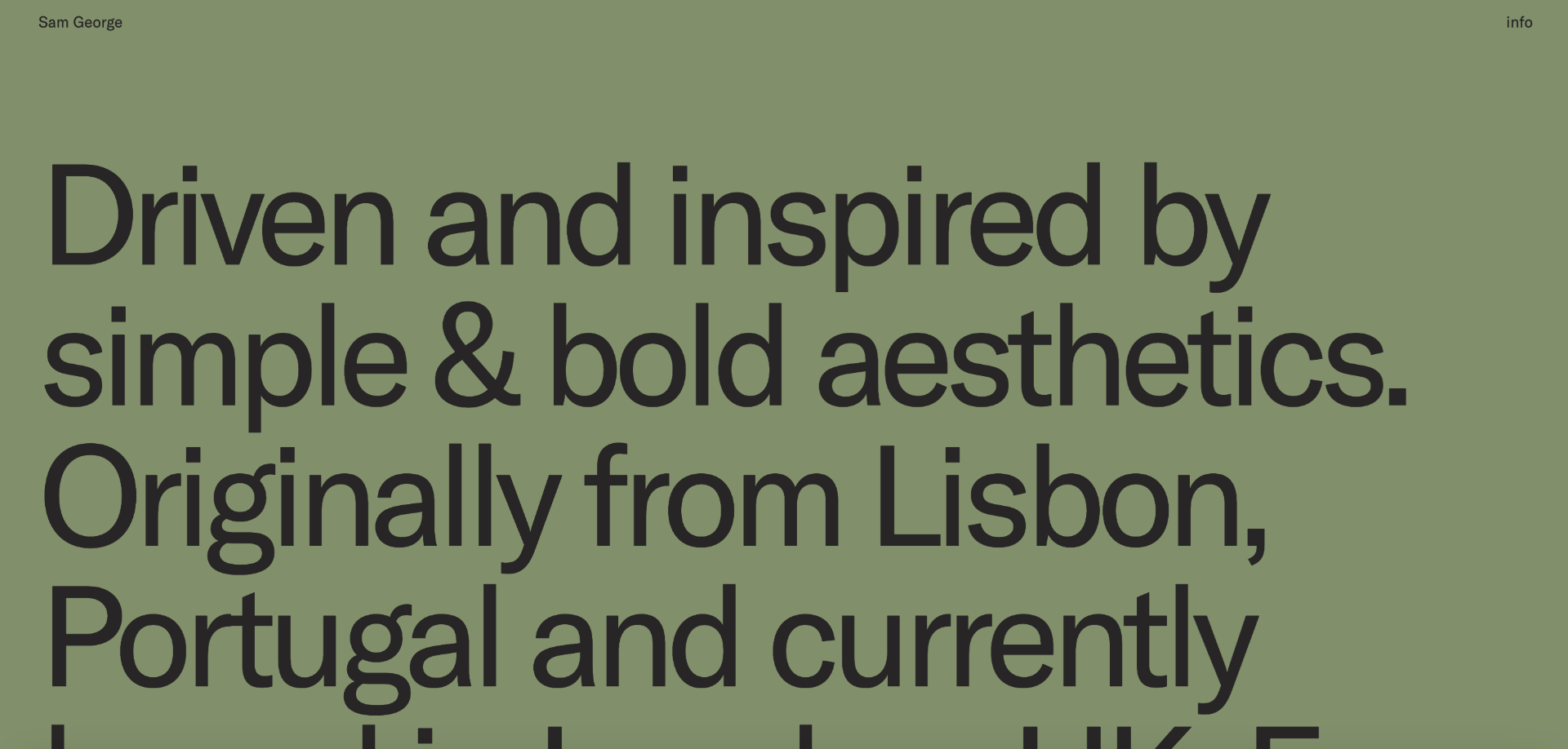

This website was also one that I really liked the look of. I like how the designer has used large text, even in long areas of text, so that it takes up the entire screen. It makes the text easy to read, while also being incredibly unique, as you would normally make a large amount of text smaller so that it fit entirely on the screen.
I also really like how plain and simple the work section of the portfolio site is. It just shows each new project one after the other, displayed as one big box across the entire screen. It allows consistency, and doesn’t draw away from what each project is about, as they are all different.
Living in the City
Link to website: https://livinginthecity.com.au/
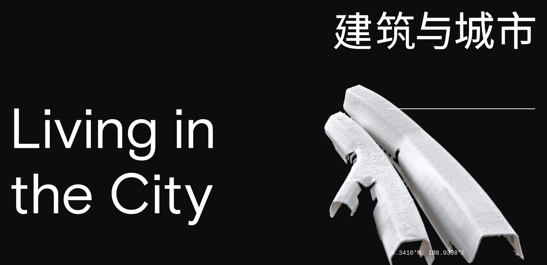


What strikes me most initially about this portfolio is the colour scheme – the whole site is entirely black and white. It is also very minimal. These two aspects are two of the main elements of my own personal brand, which allows me to see a bit of my own brand in this site, and to conceptualise new ideas. One thing I like about this site is how big everything is, such as the text and the buttons. It is straightforward on how to navigate it.
Something I’m not a huge fan of in this site is how things are overlapping each other, so you can’t really read what’s underneath.