As our third project, we must take the influence of one of our favourite songs, and present it in a way that is appropriately relevant to the artist/lyrics. The brief tells us to consider the pacing and rhythm of the song, and consider if some words or lyrics are more meaningful than others, and how they could be used to stand out more prominently in the overall final piece. We were also told to primarily focus on a more typographical approach to the project, instead of illustrative, meaning we should focus more on text instead of image.
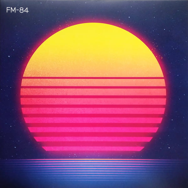
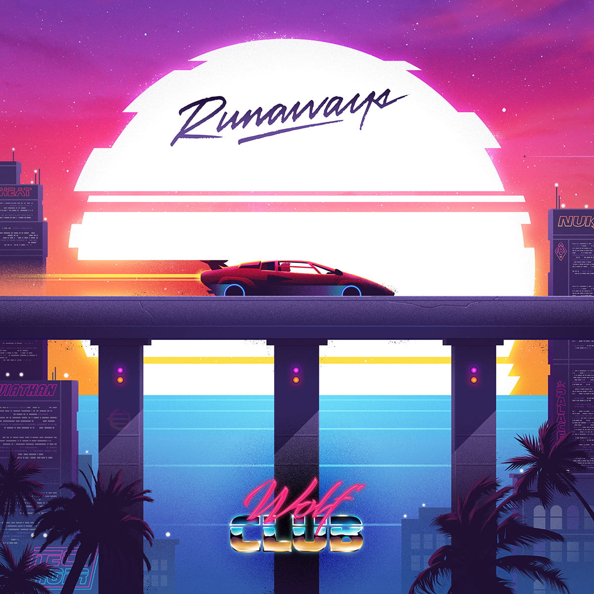
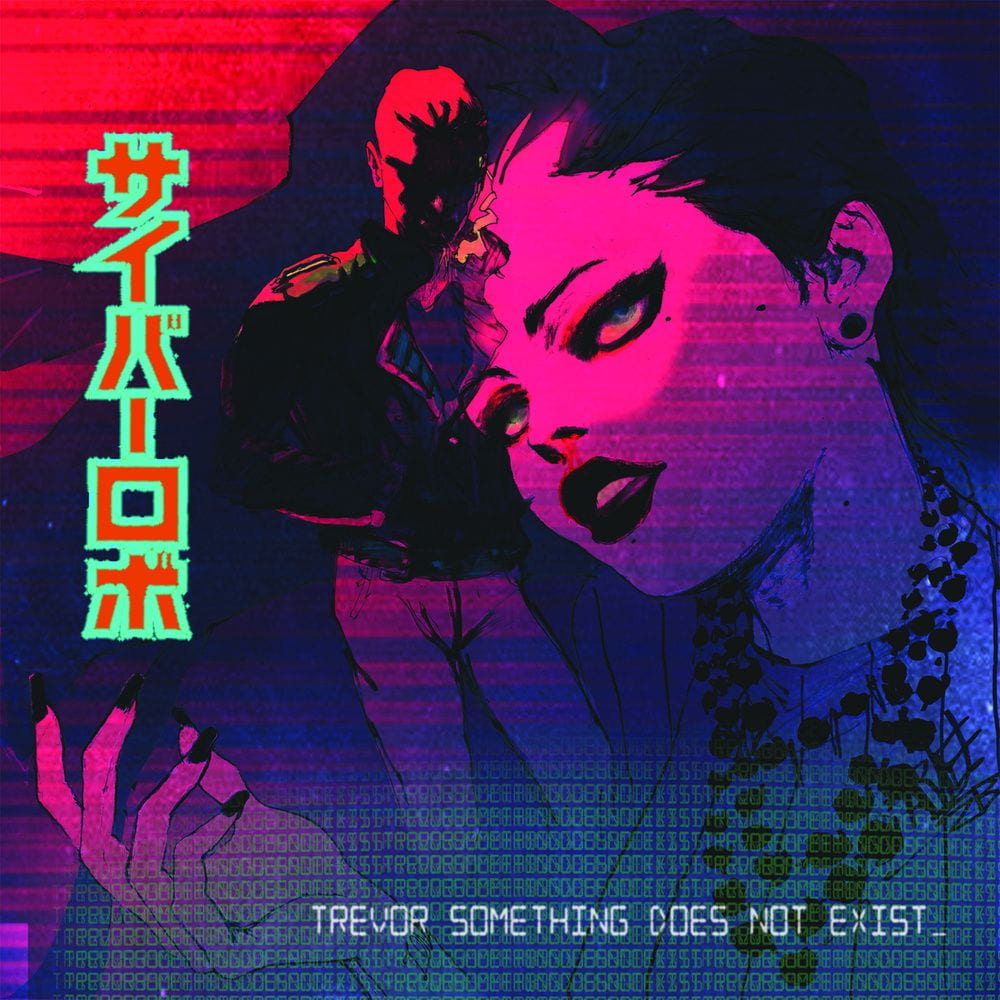
The song I am considering choosing for this project is Running in the Night by FM-84. The song and band has a lot of 80’s influence, so I want to incorporate that into the project. I also want to take into consideration the band’s album cover, and how it contains typical elements of synth-wave and retro-wave, such as horizontal lines and a neon colour scheme.
Atlas (2018) by FM-84:
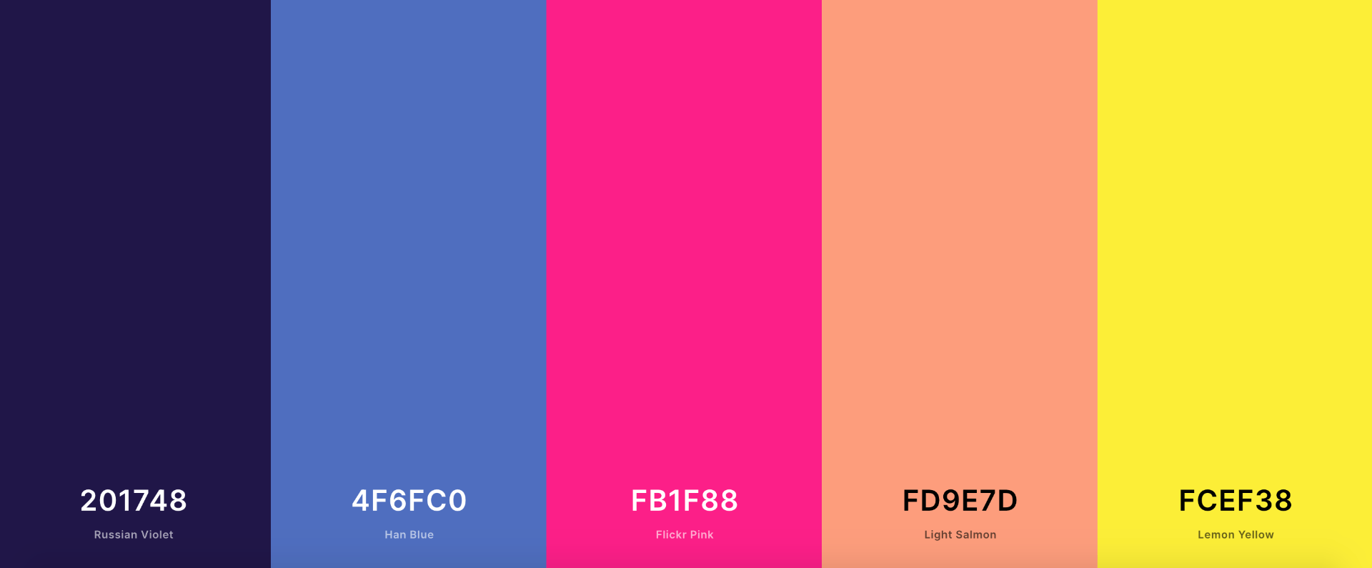
These are the colours I picked up from the album cover:
Research
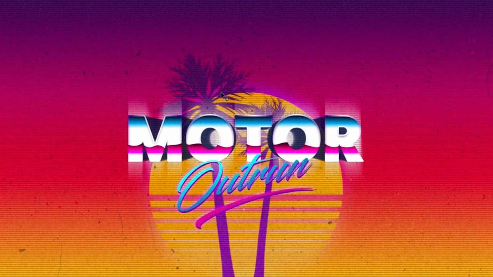
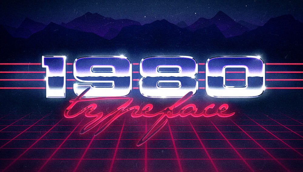
In preparation before I begin sketching my designs, I want to look at some 80’s or 80’s-influenced posters and graphics. I have gathered some images to use as inspiration. The category used to refer to this type of design is commonly known as Retrowave, and is usually tied to retro/synth-wave music or video games.

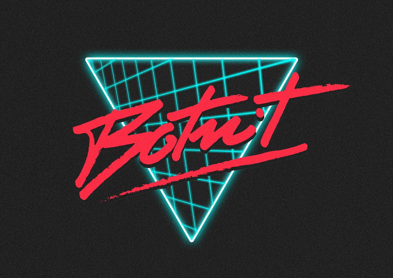
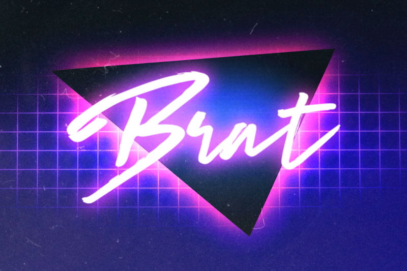

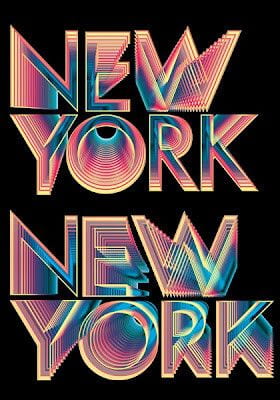
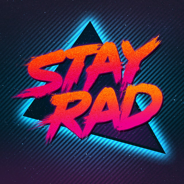
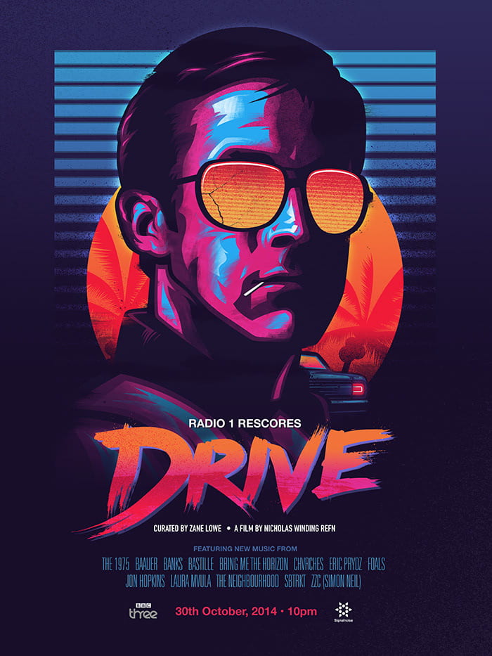
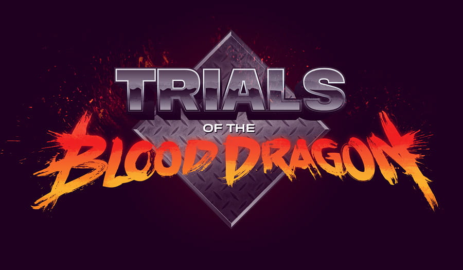
Signalnoise (The Art of James White)
James White is a designer and digital artist, who runs his own design company named Signalnoise. White is a Canadian artist, born in 1977, but he currently lived in the UK. Having had a passion for drawing since the age of four, White later went on attend a Graphic Design course after graduating from high school, where he learned the basics of editing softwares such as Photoshop and Illustrator, which he continues to use even to this day. His design career took off in 1998, when he began designing for print campaigns and websites, and local work eventually became international work. His range of clients has consisted of working with companies such as Toyota, Metallica, Warner Bros, Twitch, Nike, Universal Music and many others.
White’s style focuses on neon-infused art, reminiscent of his childhood in the 1980’s. He takes his main inspiration from that era, and has developed his own style in response to it, involving a consistent, retro colour scheme and pop art-like illustrations and portraits. Another consistency in his work is his use of text. White uses strong typography to create bold, striking pieces and designs.
Here is some of his work:


Sketching
I want to incorporate White’s style into my own final piece, but I also need to make room for a lot more text, as I want to include lyrics to the song. I began sketching a few ideas of how I thought my piece should look.
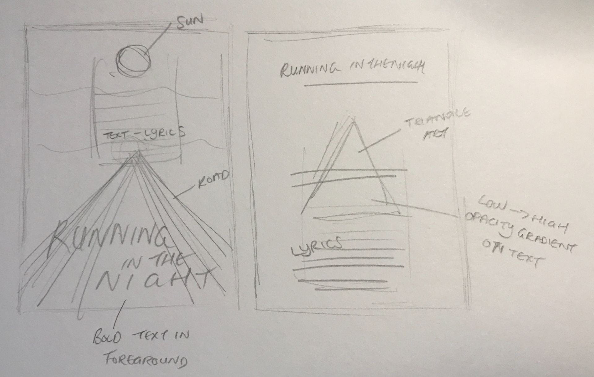
I wasn’t entirely happy with how my sketches were coming along, as I felt the text was too out of place with the rest of the piece, particularly the lyrics text. I had the idea of creating a piece reminiscent of an album cover, or the back of an album cover, where the song titles would usually go I would instead replace with the lyrics of the song.
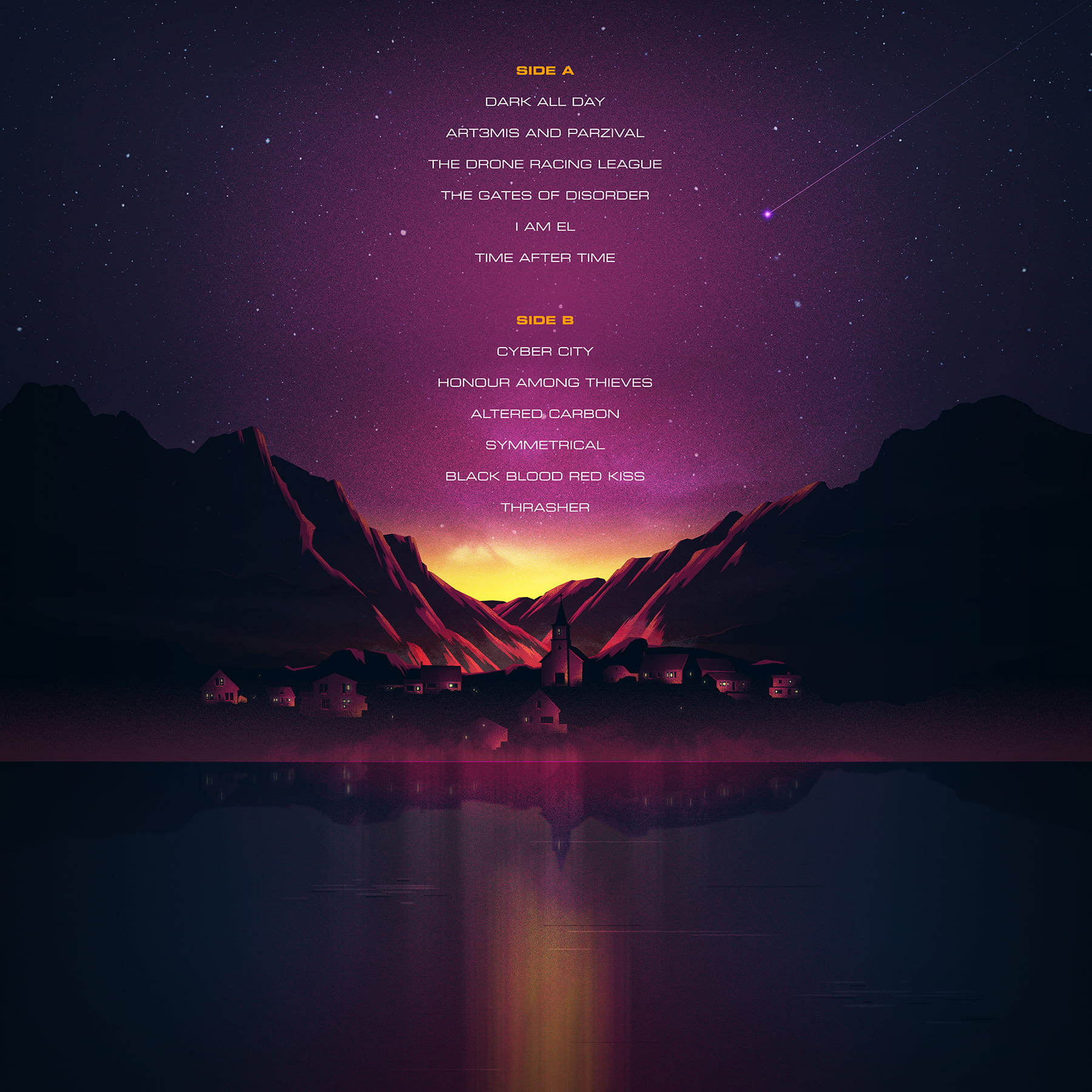
Retro/80’s Album Covers
Before sketching, I wanted to find some inspiration from 80’s and 80’s-inspired album covers.


Further Sketching
With my inspiration coming from those images, I began sketching my own ideas again.
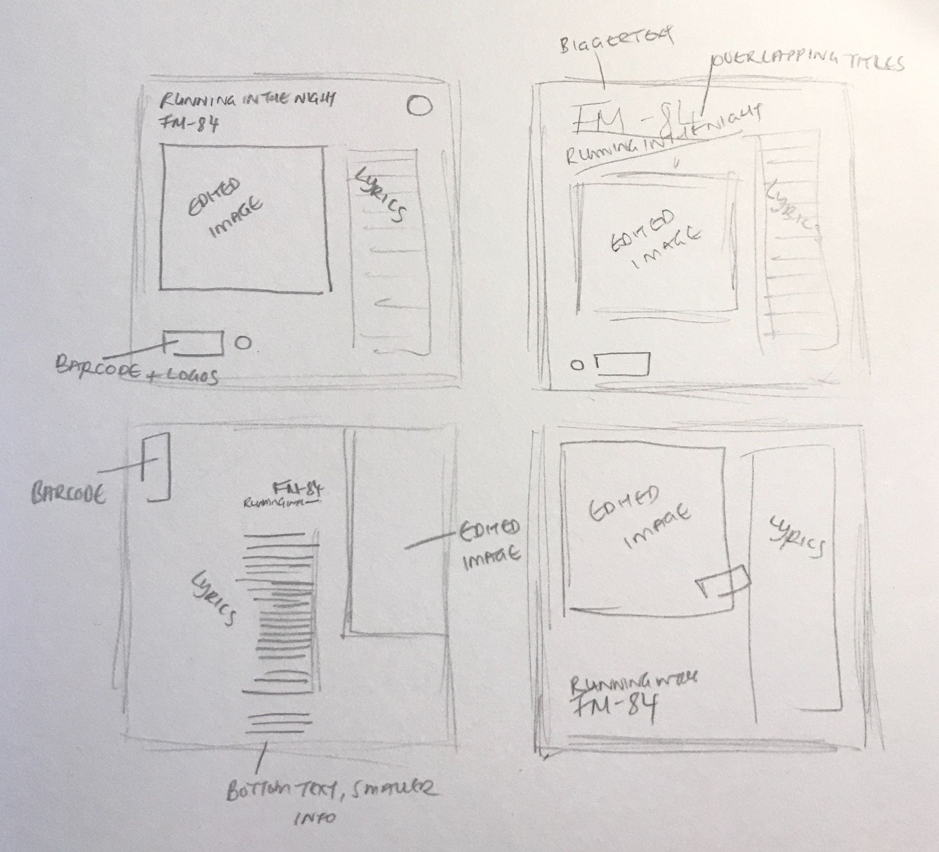
I think, out of my sketches, the two on the right are the strongest, so I am going to try and recreate those in a digital editing software. For this project, instead of Figma, I want to use Illustrator, as I feel it has more variety on what I can do, and I understand the software better.
Editing Process

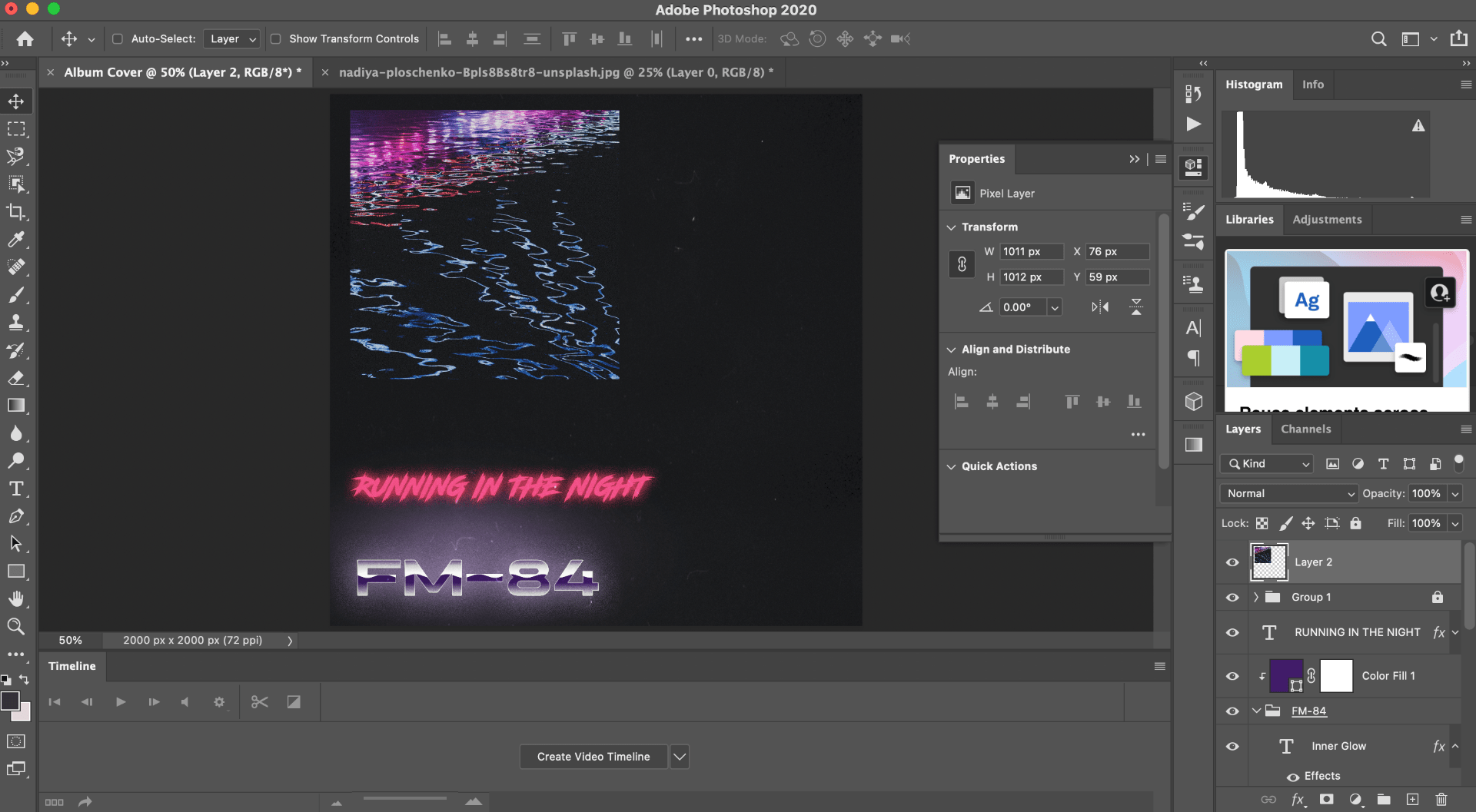
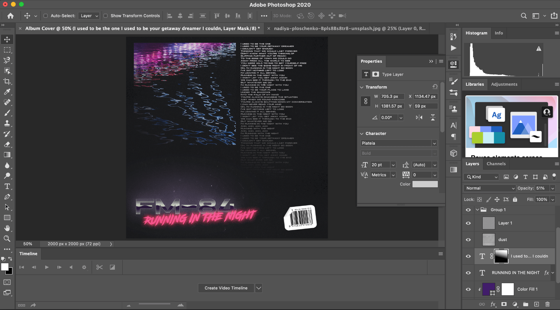
Here the design up until this point:

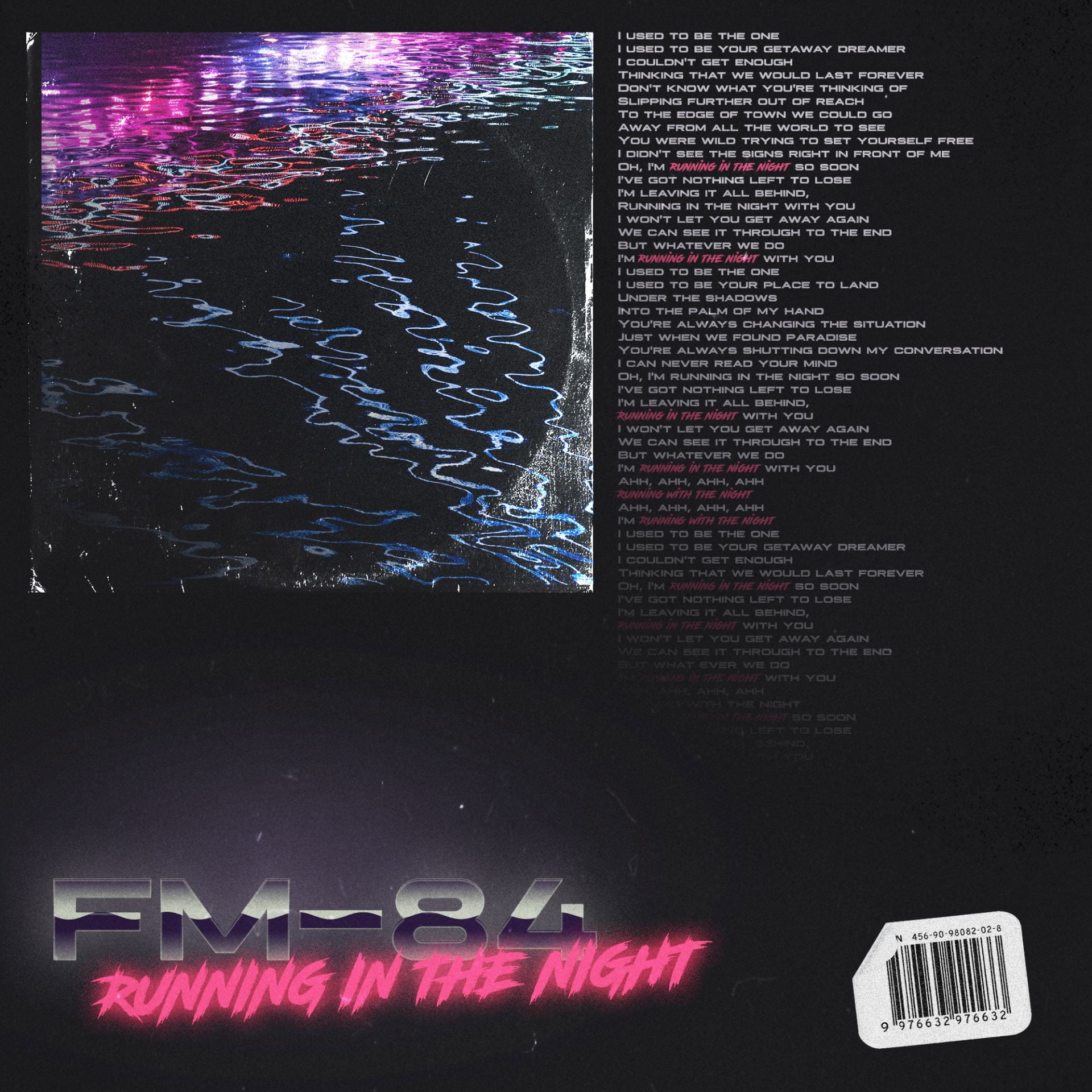
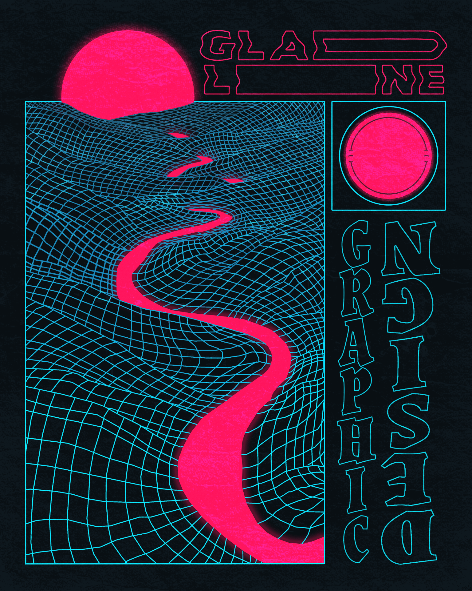
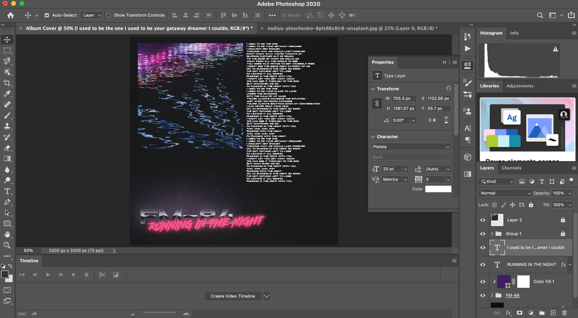
I felt the design was fairly finished, but the image was bothering me. I felt that it didn’t fit in with the rest of the piece – it didn’t blend in with the rest of the style and aesthetic. To fix this, I decided to add an overlay on top of the image of an old vinyl cover, which gave it a more worn and aged look.
I also changed the lyrics text, as I feel it looked too plain to fit in with the rest of the piece. I highlighted the parts that say the song title, “running in the night,” in bright pink, then changed the font of those lines to match the text at the bottom where the song title is featured. I just felt it helped to blend the whole image together, as it brought pink to the top right corner as well.
Final Design