Helvetica
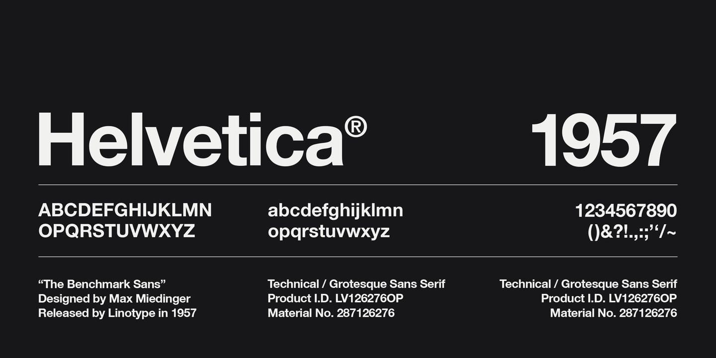
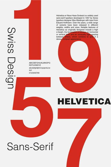
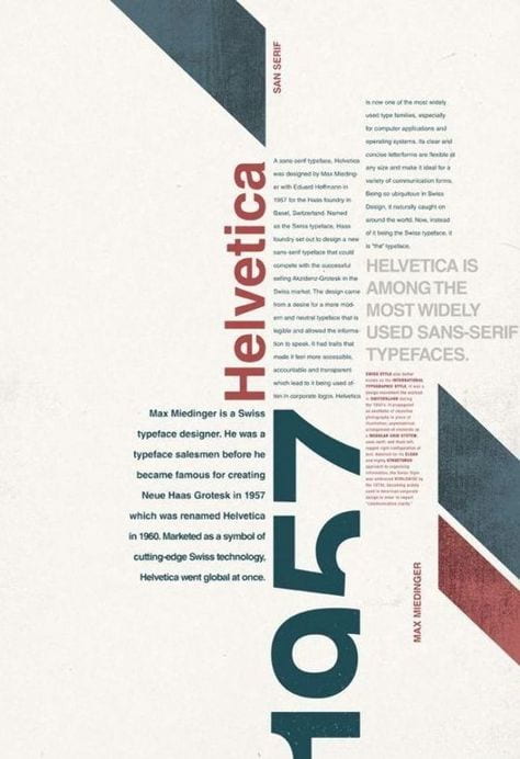
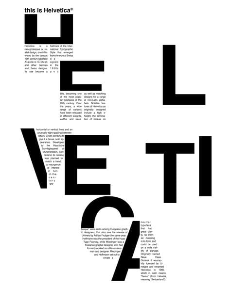
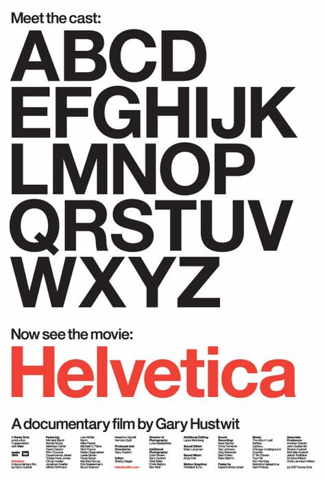
One of the most well-recognised typefaces in the world today, Helvetica came into existence in 1957, when it was developed by Swiss designer Max Miedinger. In a post-war world in Eastern Europe, many companies and institutions desired a change to the everyday norm in advertisements and packaging. Originally, it was based on the 1896 typeface Akzidenz-Grotesk. In Latin, Helvetica is the word for ‘Swiss’, which pays homage to the typeface’s origin country.
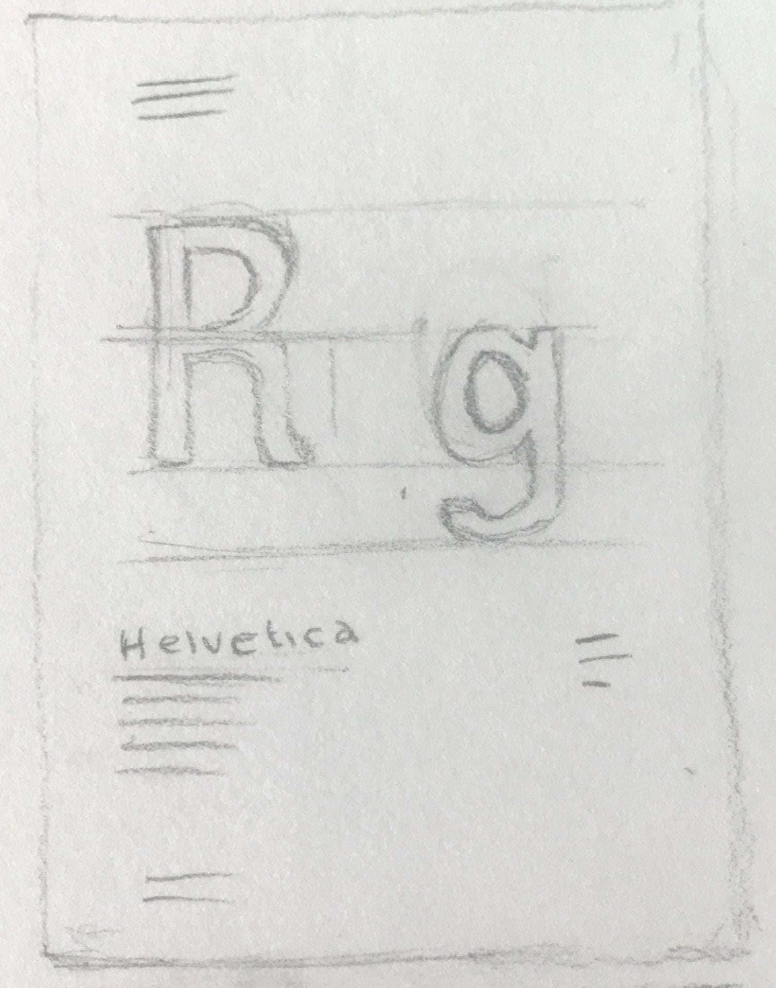
The typeface is known best for its simplicity, and its convenient, universal style. Some definitive characteristics of the typeface include:
- Tall lettering which makes it easier to read from longer distances
- Tight spacing between letters
- Wide capitals
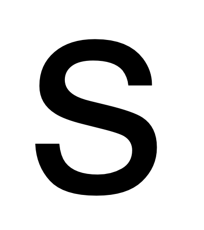
- Square-shaped letters, such as the ‘s’
- Rounded off tail on the ‘R’
- Two-storied ‘a’ and single-storied ‘g’


In the modern world, it has become common place to hear the saying, “when in doubt, use Helvetica.” Artists and designers have been using this typeface for over 60 years for everyday means such as corporate logos, movie posters, interfaces, and even spacecraft.
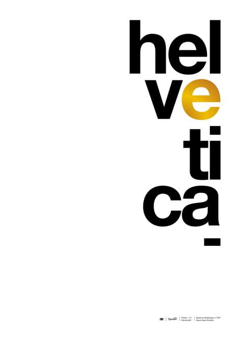
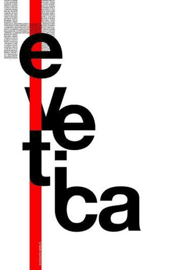
Here are a few examples of Helvetica in use:
![]()
![]()

![]()
![]()

Inspiration Moodboard
I made up a collection of images to create a mood-board, to serve as inspiration before I begin my idea sketches.


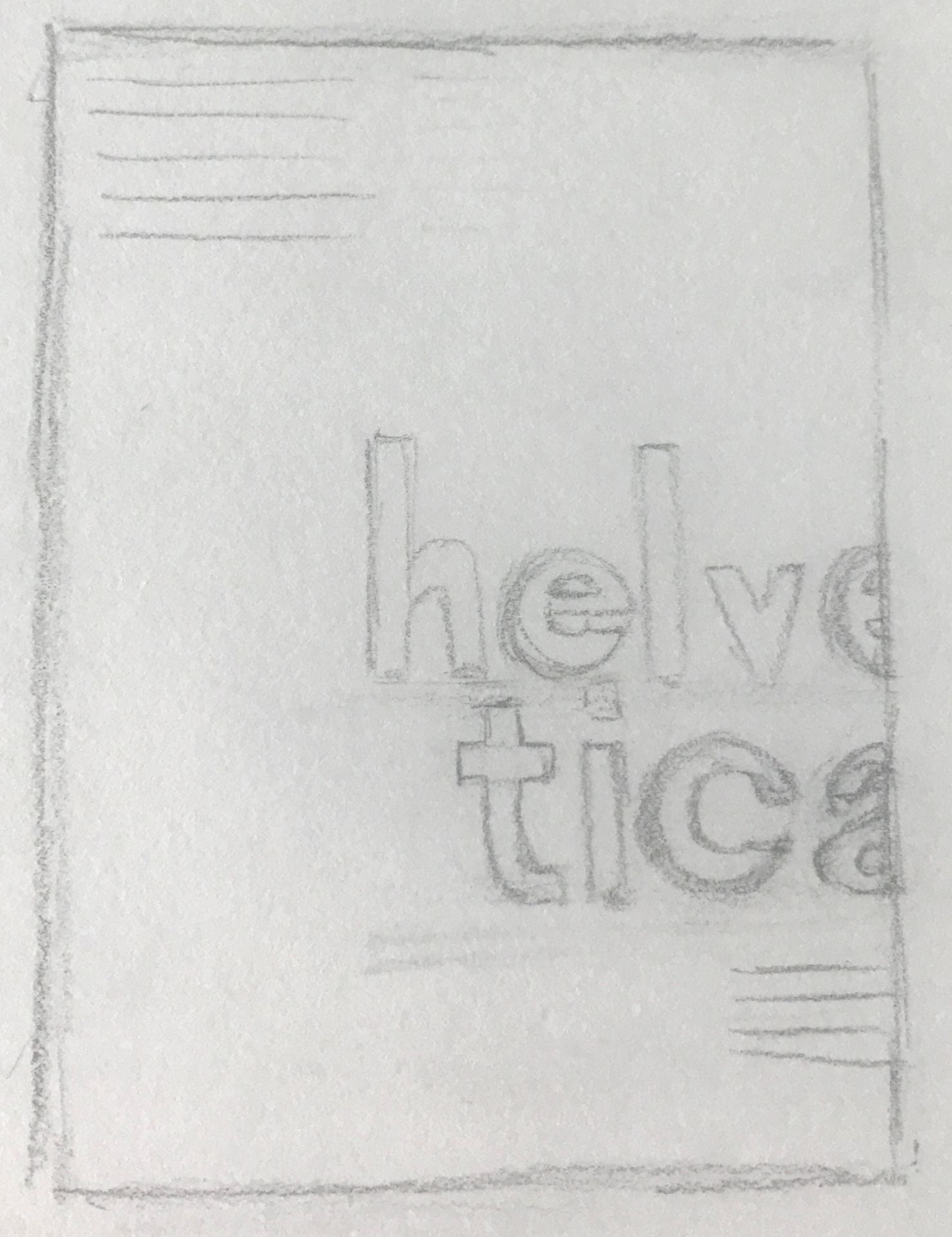
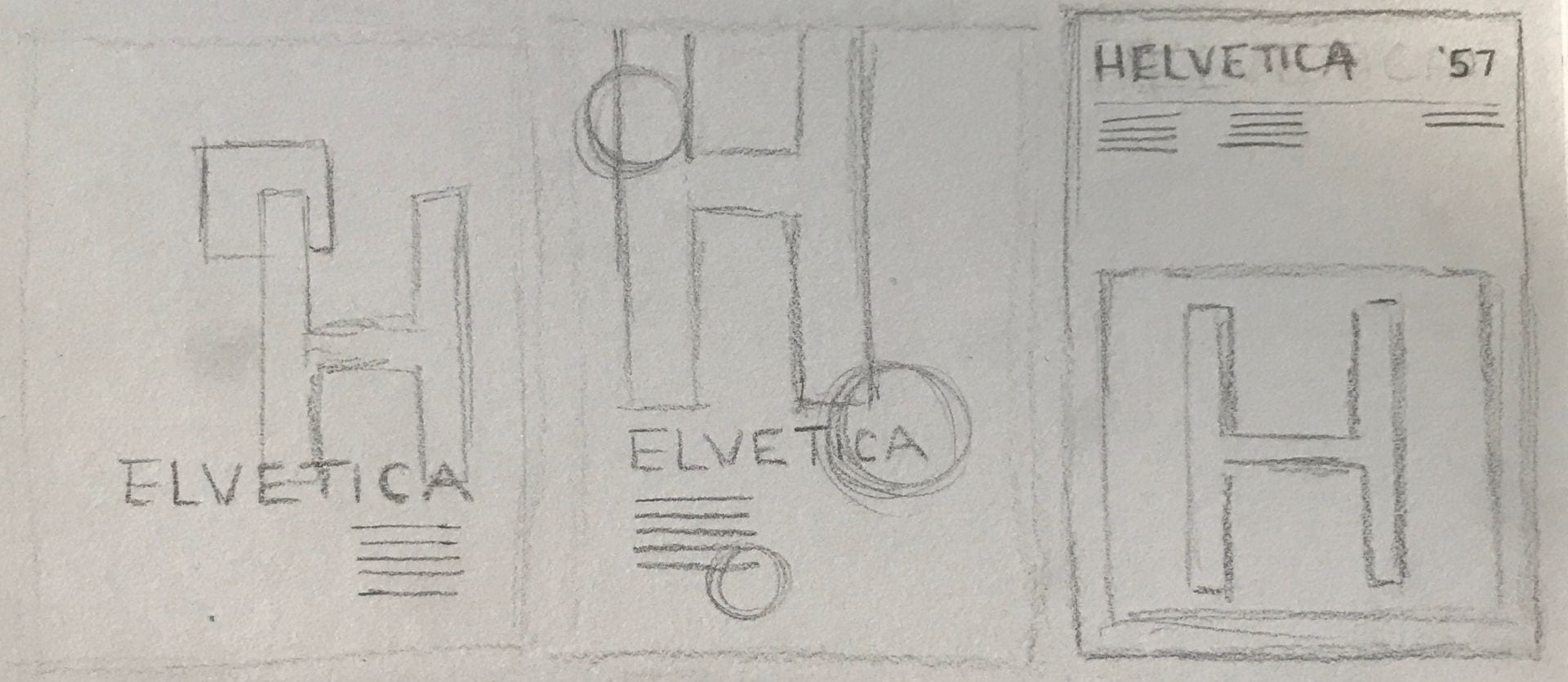
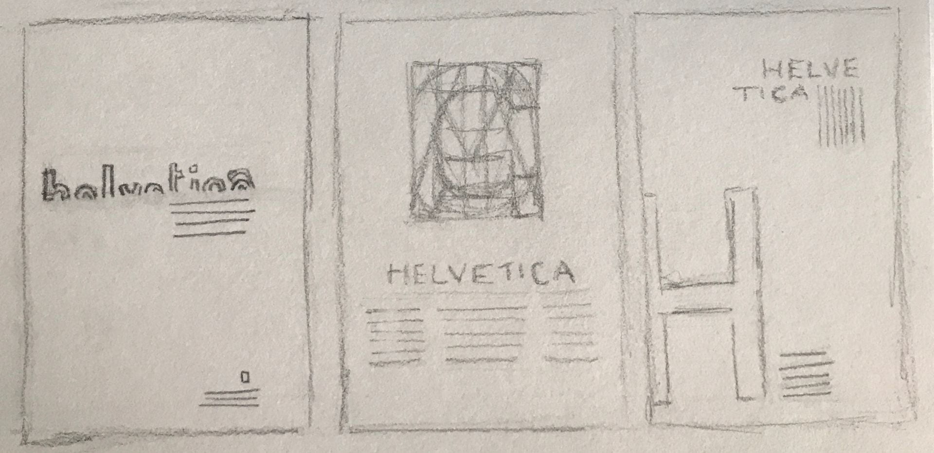
Sketches
I began to sketch ideas for a type specimen, to portray the typeface of Helvetica:


Development of Designs
After experimenting with some sketches, I decided to try and digitise some of my strongest designs.
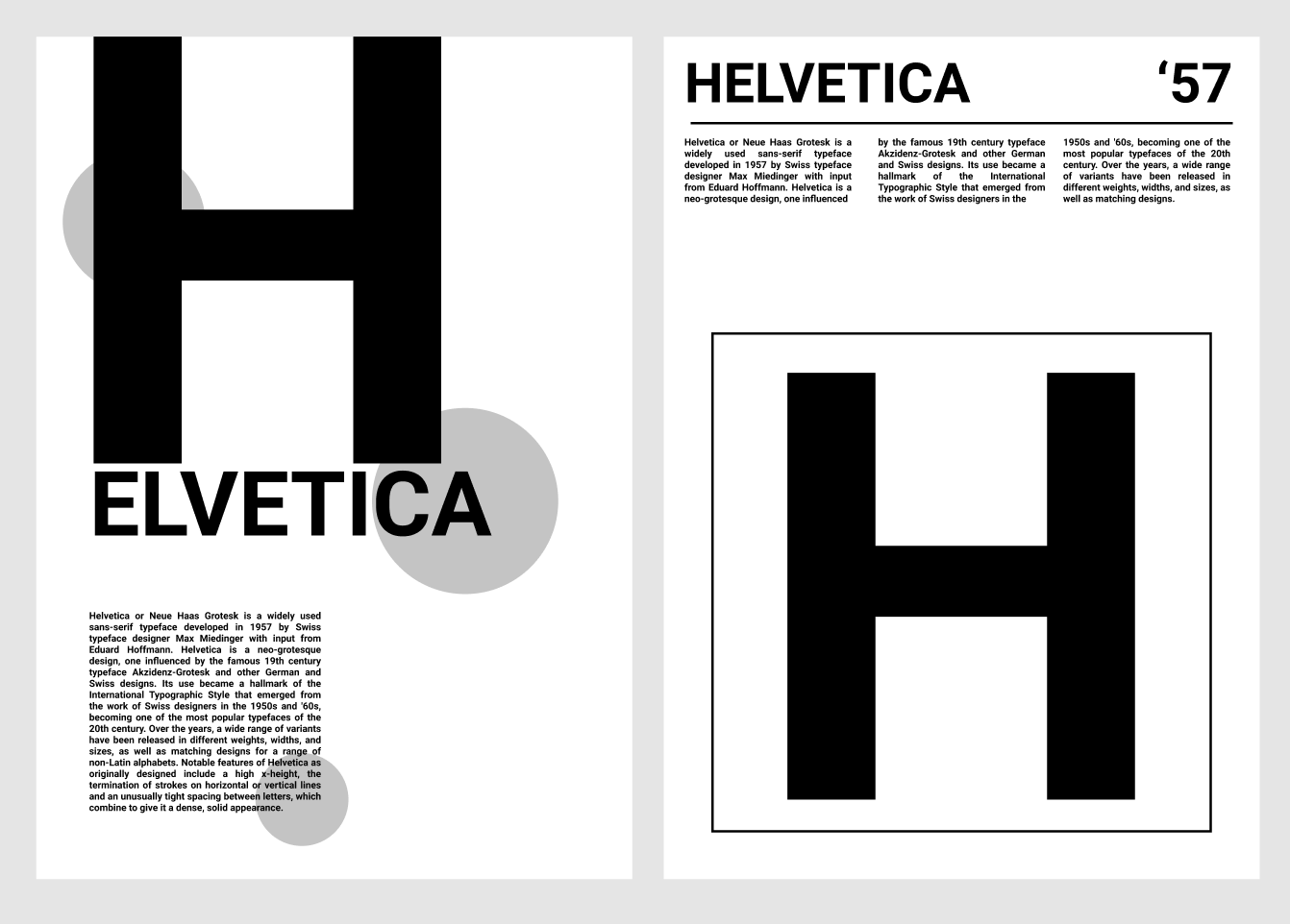
Out of all five of my designs, I have decided on the fourth one that I like best. I like how centred and grounded it feels, and how, out of all the letters at the top, the ‘H’ is the most prominent.

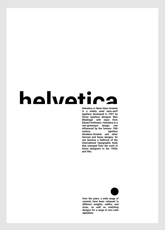
I can begin working on alternative designs for this piece, continuing to think about the end result. I have decided to begin working with colour. I wanted to keep the black and white theme for the majority of the piece, because I feel like it suits the layered lettering well. I went with red, as I feel this goes very well with black and white.
I decided to see how this design would look on a mock-up screen. I chose an iPad as an example.
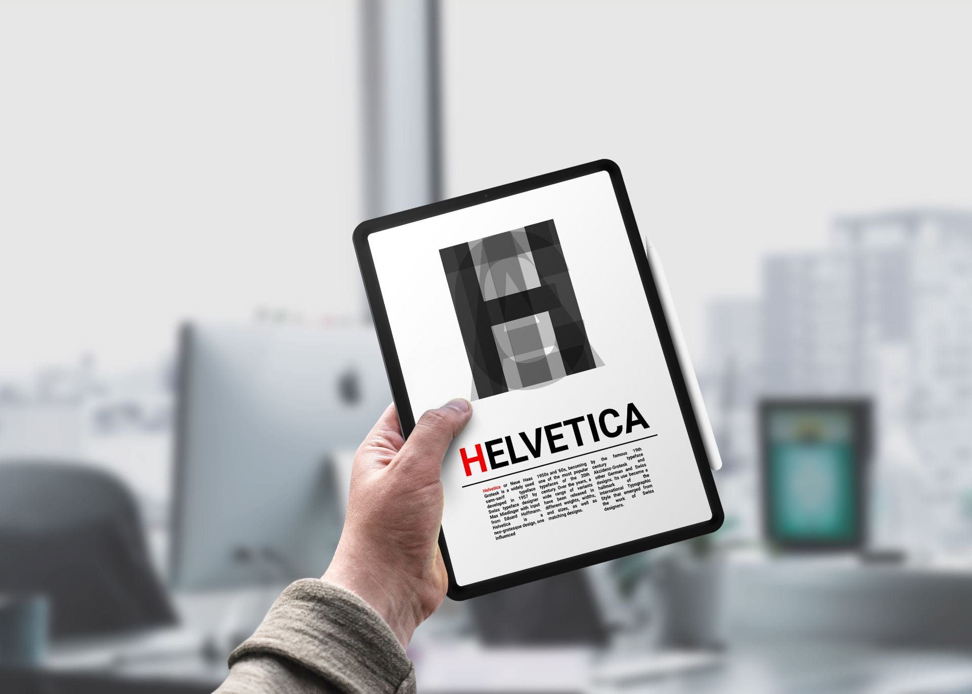
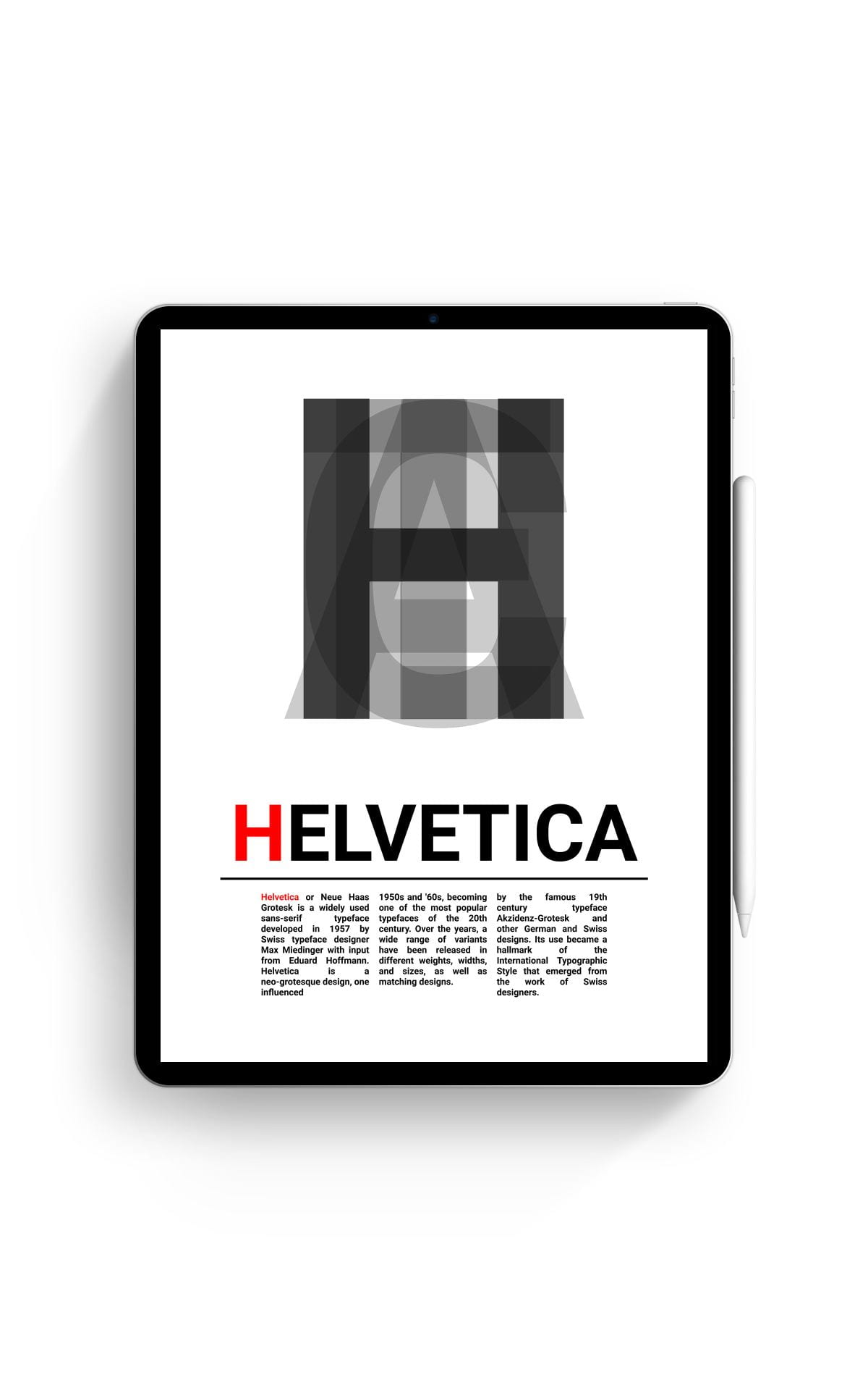
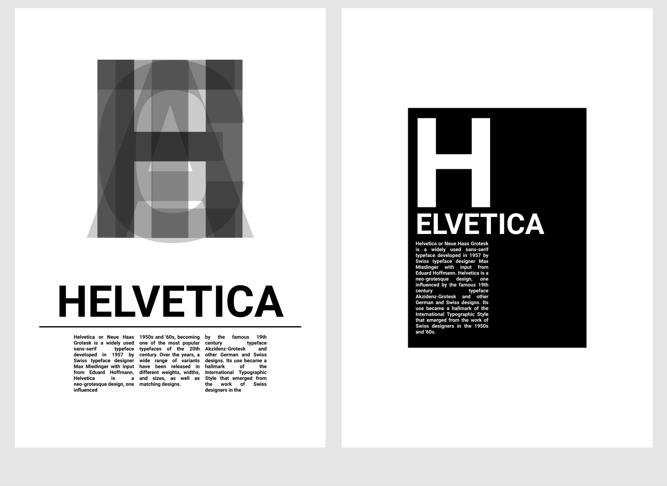
I have created these mock-ups, and after seeing what it looked like in a “finished” environment, I have been able to see that I don’t think this design is strong enough for a final product. In response to this, I am going to go back to my original designs, and attempt to develop one other one, as I feel this one is just too simple.
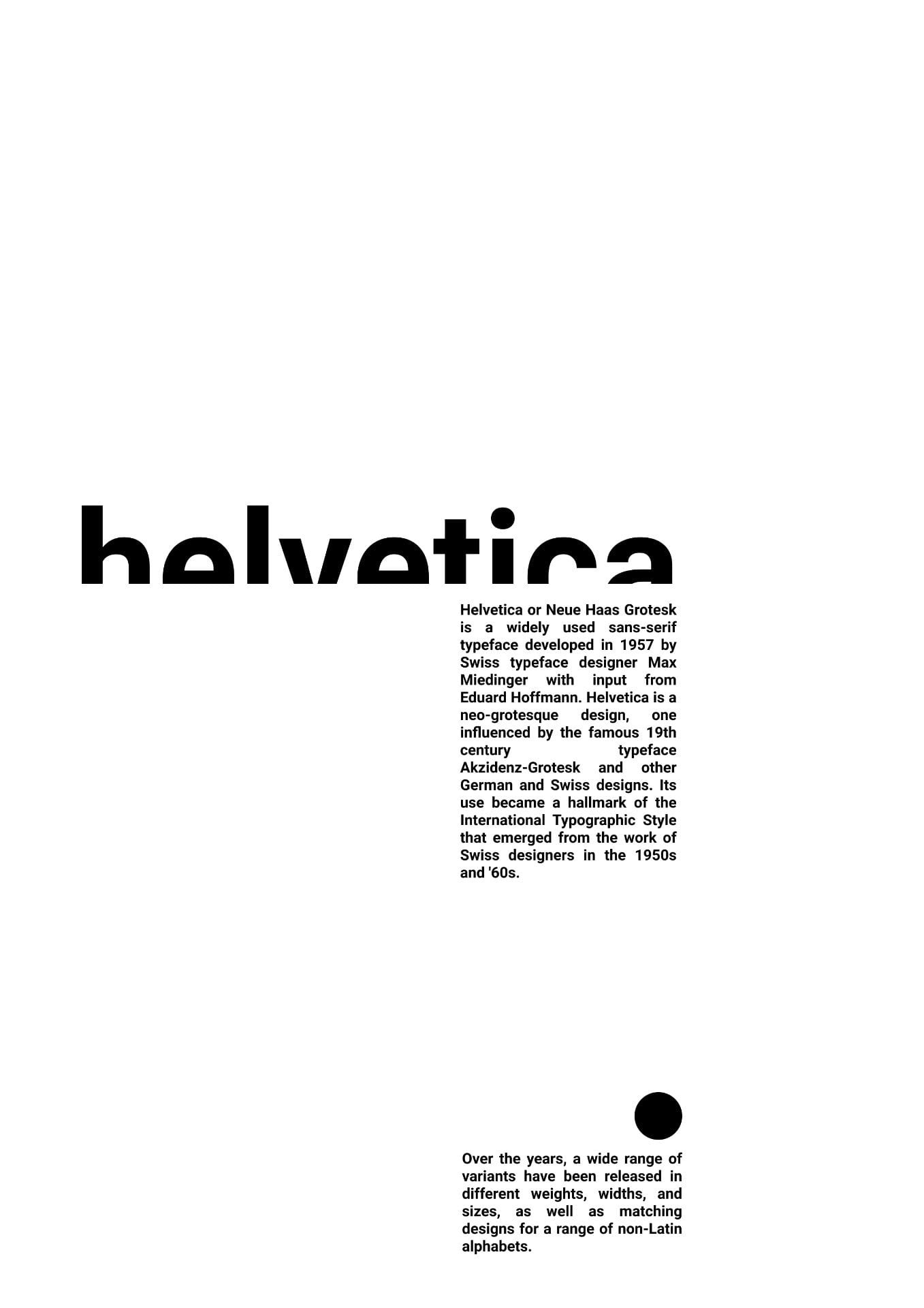
I decided to develop this design further, as I feel it had a very unique and interesting structure, with most of the elements towards the left of the screen.
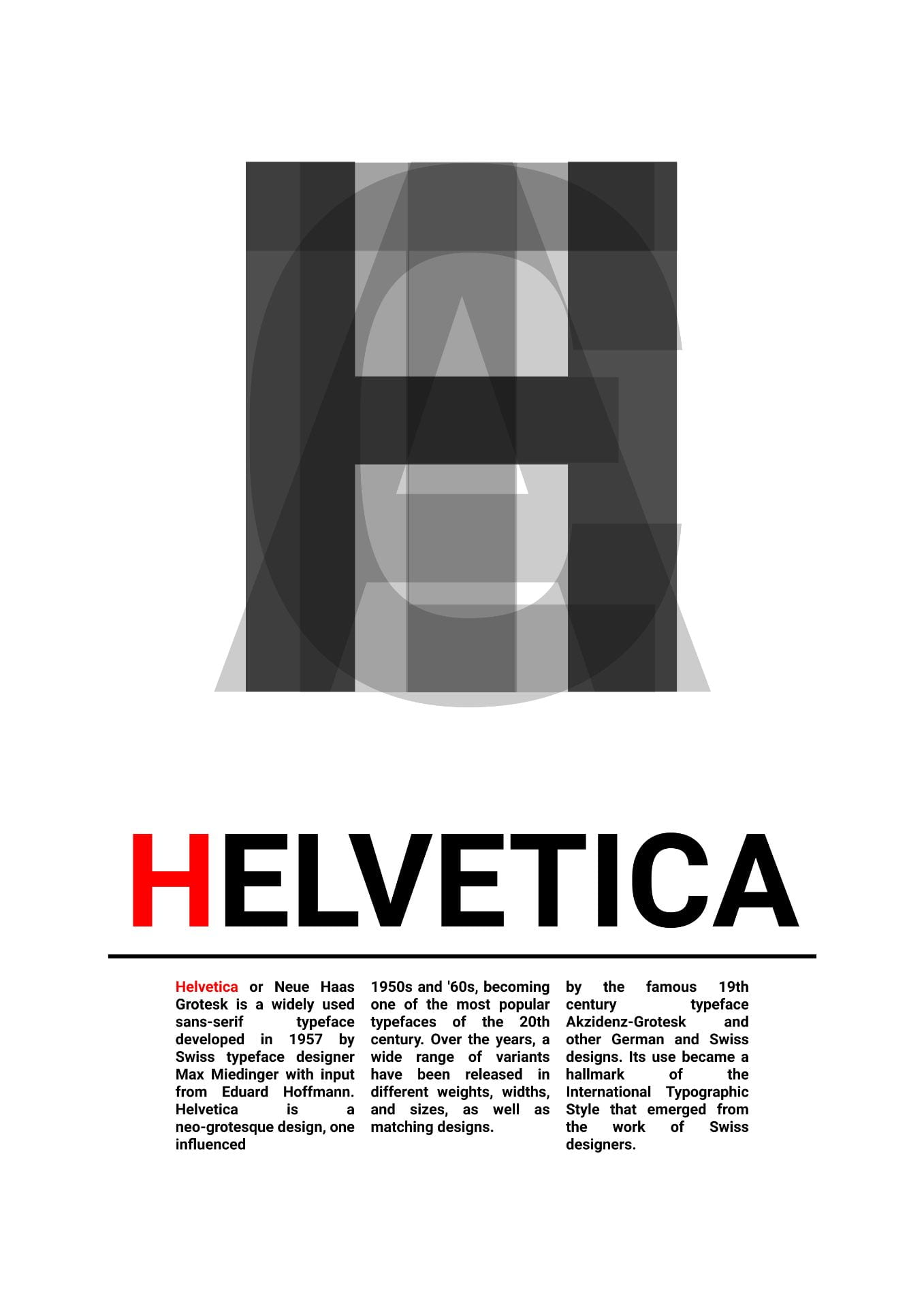
I changed the background from white to black. I feel like this adds more sophistication to the piece, and draws more attention to the red elements which I added for use of colour.
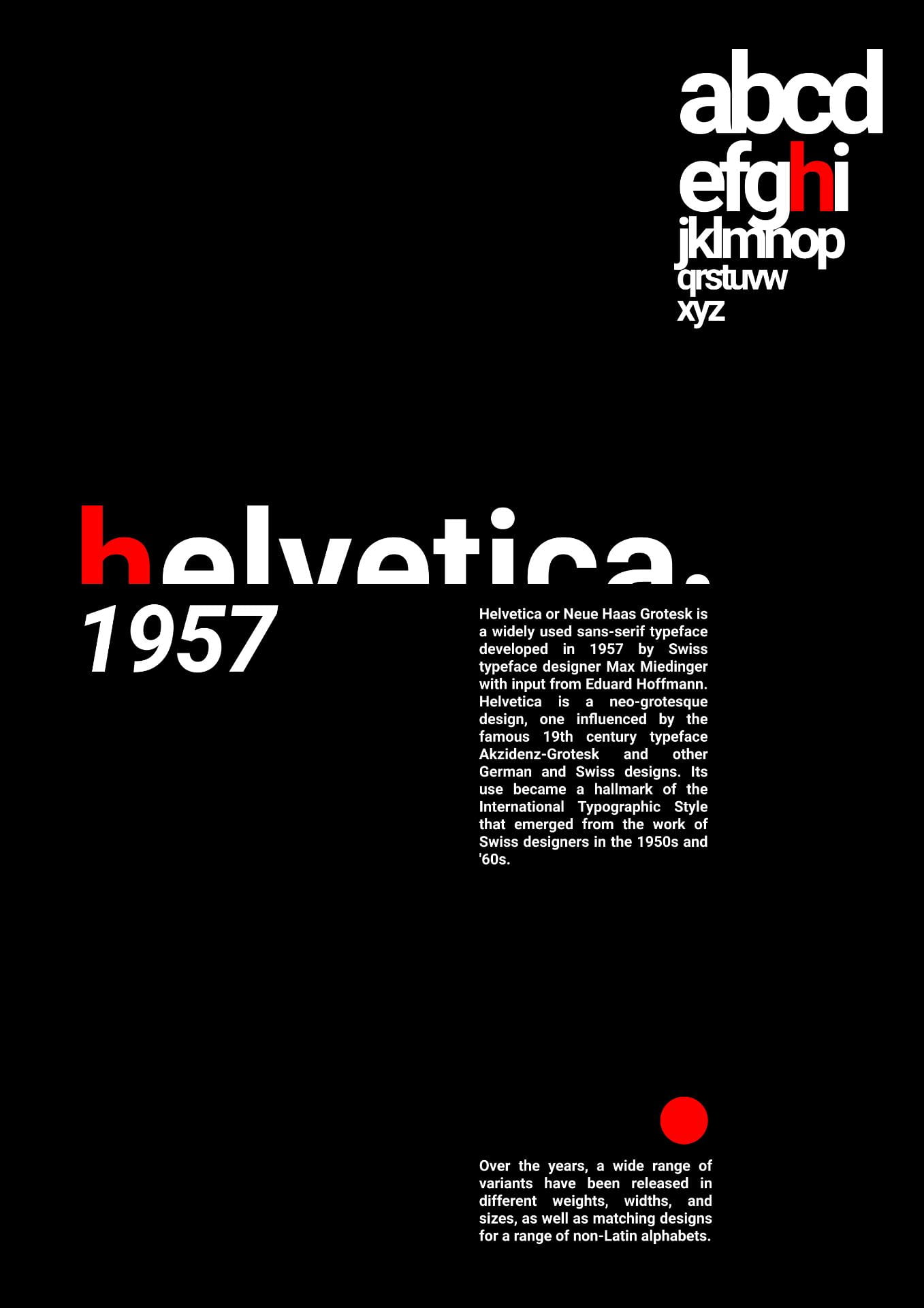
Final Design

I really liked how this design turned out, as I felt it captured the sleek, simplistic feel of the original font. I also really like the black background instead of the white. It feels more distinctive and unique, rather than generic. I also think the red goes really well against the black, and helps the letters to stand out.