Colour Theory can be deduced into 5 main sections of Hue, Saturation, Lightness, Colour Groups and the meaning behind colours and their application.
Hue
Starting with hue, it’s important to understand that hue simply refers to the “colour of the colour.” While this may sound complex, it’s actually quite simple once you break it down. Fundamentally, colour is just colour, and hues are the variations of that colour which we perceive. These variations exist on a spectrum, where colours shift and blend into one another.
- Hue is the name of a colour (e.g., red, blue, yellow).
- Colours are perceived along a spectrum, transitioning from one hue to another.
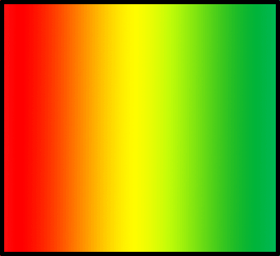
- As hues change, they can become similar colours. For example:
- Red – Orange
- Orange – Yellow
- Yellow – Green
- And so on…
Each of these transitions represents a change in hue along the spectrum, producing a range of similar but distinct colours.

Saturation
Saturation is one of the three main components of colour, alongside hue (the colour itself) and value (the lightness or darkness of the colour). The level of saturation is influenced by the amount of gray mixed with the colour:
- High saturation means a colour is very pure and intense.
- Low saturation means the colour appears faded or pastel-like.
In practical terms, you can increase or decrease saturation in digital art programs by adjusting the colour’s intensity, making the colour appear more vibrant or more muted.

Lightness
So, what is lightness? The word might imply it refers to the “lightness” of a colour, but this isn’t quite accurate. Lightness actually refers to the shade or tint of a colour.
- A shade is created by adding black to a colour. For example, when you add black to blue, you get various shades of blue that become darker, edging closer to black but still retaining some vibrancy.
- A tint is created by adding white to a colour. This makes the colour lighter, but again, it maintains its vibrancy without affecting the hue or saturation.
The process of adding black (shade) or white (tint) doesn’t change the hue or saturation of the colour, which is a separate process. The purpose of adjusting lightness is often to keep colours vibrant. For instance, this can be seen in how the time of day impacts the appearance of colours or to guide a viewers eyes to a focal point or change in emotion.

Colour Groups / Colour Wheel
Colour groups and the colour wheel are essential concepts in colour theory, widely used in creative fields like animation and filmmaking. The colour wheel is a circular diagram that arranges colours to show their relationships, helping creators understand how colours complement, contrast, or harmonise with each other. It organizes colours into primary, secondary, and tertiary categories, aiding in colour combination decisions.
Colour groups / Colour Harmony are collections of colours that share common characteristics, such as primary, secondary, warm, cool, and neutral colours. These groups serve as practical palettes for us to navigate how we want to evoke specific emotions. In animation and filmmaking, colour groups define a project’s overall look and mood, convey themes, and enhance storytelling. The adobe colour wheel is something Sarah showed us to help select and experiment with colour combinations to build custom palettes, making the process easier and more understanding for me personally as its always been difficult to understand colour theory for me and I had no idea this website even existed. To summerise, the colour wheel shows colour relationships, while colour groups provide palettes that help set the tone, mood, and emotional impact of an animation or piece of work.
There are some core colour harmonies that are used more than others, however they all serve a purpose it just depends on the type of mood or animation we’re trying to make, for the nuclear winter world my suggestion would be greens or reds, but for my previous group the vampire group it would be likely reds and western oranges.
This weeks homework as a group was to discuss colour palettes and potentially choose which one we wanted to continues with. I made two for the group, and I applied one of them to the in class workshop image we were given just to see how it would look on my computer, and after doing it I can see now what the intent behind colour theory is, as the scene looks like a warm desert or canal, whereas if it was green it would look more toxic and dread. Below are the images I whipped up as examples of the colour groups.

Monochromatic Harmony


Analogous Harmony
Analogous Harmony Exercise
Colours also have meaning, this isnt subjective, this is a primal instinict, its just human nature, and this allows us to use colours to extract emotions from our works. Obviously to get the most out of the colours theres massive combinations of acting, story, voice, emotion and colour to have the most impact, but as a base the colours tell us what to feel.
