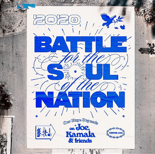
What is a manifesto/ motto/ mantra?
Definitions of a manifesto – “published declaration of the intentions, motives, or views of an individual/ group”
Definitions of a motto – “a short sentence or phrase chosen as encapsulating the beliefs or ideals of an individual/ group”
Definitions of a mantra – “a statement or slogan repeated frequently”
They’re visible reminders of what your beliefs are and reminders of why you’re doing the work you do. They’re a reminder that you can look at when facing new challenges to help motivate you and inspire you.
They are a “battle cry to inspire you when things get tough”
What does a manifesto mean to me?
My goal with writing my manifesto will be to create a saying/ motto that will inspire me to work harder and smarter. I want to give myself a visible reminder of how to go about encountering new challenges and come up with a motto to help me when I feel I am failing or falling behind on coursework.
A manifesto is a declaration of what you’re going to do/ what your goal is. This year my goal will be to get a good grasp of design fundamentals, understand how to navigate/ operate design software and learn how to code.
In order to come up with a motto/ manifesto I will need to identify my own weaknesses so I will know when I need help facing new challenges.
What are my weaknesses that my manifesto could help me overcome?
I struggle with overthinking when I’m given a new assignment. I stress myself out about planning on what I’m going to do before putting a pencil to paper as I’m scared the outcome won’t be perfect.
How do I avoid this problem?
I should calm myself down and take a short break and rejuvenate before I get myself into that overthinking state. I need to accept that the outcome will never be perfect unless I allow trial and error.
Examples of manifestos in art movements
Many manifestos are political, but artists began issuing manifestos declaring their aesthetic aims in the 1880s.
Dadaism
The dada manifesto was written by Hugo Ball and Tristan Tzara and began in Switzerland; Balls piece was written in 1916 and Tzaras was two years later in 1918. Both are explanations of the dada movement and its goals however the content differed as the modes for spreading the content throughout the world changed.
The purpose to dadaism was to convey that anything could be art if the artist deemed it to be. While this allowed for more creative freedom at the time it also shocked and angered many more traditional artists. As a result of dadaism becoming more popular it rendered their art pieces as worthless despite them spending laborious amounts of time on them.
 a two page layout of Tristan Tzara’s Dada manifesto
One of the greatest and most iconic examples of Dadaist art is Marcel Duchamp’s “Fountain”, a factory-produced urinal he submitted as a sculpture to the 1917 exhibition of the Society of Independent Artists in New York.
His intention all along was to puzzle, amuse, and provoke his viewers. It was a new form of art called the “readymade”— a mass-produced or found object that the artist transformed into art via selection and naming. The readymades challenged the very idea of artistic production.

Surrealism
four Surrealist Manifestos are known to exist. The first two were published on October 1924 and they were written by Yvan Goal and André Breton.
They were written out of rivalry between two surrealist groups. The first manifesto to be published was written by Yvan Goll. Yvan Goll published the Manifeste du surréalisme on 1st October 1924 (two weeks prior to the release of Breton’s Manifeste du surréalisme).
Brentons manifesto was written with a great deal of absurdist humor, showing the influence of the Dada movement which came prior to it.
Within this manifesto Brenton explains that the surrealist movement was about being a non conformist, and he writes that it follows no set plan or pattern.
Brenton and Goll both fought with each other over the rights to the term surrealism, in the end Brenton won.

Yvan Goll- “Surréalisme”, October 1st 1924
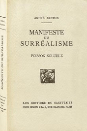
Andre Brenton – “Manifeste du surréalisme”, October 15th 1924
Brenton in the third manifesto in 1929 asked Surrealists to “assess their degree of moral competence”, and his third surrealist manifesto was not issued during his lifetime.
To conclude: surrealism from what I gather was focused on tapping into the unconscious mind to release creativity. There was an emphasis put on dreams and the imagination when creating surrealist poetry or art. Surrealistic art is characterized by dream-like visuals, the use of symbolism, and collage images
De Stijl
De stijl was an artistic movement that begun in 1917 and lasted until roughly 1931, it began in Holland and was both an artistic and architectural movement. De Stijl means “the style” in dutch and was also known as neoplasticism. It was led by the painters Theo Van Doesburg and Piet Mondrian.
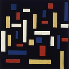 Theo van Doesburg -“composition VII”
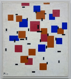 Piet Mondrian- “Composition en couleur A”
It was a “utopian perception of spiritual harmony” according to Mondrian. They were a lot more concerned with the nature of form and colour themselves rather than the appearance of the world around them. Mondrian felt that the three dimensional world was “deceptive” in a way and that de stijl aimed at looking at the world from the simplest, most basic levels. That’s why there’s such an emphasis on simple, basic shapes, primary colours, and the three primary values, black, white, and grey.

Other designs/ designers work I’m inspired by
– Barney Bubbles record sleeve work for Ian Dury and the Blockheads’ “Hit Me with Your Rhythm Stick”
Barney Bubbles was an English graphic artist whose work encompassed graphic design and music video direction. He also sketched and painted privately and is best known for his contribution to the design practices associated with the British music scene of the 1970s and 1980s. His record sleeves were his most recognisable outputs and probably the work I am most inspired by when it comes to this artist.

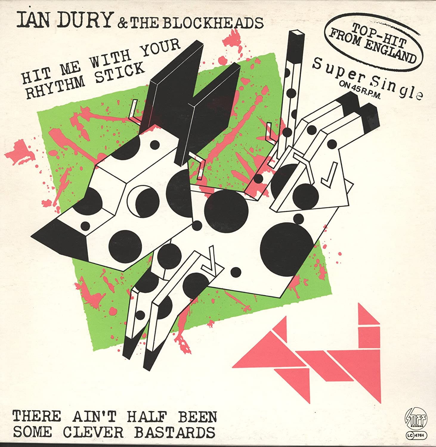
I really like his use of abstract black lineart paired with the bright green and pink shapes layered over and under. I feel I could maybe achieve a similar effect using ink and acrylic paint.
The method he used where he simplified the dog into geometric shapes and then took the pieces apart for the back of the album cover to me is reminiscent of De Stijl.

Theo van Doesburg (one of the De Stijl pioneers) also did this in his artwork which I found interesting. He took a very natural, organic shape of a cow and through the process below he created an abstract painting purely made up of colourful squares rectangles.
-Jennet Liaw (a graphic designer based in NYC)
I am also inspired heavily by this more modern artist. I love the way she uses only two block colours in her designs as well as a range of bold fonts
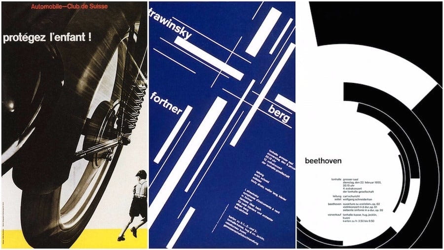
The International Typographic Style
Also known as the “Swiss style” consists of blocky layouts, a minimalist design ethos, and sans serif / Helvetica typefaces.
Josef Müller-Brockmann was a leading Swiss designer in the 1950s. he is remembered for his posters which are made striking through the use of primary colours, black and white photographs, and slanted text.
In his own words he describes the process of his work:
“In my designs for posters, advertisements, brochures and exhibitions, subjectivity is suppressed in favour of a geometric grid that determines the arrangement of the type and images. The grid is an organisational system that makes it easier to read the message…”
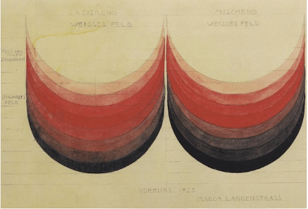
Paul Klee
Paul Klee was a swiss born German artist. His style was also highly influenced by expression, cubism, and surrealism. He was deeply interested in colour theory and was known for his colour theory classes at the Bauhause school of art.
I really like this imagery from his colour course, its purpose was to emphasize how changing the values and saturation of colour can change the feeling it creates.
Ideas for my own manifesto/motto
“Art isn’t always perfect”
“Don’t overthink art”
“Grab a pencil and make something”
I feel I struggle a lot with beginning a new project. I’m a perfectionist and as a result I find it hard beginning the process as the beginning is never exactly what you want the end product to look like. In order to combat this problem, I just need to start into it and put pencil to paper.
“Pour yourself a cuppa and pull yourself together”
I really like this motto because it is simultaneously a comfort to read and it also makes me feel more in control of my work. I like the alliteration of the two repeated p words and I also feel I could do a lot visually with this motto. I feel it will instantly calm me down if feeling stressed about work and it would put me in the right mindset for a new challenge. It’s a visible reminder for me to take a short break from work and clear my head for a bit before getting stuck in again.
My design

I started deciding on the placement of my words after that and settled on something similar to the first or second.


At first I decided I wanted one of my manifesto designs to be inside the shape of a teacup. (This is a quick sketch of the shape I decided on along with the general word placement)

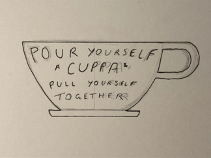
I was heavily inspired by this design by Jennet Liaw when drawing my own, however I scrapped this idea after realising that the teacup mug left a ring on my sketchbook page.

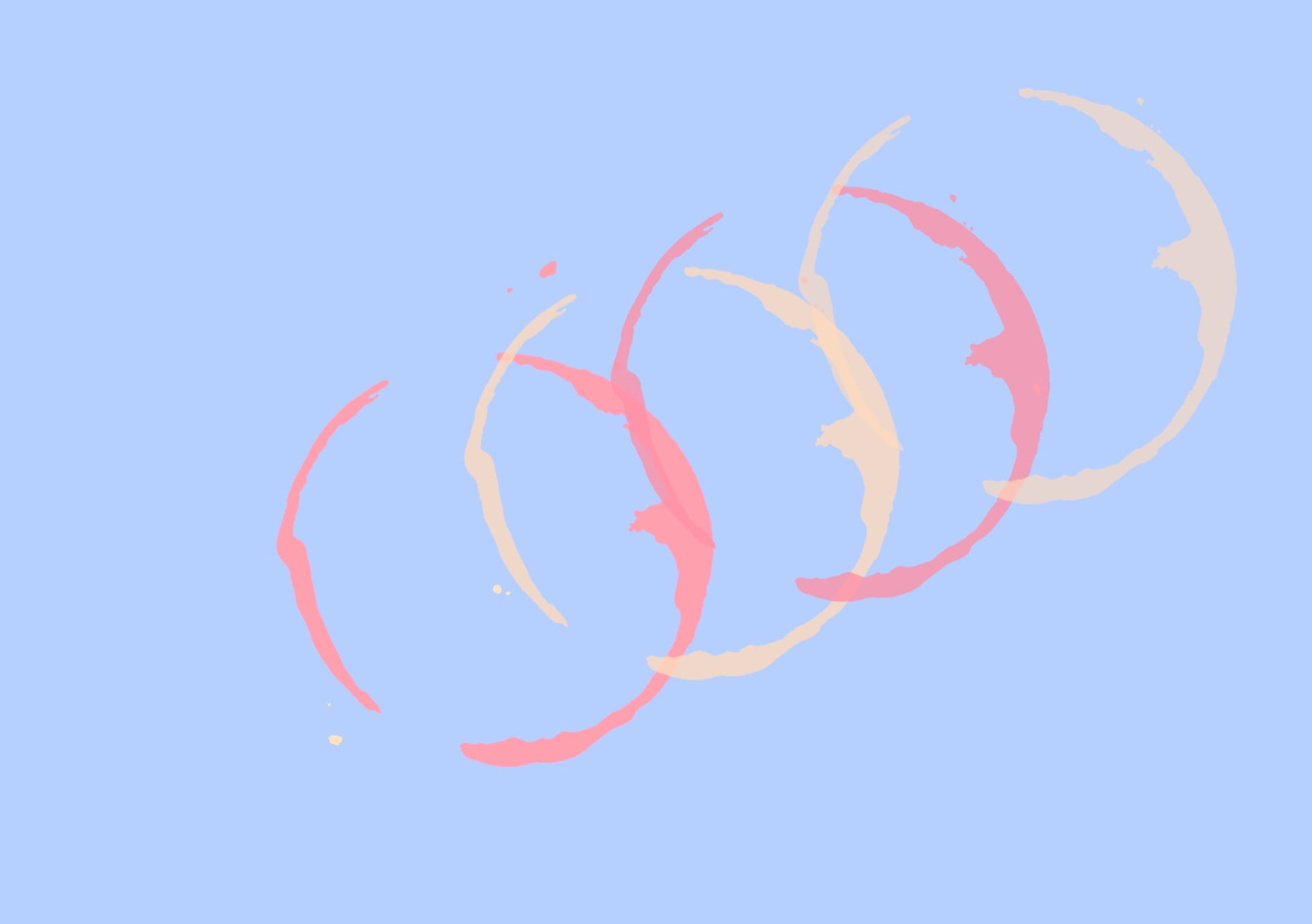
The above ring is after I tried using brown watercolour instead as I found the below tea stain to be too pale to work with.

After letting it dry this was the final outcome of the watercolour teacup ring.
Usually I would use oil paint or gouache paint for my designs/ art but I wanted to experiment more with using a drawing tablet for this first project. I’m inexperienced with drawing digitally so I decided I’d draw over this watercolour print on Procreate.

I duplicated the ring 3 times and changed the colours to be blue, tan and pink as I felt the connotations of those colours fit what I was communicating with my work the best.
After looking at Josef Müller-Brockmanns style I decided I wanted to make my text slanted as well as make the text font Helvetica.

I again took inspiration from Josef Müller-Brockmann for this variation too. I really liked how in his Beethoven poster the background spiraled out from the words he was saying.
