The pioneers of postmodern design
group members:
- Emma M.
- Rachel D.
I was very nervous at the start but I ended up in a great group, we were able to work well together and divide the work up well. We had our first video call moments after the class ended and got to work.
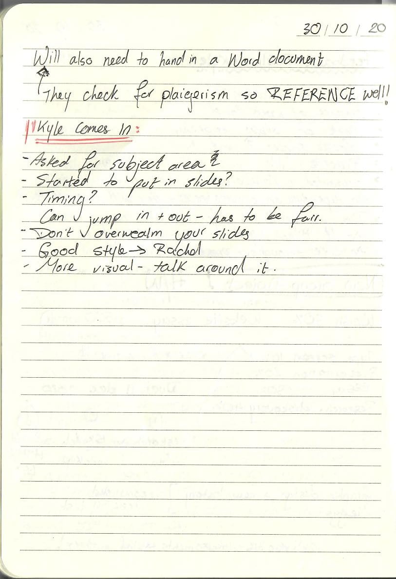
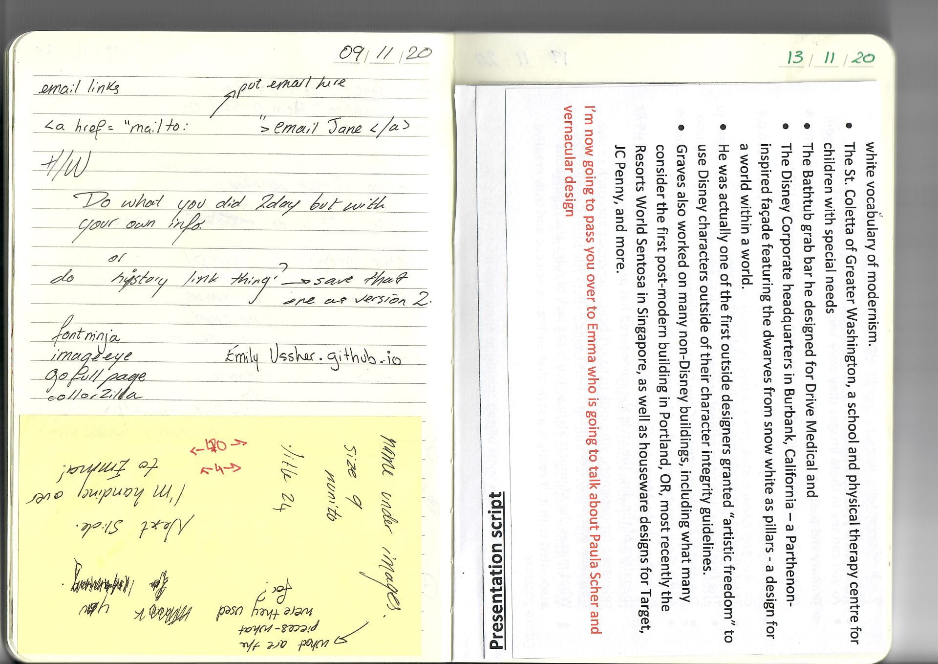
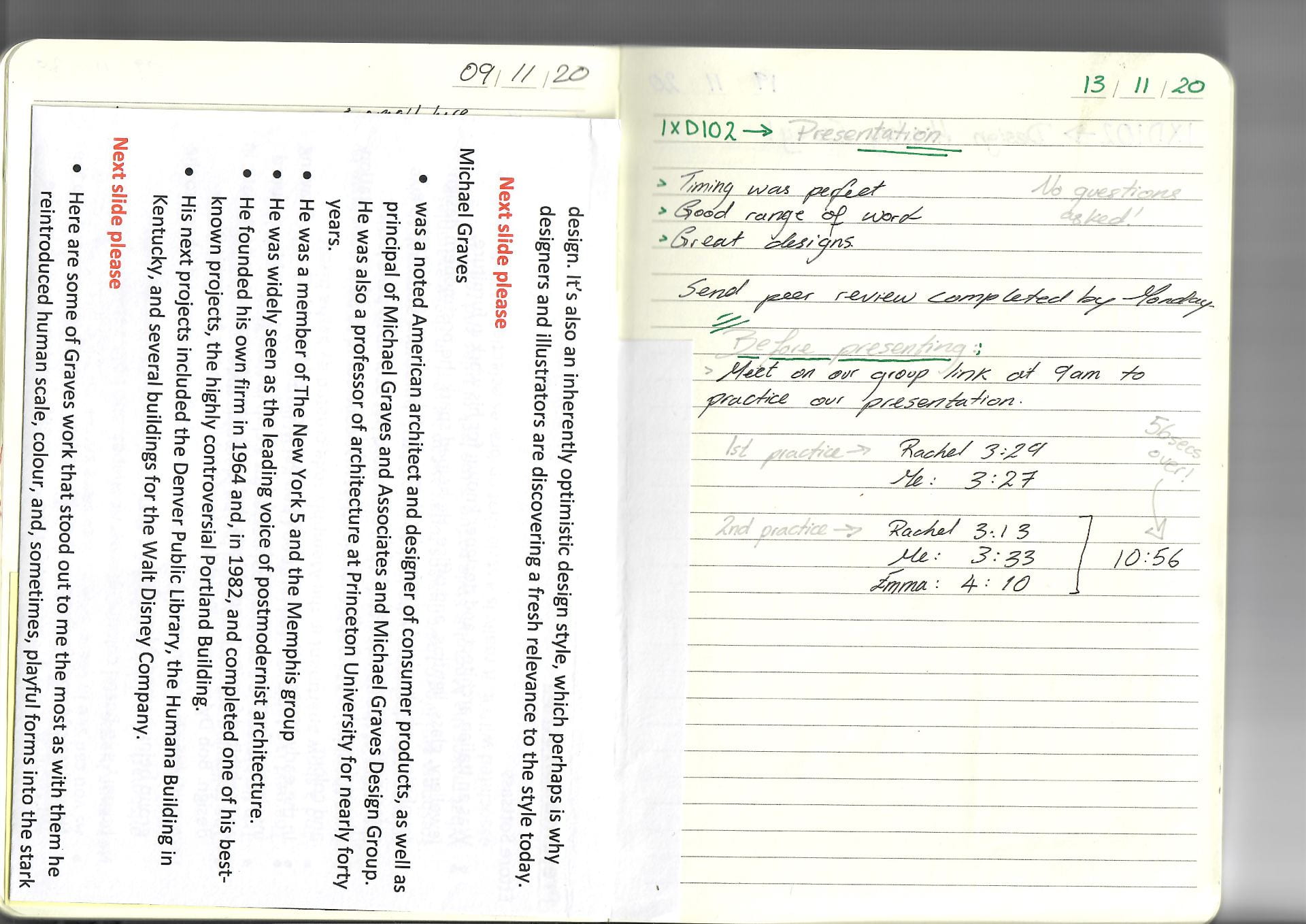
These are the notes I took during the group meetings

Research
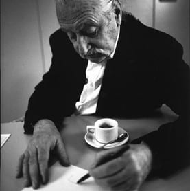
Ettore Sottsass (1917–2007)
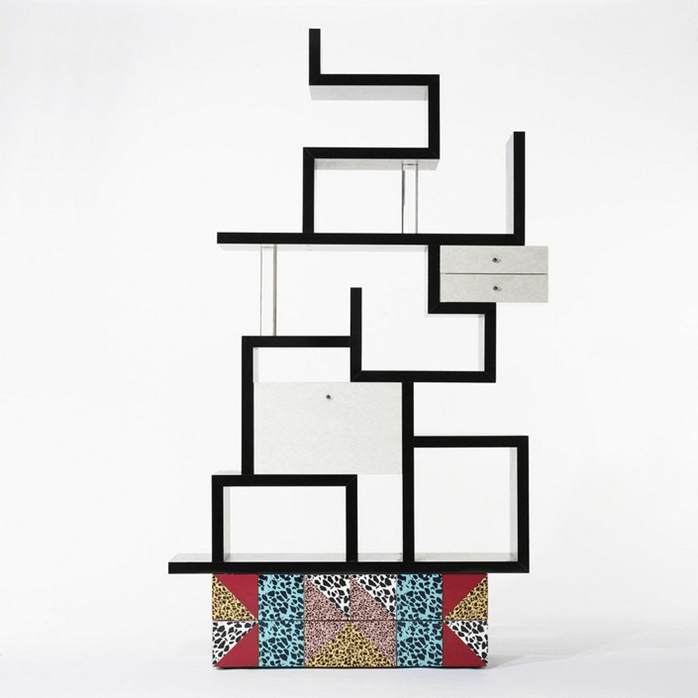
 He helped spark the postmodern design revolution, which mixed pure modernism with colour and pattern, historic references and unabashed pastiche. Now-classic Memphis pieces such as his Carlton room divider rocked the design world in the early 1980s, and continue to inspire designers today (a burned Carlton divider appeared in the 2004 show “Where There’s Smoke” at Moss). (Walters and May 2020).
Sottsass was considered the key source of inspiration and the binding force within Memphis, along with his partner Barbara Radice. His contributions to the group included furniture, lamps, ceramic and glass objects, as well as decorative patterns for material. (Memphis, 2020) Barbara Raddice was closely involved in the founding of Memphis. Along with Sottsass, with whom she had lived since 1976, she became the driving force and artistic leader of the Memphis movement. (Memphis, 2020)
Ettore – better description?
An Italian architect and designer known for his large oeuvre including furniture, jewelry, glass, lighting, and office design, Ettore Sottsass was also the founder in the early 1980s of the Memphis Group. Drawing inspiration from such movements as Art Deco ad Pop Art, Memphis produced and exhibited furniture and objects that were vibrant in color and futuristic in design. Sottsass’ own work was known for its variety, oftentimes incorporating playfulness through ornamentation and color. His Olivetti typewriter (1969), one of his most celebrated designs, made of bright red-orange plastic, was a Pop phenomenon in both its functionality and innovative design. His architecture and design career spanned many decades and styles. The Memphis Group’s designs have continued to be influential in the world of design, with its innovative vision inspiring the works of Tom Dixon and Thomas Heatherwick. Sottsass died in 2009 in Italy at the age of 90. Today, the designer’s works are included in the collections of the Art Institute of Chicago, the Design Museum in London, and The Museum of Modern Art in New York, among others.
Members
Ettore Sottsass, Barbara Raddice, Michele De Lucchi, Aldo Cibic, Matteo Thun, Marco Zanini, George James Sowden, Nathalie Du Pasquier, Martine Bedine, Andrea Branzi, Peter Shire, Michael Graves, Gerard Taylor, Shiro Kuramata, Massimo Iosa-Ghini, Marco Zanuso Jr, Javier Mariscal, Hans Hollein, Thomas Bley, Masanori Umeda, Beppe Caturegli, Ernesto Gismondi (Memphis, 2020).
Little about Memphis was truly innovative. Most of its concepts had been trail-blazed by Alchymia. Yet the Memphis collaborators were much more adept at communicating their ideas and at manipulating Ettore Sottsass’ contacts. He even persuaded Artemide, the Italian lighting manufacturer, to work with them.
The Memphis Group
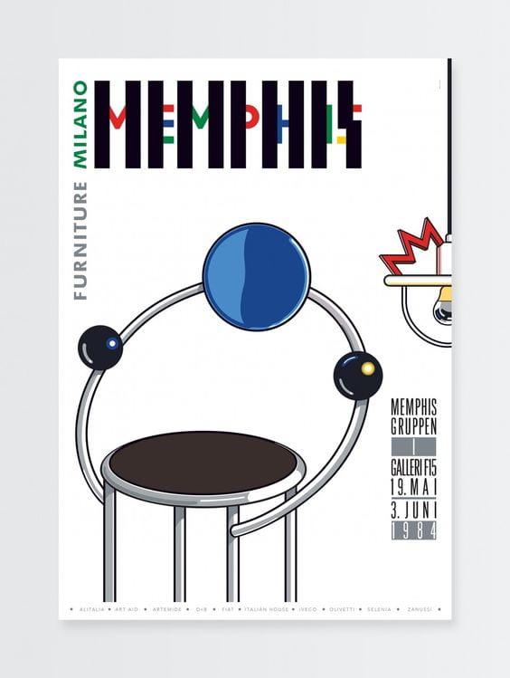
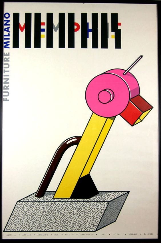
 In 1981, Italian designer Ettore Sottsass founded a group of artists and designers called Memphis. Bob Dylan’s song ‘Stuck Inside of Mobile with the Memphis Blues Again’ was playing on repeat during the group’s first meeting, which led to the group being named ‘Memphis’.
After the inaugural meeting, the group decided that they would meet again in February 1981. The members brought over 100 drawings with them, picturing a variety of bold, colourful designs with multiple stylistic influences.
The Memphis Group went on to create furniture, fabrics, patterns, ceramics and other products in a distinctly Postmodern style that blended stylistic traits of 1950s kitsch, Art Deco, and Pop Art. (Fussell, 2020).
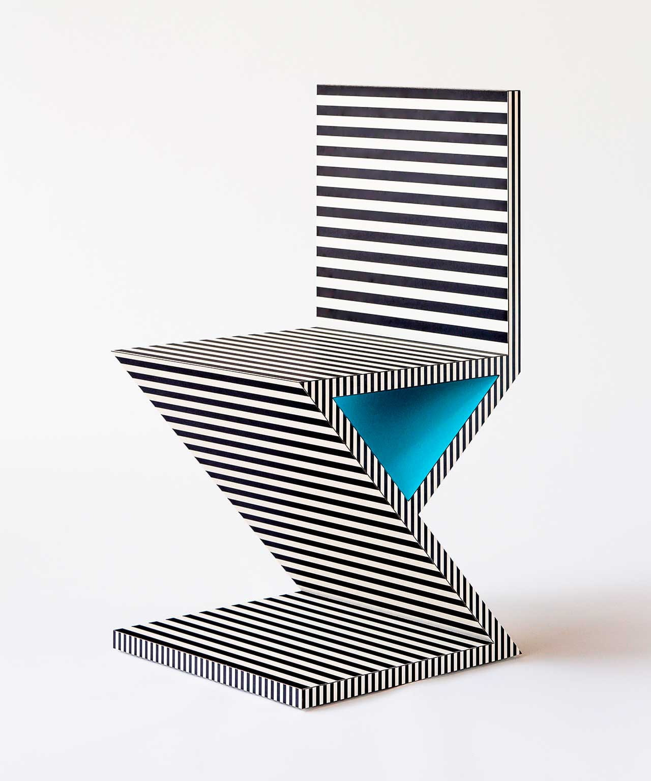
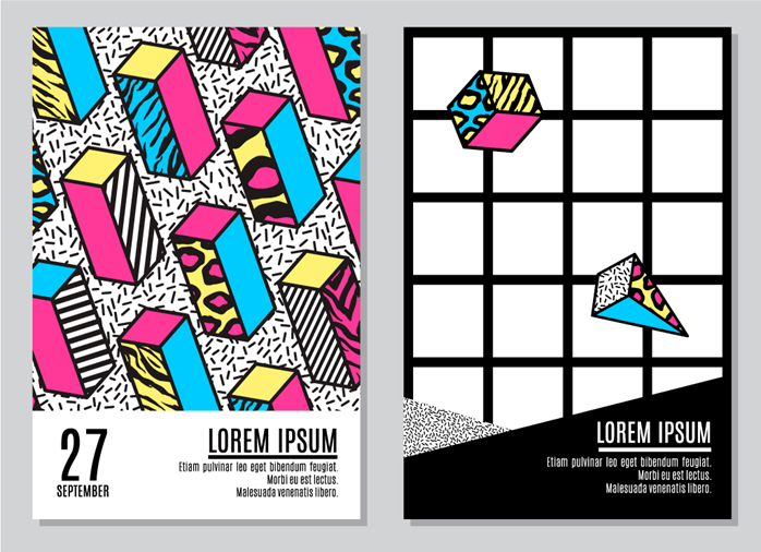
The style is known for its use of bright neon, primary and pastel colours, geometric shapes, and bold, repetitive patterns. It’s a mishmash of various design styles that were popular during the 1980s.
Graphic design has allowed the Memphis Style to be recreated for a contemporary audience, with designers creating patterns, textures, colour fonts and posters using its trademark geometric shapes and bold colours.
CONCLUSION
Even though the Memphis Group’s ethos was considered to be in poor taste by the critics of the day, the style they pioneered has proven to have lasting relevance for designers, who look to its off-beat, humorous approach to give freshness and life to their designs. What makes the Memphis Style so fun is the lack of rules and regulations associated with it. It really is a style that embraces eclectic and truly creative design. It’s also an inherently optimistic design style, which perhaps is why designers and illustrators are discovering a fresh relevance to the style today. (Fussell, 2020).
Michael Graves (1934–2015)
 Michael Graves was a noted American architect and designer of consumer products. As well as principal of Michael Graves and Associates and Michael Graves Design Group, he was of a member of The New York Five and the Memphis Group – and professor of architecture at Princeton University for nearly forty year. Graves was also a member of the Memphis Group and a leader of the postmodern movement. He founded his own firm in 1964 and, in 1982, completed one of his best-known projects, the highly controversial Portland Building. His subsequent projects include the Denver Public Library, the Humana Building in Louisville, Kentucky, and several buildings for the Walt Disney Company. (Michael Graves Design and Architecture | Architectural Digest, 2020). Graves was widely seen as the leading voice of postmodernist architecture, which reintroduced human scale, colour, and, sometimes, playful forms into the stark white vocabulary of modernism
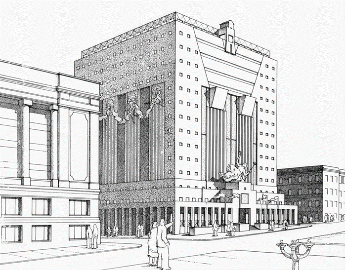
The Disney building – a world within a world
He was the creative mind behind the design of the Team Disney Building in Burbank. The Parthenon-inspired facade features the dwarves from Snow White as pillars because of him.
Graves went on to design the Walt Disney World Swan and Dolphin resorts, as well as Disney’s Hotel New York at Disneyland Paris. He even designed some items for Disney Consumer Products, including housewares, bookends, and watches.
In fact, Michael Graves was one of the first outside designers granted “artistic freedom” to use Disney characters outside of their character integrity guidelines.
Graves also worked on many non-Disney buildings, including what many consider the first post-modern building in Portland, OR, most recently the Resorts World Sentosa in Singapore, as well as houseware designs for Target, JC Penny, and more.
Just in case
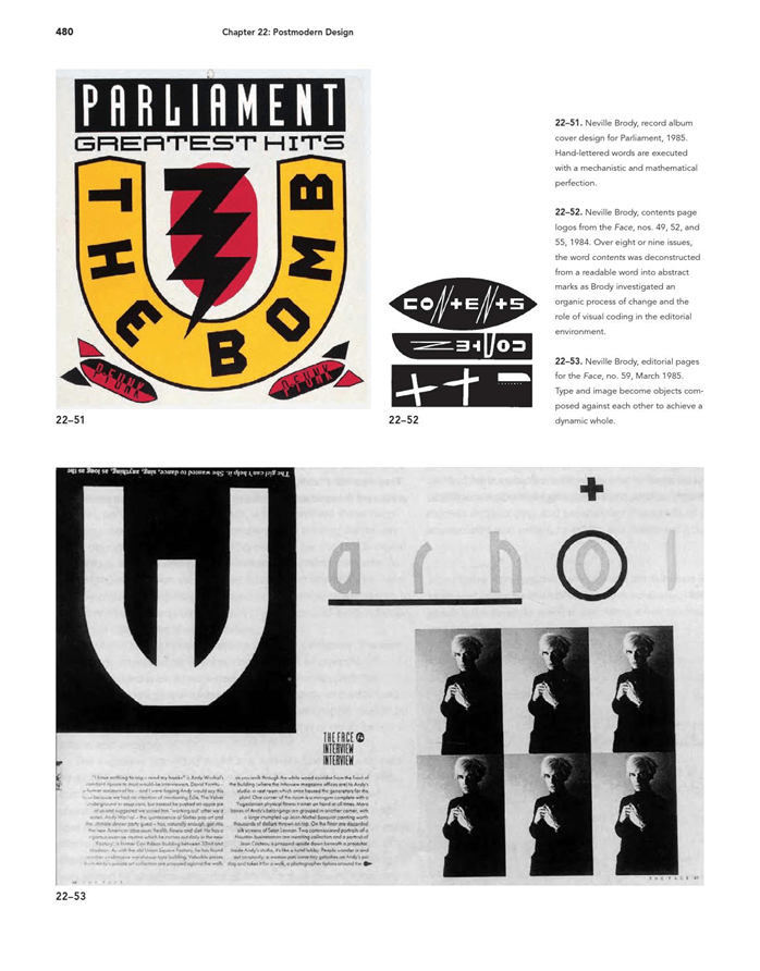
Neville Brody
Brody Associates is a London-based design studio specializing in identity, typography, and creative direction across all platforms. Founded by Neville Brody in 2014, we collaborate with the world’s biggest brands, celebrated institutions, and exciting start-ups.
Neville Brody is the founder of brody associates – a globally renowned, innovative, creative agency specializing in digital, typography and identity. brody is internationally recognized as a pioneer in the fields of graphic design, art direction and brand strategy having established his reputation working with record labels (stiff records), magazines (the face and arena) and a range of other international clients (samsung, yamaha, LVMH, NIKE, the BBC and the times london among them).
Bibliography
- Walters, H. and May, K., 2020. Ettore Sottsass, 1917-2007. [online] TED Blog. Available at: <https://blog.ted.com/ettore_sottsass/> [Accessed 20 October 2020].
- Design Museum. 2020. Memphis. [online] Available at: <https://designmuseum.org/memphis#> [Accessed 21 October 2020].
- Architectural Digest. 2020. Michael Graves Design And Architecture | Architectural Digest. [online] Available at: <https://www.architecturaldigest.com/michael-graves-architect> [Accessed 21 October 2020].
- Fussell, G., 2020. What Is The Memphis Style?. [online] Design & Illustration Envato Tuts+. Available at: <https://design.tutsplus.com/articles/what-is-the-memphis-style–cms-31160> [Accessed 20 October 2020].
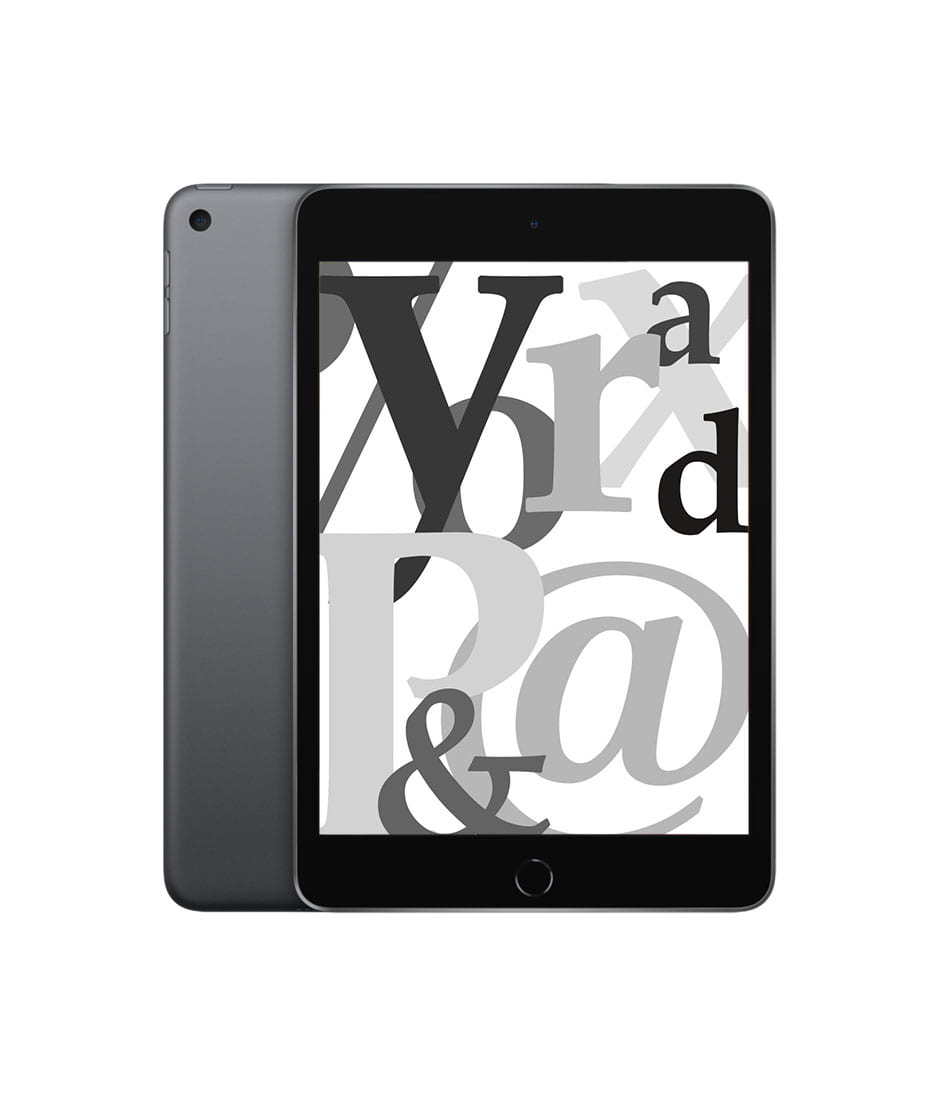
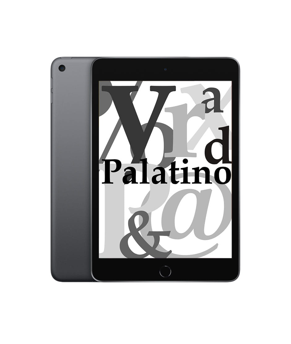
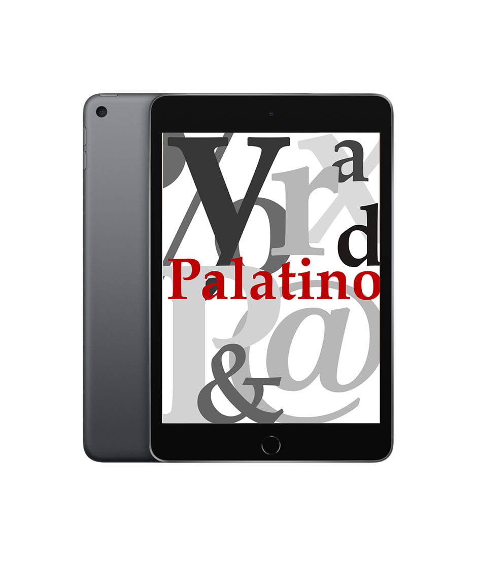
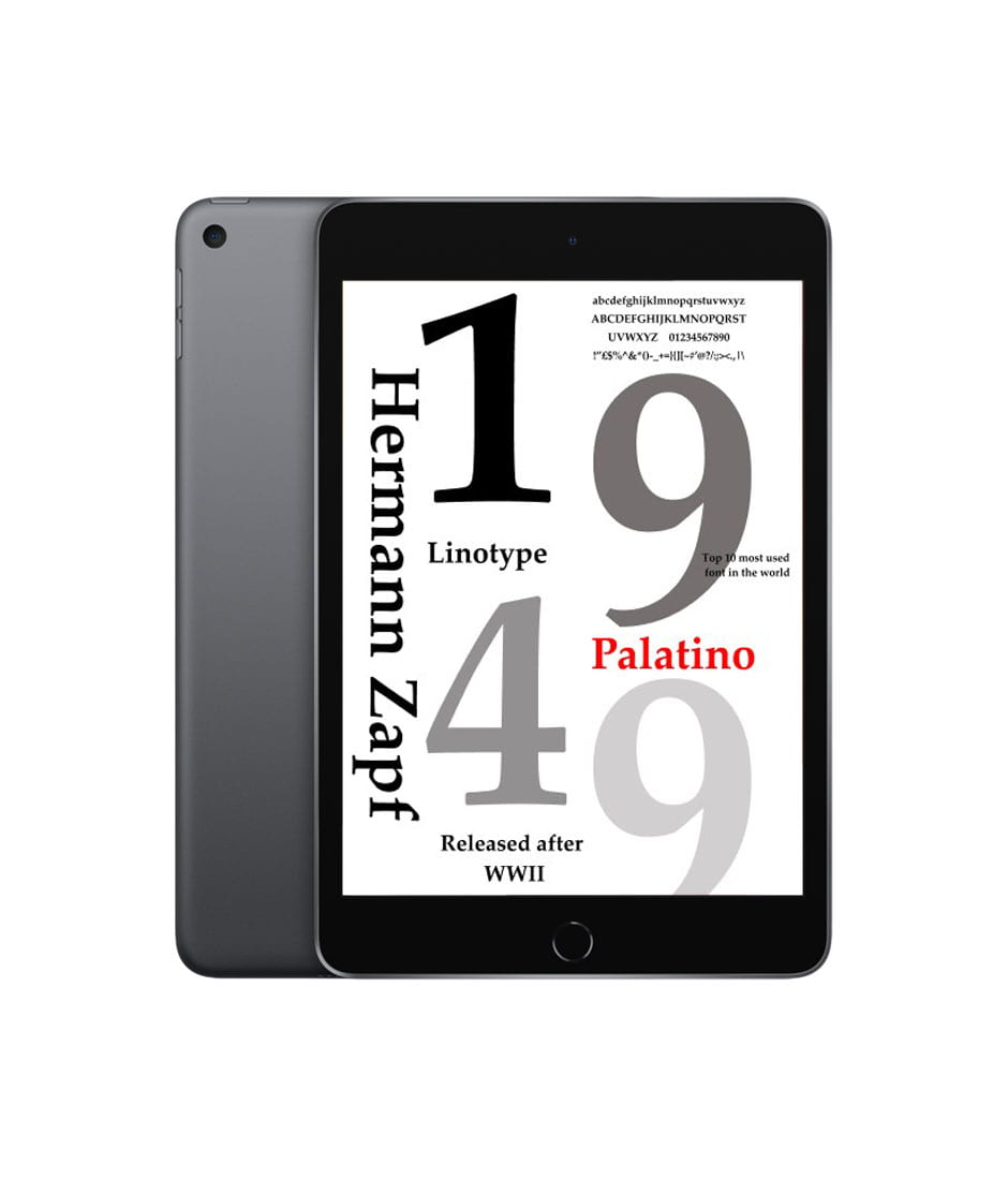
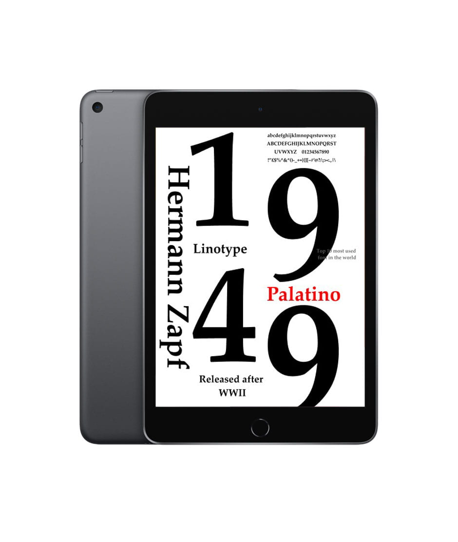
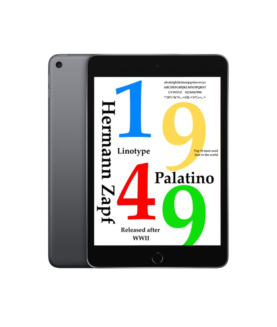
Imagery research


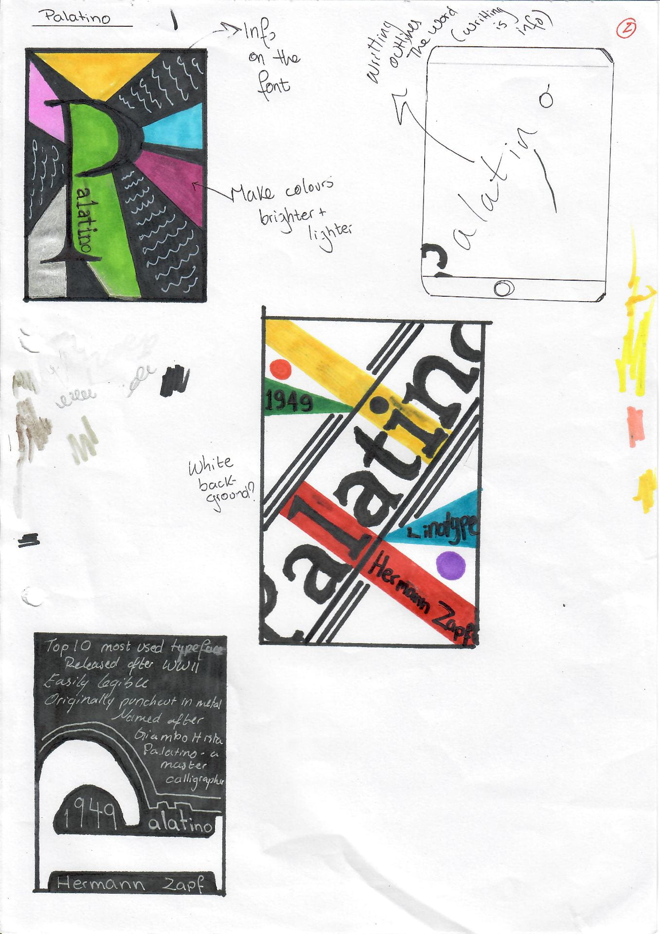
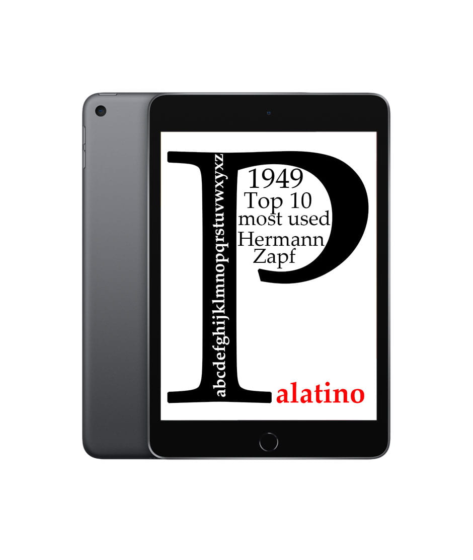
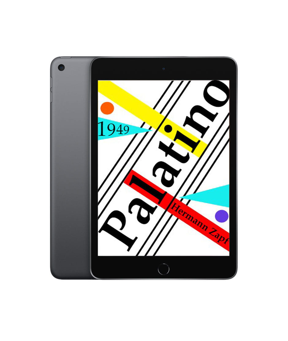
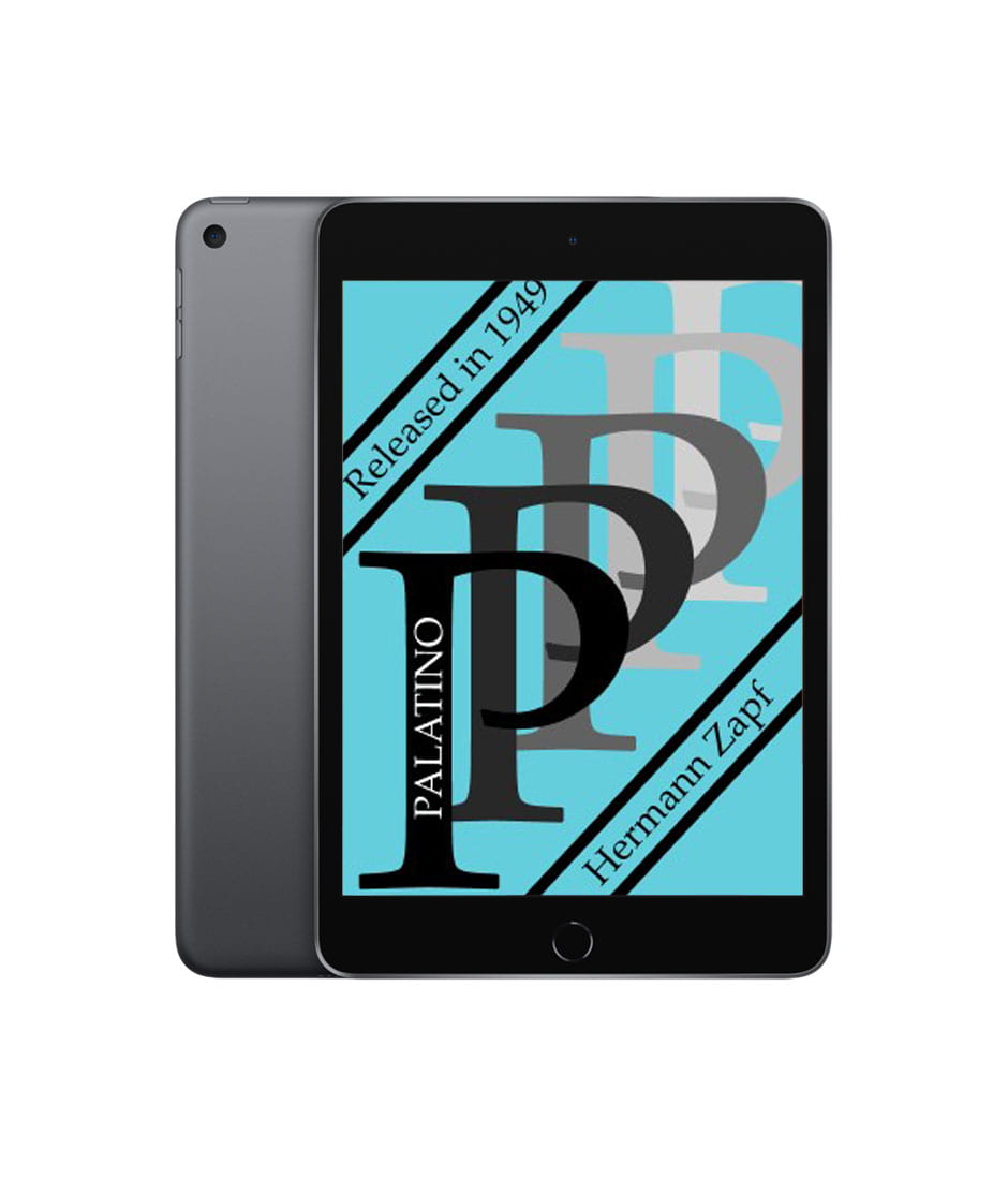
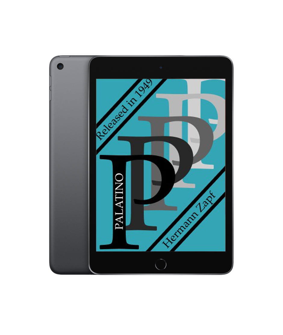
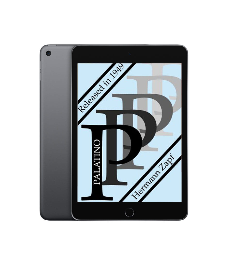
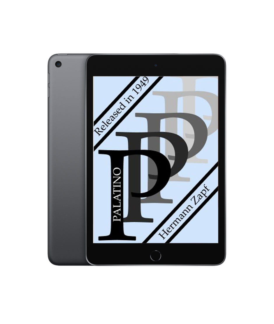
Title page design
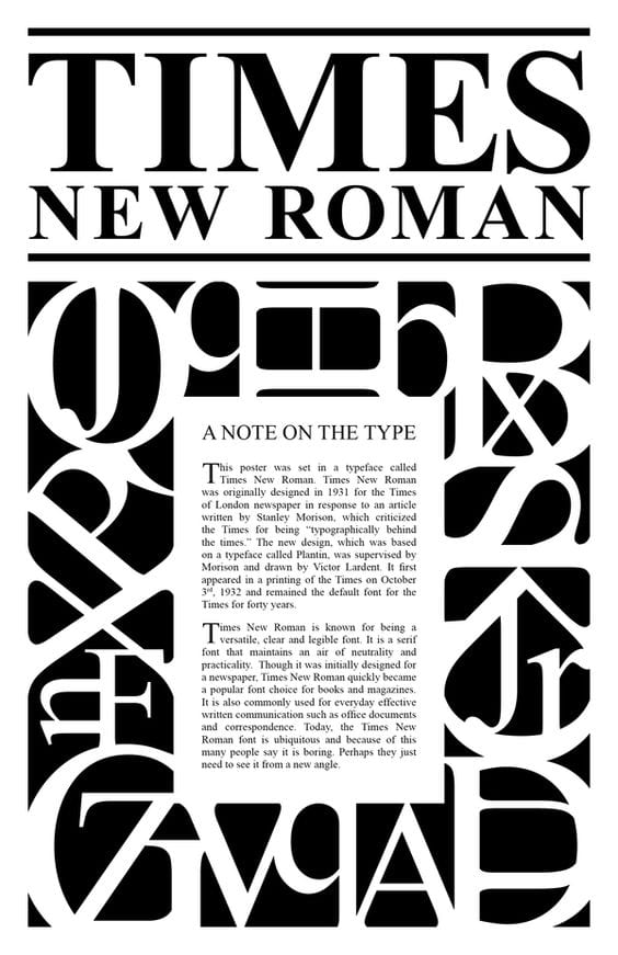
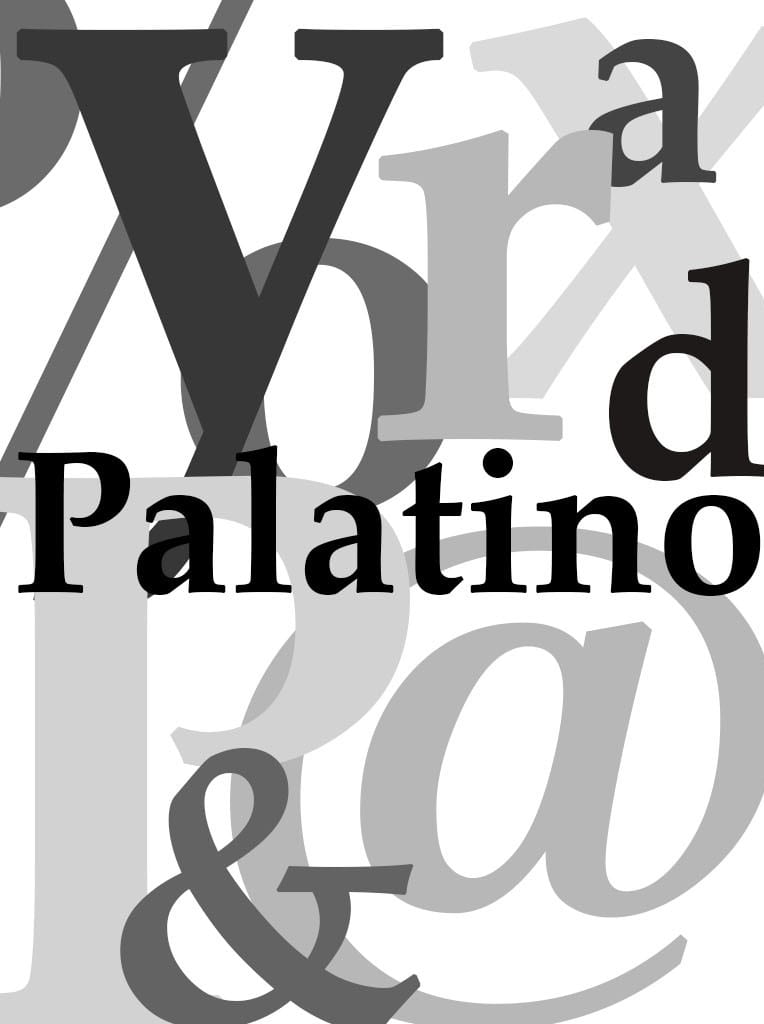
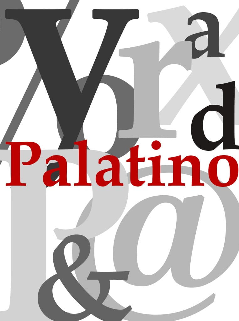
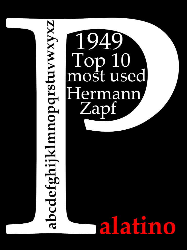
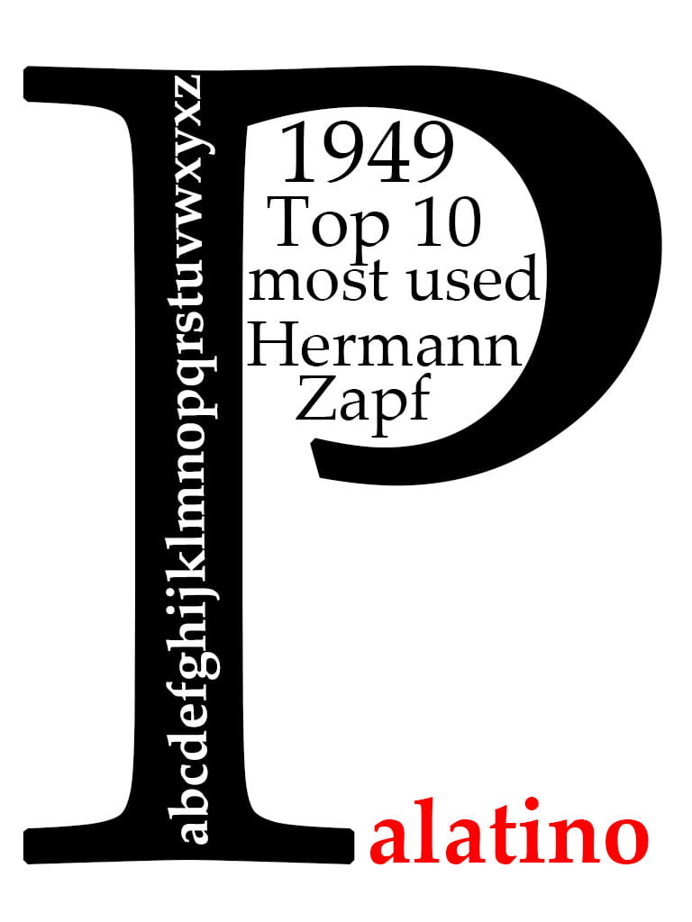
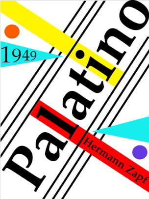
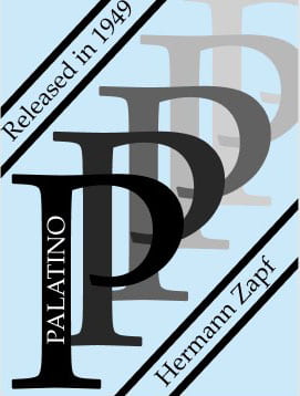
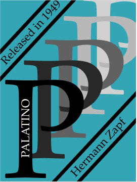
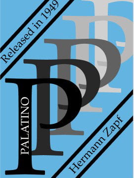
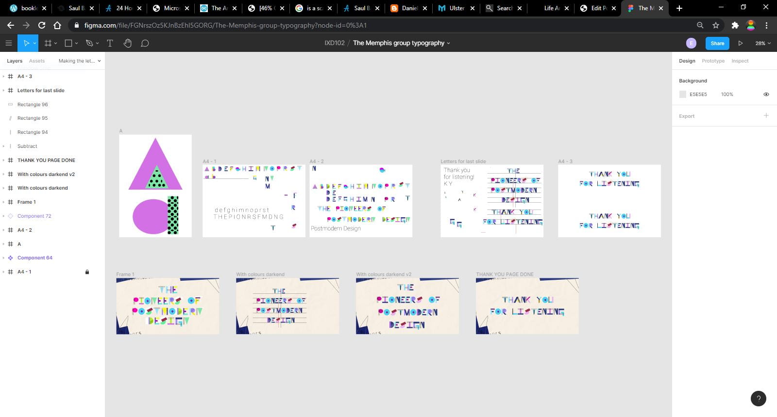
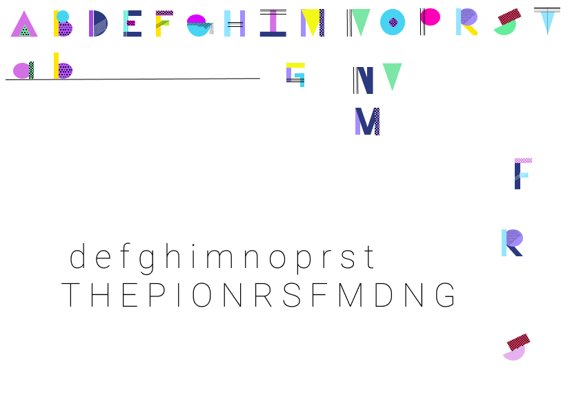
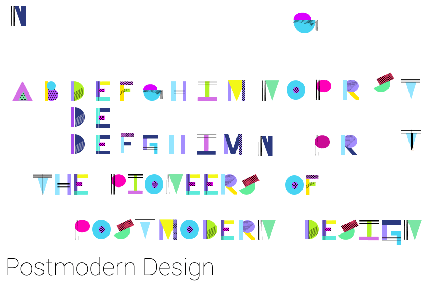
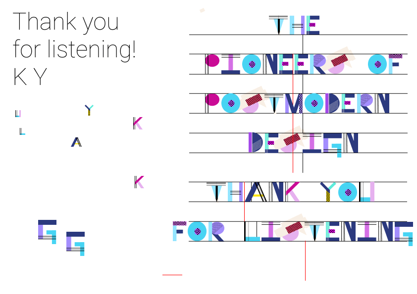
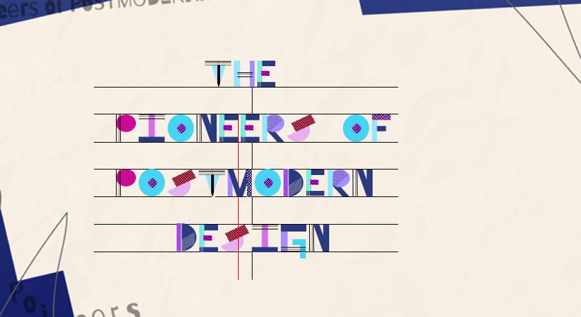
Rachel designed the background and I was tasked with designing the typography for the title page.
I decided to go for something heavily reliant on shapes and vibrant colours – quirky like the style of the Memphis group. I started off quite bright but then dulled down the colours a bit as they clashed with Rachels background. I used the straight black lines for letters like the Ts as they made quite the impact, which I believe is the essence of the Memphis style.


Presentation Script
Ettore Sottsass
- Was an Italian architect and designer known for his work in furniture, jewellery, glass, lighting, and office. He helped spark the postmodern design revolution, which mixed pure modernism with colour, pattern, historic references, and unabashed pastiche.
- His work was known for its variety and playful incorporation of ornamentation and colour.
- In the early 1980s Sottsass and Raddice founded the Memphis Group. Drawing inspiration from such movements as Art Deco ad Pop Art, Memphis produced and exhibited furniture and objects that were vibrant in colour and futuristic in design. Bob Dylan’s song ‘Stuck Inside of Mobile with the Memphis Blues Again’ was playing on repeat during the group’s first meeting, which led to the group being named ‘Memphis’.
Next slide please
- Now-classic Memphis pieces such as his Carlton room divider – as seen to the right – rocked the design world in the early 1980s, and continue to inspire designers today (a burned Carlton divider appeared in the 2004 show “Where There’s Smoke” at Moss
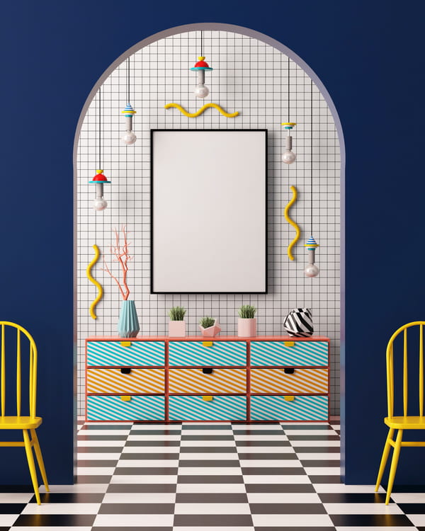
- As you can see in these images they were known for their use of bright neon, primary and pastel colours, geometric shapes, and bold, repetitive patterns. A mishmash of various design styles that were popular during the 1980s.
Next slide please
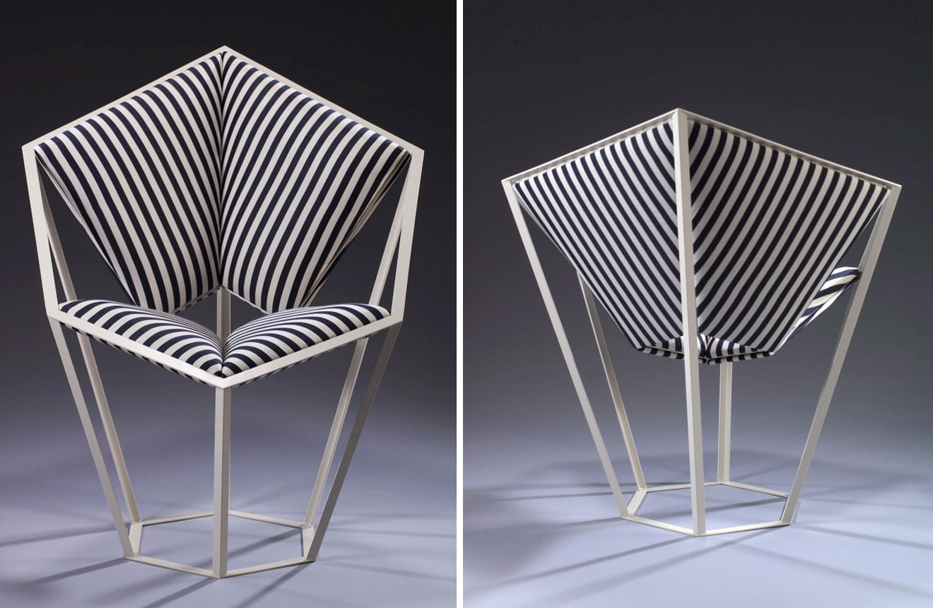
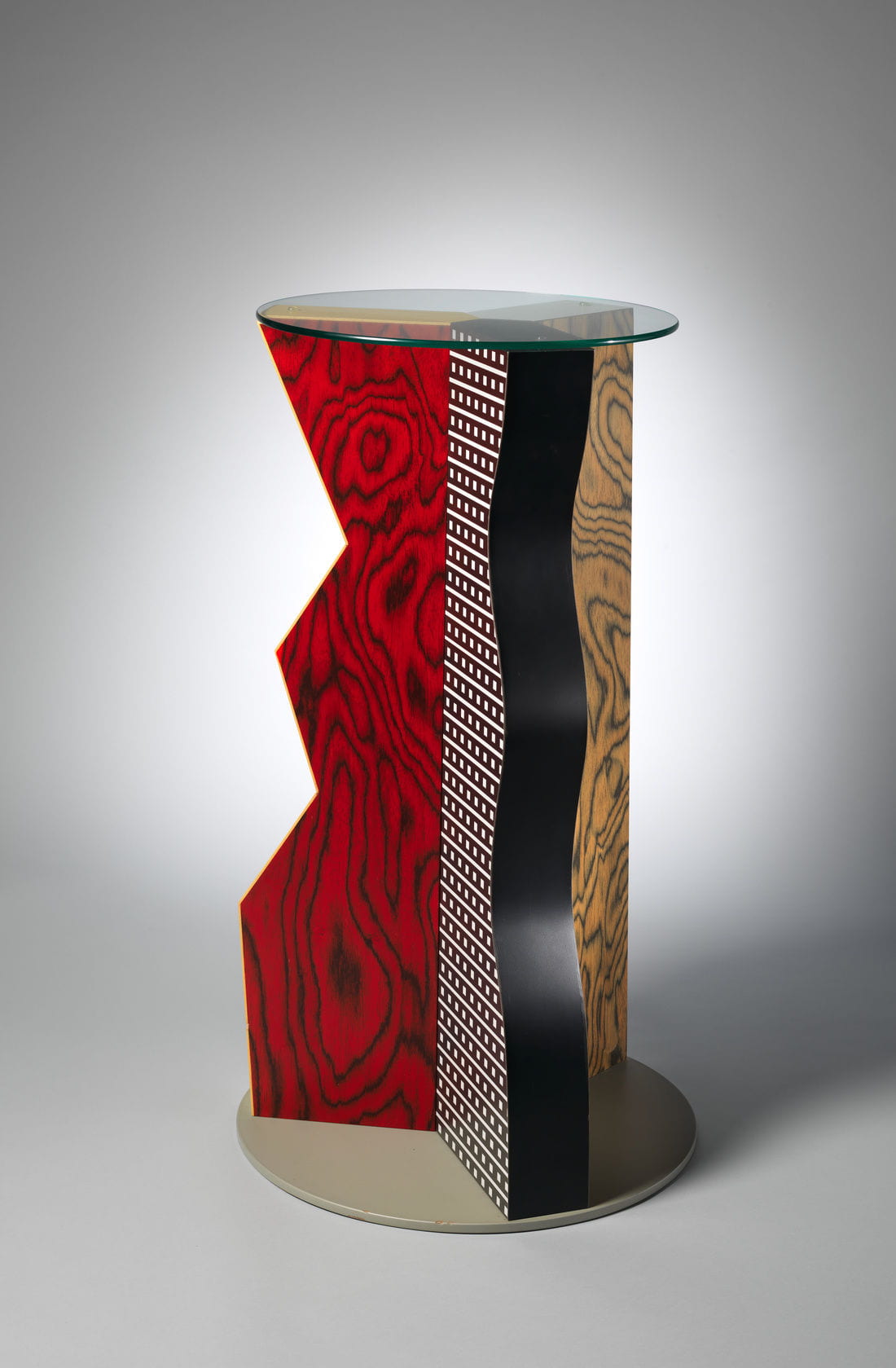
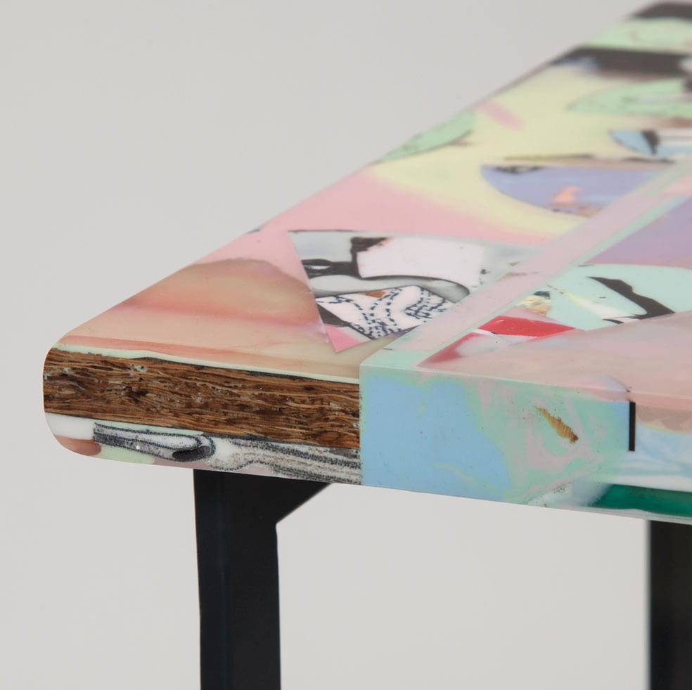
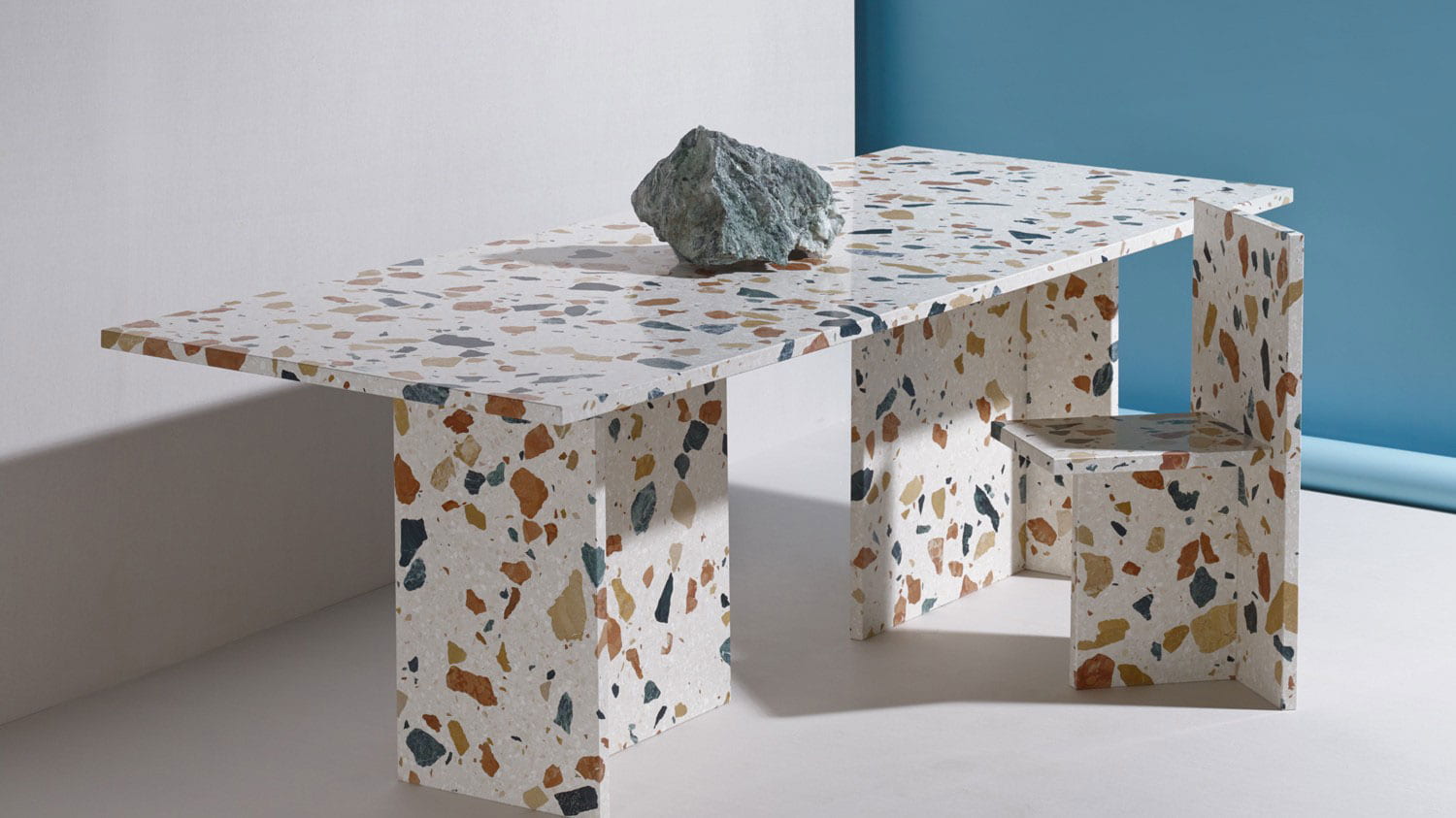
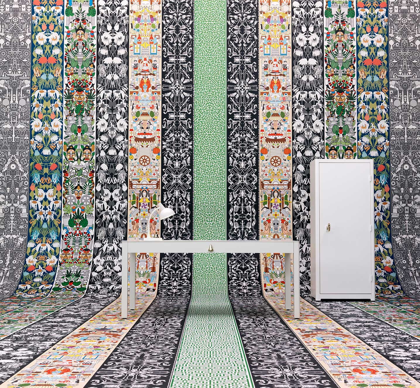
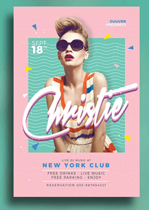
- The following are works inspired by the Memphis style
- The first image is a promotional poster for a club in New York
- The next is a table created by Chen Chen Kai Williams
- And a show apartment in the Memphis style created by Sasha Bikoff.
- Even though the Memphis Group’s ethos was considered to be in poor taste by the critics of the day, the style they pioneered has proven to have lasting relevance for designers, who look to its off-beat, humorous approach to give freshness and life to their designs today as can be seen in these examples.
- What makes the Memphis Style so fun is the lack of rules and regulations associated with it. It really is a style that embraces eclectic and truly creative design. It’s also an inherently optimistic design style, which perhaps is why designers and illustrators are discovering a fresh relevance to the style today.
Next slide please
Michael Graves
- was a noted American architect and designer of consumer products, as well as principal of Michael Graves and Associates and Michael Graves Design Group. He was also a professor of architecture at Princeton University for nearly forty years.
- He was a member of The New York 5 and the Memphis group
- He was widely seen as the leading voice of postmodernist architecture.
- He founded his own firm in 1964 and, in 1982, and completed one of his best-known projects, the highly controversial Portland Building.
- His next projects included the Denver Public Library, the Humana Building in Kentucky, and several buildings for the Walt Disney Company.
Next slide please
- Here are some of Graves work that stood out to me the most as with them he reintroduced human scale, colour, and, sometimes, playful forms into the stark white vocabulary of modernism.
- The St. Coletta of Greater Washington, a school and physical therapy centre for children with special needs
- The Bathtub grab bar he designed for Drive Medical and
- The Disney Corporate headquarters in Burbank, California – a Parthenon-inspired façade featuring the dwarves from snow white as pillars – a design for a world within a world.
- He was actually one of the first outside designers granted “artistic freedom” to use Disney characters outside of their character integrity guidelines.
- Graves also worked on many non-Disney buildings, including what many consider the first post-modern building in Portland, OR, most recently the Resorts World Sentosa in Singapore, as well as houseware designs for Target, JC Penny, and more.
I’m now going to pass you over to Emma who is going to talk about Paula Scher and vernacular design
Finished presentation slides
https://docs.google.com/presentation/d/1Y4v4oSW2nbsas3KED7xj5zCGw4PqsLYIjOnie-NHu1s/edit?usp=sharing